
In this Photoshop tutorial, I’m going to show you how to change a model’s eye color and recreate the character poster for the recent Dune movie. In the course of this tutorial, we’ll also dive into skin blemish correction, frequency separation, blending options and much more. If you want the files used in this tutorial to follow along step-by-step, click below.
This post has been adapted from the following YouTube tutorial. Watch the video or just follow the steps as outlined below.
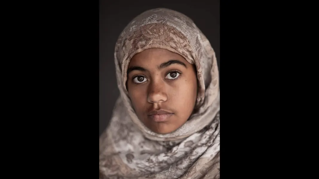
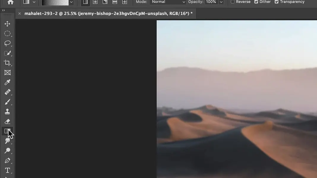
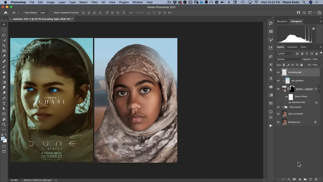
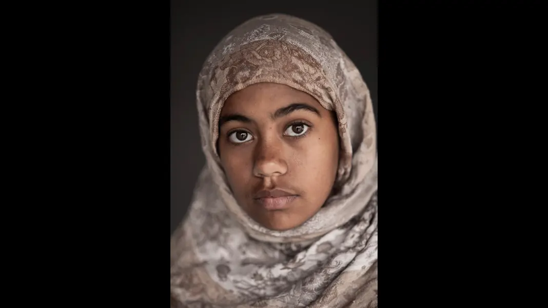
Now, let’s talk about how to create a Dune movie poster. Here’s the “Before” image we’ll be working with today:
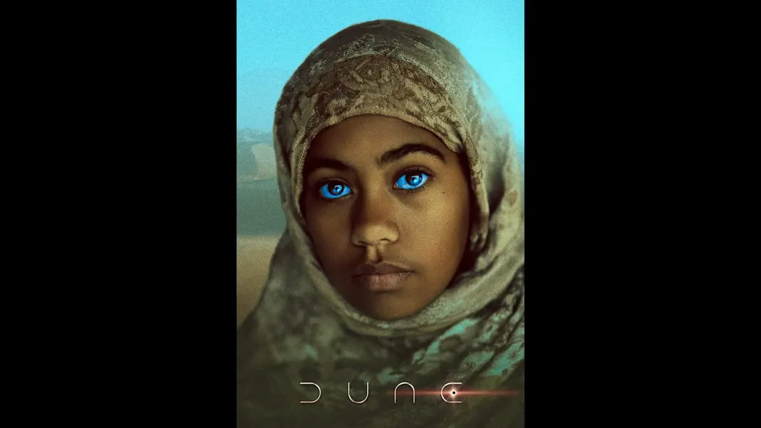
And here is the “After”:
To get started, once you have downloaded the source files we will be working with today, navigate to File > Open in Photoshop and open the “mahalet-293.dng” file.
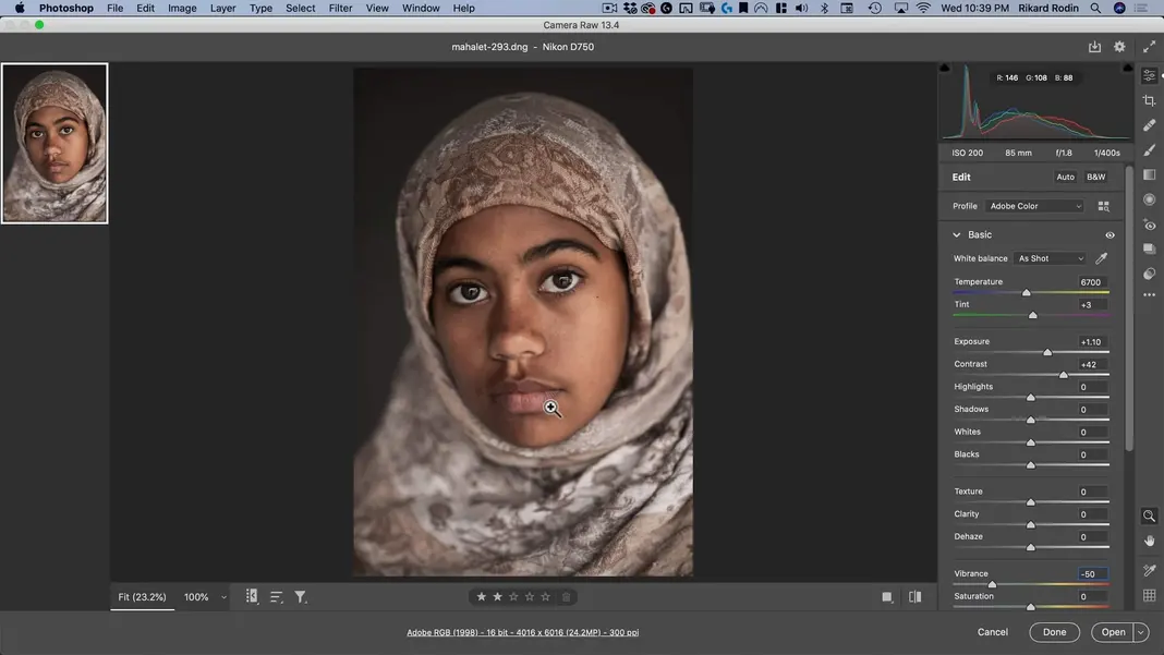
You should now see this photo that I took of a model opened up in Photoshop.
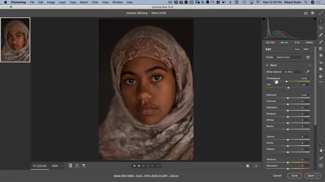
The only edits I’d like to make to this photo is to set the exposure to +1.10, the contrast to +42, and the vibrance to -50. This will take out a lot of the colors from the photo so that we can apply a heavy color grade later without competing with the colors in the original image.
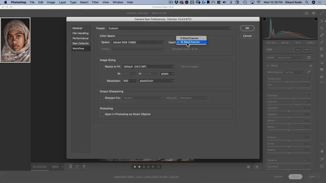
As a last step, click the “Adobe RGB (1998)” link at the bottom of the screen to open the Camera Raw Preferences, and make sure the Depth setting is set to 16 Bits/Channel. Then hit OK.
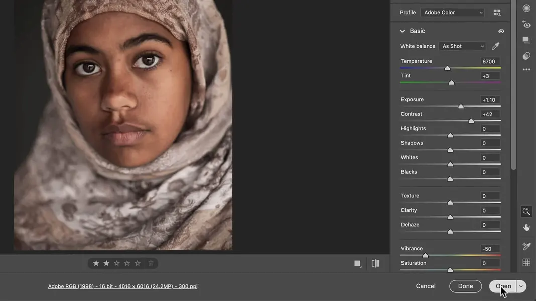
Hit Open in the bottom right corner.
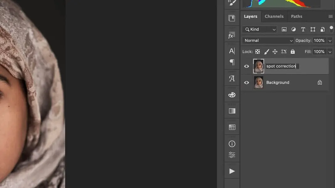
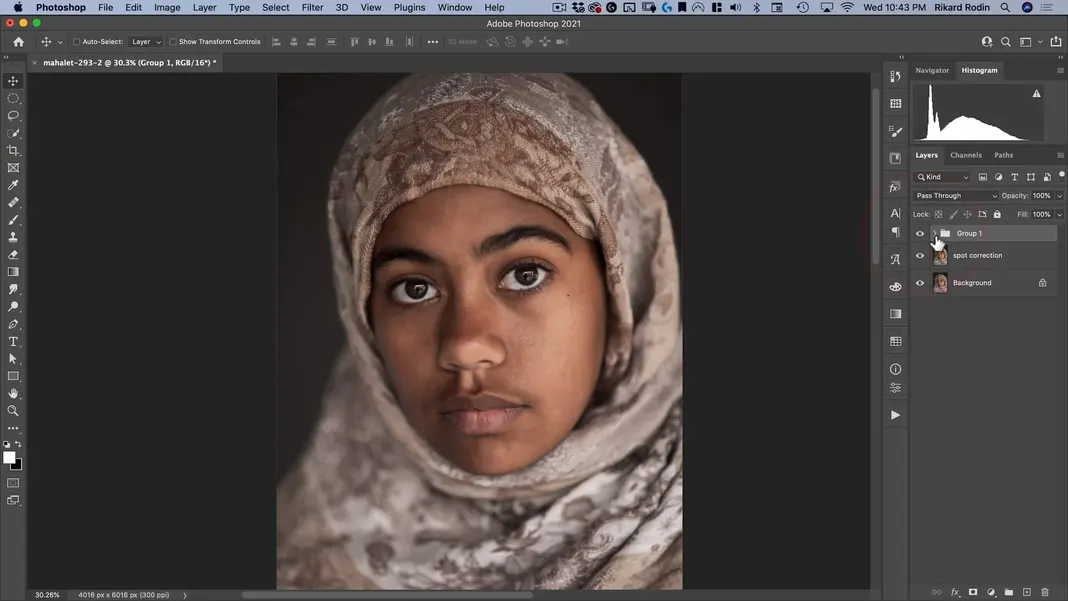
Drag and drop the Background layer to the new layer icon
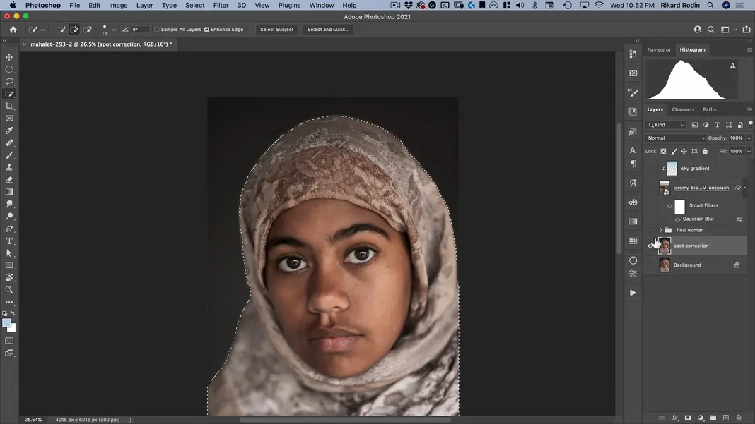
We can name this new layer “spot correction”, since that’s the first thing we’ll be doing.
We’re going to be cleaning up some of the spots on her skin, so let’s zoom in on her face and grab the Spot Healing Brush Tool.
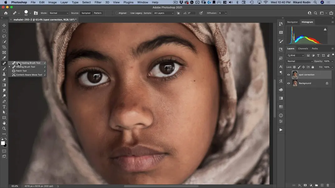
Now let’s paint over any blemishes we see on her skin; Photoshop will use its AI to fix them and replace them naturally.
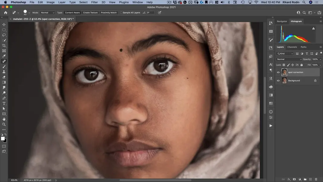
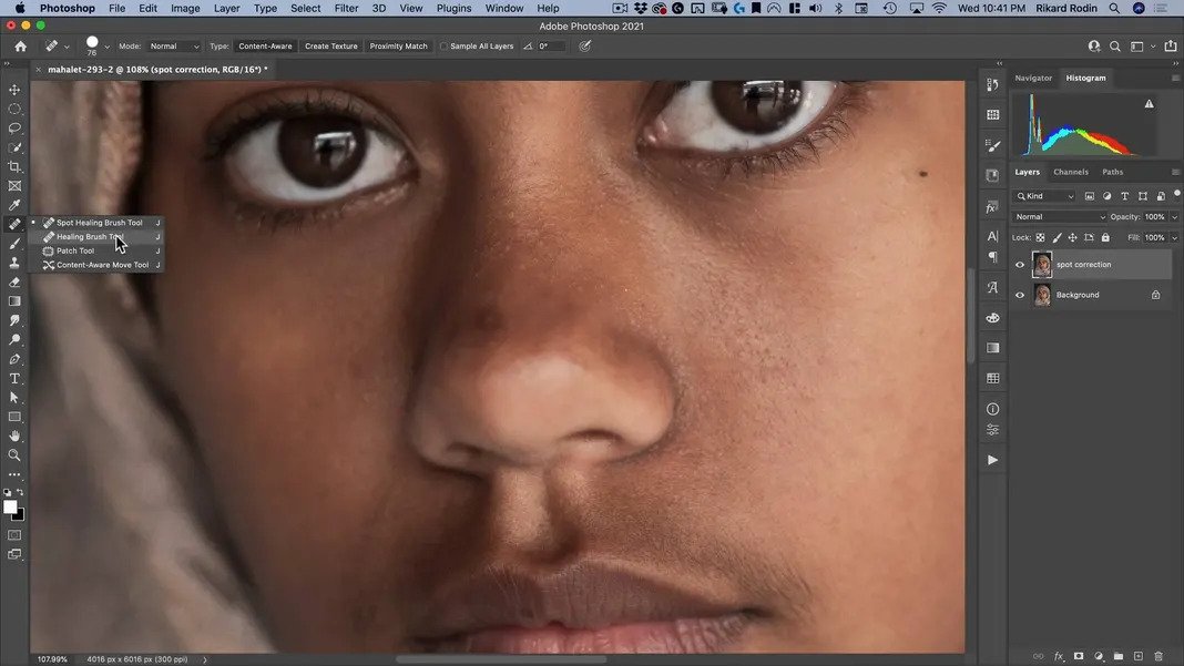
I’m happy with those changes, but I will need a different tool to fix the area on the tip of her nose. The problem with using the Spot Healing Brush Tool there is that it will sample a higher texture area, so instead we can select the Healing Brush Tool.
With this tool, by holding down the Option key, I can tell it where to sample information from. Just make sure it’s sampling information from a similarly focused area.
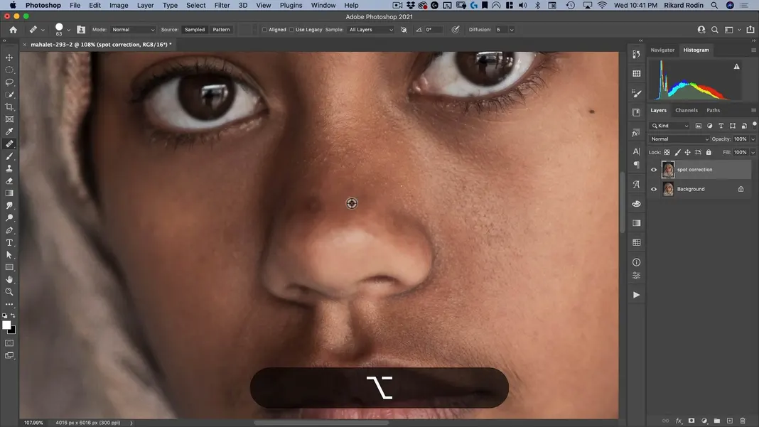
Once that’s been selected, paint over the blemish on the nose.
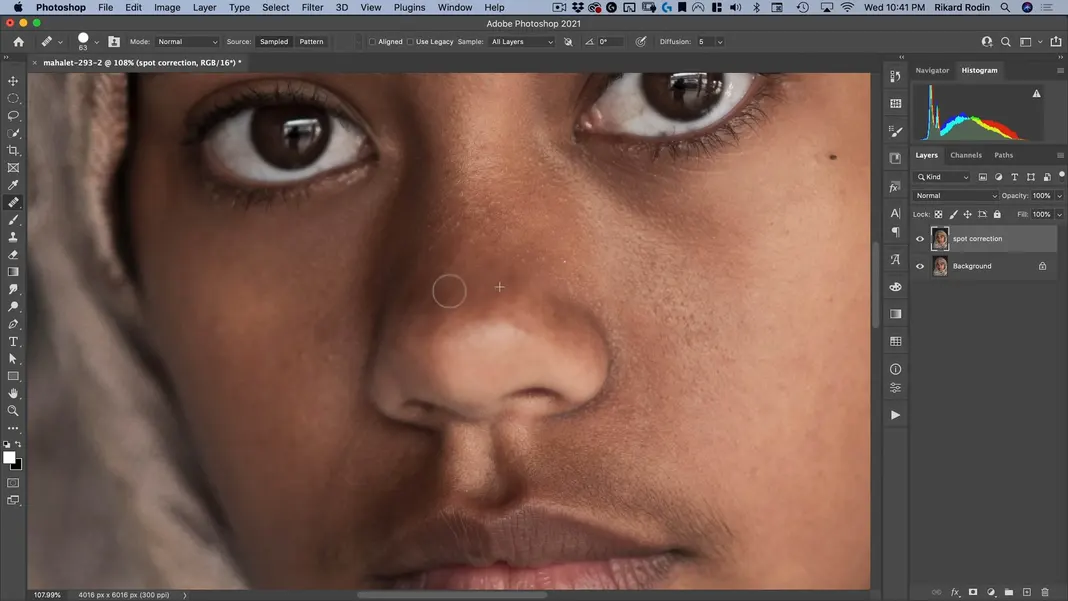
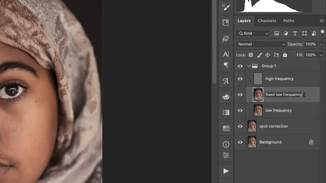
With that, the spot correction is done. The next step is frequency separation, which is a great way to fix up skin for fashion or beauty photography. To do this, we have to split the layer into two separate layers: one with the low frequencies, and one with the high frequencies. Similarly to before, create two new duplicate layers of the spot correction layer, and name them “low frequency” and “high frequency”.
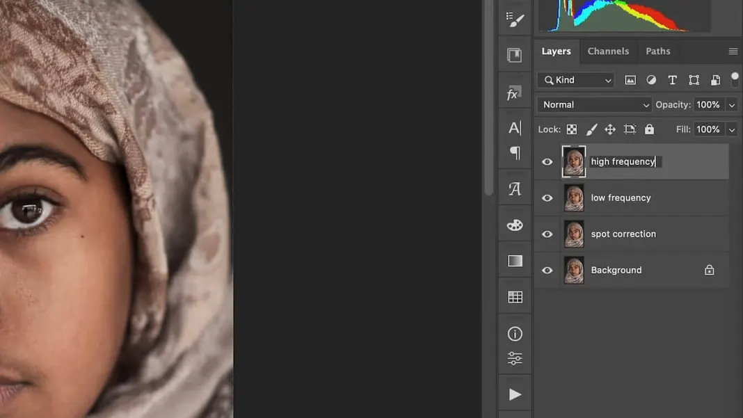
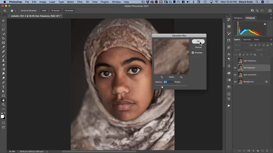
Turn off the high frequency layer. Then navigate to Filter > Blur > Gaussian Blur.
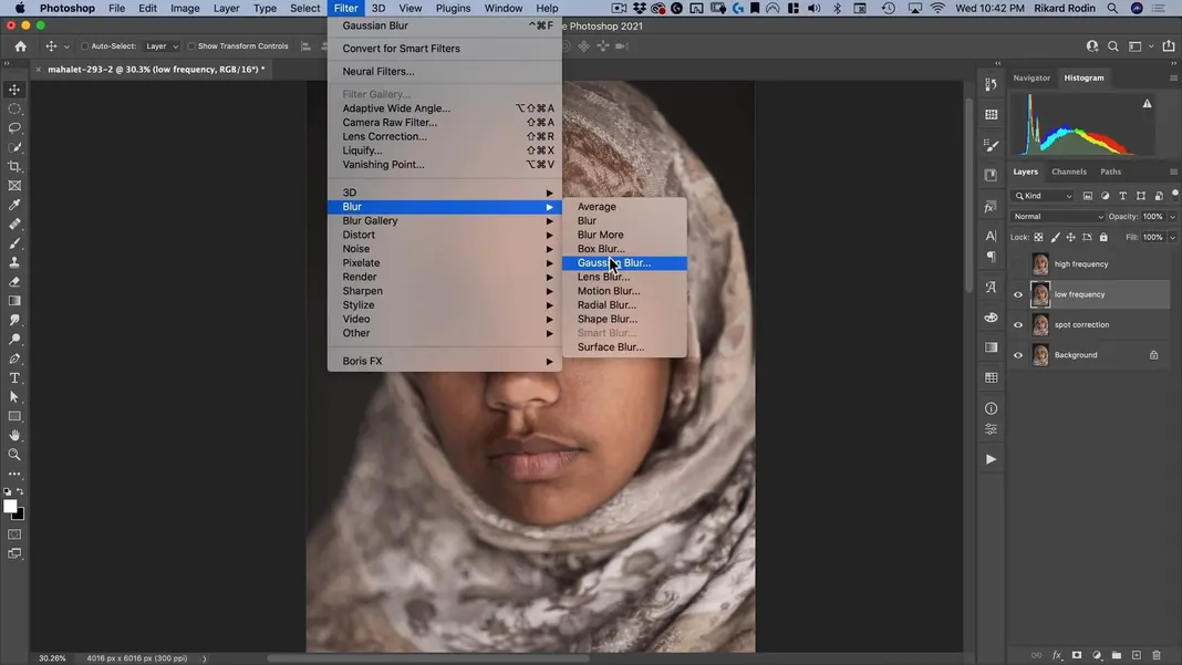
Make sure the radius is set to 4 pixels and hit OK.
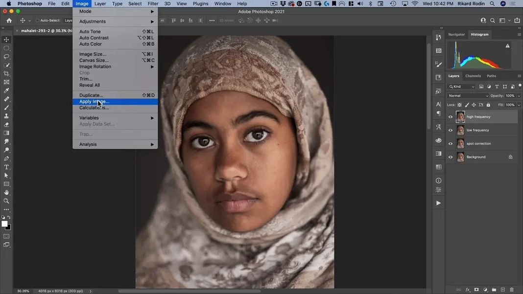
Now turn on and select the high frequency layer, and navigate to Image > Apply Image.
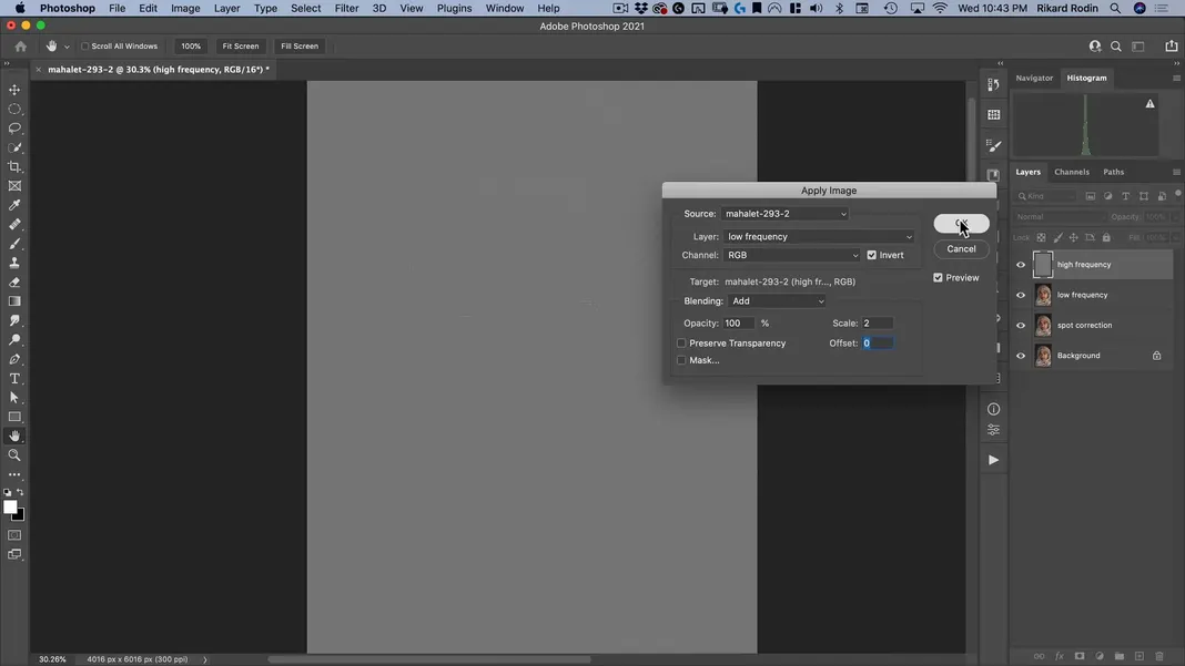
As shown below, set the Layer to low frequency, turn on Invert, set Blending to Add, set Opacity to 100%, set Scale to 2, and set Offset to 0. Then click OK.
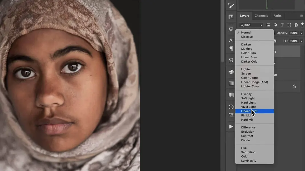
Then change the high frequency layer to a Linear Light layer.
Now we can put the two frequency separation layers in a group. If you turn the group on and off, you should see no obvious difference between it and the original. However, we now have the low frequency layer which we can start blurring to get rid of some of the imperfections in her skin.
I do recommend making a copy of the low frequency layer and calling it “fixed low frequency”. That way, once we have made our changes to the low frequency layer, we can change the opacities of the fixed layer to strengthen or tone down the effect.
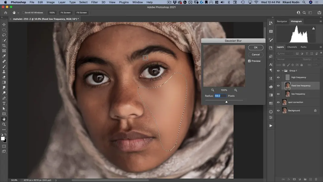
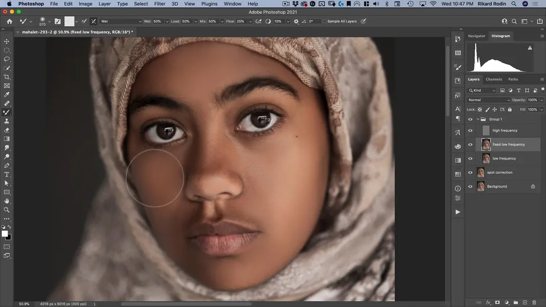
Now that we’ve completed the frequency separation, it’s time for the blurring step. Some people do this by selecting large areas and applying a strong Gaussian blur, as shown below.
However, I’m personally not a fan of this method, as it gives the image an Instagram filter feel where all of the skin defects in the image are edited out. Instead, my preferred method is using the Mixer Brush Tool.
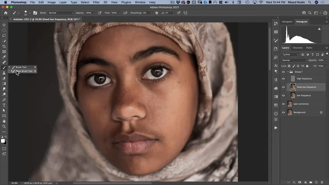
With some settings, you can turn a Mixer Brush into a Gaussian Blur brush. First, make sure it’s set to Clean Brush.
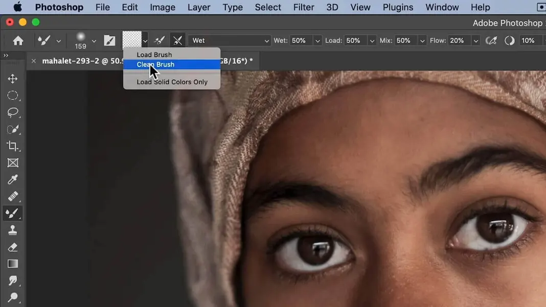
Then, make sure the “Clean after each stroke” setting is enabled and the “Load after each stroke” setting next to it is not.
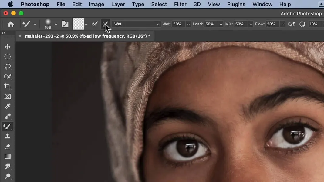
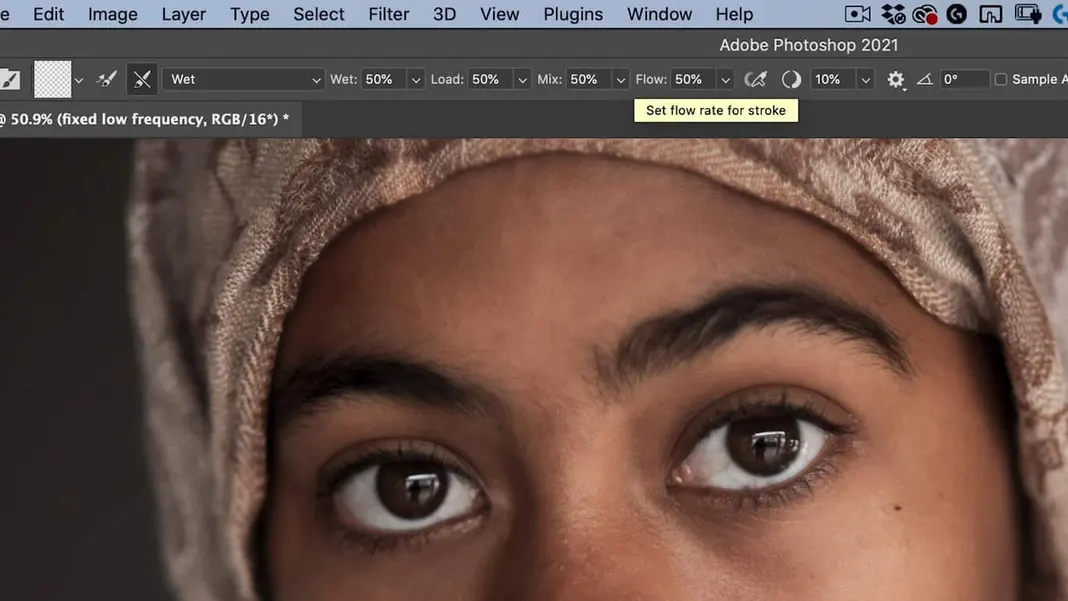
Set the Wet, Load, Mix, and Flow settings all to 50% to start; we can modify the Flow setting as we go depending on how much of the effect we want.
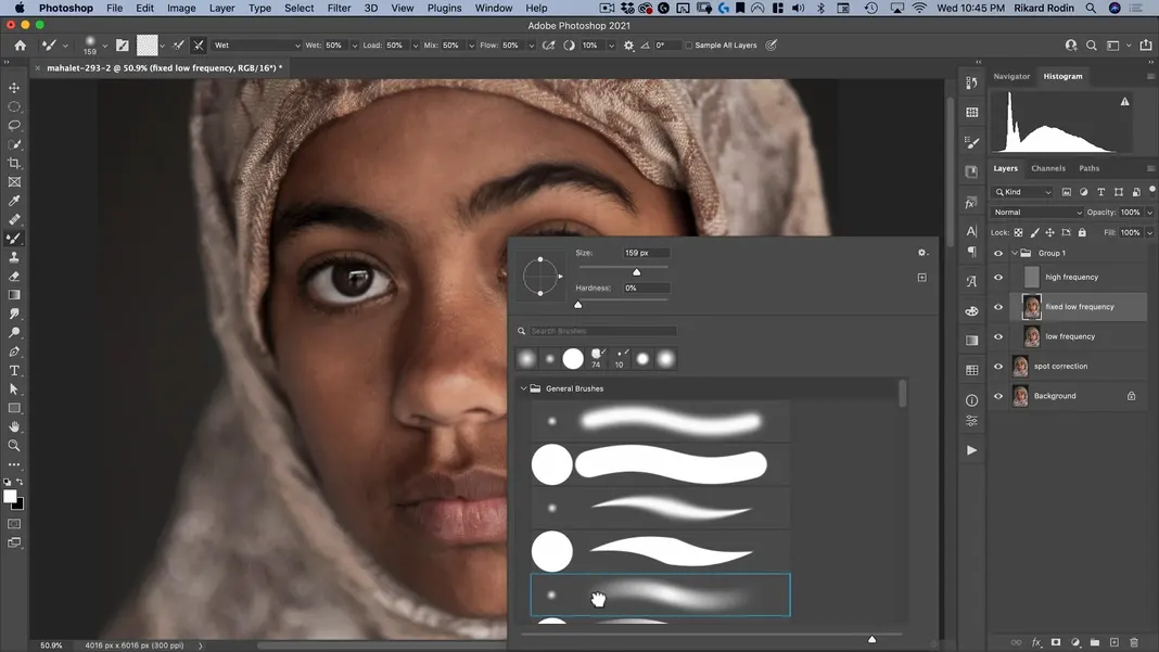
Make sure you’re using a soft brush. We can adjust the size based on the area we’re painting; if we’re painting a large area—like the cheek—we can set the brush to a large size, whereas if we’re painting a small area—like the area between the eyebrow and eyelid—we can set the brush to an appropriately small size.
With these basic settings in place, let’s smooth out the skin following the contours and the existing shapes of the face. My final result looks like this.
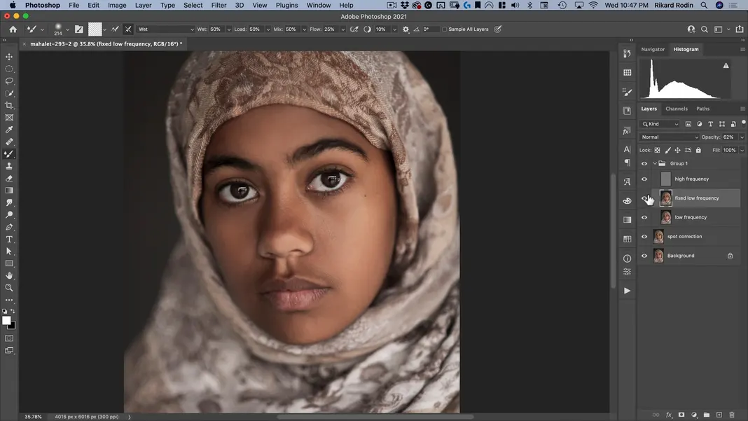
I’m happy with these results. However, you will notice that it still has the Instagram filter effect. That is a big reason why I always make a copy of the layer so that I can tone down the effect. Normally I set the opacity to somewhere between 60% and 70%, which allows enough of the original image to show through to get a more natural effect.
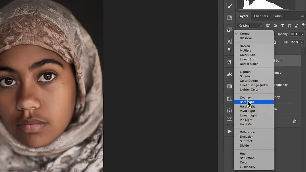
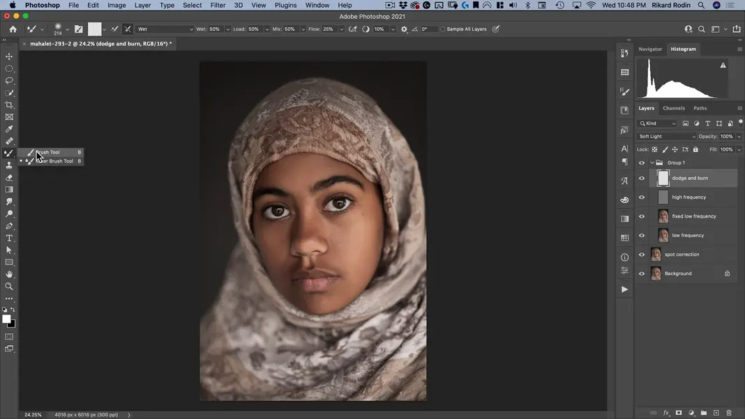
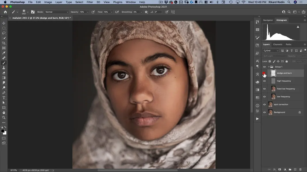
We’ll now do some dodging and burning. Let’s create a new layer and call it “dodge and burn”.
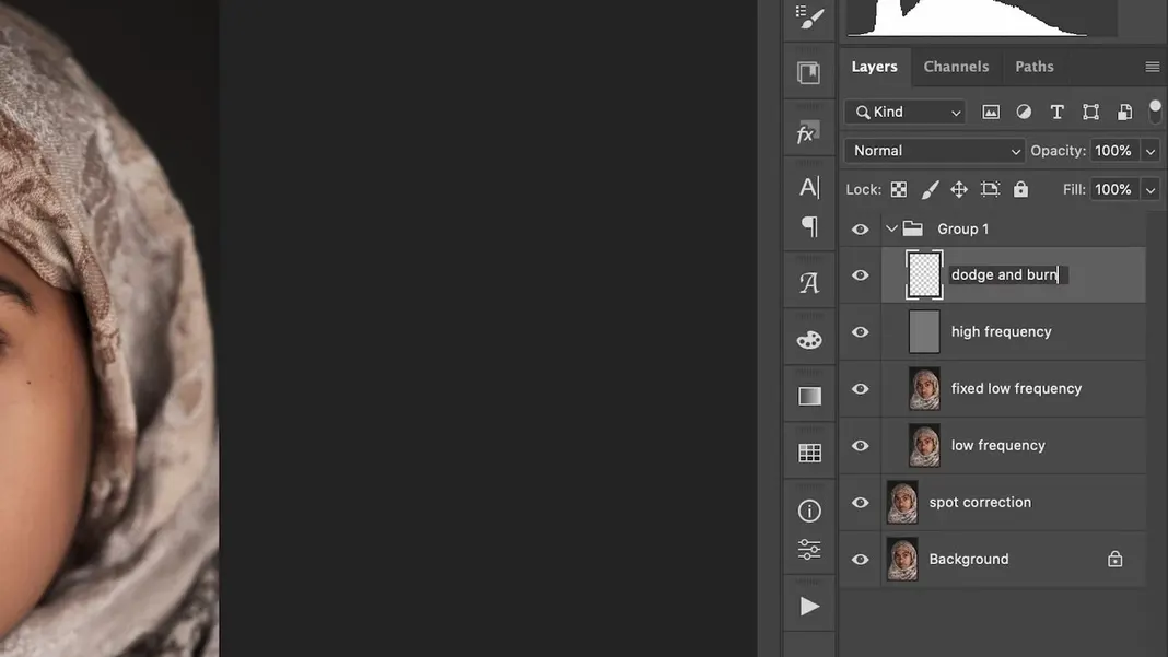
Set this layer to a Soft Light layer.
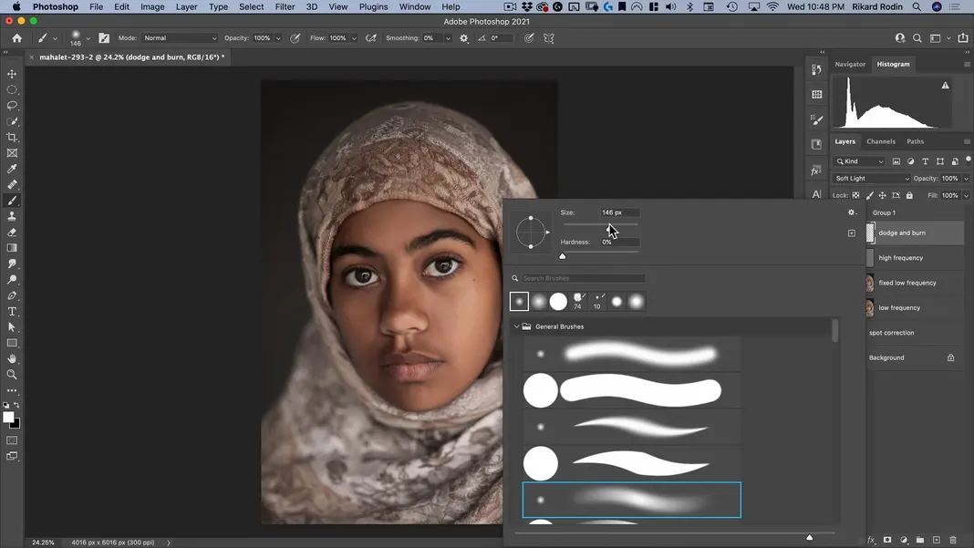
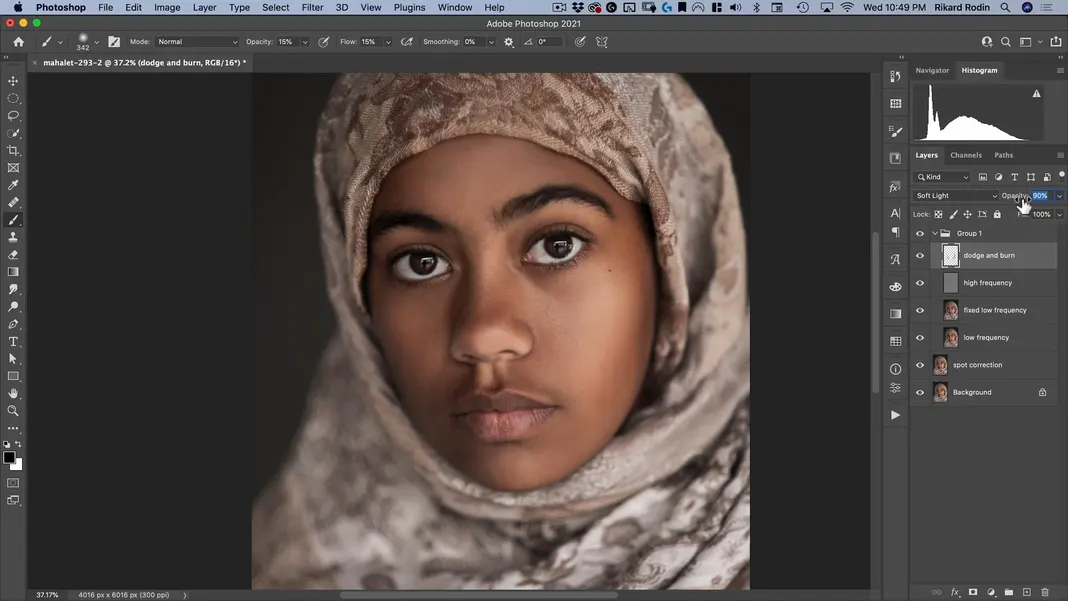
Switch back to the normal Brush Tool.
Select a soft and relatively large brush.
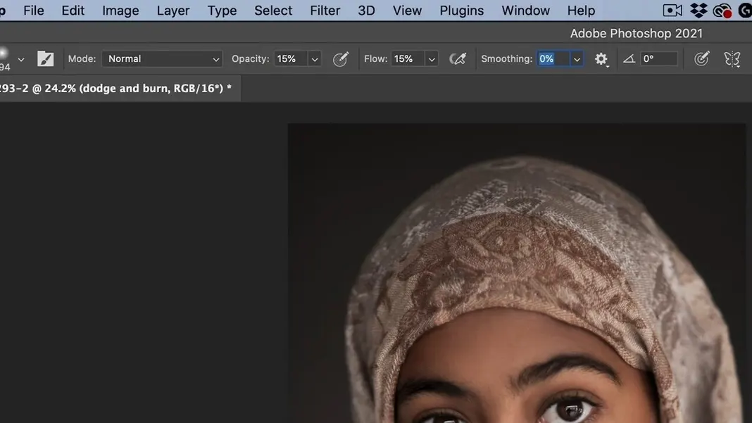
Set both the opacity and the flow of the brush to 15%. We want it to be really low when we start, and then we can always work it up by adding more layers.
We want to use this brush to contour the face very subtly. It’s similar to applying makeup to a woman’s face, as shown in the example graphic below.
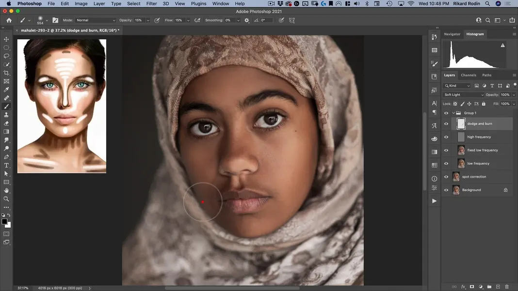
Remember to add both light and shadow in the appropriate locations; I encourage you to reference makeup and contouring tutorials for more information on where each should be used. Here’s my final result for this step.

If we turn the dodge and burn layer off, we can check how the image looked before the contouring step and see the effect the changes we’ve made are having.
Just like we did with the blurring step, we can change the opacity of the layer to moderate the effect, or even duplicate the layer to double the effect. In this case, I’ll just set the opacity to 90%.
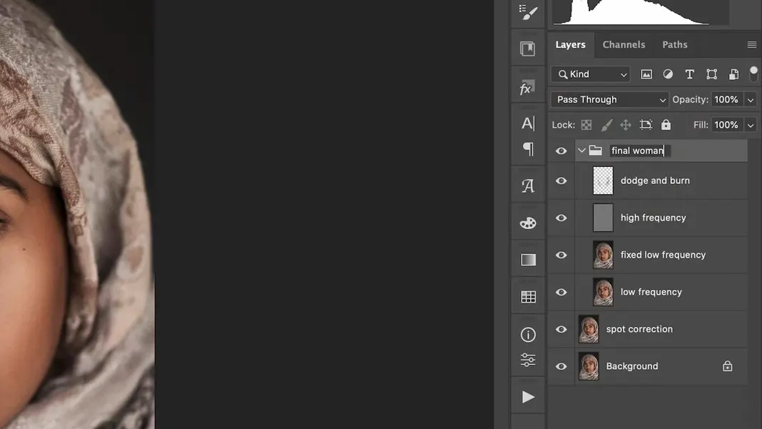
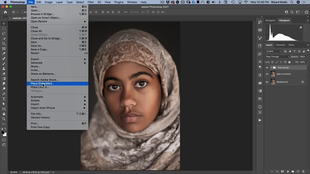
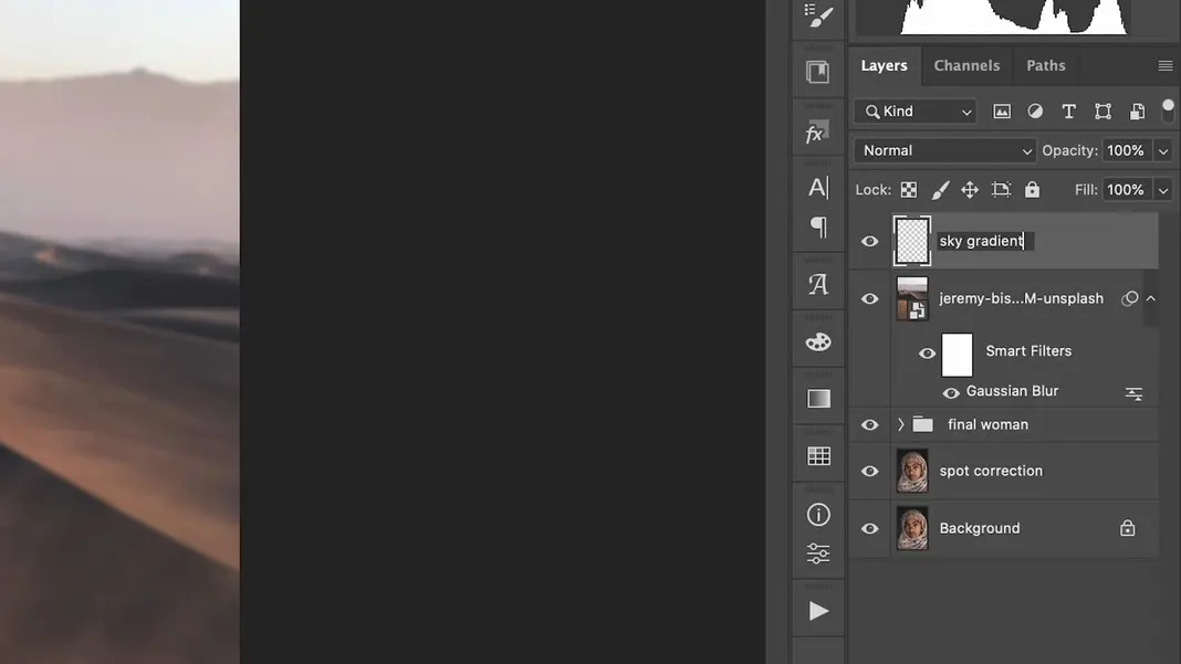
Our next step is adding the background. Let’s rename the group we’ve created to “final woman” to keep ourselves organized.
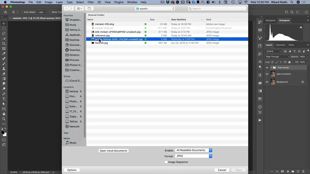
To add the background to this image, we’ll just throw the background image on top and then mask the woman out of it. Navigate to File > Place Embedded.
Select the file “jeremy-bishop-2e3hgvDnCpM-unsplash.jpg”.
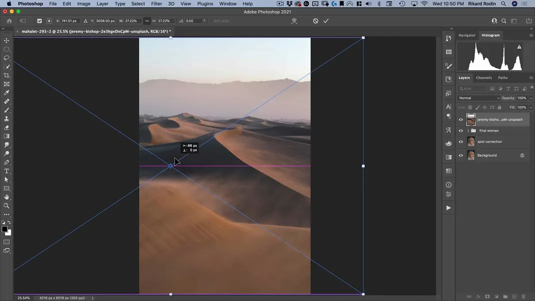
Scale the image up so that it fills the frame, and move it over to the left so that the sand dunes in the image are visible.
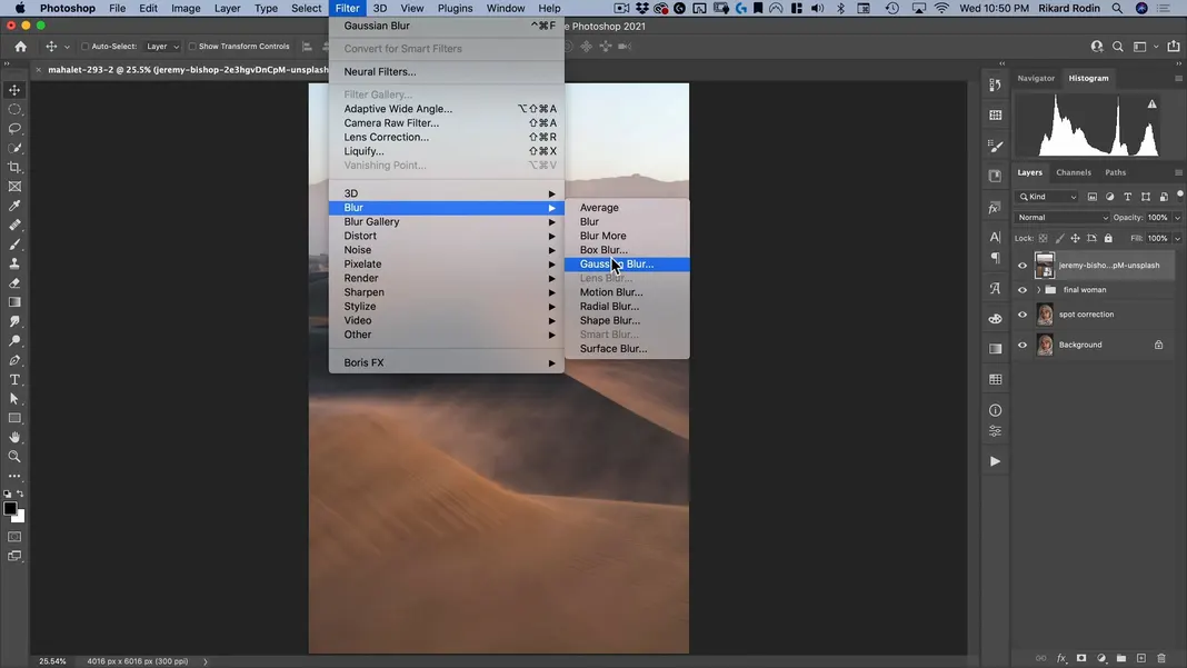
Now we’ll want to give it just a bit of a blur since the photo of our subject uses a relatively shallow depth of field. Navigate to Filter > Blur > Gaussian Blur.
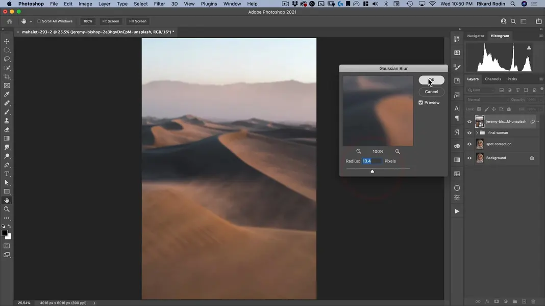
Set the blur radius as desired and hit OK; I’m setting the radius to 13.4 pixels.
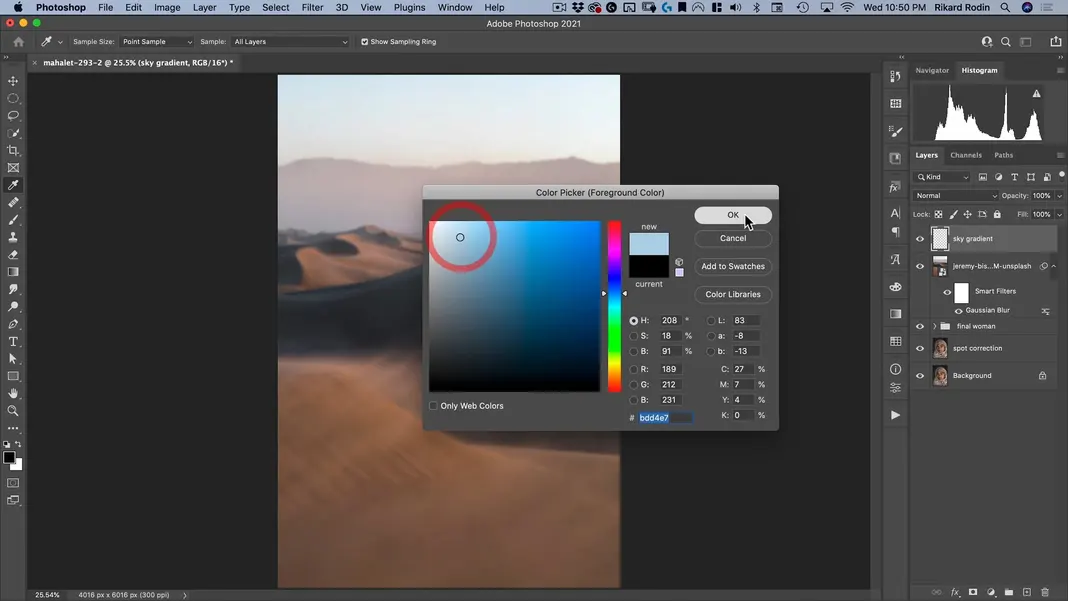
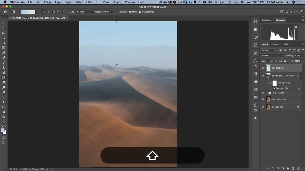
I also want to add a blue gradient. To do so, select the Gradient Tool.
Create a new layer and call it “sky gradient”.
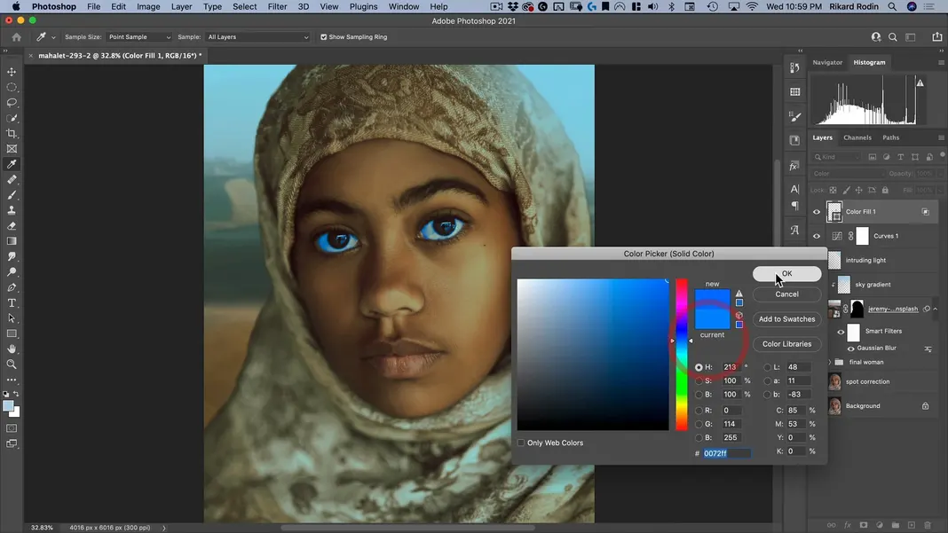
Open the color picker for the foreground color and select a blue color. Once that’s done, hit OK.
Then, create a gradient, starting at the top of the frame and going downwards, as shown below.
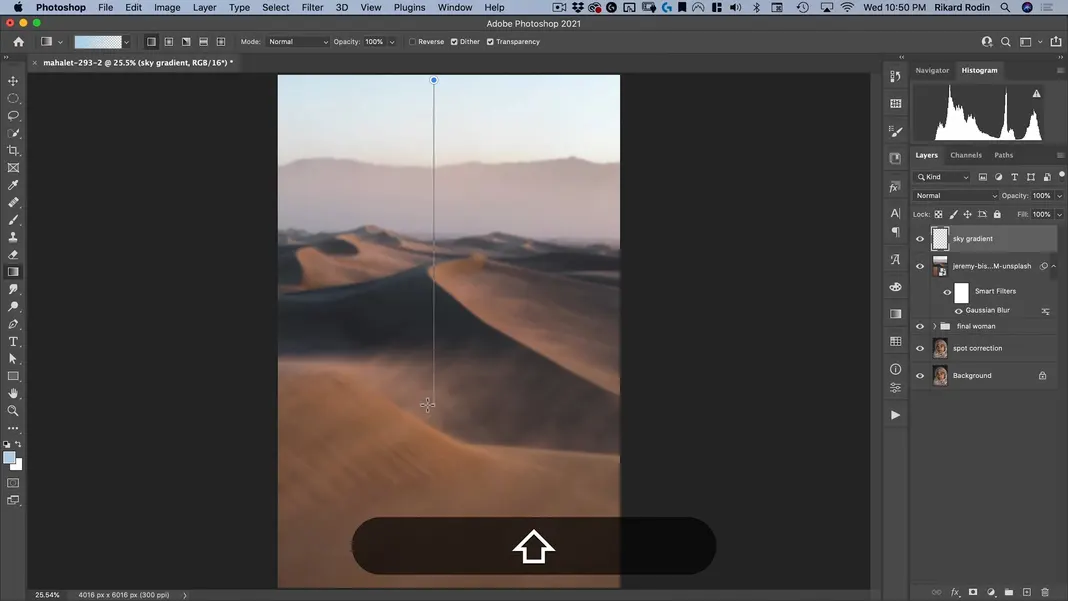
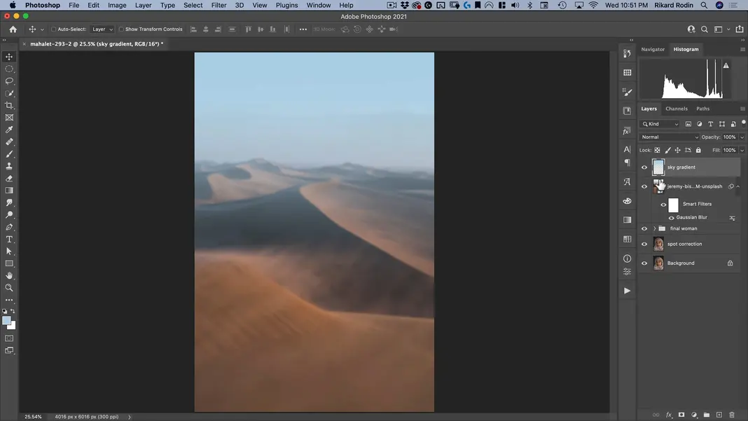
We can do so a second time as well, this time ending at the horizon.
The result should look something like this.
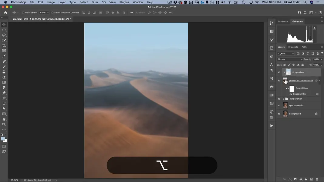
Finally, clip the sky gradient layer so that it’s just on the background image layer. This will be important when we mask out the woman next.
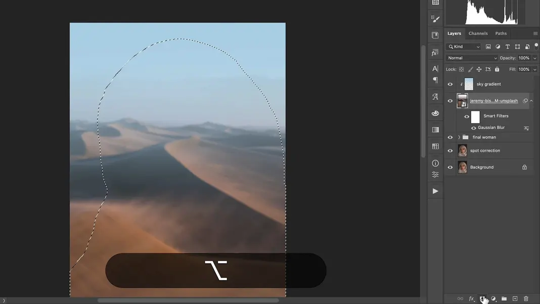
To create the mask, Option + click on one of the back layers with the woman on it. Choose the Quick Selection Tool and click Select Subject.
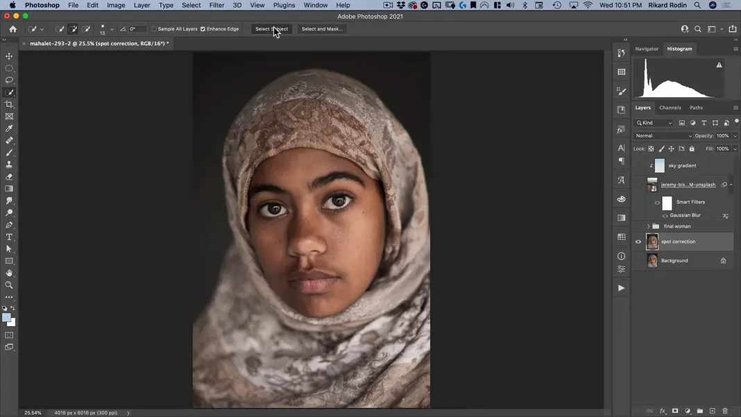
Once the subject is selected, click Select and Mask.
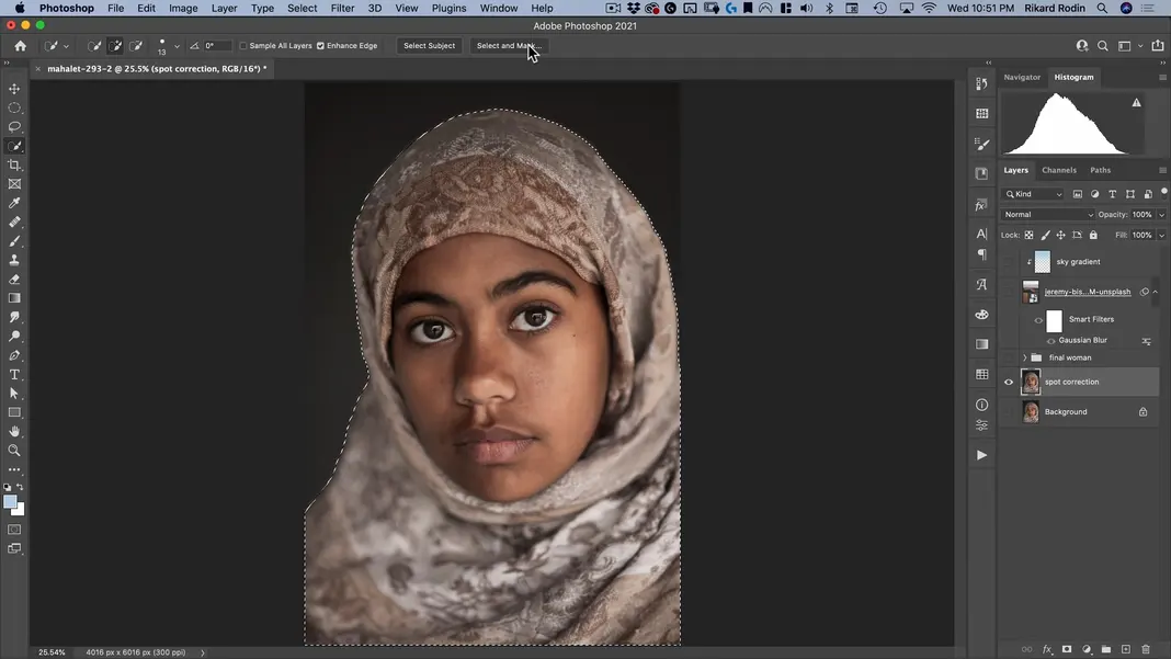
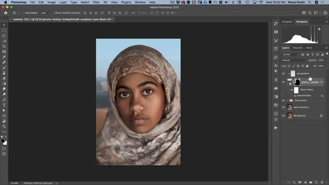
You should see the following result.
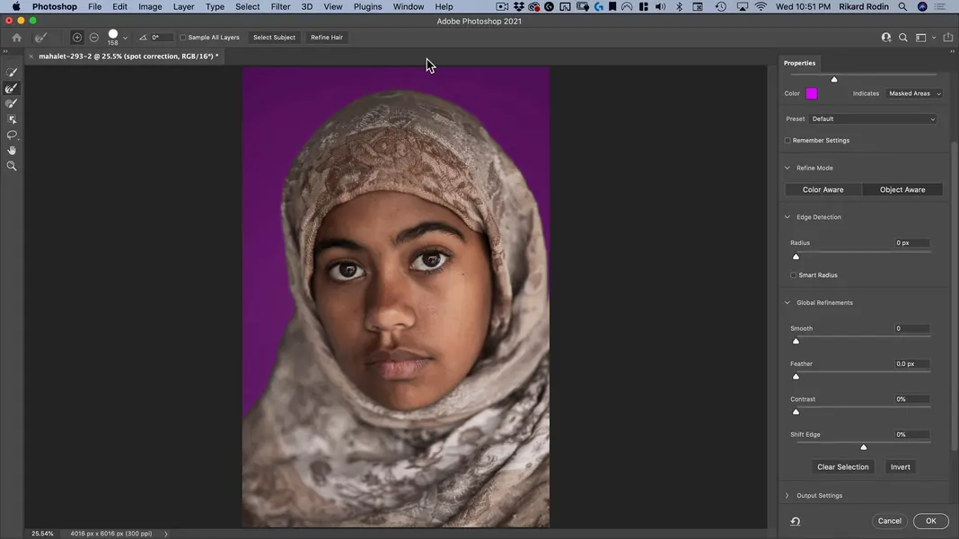
If we zoom in, we can see that the edge is currently pretty harsh.
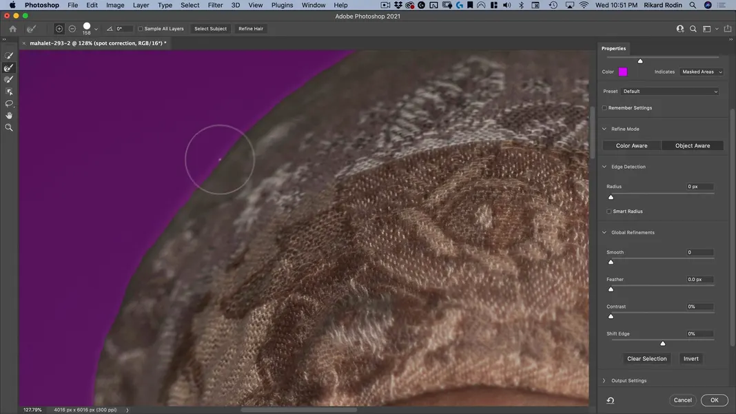
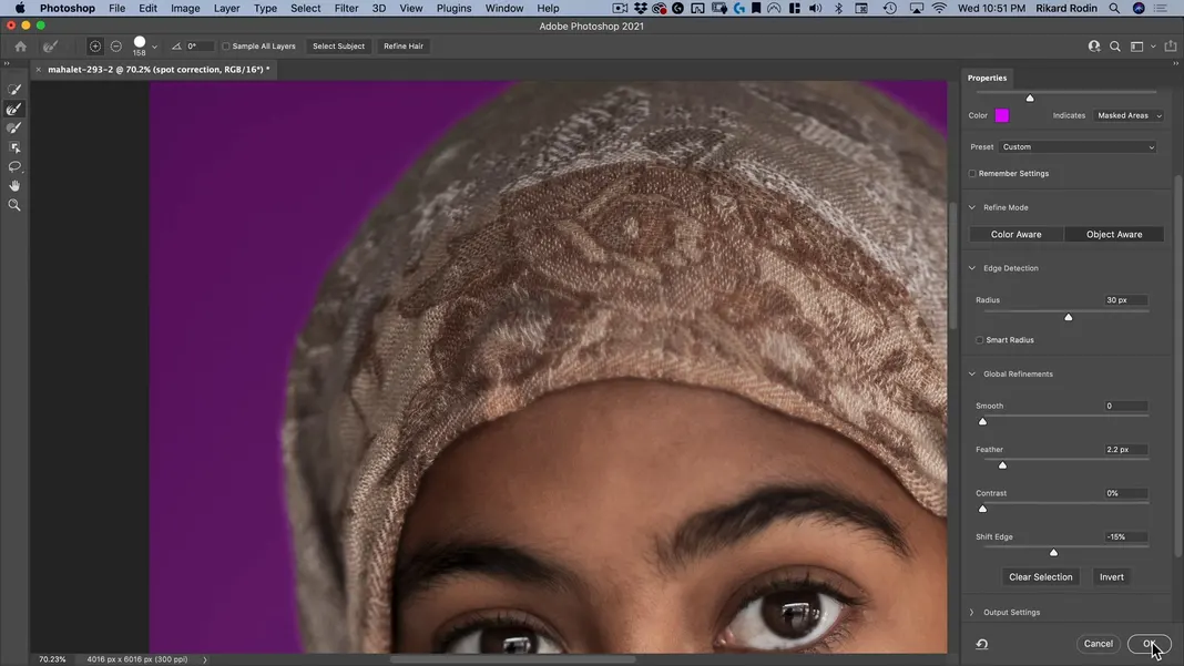
To help correct this, we can add a 30 pixel edge detection radius. This is much more than I’d normally use, but since the entire edge of the subject is soft from using the soft focus, I think I can get away with using 30 pixels here. I’ll also add a bit of feather and shift the edge inside a bit. With these changes made, select OK.
Now Option + click on the eyeball by the layer we are working with again.
Select the background image layer and Option + click on the Add layer mask button at the bottom of the Layers panel.
That will show the subject through the mask.
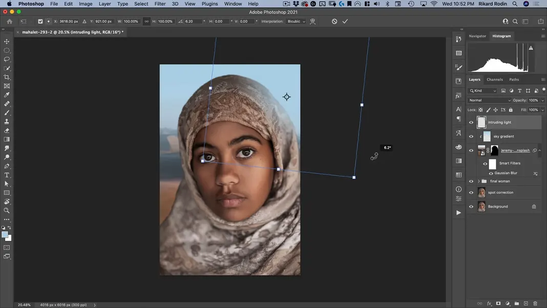
Next, I want to make some of the light from the background intrude onto the woman, because at the moment she feels like she has just been plopped on top. To do this, create a new layer and call it “intruding light”.
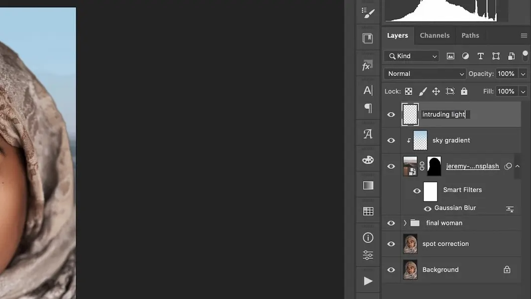
Now, make sure the same blue color we created the sky gradient with is selected as the foreground color, go back to the Gradient Tool, and select the Radial Gradient tool.
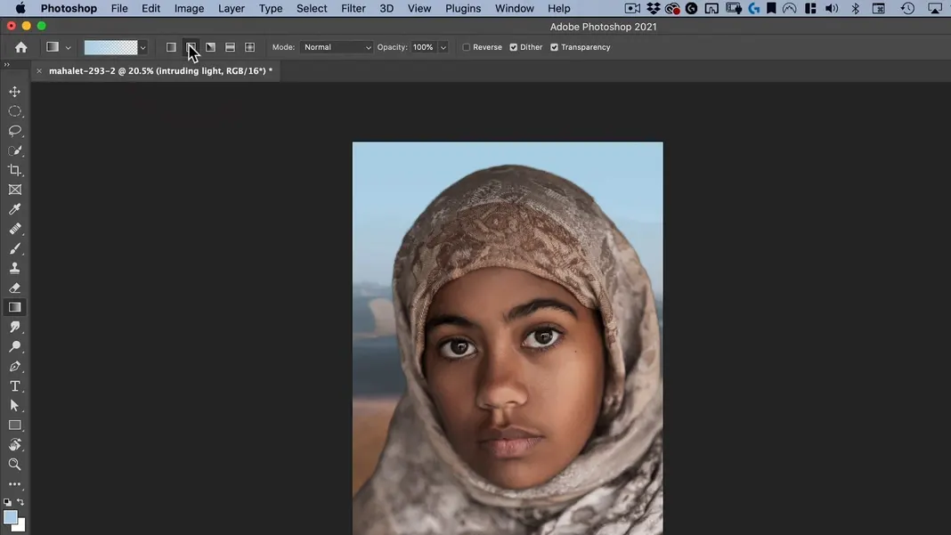
Make a radial gradient as shown below.
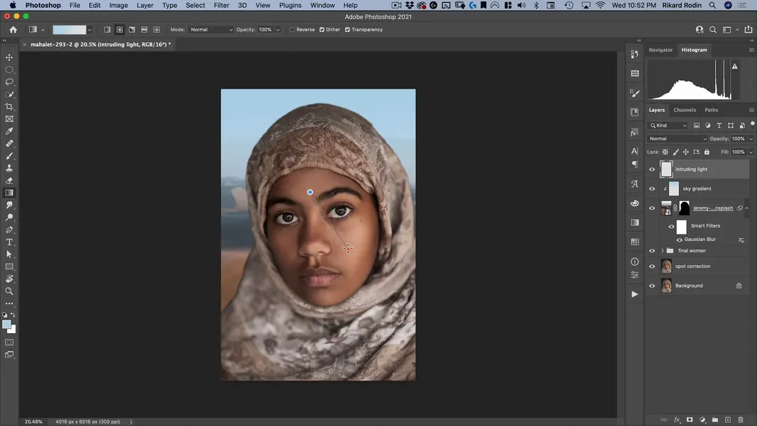
Make sure the edges in the resulting gradient are all blurred out to nothing. This will allow us to use it to add some blue light around the edges.
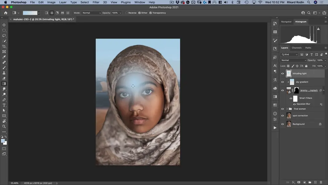
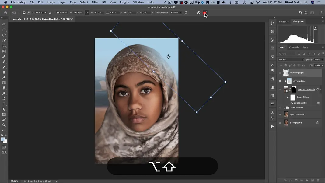
Use the Transform Tool to resize and rotate the gradient as desired. Select the checkmark once the changes have been made.
Feel free to make any further adjustments as needed. This intruding light should help that edge look a little more realistic and help the subject look like she’s actually in the environment.
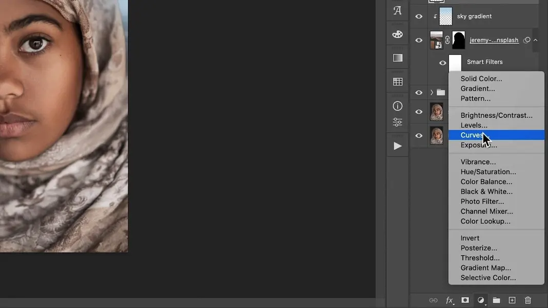
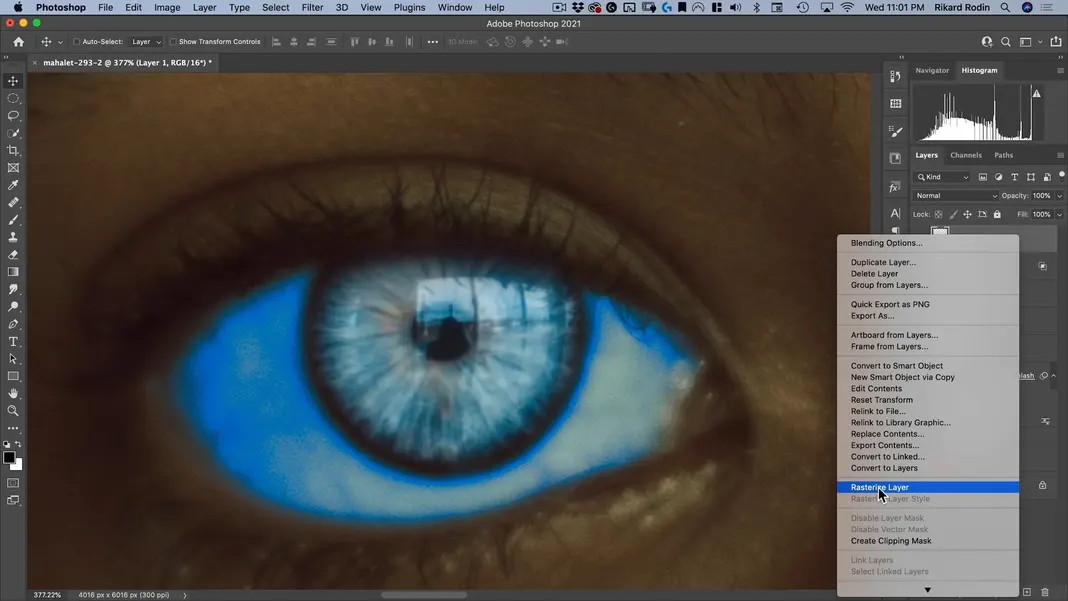
Next, we will be applying a color grade, which will go a long way to helping our poster look like the reference Dune poster.
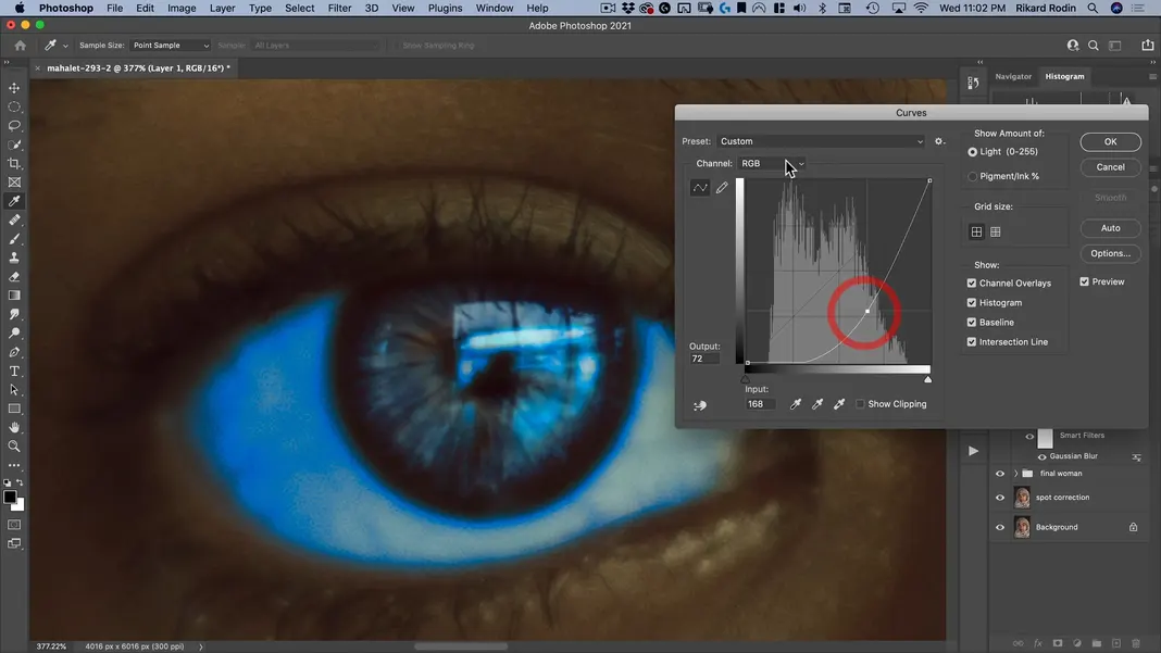
To start, add a Curves adjustment.
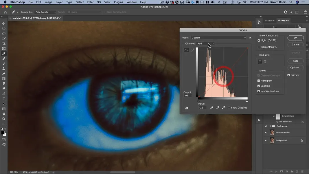
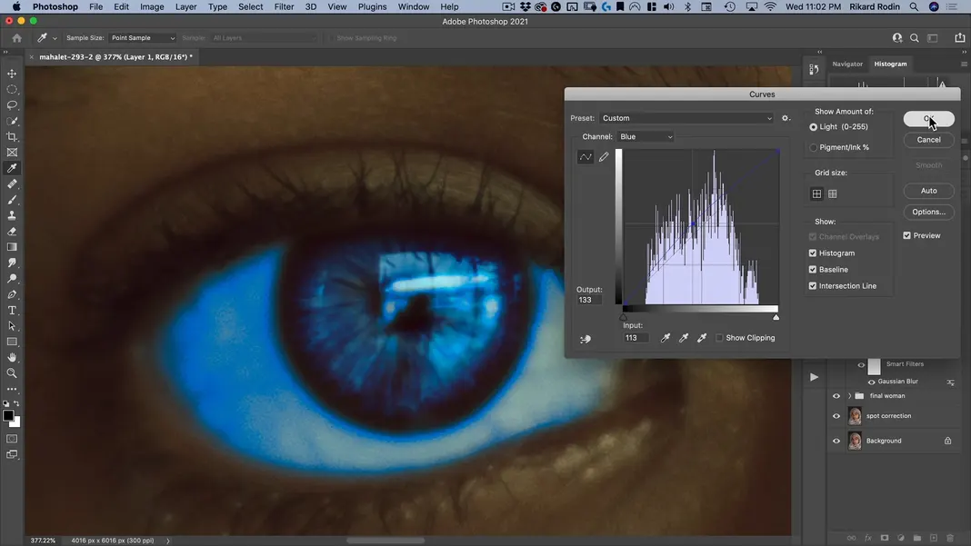
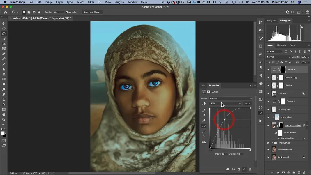
We’re going to manipulate all of the channels, but the one that will do the most work for us is Red, so I’ll leave that one until last so I can better explain why red is so important for this color grade.
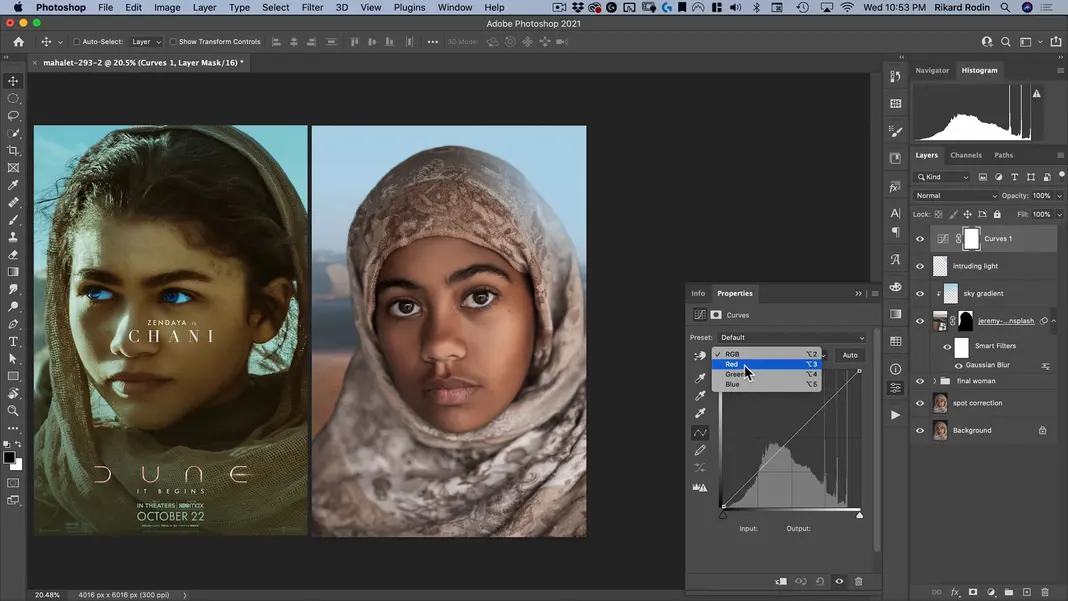
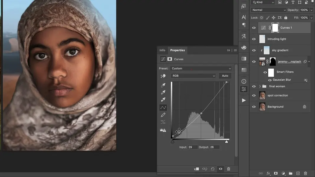
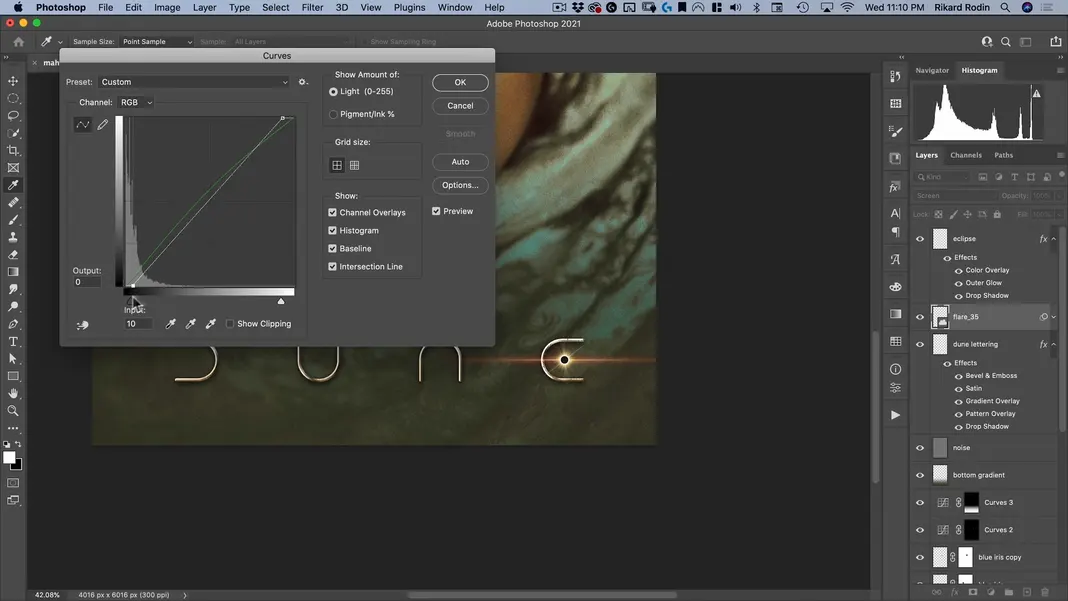
We’ll start with RGB, and we’ll brighten the shadows and highlights a bit while dipping the mid-tones.
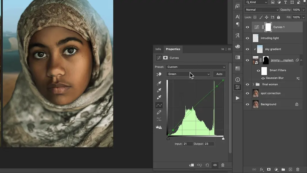
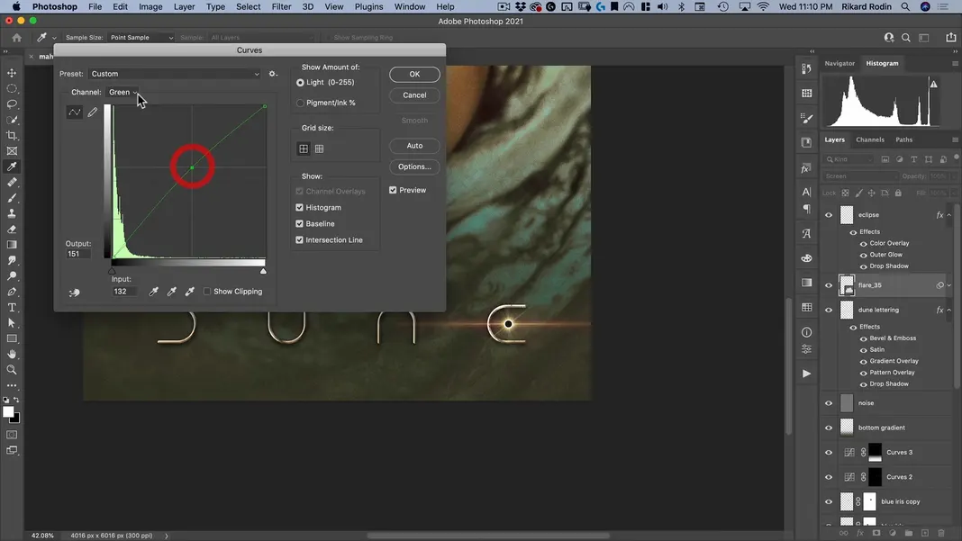
Now for the Green channel, we don’t need to do too much; we can bring up the mid-tones just a bit while keeping the ends straight so that we don’t get rid of the magentas in our shadow.
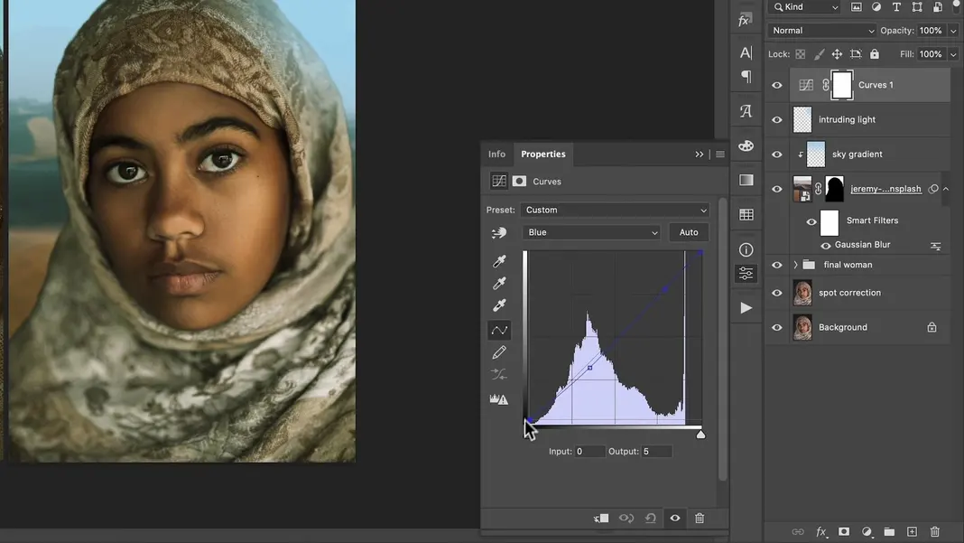
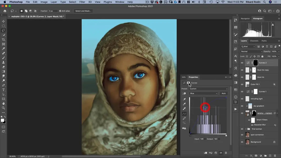
Finally, for the Blue channel, we can keep our highlights as is, drop the mid-tones a bit just to add a bit more yellow to the image, and bring up our shadows just a bit.
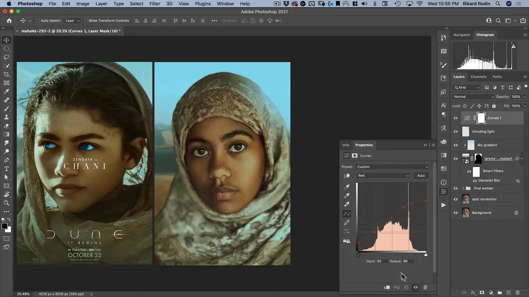
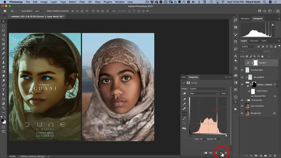
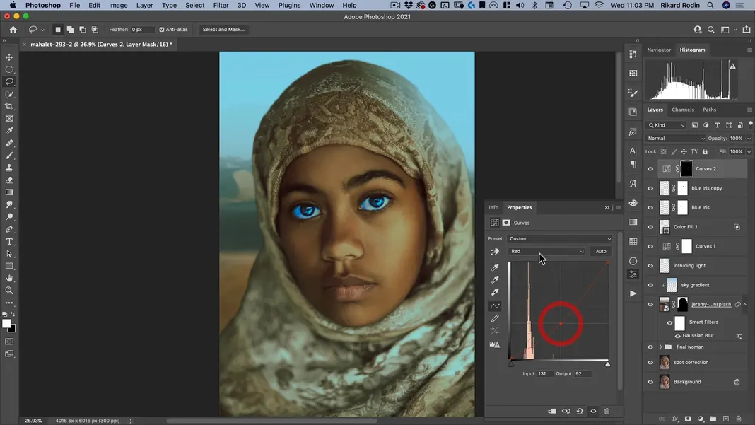
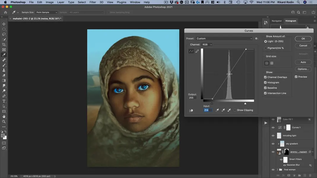
Now it’s time for the Red channel as mentioned before. The opposite of red is cyan, and the reference poster has cyan in the highlights, so we need to take the red down in that highlight range. The poster also has red in the shadows, so we need to bring the reds up in the shadow range. We’ll want to leave the mid-tone range roughly intact. My final result is the following.
For comparison, here is the before image with the curves adjustment turned off.
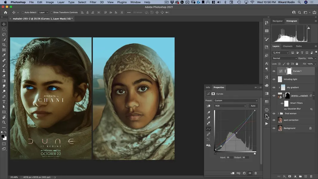
I’ll make a few final tiny adjustments to the RGB curve to get those shadows a little bit stronger, and here’s what my final result looks like.
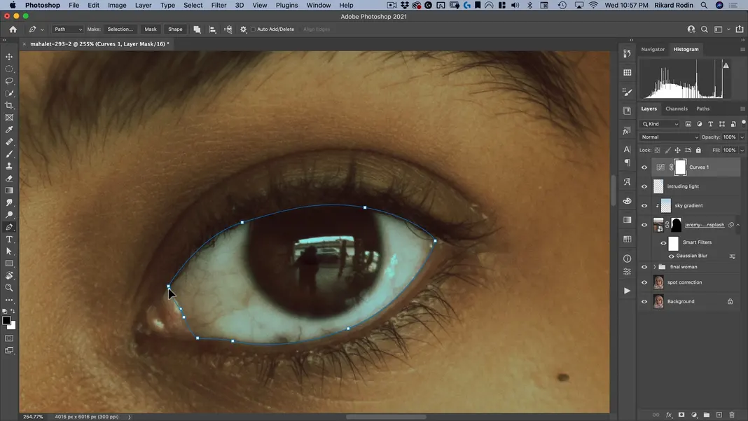
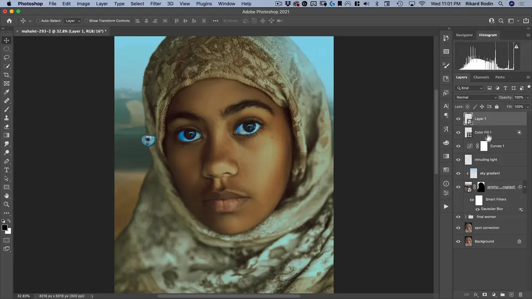
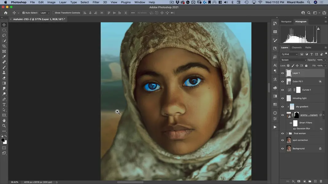
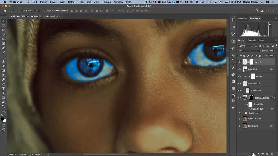
Our poster is starting to look quite close to the reference to me. Next, we’ll color the subject’s eyes blue. The first step is selecting the Pen Tool.
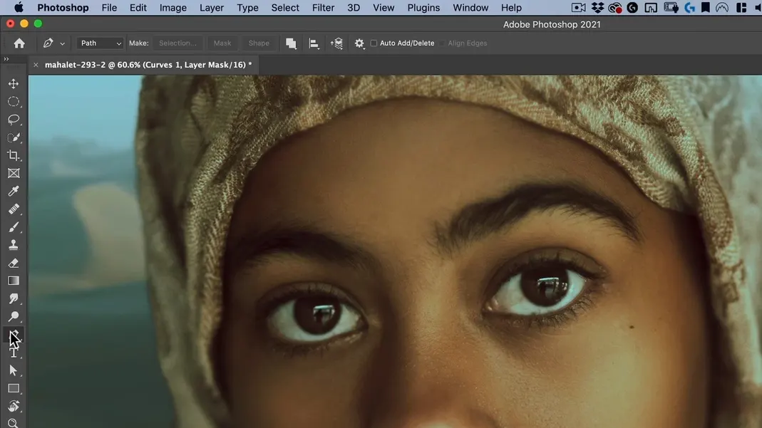
Now use the pen tool to draw around the eye. It’s important to get the whole eye proper, meaning the entire wet part of the eye. In Dune, the blue eyes are achieved by blue dye and are meant to help protect the eyes from the sun, so the blue should cover the entire eye. Here’s the first eye:
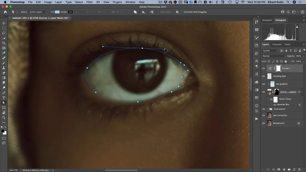
And here’s the second eye:
Now switch to the Path Selection Tool.
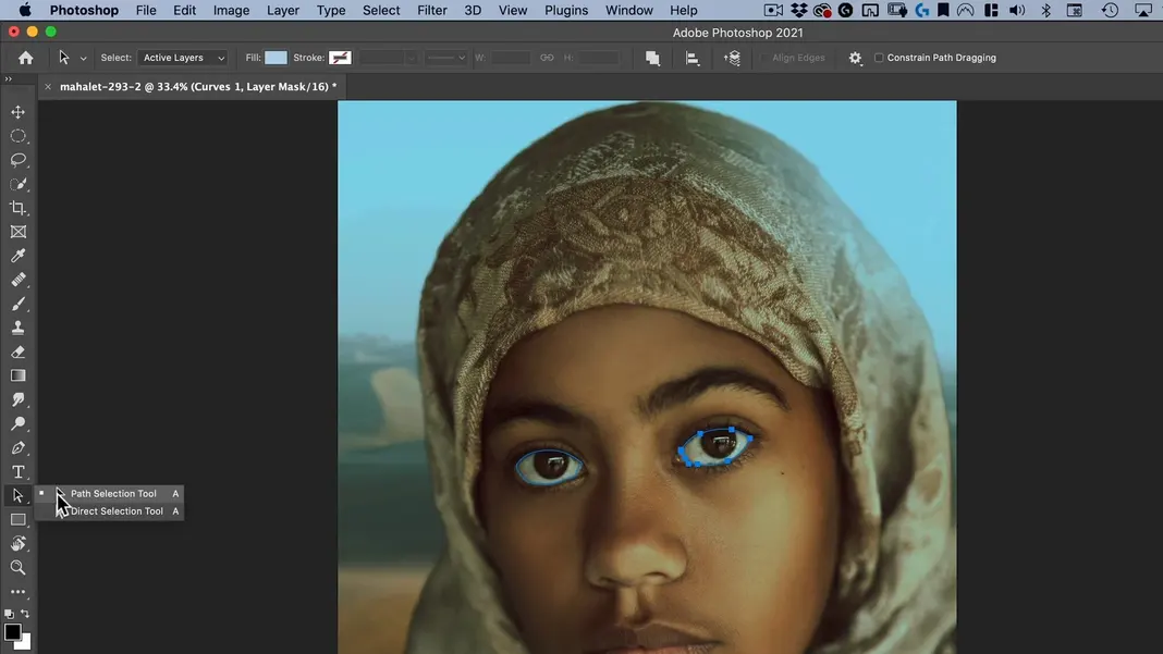
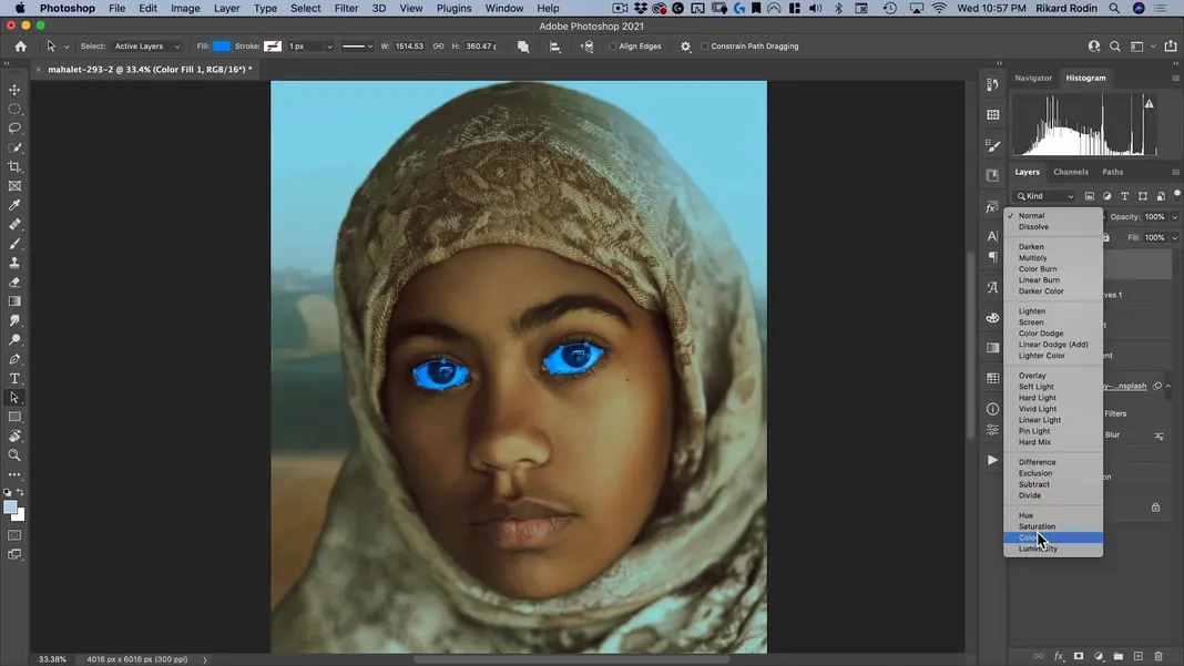
Select both of the paths we drew and add a Solid Color adjustment.
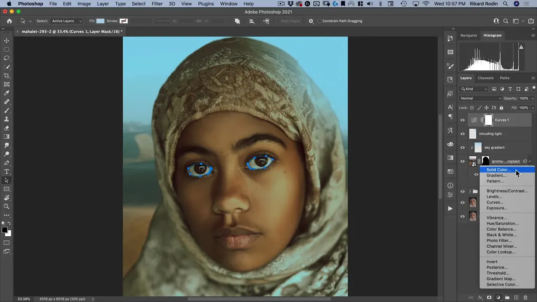
Photoshop has used our paths to create a vector mask. Let’s push the color all the way to the brightest blue and hit OK.
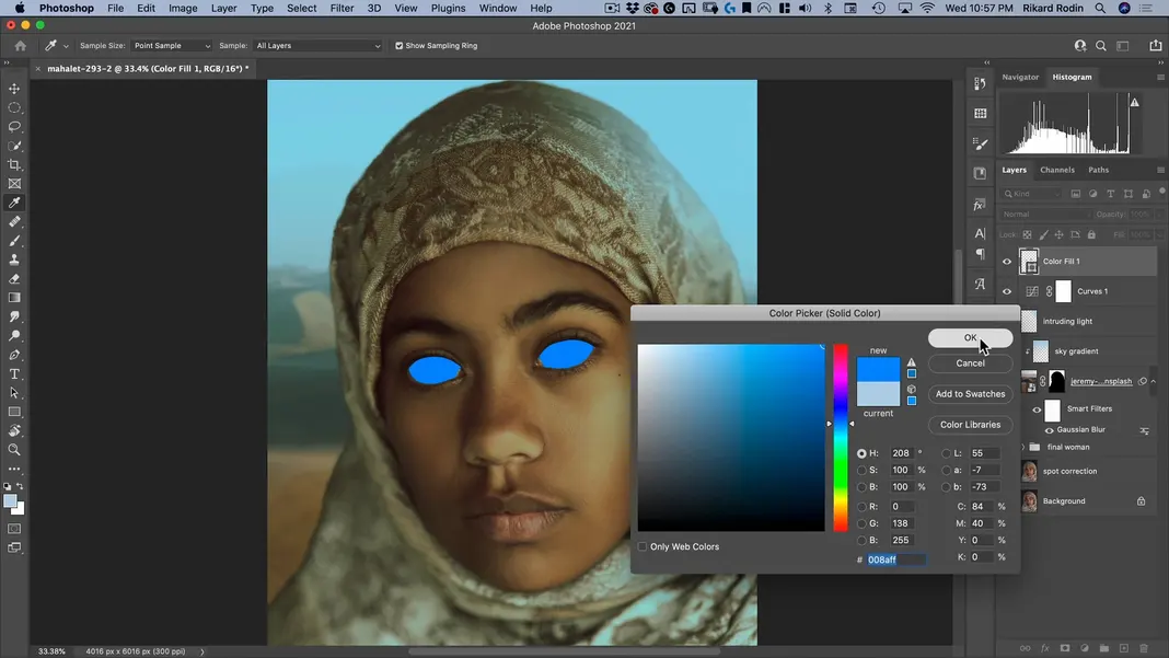
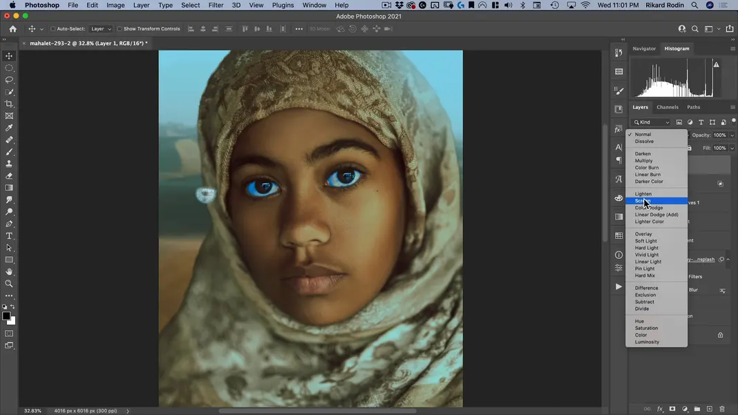
Now change the layer to a Color layer.
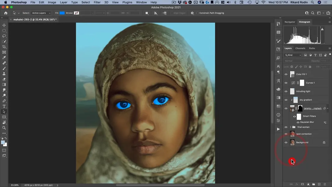
Here’s what the image looks like now. We’re starting to get the effect we want, but this looks more like the original Dune, where the effects weren’t very good.
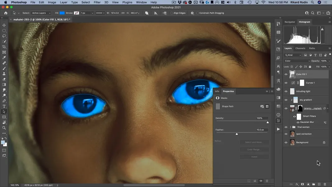
To make this effect more natural, let’s first add a 10 pixel feather in the layer properties so that the edges aren’t so sharp.
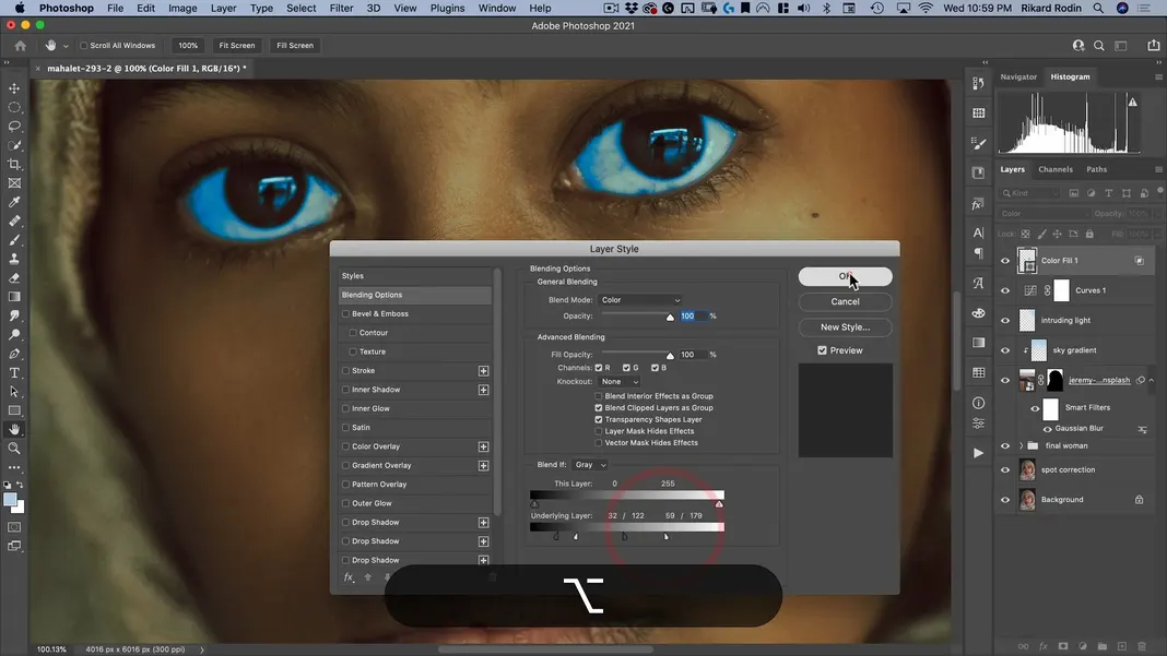
Next let’s double-click the layer to open our Layer Style settings. This will allow us to change the Blend If settings. What we will be changing here is the Underlying Layer settings, which let us set the value range within which blending should be performed; anything darker than the left bound won’t be affected by the blue color blend, and anything lighter than the right bound also won’t be affected. We can also hold Option and click the markers to split them and set a feather range as well. Using these techniques, I’ll set the bounds to the following, where the lightest highlights and the darkest shadows are just coming through the color blend. You might notice that the ranges are overlapping here, but that’s not an issue and can actually produce a nice effect.
Since all of our blending is being handled by the layer’s underlying settings, the nice thing is that we can double-click the Color Fill layer and change the color being used at any time. Since our goal is to match the movie, we’ll stick with an electric blue color and hit OK.
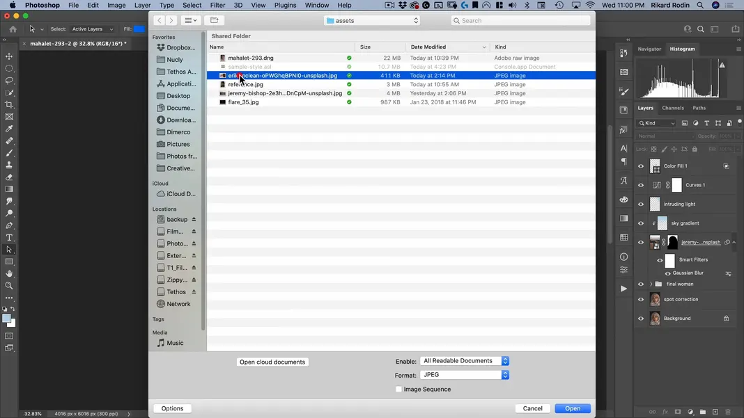
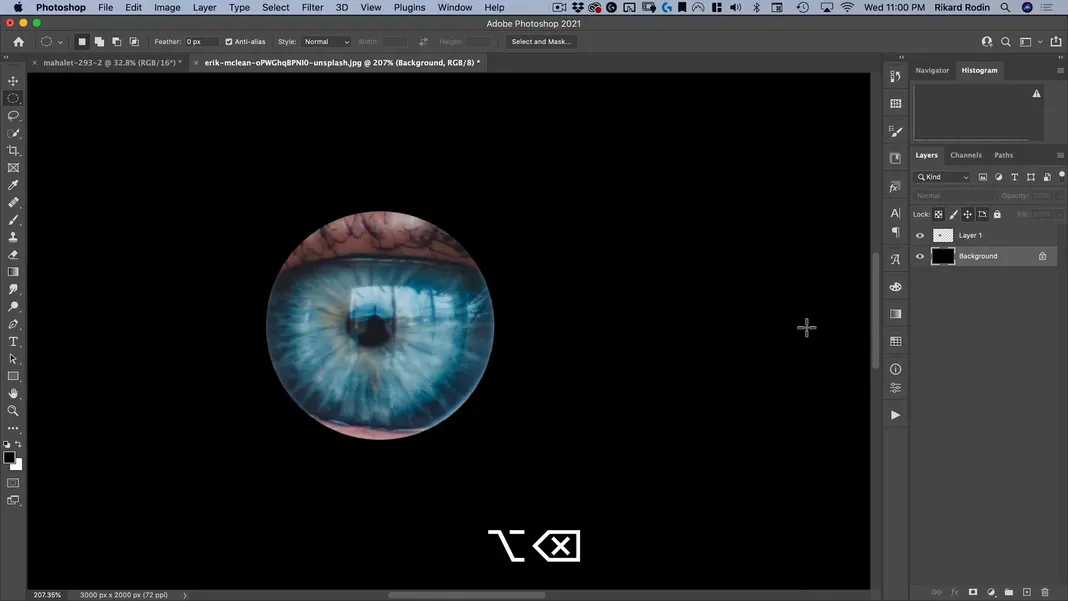
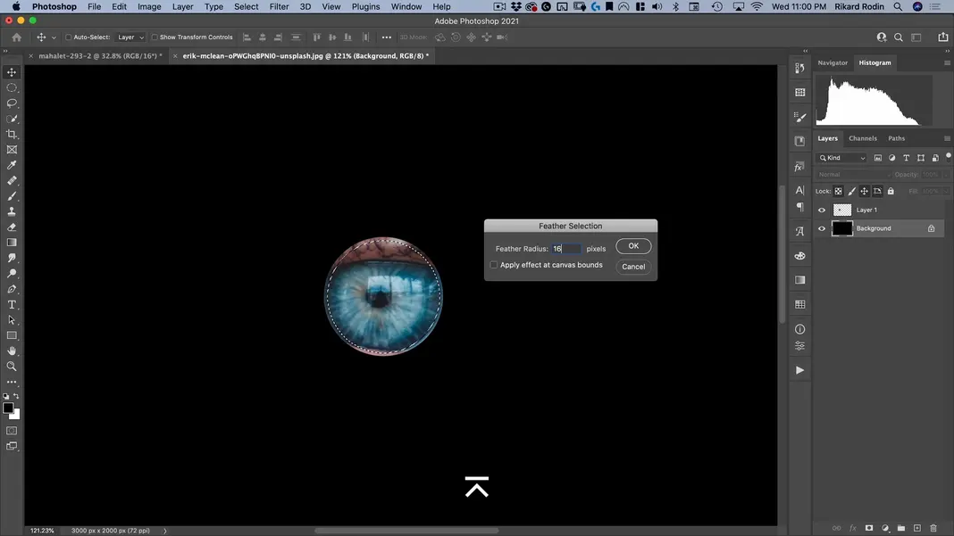
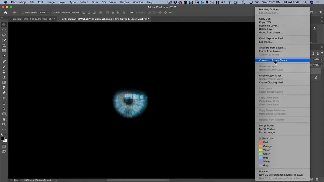
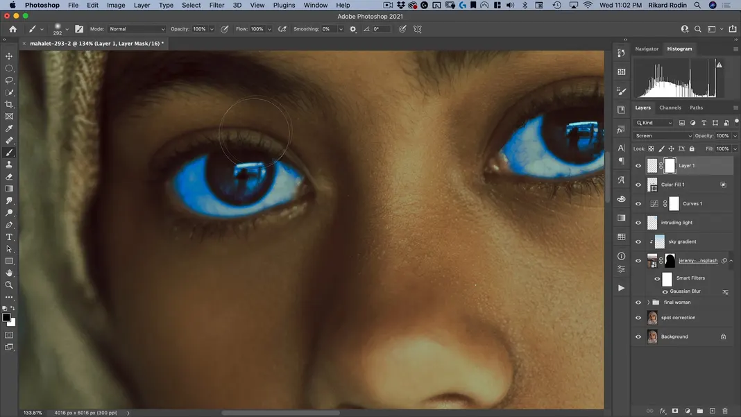
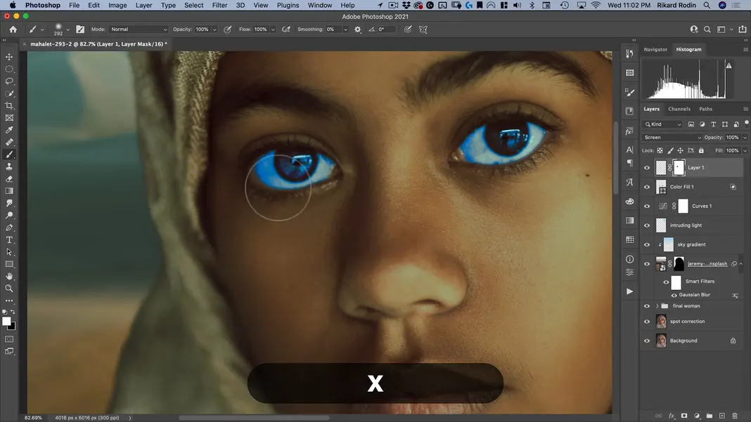
Now I’d like to add more blue to the subject’s eyes. To accomplish this, I’ll navigate to File > Open and select the file “erik-mclean-oPWGhqI0-unsplash.jpg”.
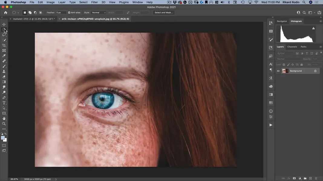
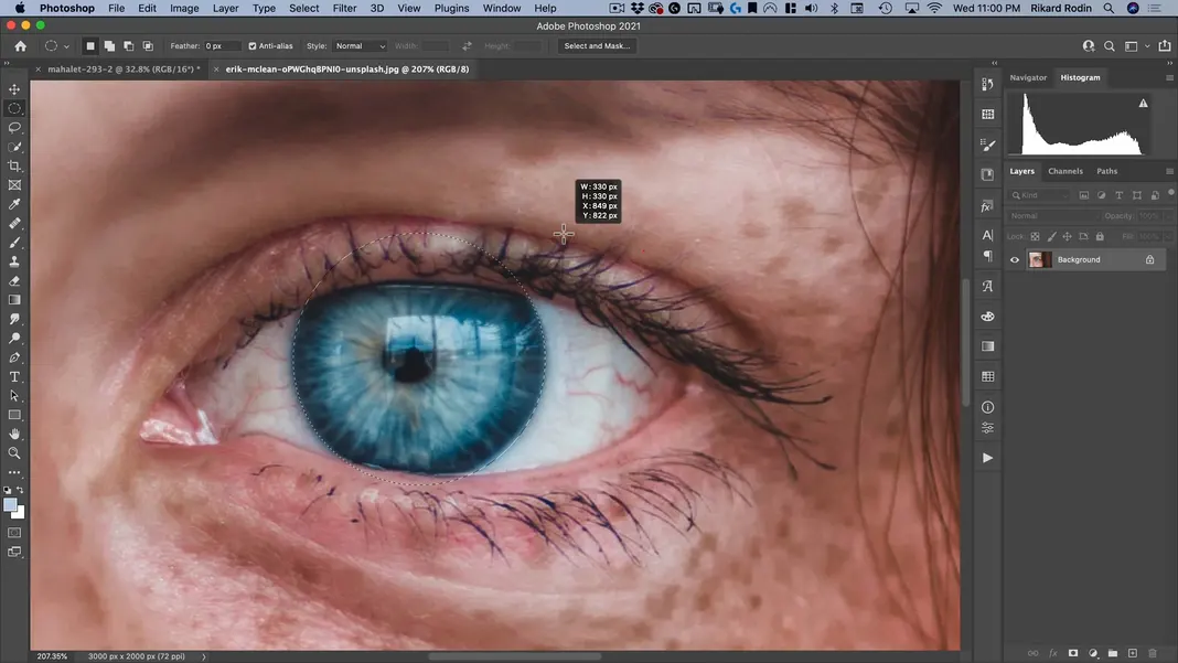
You should now see the following image. Select the Circular Marquee Tool.
Use the circular marquee to cut out the iris.
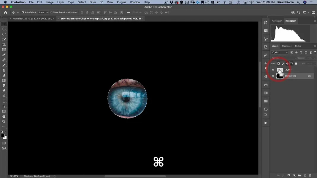
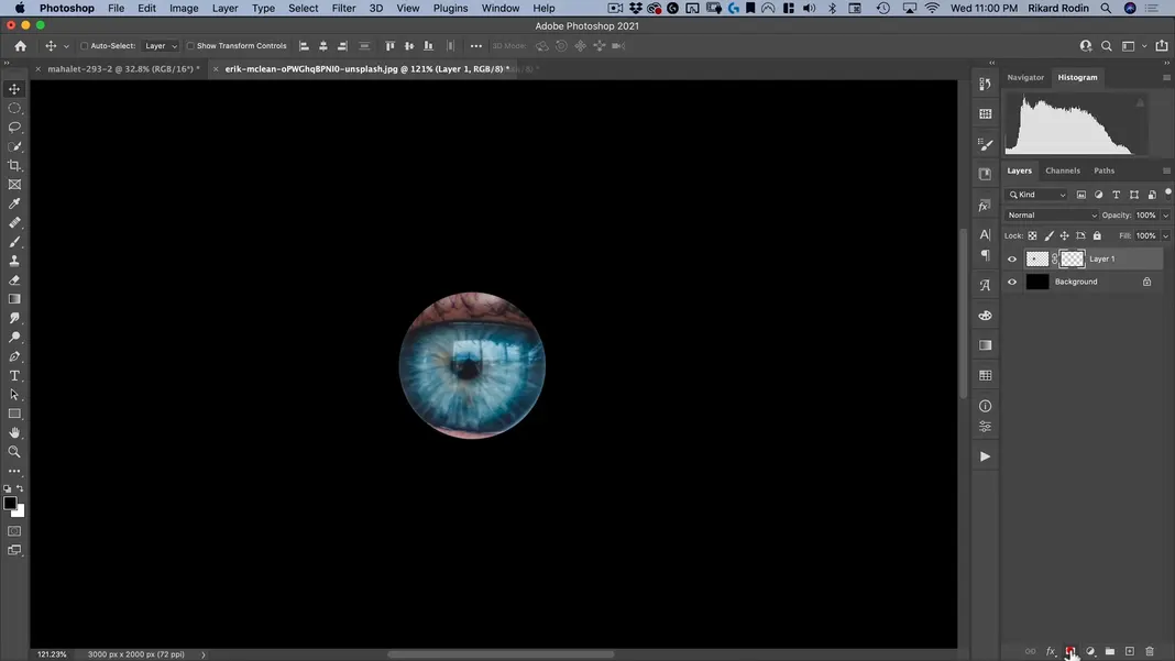
Use Command + J to copy this selection to a different layer. Then select the layer containing the woman, hit D to return to the default foreground/background colors, and then use Option + Delete to fill the layer with black, leaving just the iris visible.
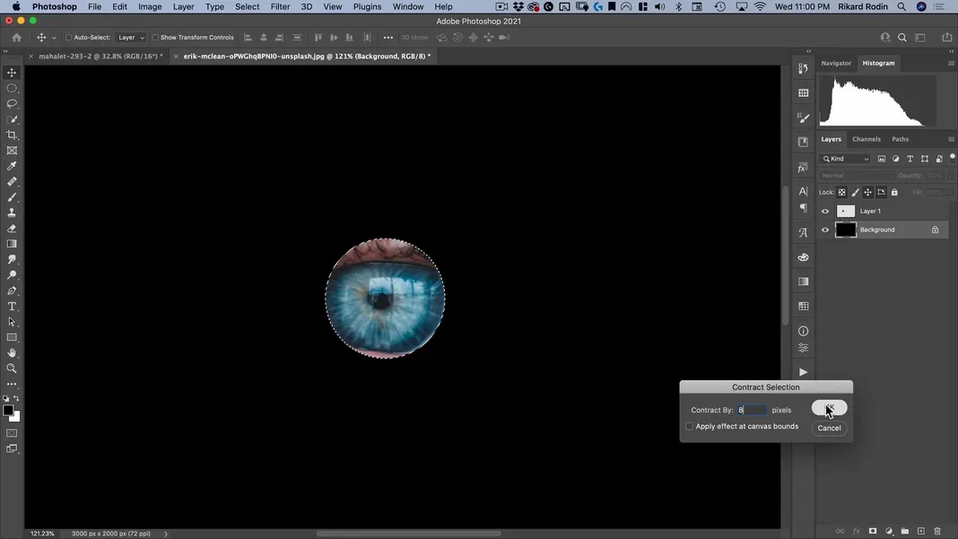
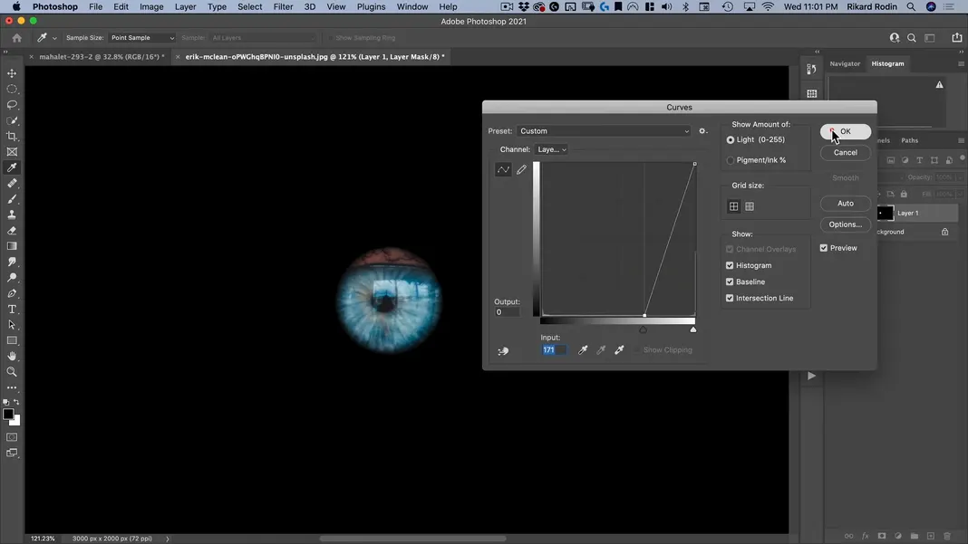
Now I’d like to fade in the edge on this iris. To do this, Command + click on the thumbnail for the layer containing the iris to bring back our selection.
Navigate to Select > Modify > Contract.

Contract our selection by 8 pixels and hit OK.
Next, navigate to Select > Modify > Feather.
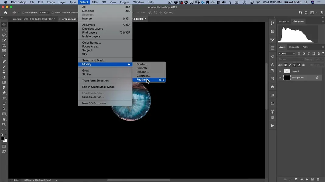
Set the Feather radius to double that amount—in this case, double 8 pixels is 16 pixels—and hit OK.
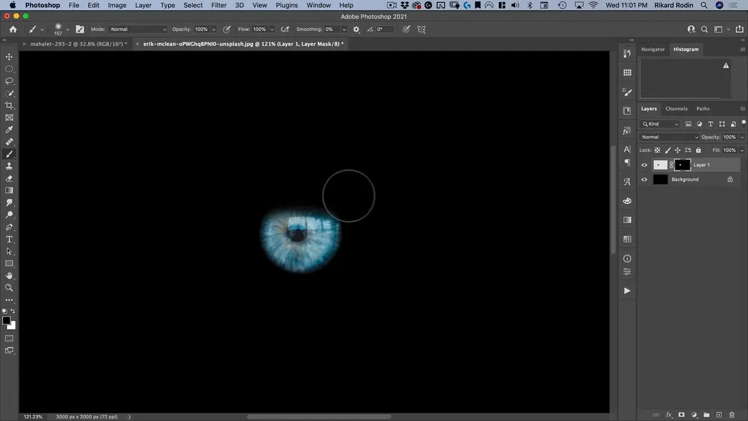
Now select the iris layer and add a mask to it.
You can see that this has applied a vignette effect to the iris. Select the mask we just created and hit Command + M to bring up the Curves settings and you’ll find that you can actually control where the edge of this mask is using the Input slider. I’ll set it as shown below so that the eyelid on the bottom edge is removed completely.
Finally, select the mask and paint out the top eyelid with your opacity and flow both set to 100%.
Convert the mask to a Smart Object.
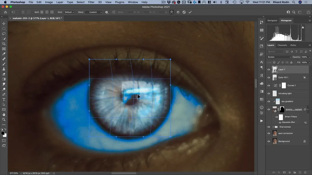
With that done, drag the iris into our original file.
Change it to a Screen layer.
Drag the iris to where it needs to be to match the subject’s eye, resizing and warping it as needed so that both the iris and the pupil sit correctly.
Finally, briefly change the iris layer back to a Normal layer and rasterize it, as we do not need a smart object anymore. Once it’s rasterized, we can change it back to a Screen layer.
I now want to add a curve to this layer, so I’ll hit Command + M to bring up the Curves settings again and darken the RGB channel considerably so that just a hint of this coloring is showing through here.
I’ll pull down the Red channel as well to bring out the cyan a bit more.
And I’ll bring up the Blue channel a bit before hitting OK.
The eye is now looking like this in context. I love the effect this is having and think it looks great, although I do want it to be much more subtle than this looks.
To make this more subtle, I’ll add a mask to the layer.
Then, using a big black brush, I’ll paint in the top of the iris until I’m just seeing a hint of this at the bottom.
That might actually be too little, so I’ll go back in with white and bring the effect back in a bit.
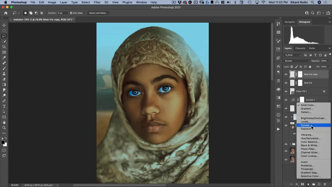
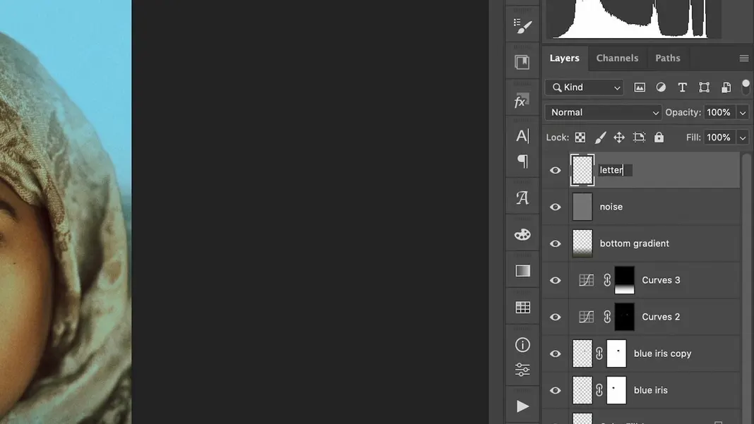
We’ll call this layer “blue iris”.
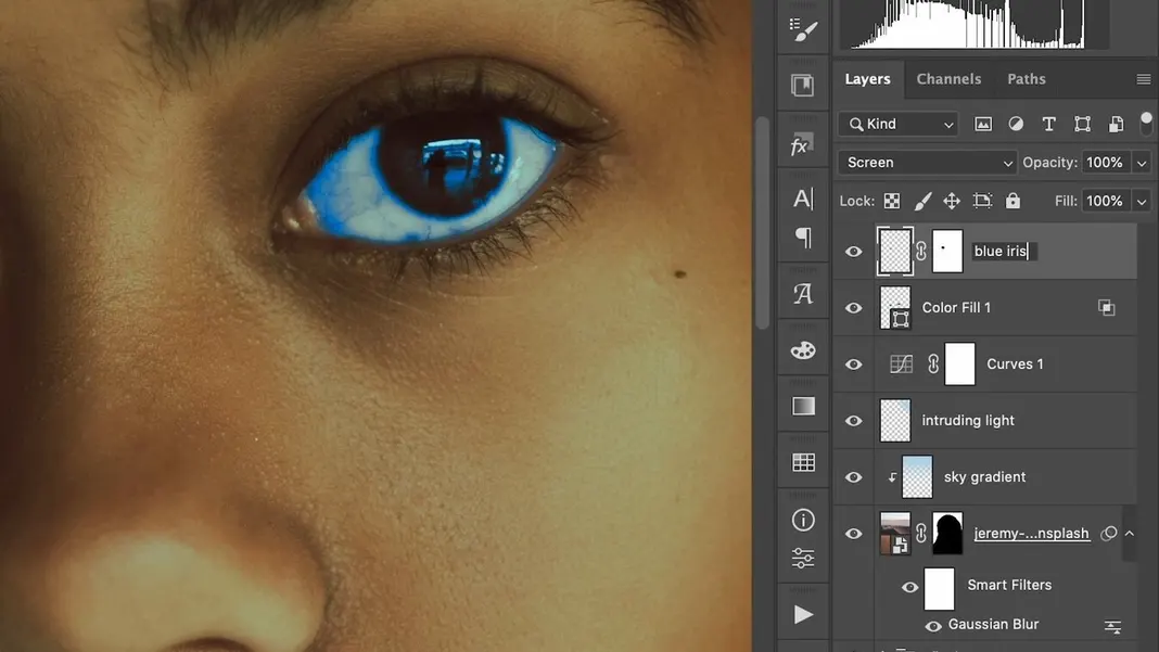
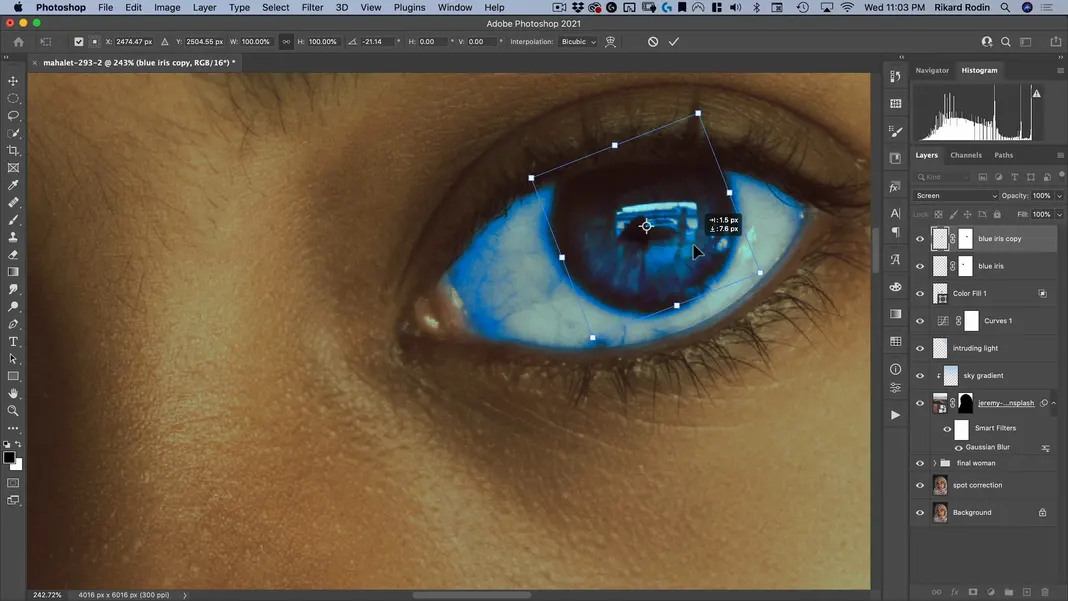
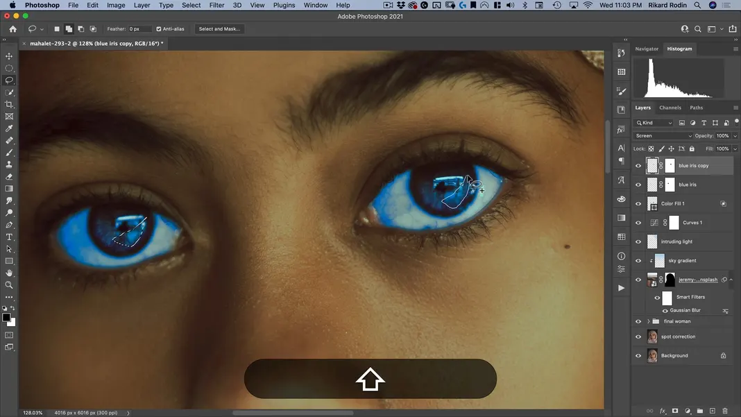
I’ll make a copy of that layer with Command + J and drag it to the other eye, rotating it so it’s not exactly the same.
The last thing I want to do with the eyes is add a really obnoxious highlight. To do this, I’ll make sure I have no feather, and then I’ll make a weird freeform shape in both irises. Because my light source is towards the right of the frame, that’s the side I want the highlights to be on as well.
Add a curves adjustment to this selection.
I’ll crank up the RGB channel curve first.
Then I’ll turn down the red a bit like before to pull in some cyan.
And I’ll pull in some blue like before as well.
Taking another look, I’ll actually turn the RGB channel up even higher.

Then I’ll go into my masks and add a feather until I don’t see the shape anymore—just the highlight.

I can always turn the opacity down if I think the effect is too strong, so I’ll set it to 67%.
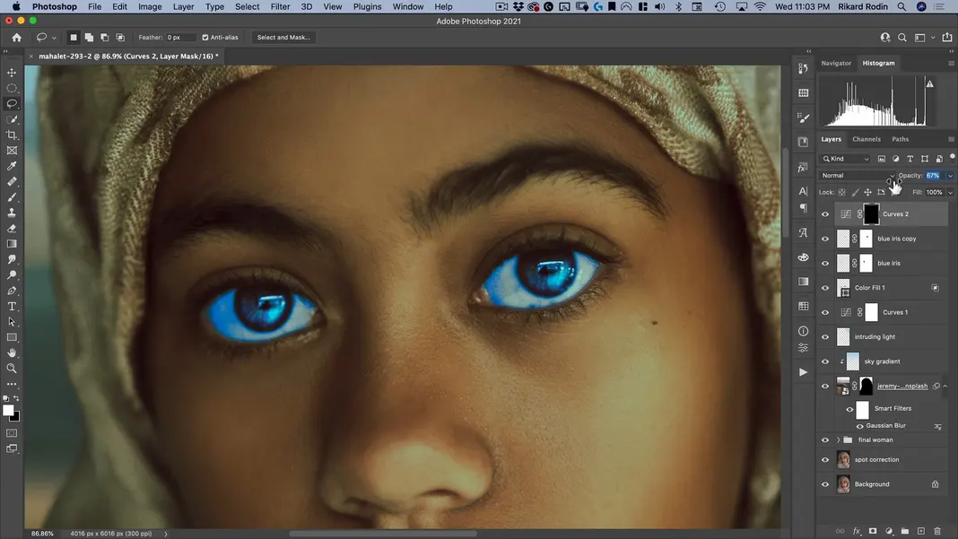
This is how the whole image is looking now. I’m pretty happy with our progress so far.
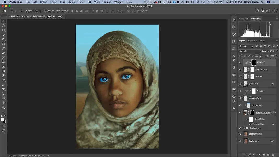
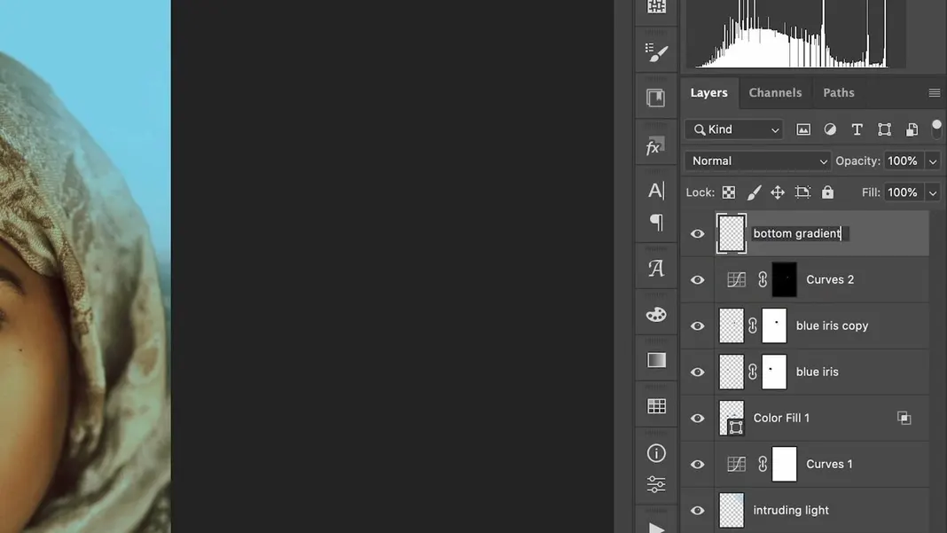
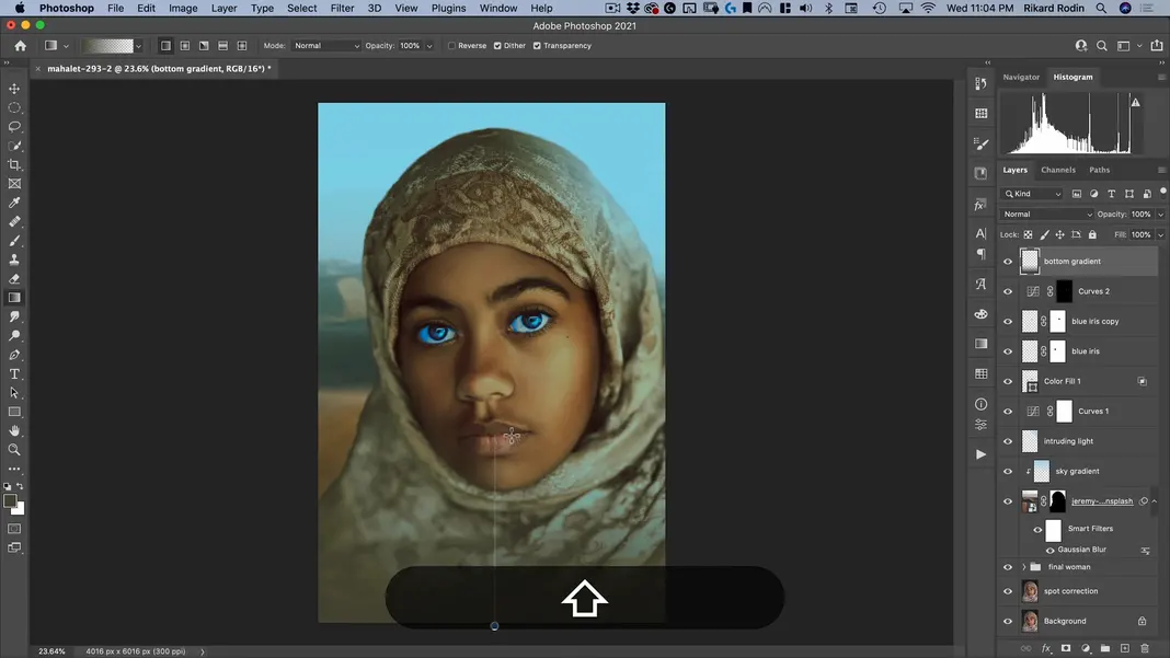
Our next order of business is to add a bottom gradient. To do that, I’ll select the Gradient Tool and make sure I’m on Linear Gradient.
Then I’ll create a new layer and name it “bottom gradient”.
Next, I’ll select a darkish color from the subject’s clothes.
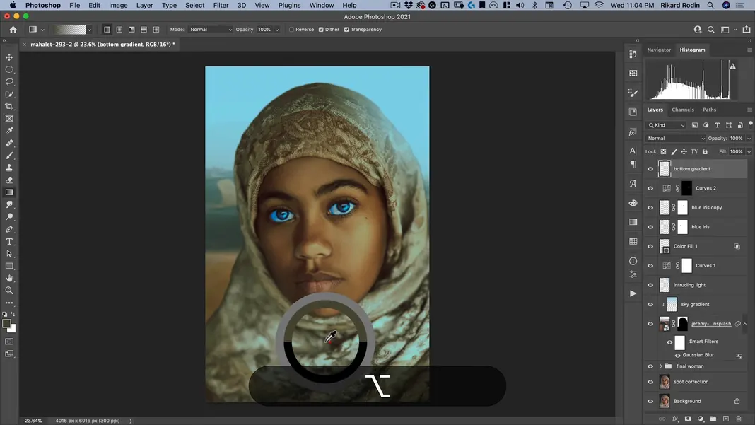
Finally, I’ll create my gradient, starting at the bottom and going up to about where her mouth is.

I’ll do the same thing a second time as well.
I’ll Command + click on the thumbnail for this layer to select my gradient, and I’ll add a Curves adjustment. I’ll bring the curve down to darken the gradient.
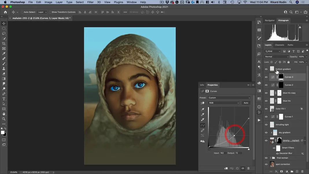
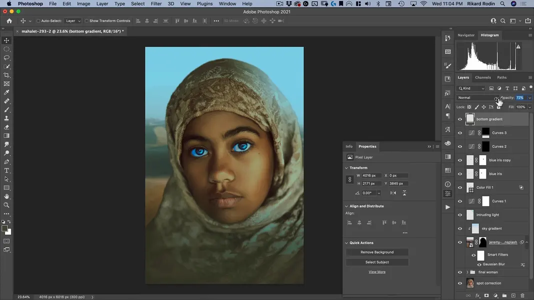
I’ll also take the opacity on that layer down so that we still have some of the original image showing through.

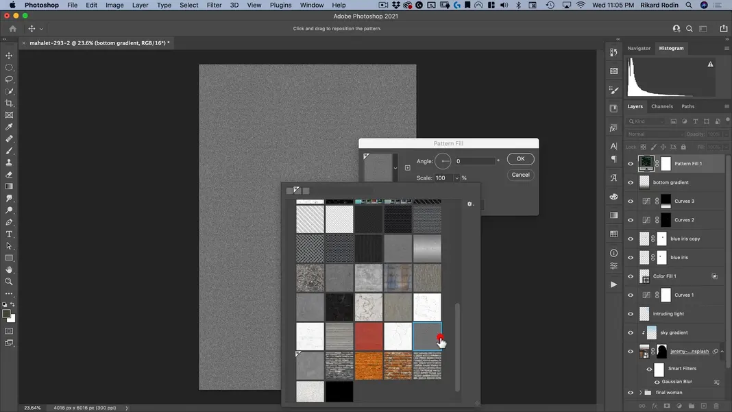
And that’s it for our bottom gradient. Before we add our lettering, one other thing I’d like to do is add some film grain. My preferred method is to add a Pattern adjustment.
In my Nucly patterns, I have a film grain pattern. It’s included in my Photoshop Tools and Add-Ons bundle, which you can get on discount here.
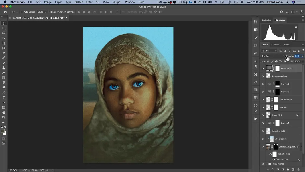
I’ll change that layer to an Overlay layer.
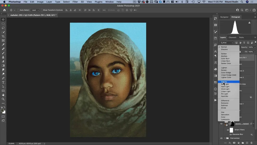
I’ll also take the opacity of that layer down a bit.
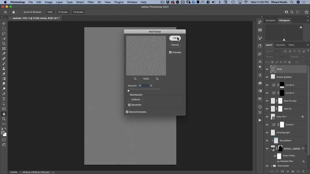
However, I know not everyone has the Nucly pattern, so I’ll delete that layer and demonstrate an alternate way to do this. I’ll create a new layer named “noise” and set our foreground color to 50% gray.
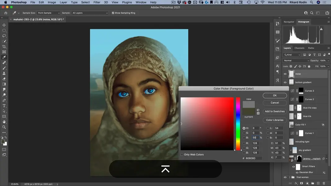
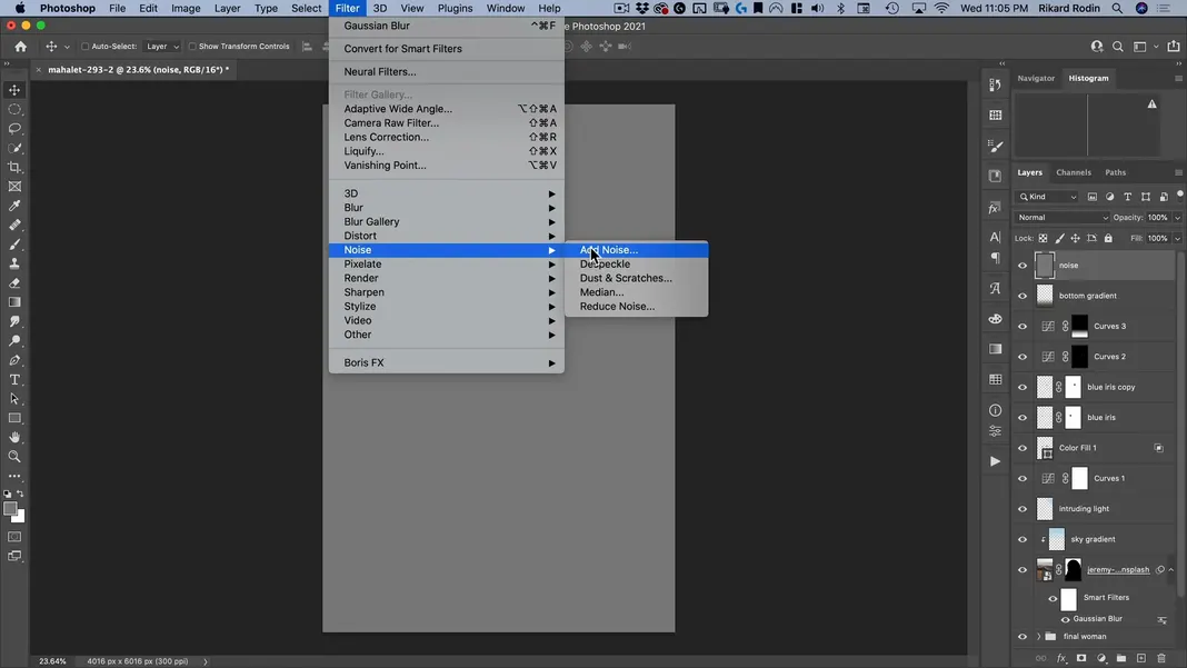
Fill the layer with this color and navigate to Filter > Noise > Add Noise.
The amount isn’t that important, but let’s say 10% for now. We do want to make sure that the noise is Gaussian and monochromatic. Once you have those settings, hit OK.
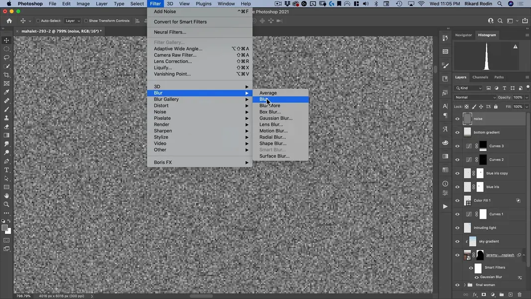
I’m going to zoom in and add one blur. Zoom in and navigate to Filter > Blur > Blur.
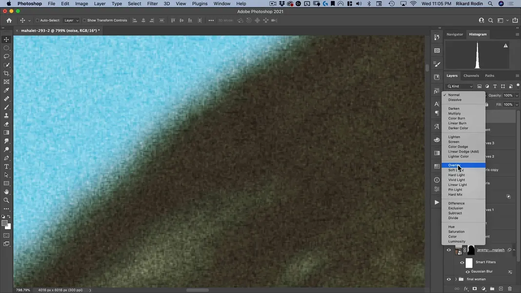
Then turn this into an Overlay layer.
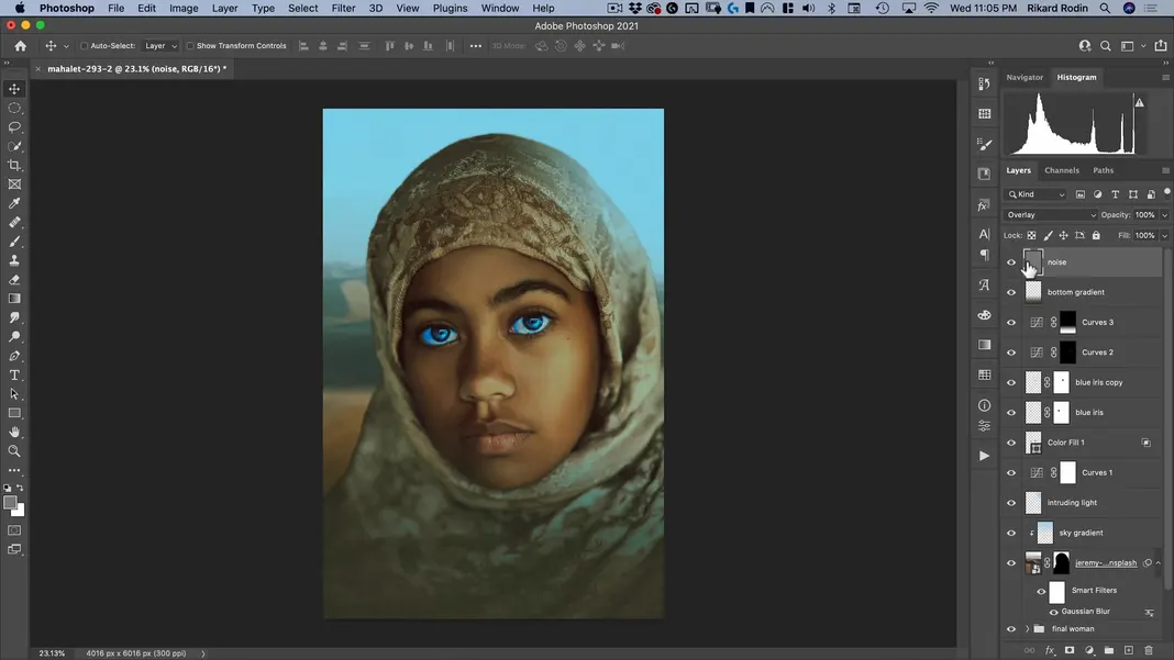
We’ve now added a strong blur, and the image looks like this with that change made.
If we’d like this blur to be stronger—which I do—all we need to do is hit Command + M to open the noise layer’s curves, move both bounds towards the center equally, and hit OK.
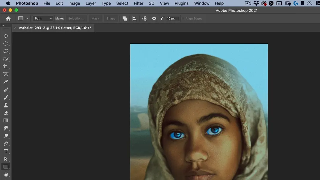
Now it’s time to add our title. I’m not going to bother with finding a font; we just have one letter form, so we can create it pretty easily. Create a new layer named “letter”.
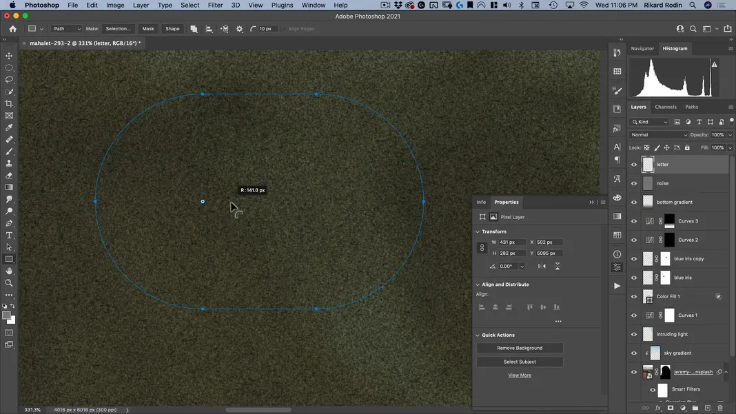
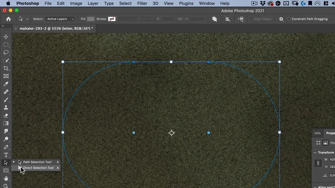
Select the Rectangle Tool and make sure we’re set to Path.
Create a shape like the one shown below.

Zoom in and pull the dots determining the rectangle’s edge radius all the way in.
Switch to the Direct Selection Tool.
Delete the two rightmost segments.
Select the rightmost anchor points and adjust the length of the parallel segments a bit, and our letterform is good to go.
Now we need to turn this vector information into pixel information. Make sure the foreground color is set to white, and then select this round brush and set the size to 20 pixels.
Next, go to “Paths” and click the icon to “Stroke path with brush” which will use your selected brush to stroke the path.
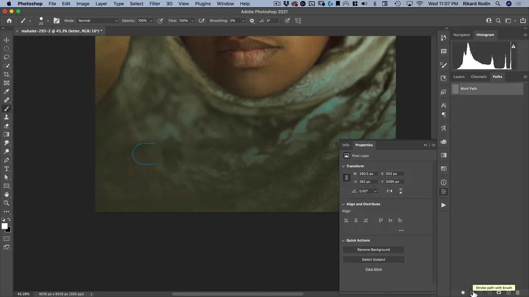
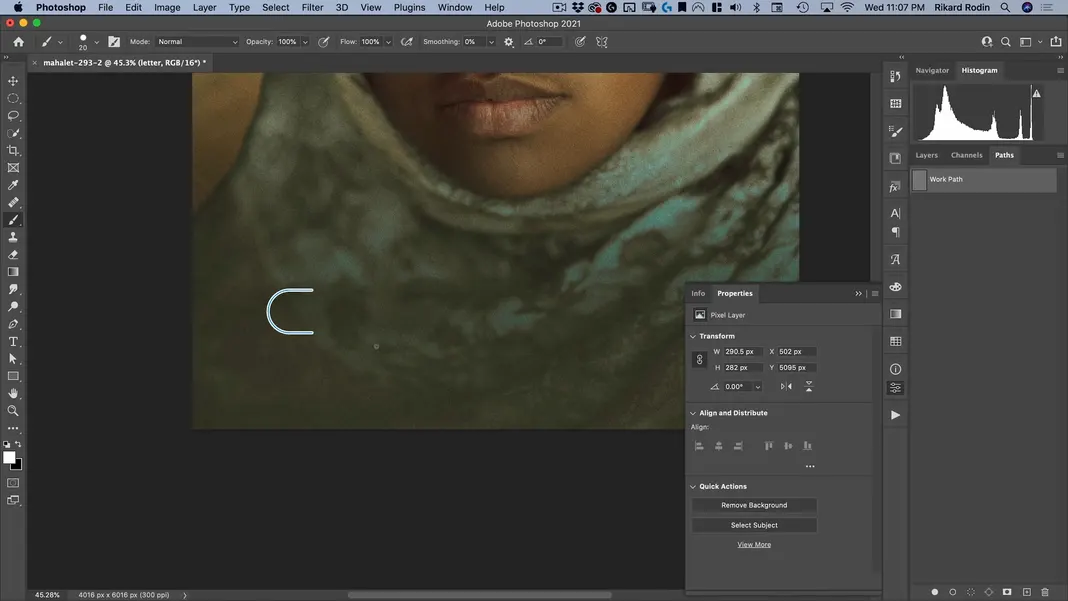
That will create the following stroke.
Now we can just copy this letterform by holding down Option and dragging it.
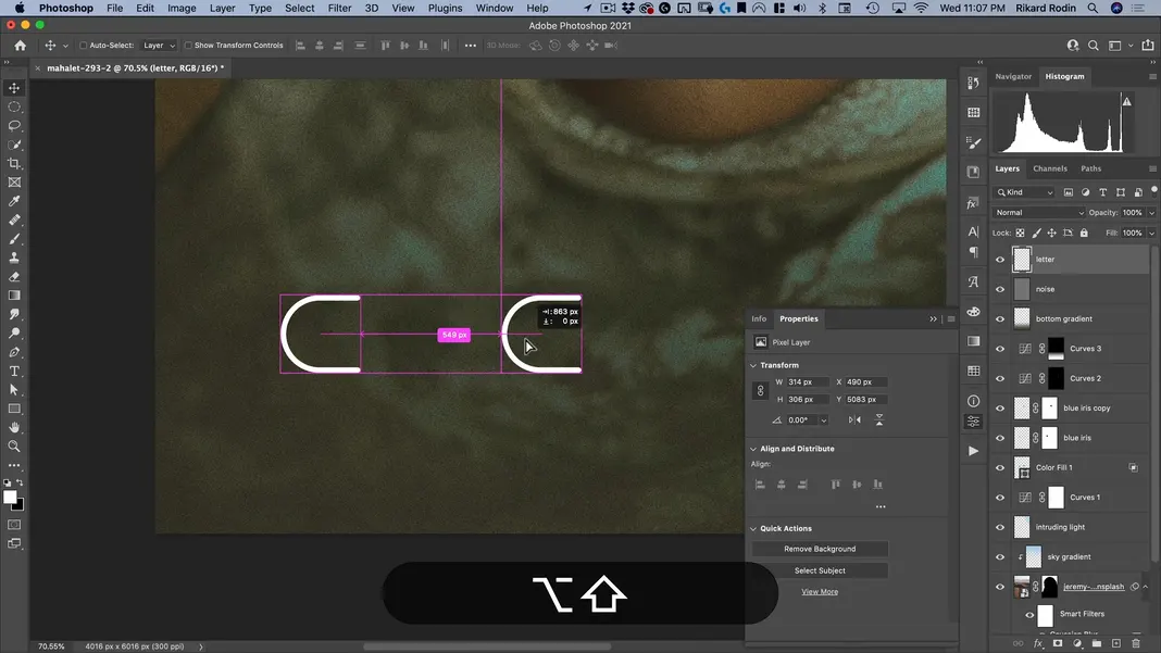
Repeat this process until you have 4 letters, and use Command + T to rotate the letters as needed to spell out Dune. The result should look something like this.
Now we can select all of the letters and use the horizontal distribution button shown below to evenly space the letters horizontally.
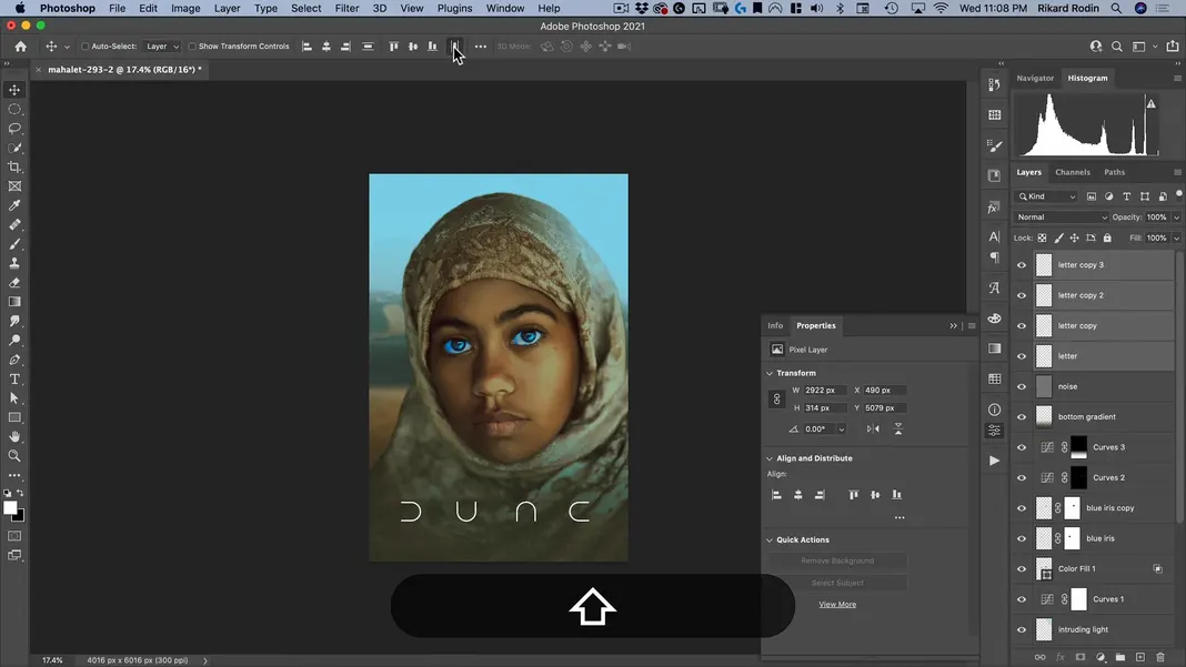
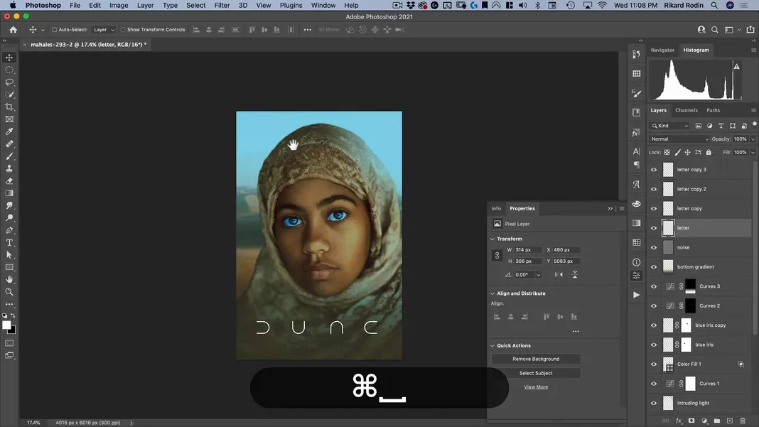
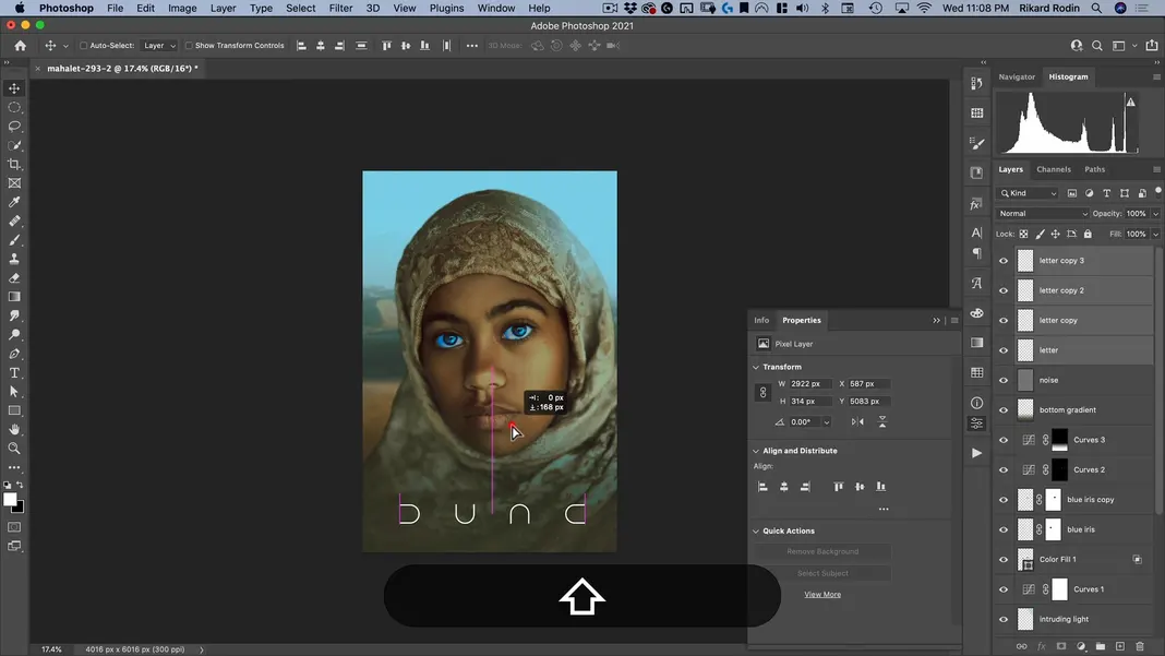
Center the letters horizontally and move them vertically as desired.
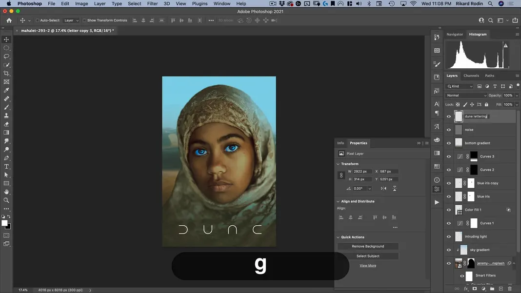
Finally, merge the layers and rename the resulting layer to “dune lettering”.
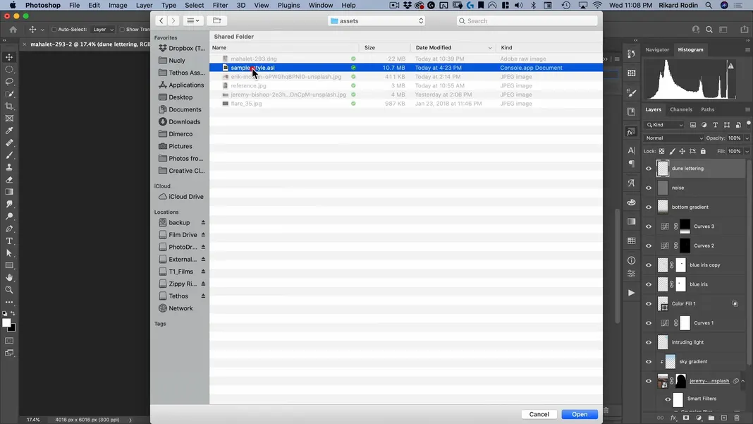
I do also want to apply a layer style here; the one I’m using is included in the assets for this tutorial. Open the Styles pane, click the menu button in the upper-right corner, and select Import Styles.
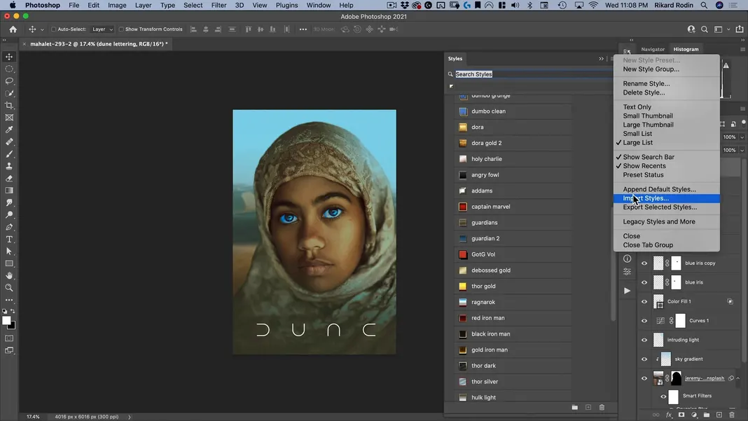
In the assets, you should see the file “sample-style.asl”. Select this file and hit Open.
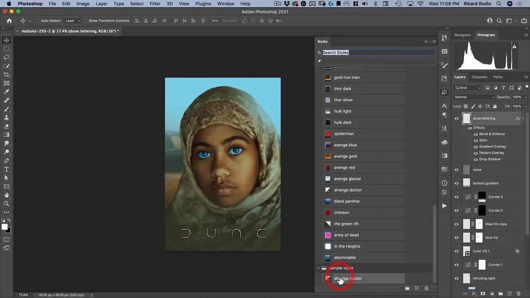
Now in the Styles pane, under sample-style, you should see the “strange doctor” style. Click on that and Photoshop should apply it.
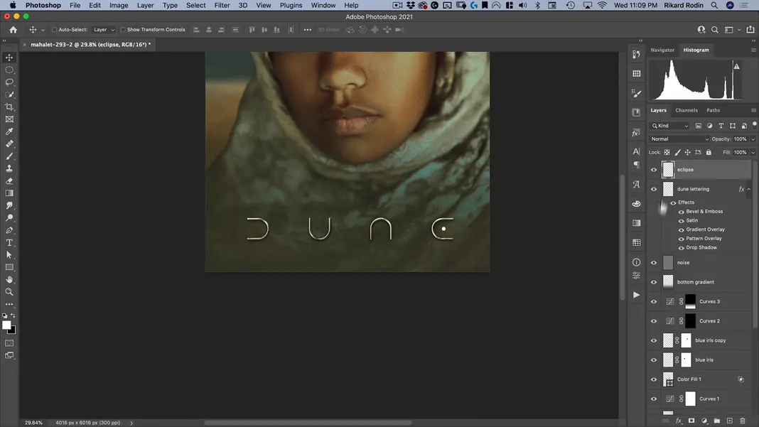
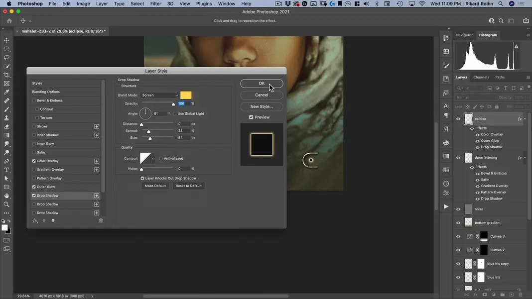
The last thing we need to do for our poster is add the eclipse inside our “E” letterform. Switch to the Elliptical Marquee Tool, create a new layer named “eclipse”, and create a small circle inside the “E”.
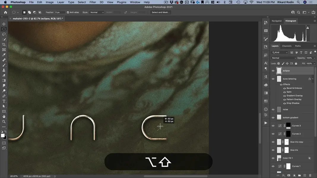
Use the smart guides to center the circle vertically inside of the “E”.
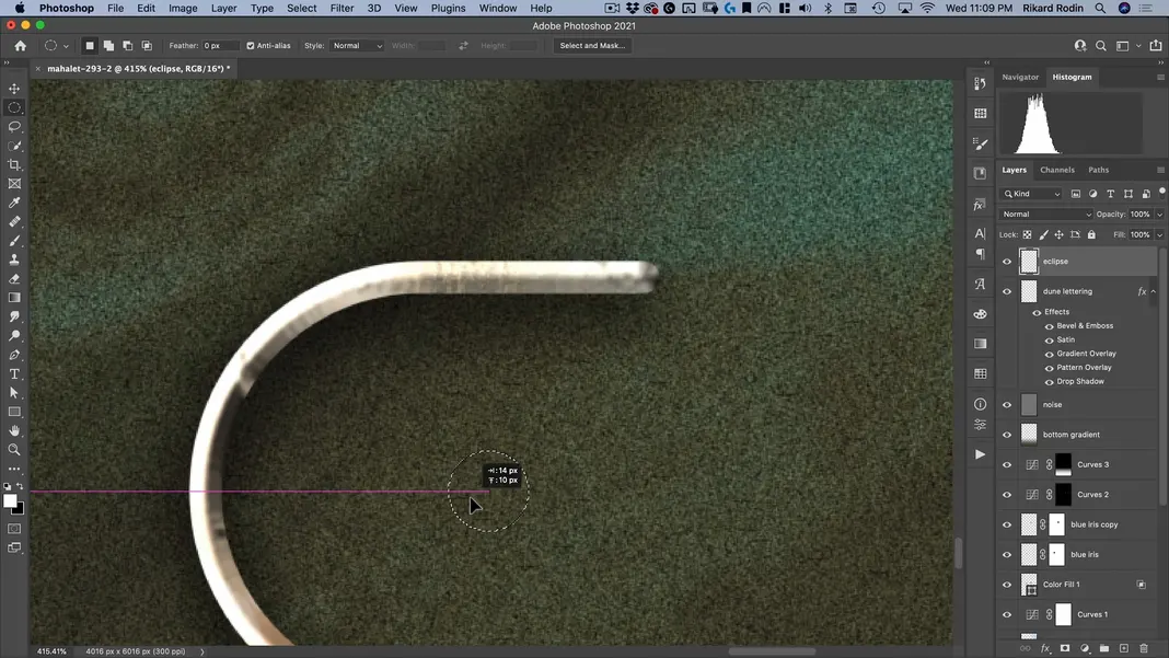
Fill it in with white and move it as needed so that it looks horizontally centered inside of the “E” as well.
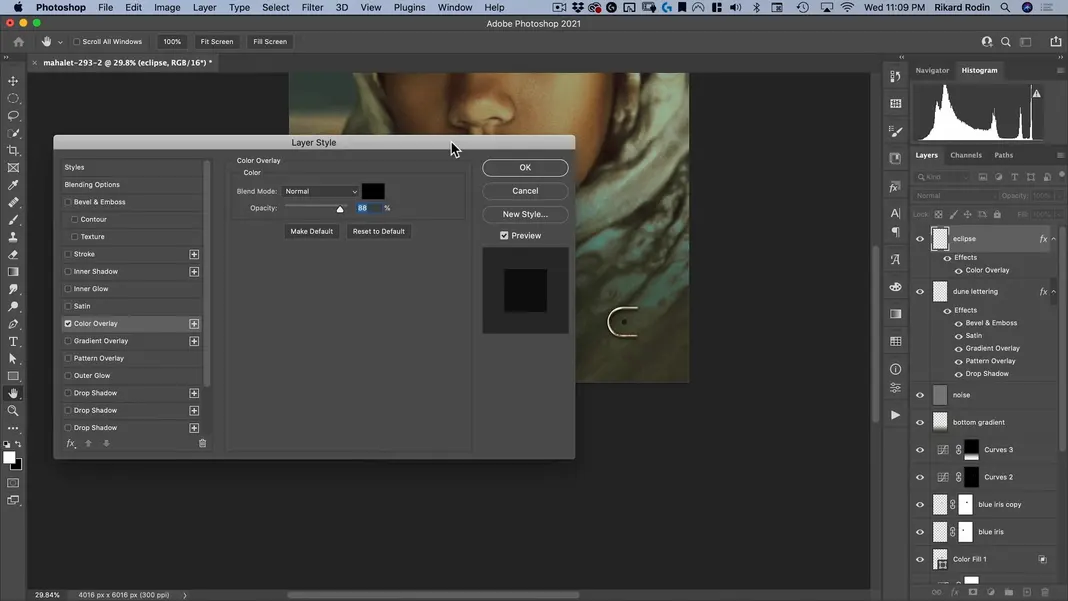
Now I’ll add a few effects to this, starting with a Color Overlay.
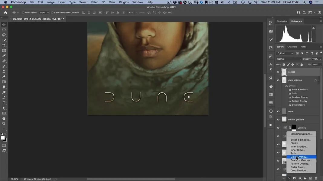
I’ll use the color overlay to turn the circle black.
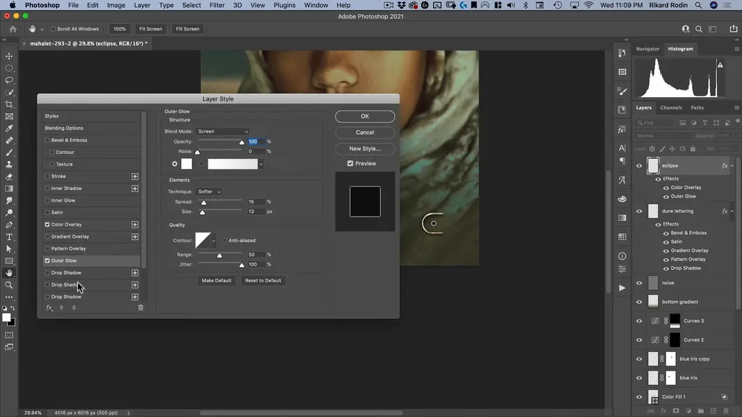
Then I’ll add an Outer Glow to create a white glow around the circle.
Finally I’ll add a Drop Shadow with the Blend Mode set to Screen and the distance set to 0 pixels to give it a yellow glow, like an eclipse. Then I’ll hit OK.
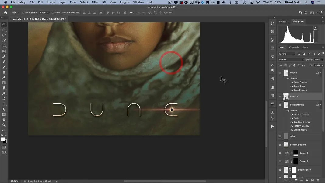
Now in my Library, I have a flare named flare_35 which I’d like to use here. This is also included in the assets for this tutorial.
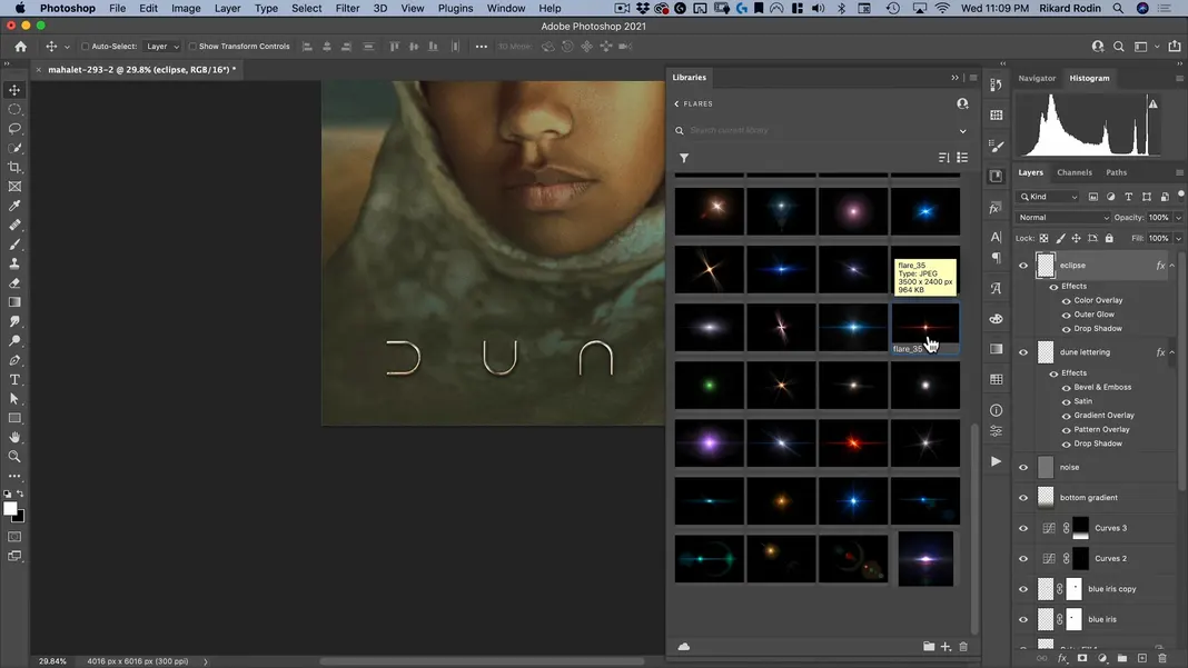
Drag this flare in and set the layer to a Screen layer. Then drag it behind the eclipse we’ve created.
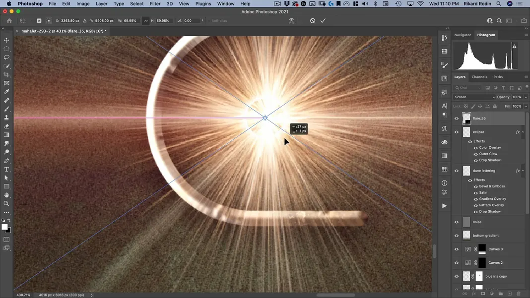
Then scale it down to the right size.
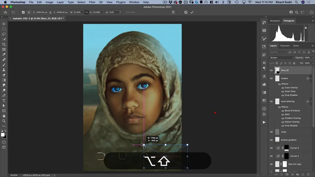
Move the flare layer behind the eclipse.
Use Command + M to open Curves again and bring up the Green channel a bit. That will take out some of the magenta and bring in some more yellow instead.
And finally, in the RGB channel, I’ll make the lights a little bit lighter and the darks a little bit darker. Then I’ll hit OK.
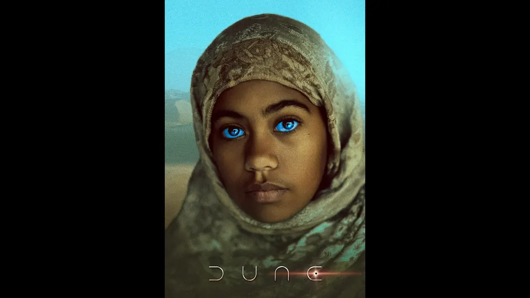
And that’s it! Our Dune-style poster is now complete. For comparison, here’s our Before image again.
And here’s our After.
I hope this tutorial gave you a thorough look at how to recreate a Dune-style poster in Photoshop. If you learned something today and would like to see more Photoshop tutorials, you can find more on my YouTube channel, so please subscribe and share with your friends.
I’ll see you all next time!