Today I will show you how to use Adobe Lightroom to edit your landscape photographs. Follow along by downloading the raw files used in this tutorial via the link below.
Editing a Landscape Image
Now, let’s begin by opening up Lightroom classic. Here, we can import the raw files that you’ve downloaded so you can follow along step-by-step.
Importing our Images
To import the raw files, click on the Import button in the bottom left-hand corner.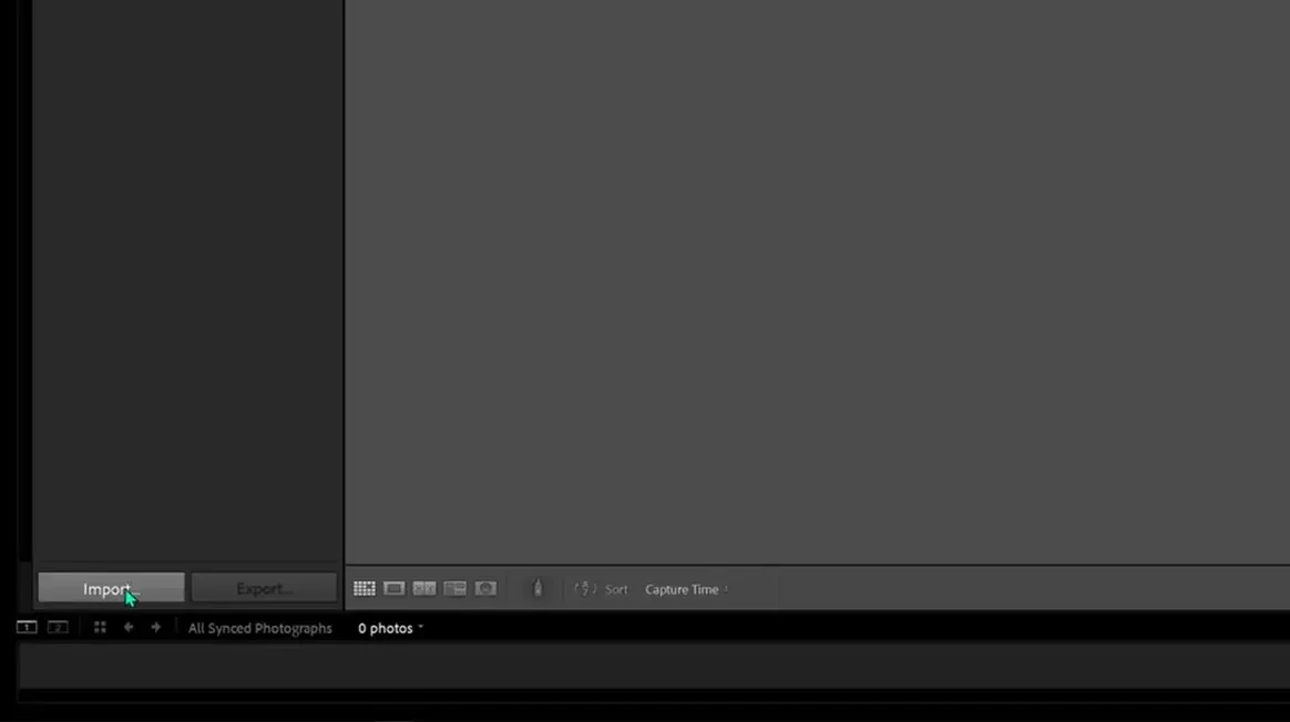
We should then see a menu of all of the files we can import. We’re going to select and use the WP reference files.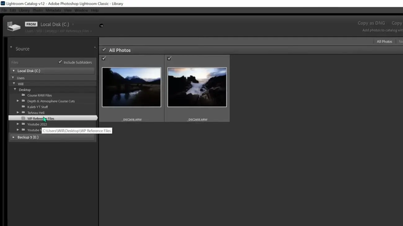
When we select that folder, you’ll see that we have two options come up. Make sure they’re both selected, and then push the Import button in the bottom right-hand corner.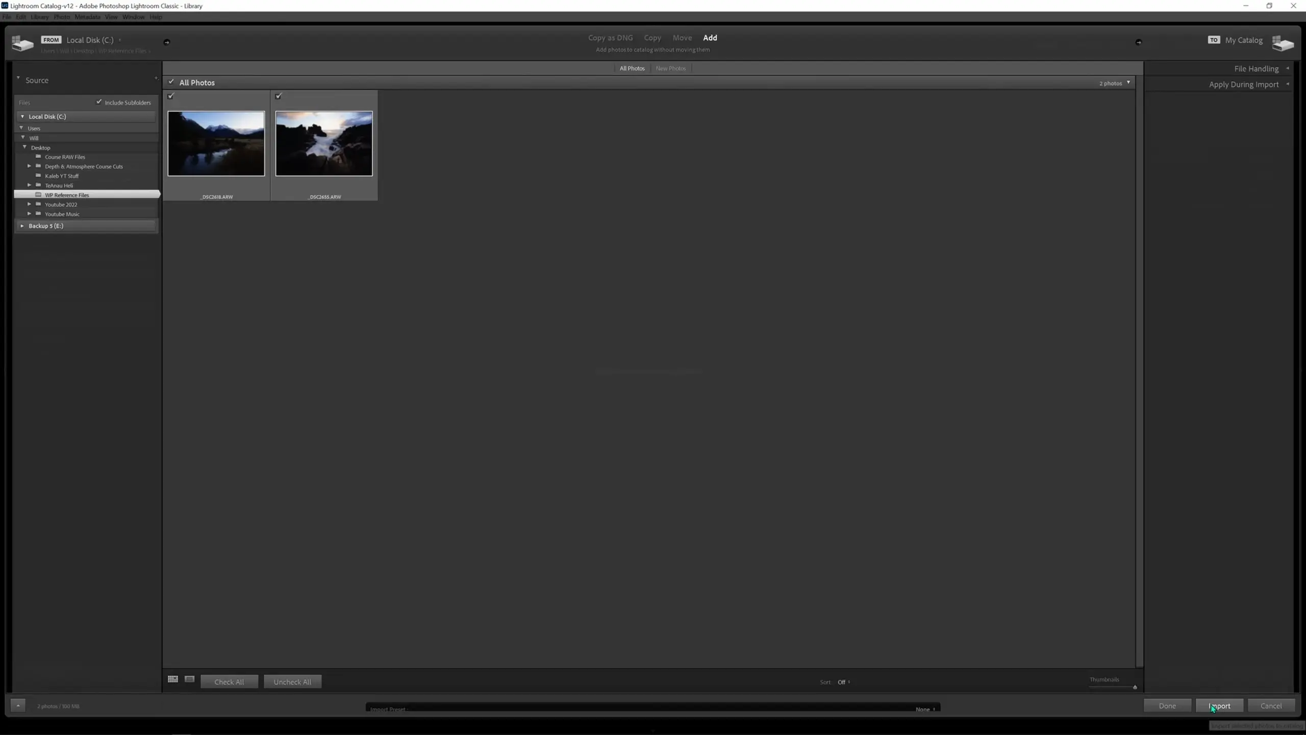
A note on the import options available to us: up at the top, we have a few different options for importing files, with the most notable being “Copy” and “Add”.
“Add” is saying that we want to add these files from wherever they’re currently located and just give Lightroom access to view them. Essentially this is just telling Lightroom that it can view these raw files so we can edit them.
“Copy” will instead create copies of the files in a different destination folder that we choose and then work with those copies. This is particularly useful when working with images on a camera’s SD card or on a portable hard drive.
In this case, we’ll just use “Add”.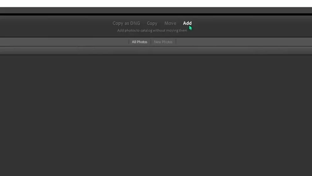
You can view what’s in your catalog on the left-hand side. Our WP reference folder is now added to the catalog, which confirms that our import was successful.
Let’s start processing our mountain scene. To do so, select the mountain image and push the Develop button in the top right corner. 
With that selected, you should see a totally different layout. This includes our imported images at the bottom and our editing panel on the right; I’m minimizing these in size as we don’t need these to be very big for our purposes today.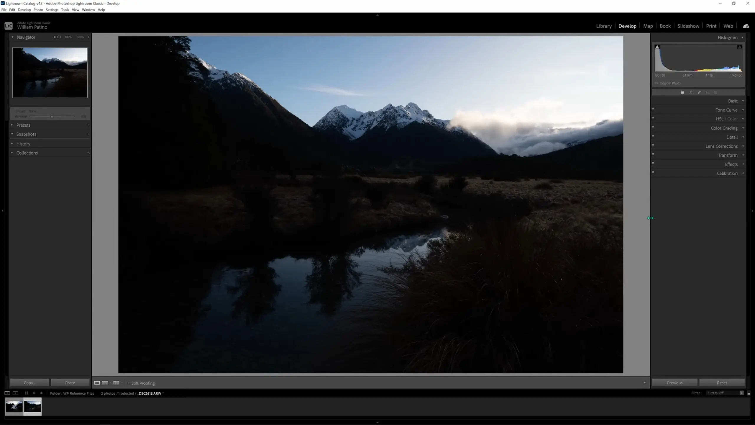
Before we jump into making changes, it’s really important to pre-visualize the final result and have some kind of goal in mind. For our image today, we just want to accomplish some of the basic steps that you’ll most likely need to do to most raw files: reveal the darker details, recover those bright sky details, bring back some of the color into the image, and create a bit of depth and atmosphere in the scene.
Making global adjustments
The first thing we’re going to do is open up the Lens Corrections tab. Here, we can remove the chromatic aberration, which is a very vibrant neon glow that we can sometimes get along the edges in our image depending on our lens and the type of light we’re shooting in. To correct this, select “Remove Chromatic Abberation.” Then select “Enable Profile Corrections.” This is where Lightroom is going to help repair some of the vignetting and distortion that your lens may have.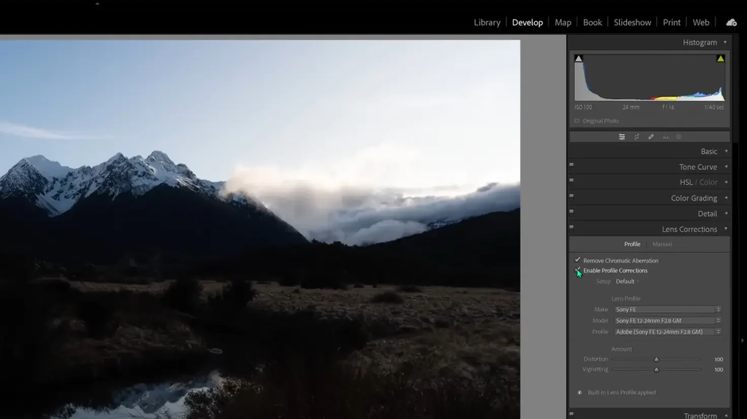
Now let’s jump into the Basic tab, where we make global adjustments—adjustments that are made across the entire image. These adjustments are primarily about balancing out the exposure. These values are fairly self-explanatory and are all controlled by sliders that we can adjust.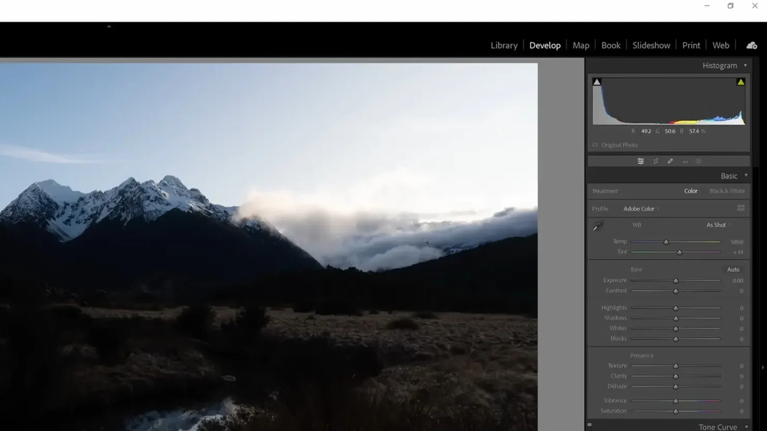
For this image, we want to make it brighter initially, so let’s grab the exposure slider and drag that to the right. With this change, I’m starting to reveal a lot of those darker tones and we’re able to see everything in the mountains.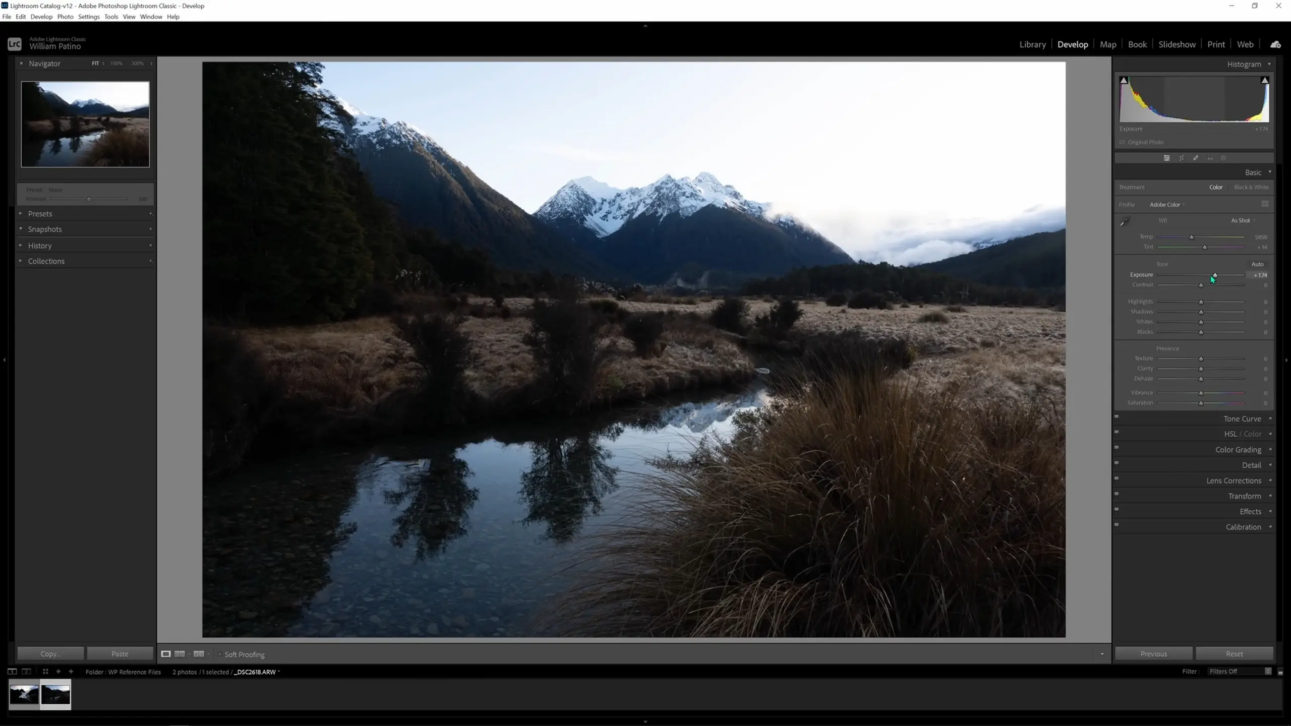
But this leads to the sky being too bright; if you look at the histogram now you’ll see that those highlight details are getting lost all up here in the sky. To correct this, we can grab the highlights slider and pull that back to the left to recover those details.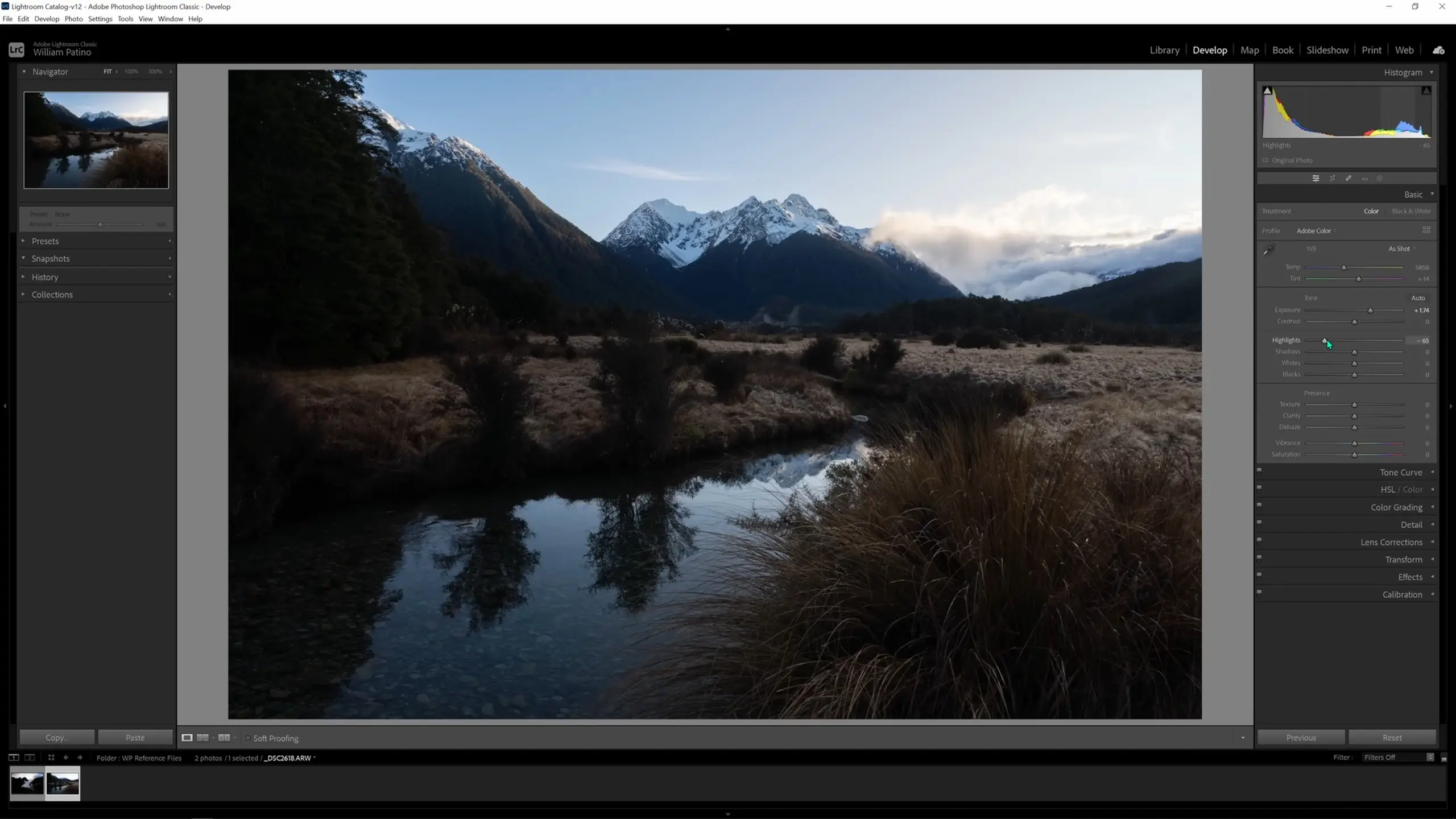
When making these changes, we want to be careful not to brighten the shadows and darken the highlights too much, as this destroys the dynamic range of the image. The reality of highlights is that they should be quite bright, and similarly the reality of shadows—especially those closest to the viewer—is that they should be quite dark. We can bring up the shadows slider to emphasize that dynamic range.
Soon we’ll be making local adjustments to help separate all of the tones and help bring that depth. We want a variance of tonality as we move from the front of the image to the back. Some of the values I like to adjust locally sometimes are the texture, clarity, and dehaze sliders within that same Basic tab. These are all contrast adjustments that give the illusion of creating exactly what they say: more texture, more clarity, and less haze. But before we make any local adjustments, let’s adjust the vibrance and saturation globally.
I’ll adjust the vibrance and saturation for most images because the raw files come out so flat. On most images, I pull the vibrance up anywhere from +10 to +30, but then I go easy on the saturation and only bring it up from 0 to +10 or +15, depending on the scene. For today, I’ll set the vibrance to around +20 and the saturation to around +5. 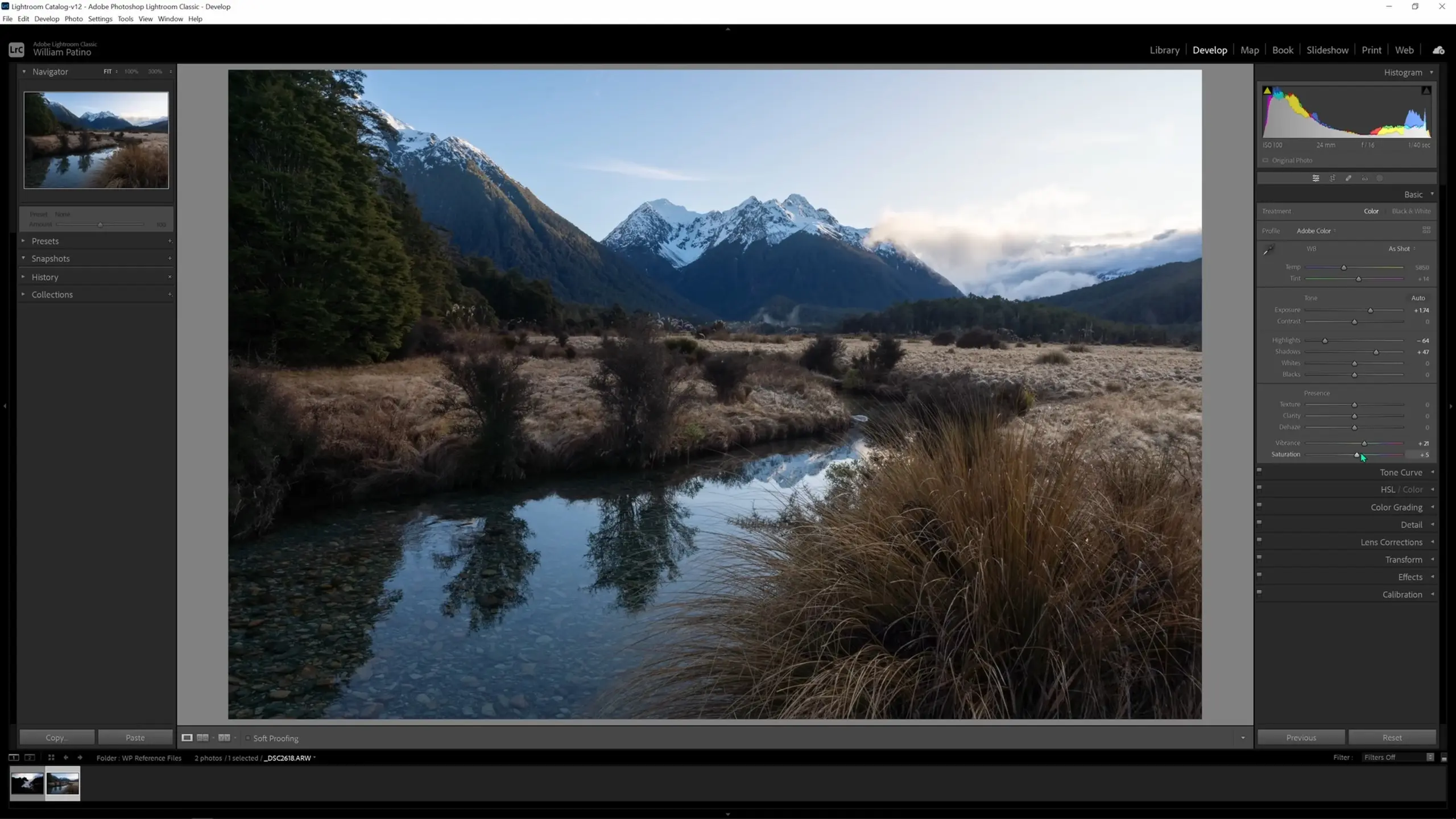
Now for the color work, I very rarely will adjust the color profile or even the white balance. What I like to use are the temp and tint sliders. Dragging the temp slider to the left will cool the image down, and dragging it to the right will warm things up. For this image, I’m happy to warm it up slightly; I think that will work really well with the snow grass we see in the foreground and the highlights in the sky. I’m pretty happy with how the tint is set so we’ll leave that value alone.
That’s it for the adjustments we’ll be making in the Basic tab. And it’s worth noting, when you’re first starting out, some of those basic adjustments could be all you need to get the image across the line. Using the Before & After option in the lower left corner, we can see how far we’ve come already.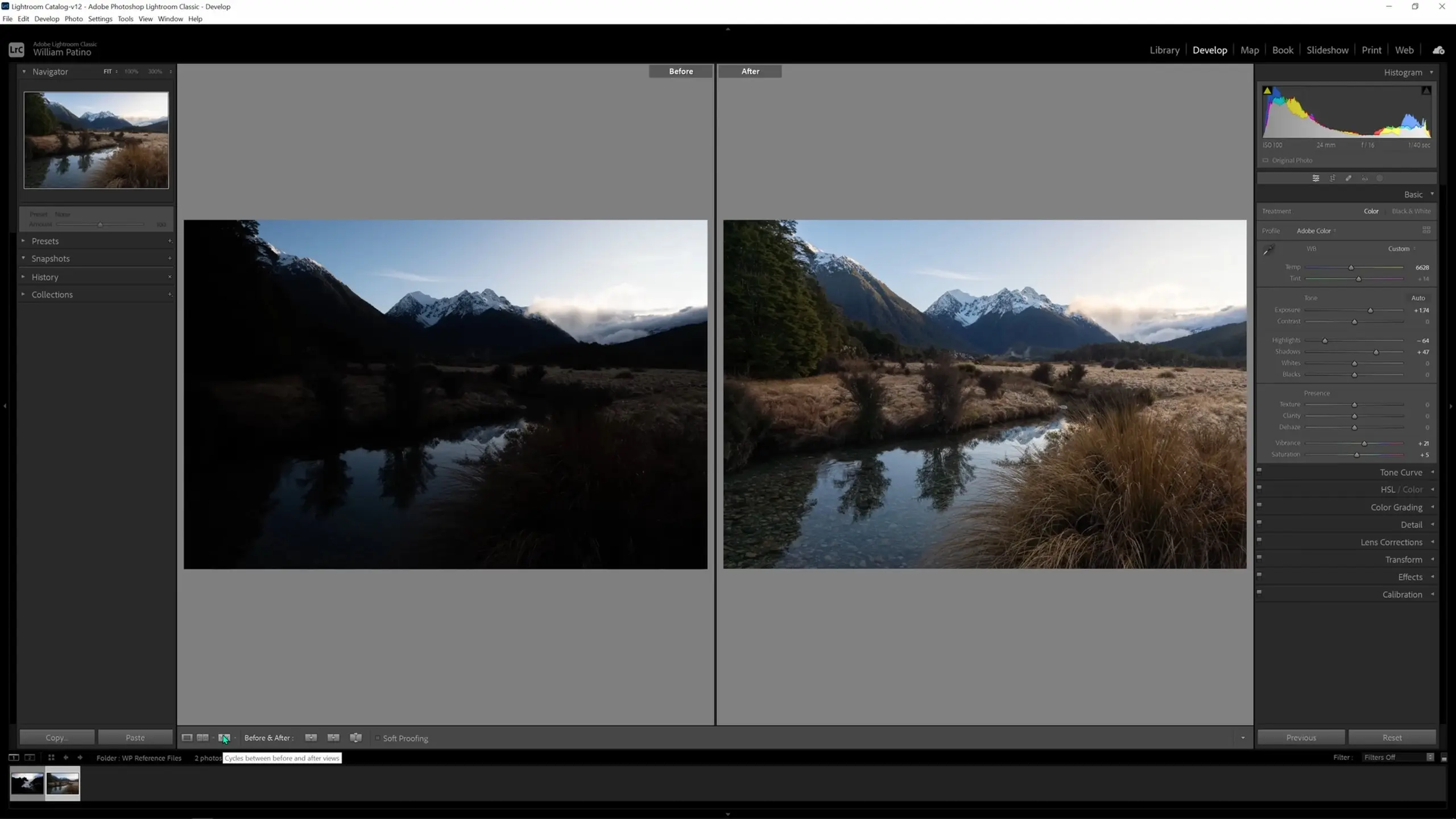
Making local adjustments
Now let me show you local adjustments, which are some of the most powerful things you can do in your image processing. We’re going to take a look at my key tool for post-processing every single image in Lightroom: the adjustment brush. Start by selecting the Masking button. 
When we select masking, we’re going to get a number of “Add New Mask” options, which are essentially selections we can make. We will also get a whole host of local adjustment options. In my opinion, the only tool you need to know about here is the Brush.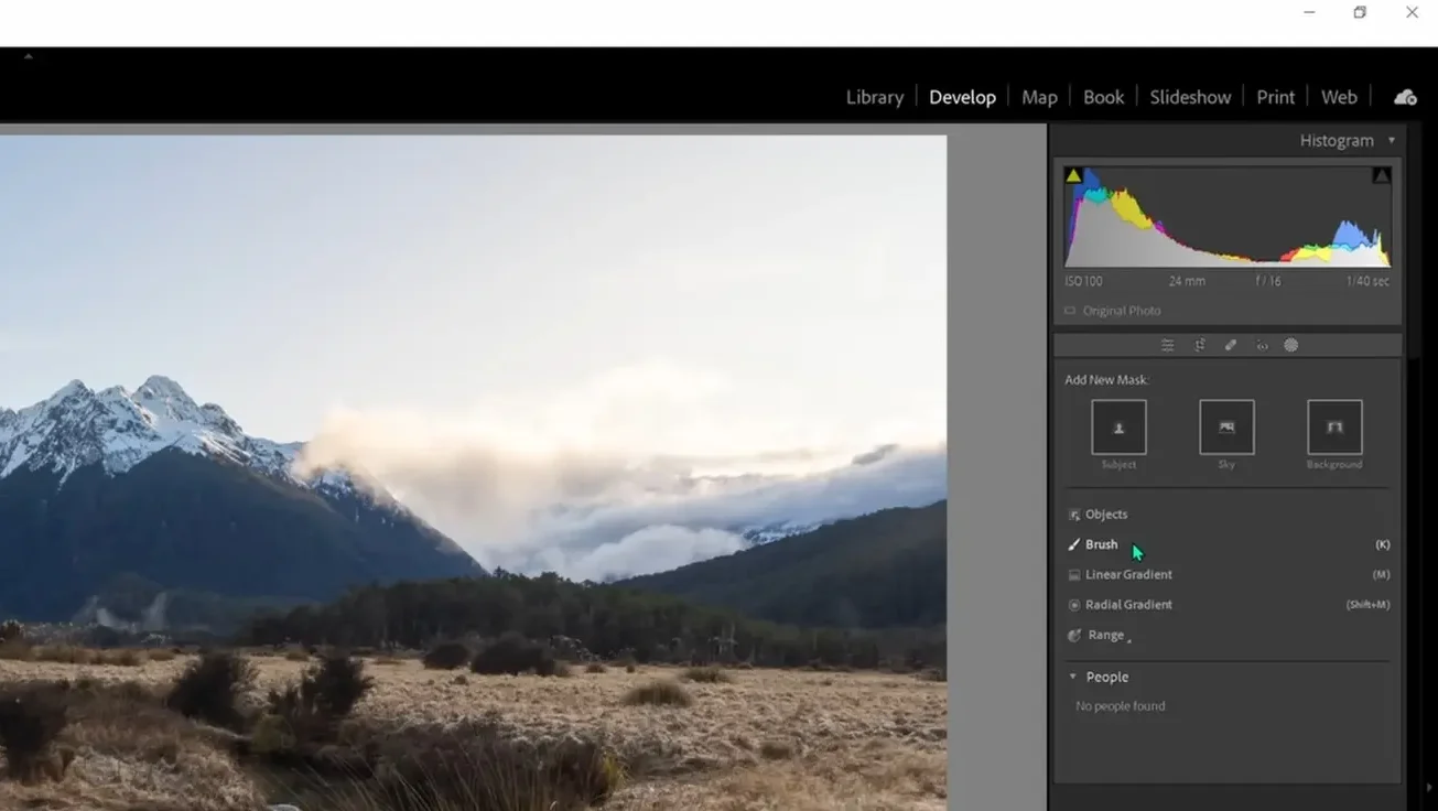
When the adjustment brush is selected (either from the right-hand menu or by using the keyboard shortcut “K”), you’ll see the following cursor and the following options on the right-hand side. We have the opportunity to adjust the feather on our brush—which is basically the softness or hardness of the brush—and the flow and density—which essentially determine what percentage of our brush effect is applied with each stroke. I like to leave all of those values at 100, but you can experiment to determine what works for you.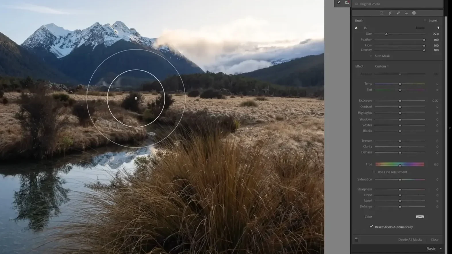
We again have all of the same sliders we saw during our global adjustments, but now they will be applied only to the brush area. The way the brush works is that the inner circle will get 100 percent of whatever adjustment we choose, and then the adjustment will fade out gradually to zero percent by the time it gets to the outer circle. This is thankfully very forgiving in terms of brush accuracy; it’s unlikely to be noticeable if the edges of your brush slip outside the line sometimes since the edges of the brush are the part making the gentlest change. You can see an example here with a dramatic exposure effect. 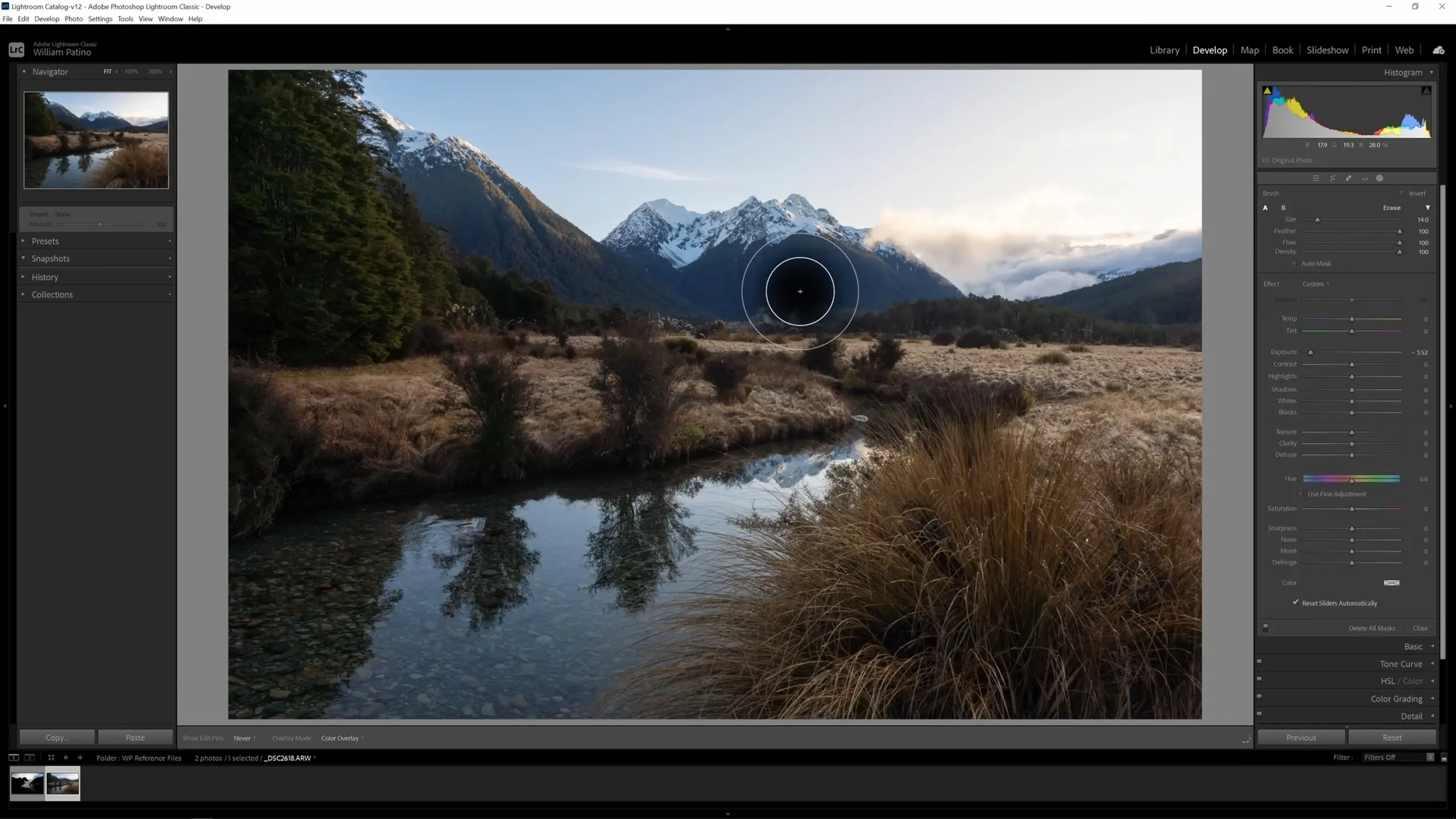
So for this image here, let’s make some local adjustments to create some separation and depth in our background. The main way I like to do that is bringing up the shadows and the blacks on the brush, and sometimes I’ll also grab the dehaze slider and slide it to the left.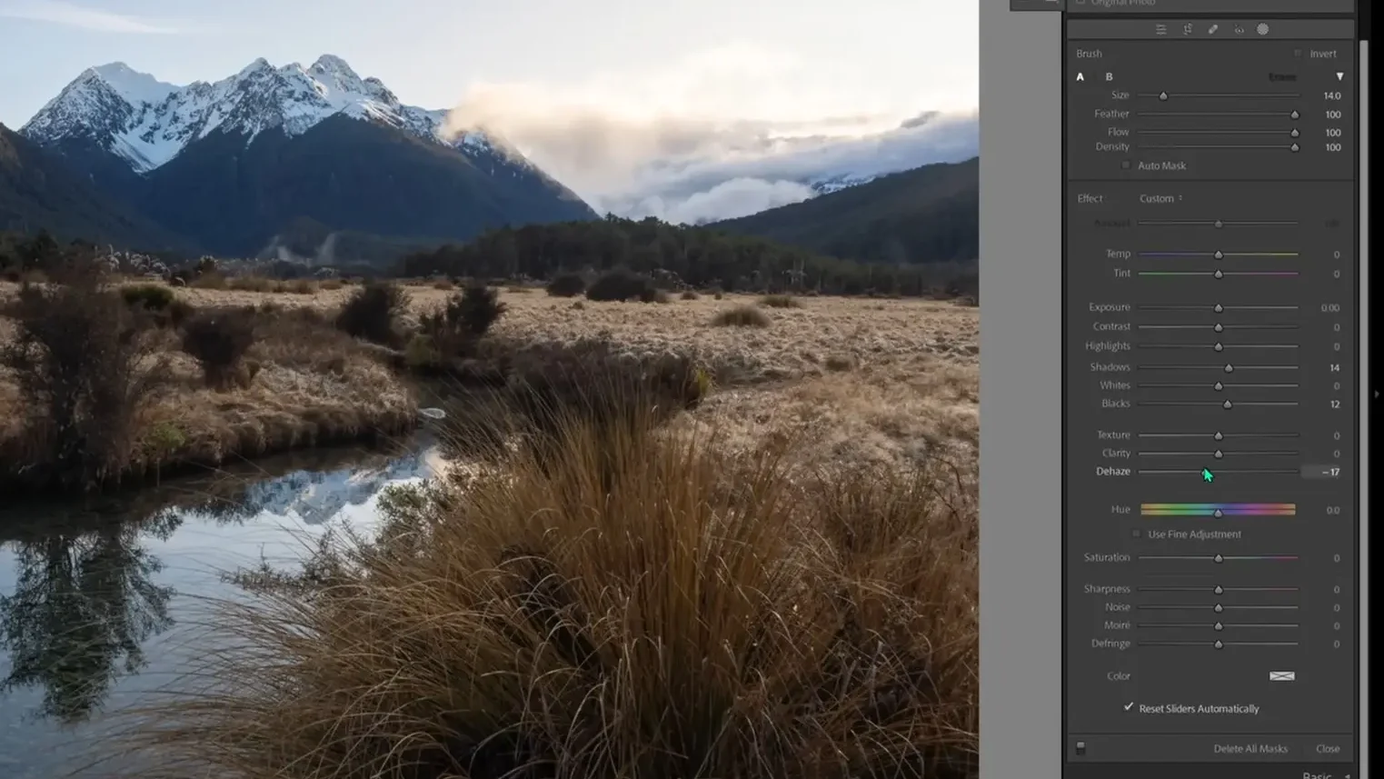
I’ll then brush the background using this adjustment, and we should see it lifting exactly all of the things I’ve asked it to.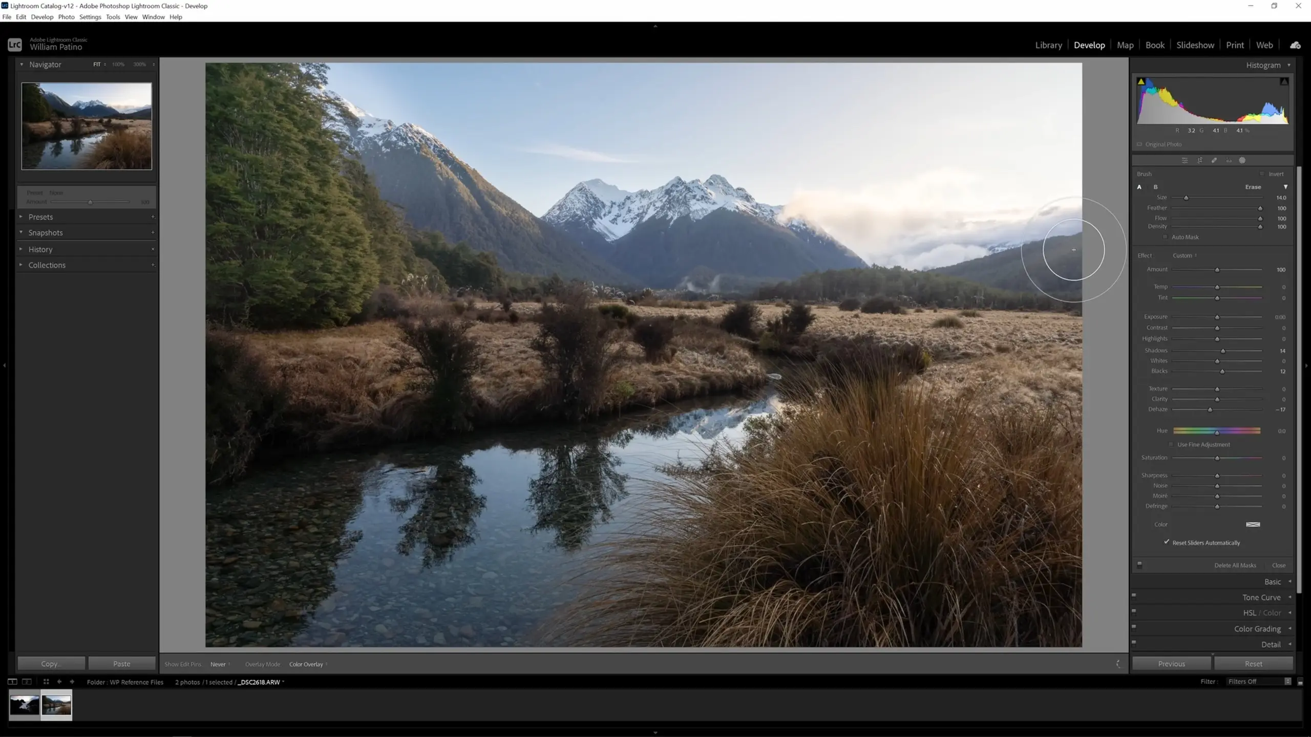
This does look like it’s gone a bit heavier than I wanted it to; luckily, we can still just change the slider values to dial in the adjustment we want. I’ll go in and increase the dehaze value slightly, and we should see the image adjustment change accordingly in real-time.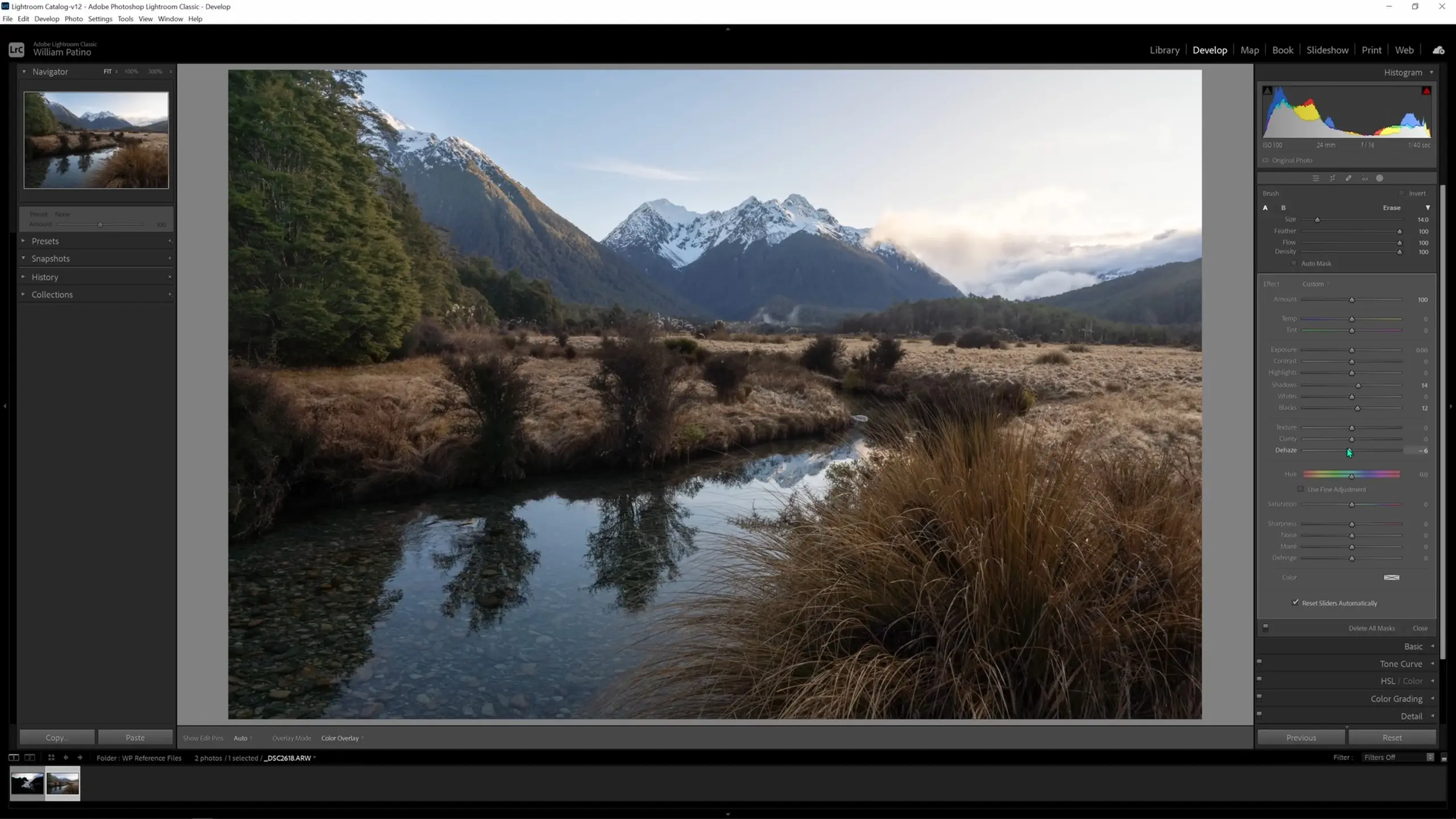
From here we can build up multiple local adjustments to get the image where we want. What I’d like to do now is darken the top part of the sky to lead the eye downwards back into the frame. I’ll push the K button, which will instantly give us a new brush. Then we can lower the exposure on this brush to make our sky adjustment.
It’s worth noting that you won’t know how much to set the sliders to at first since there’s no visual feedback until the adjustment is applied. You’ll need to guess, apply the adjustment, and then tweak it from there. I’ll apply my first exposure adjustment to the sky, angling away from the tree so that it doesn’t get too dark. Here’s what I get from my first application.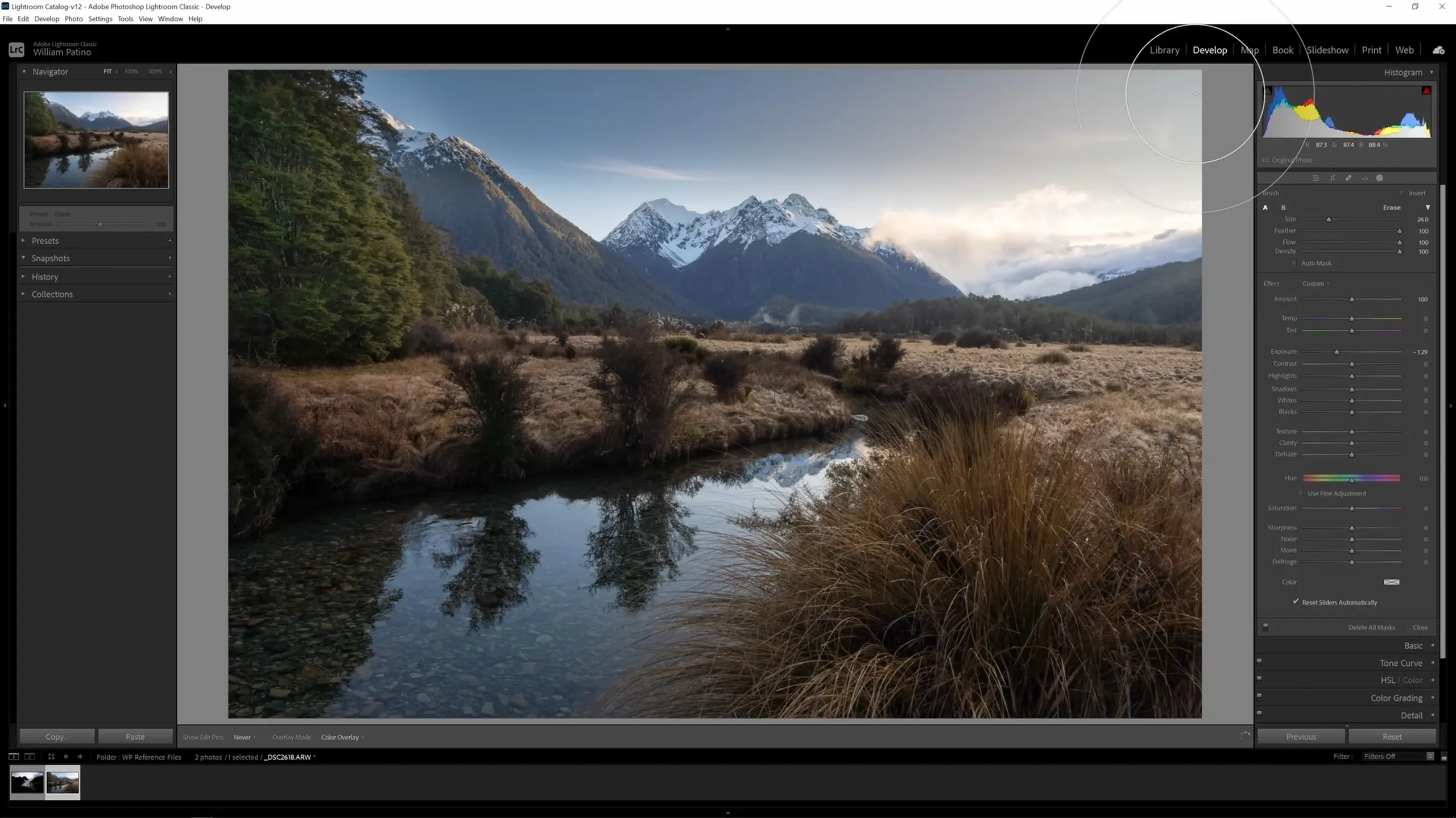
The effect is a bit heavy, so I’ll pull the exposure up a bit and also pull the highlights down so just the highlights in the sky are being toned down rather than the whole spectrum.
Let’s hit K again to pull up another new brush; this time we’ll warm up all the light visible in the distance. We can bring up the temperature and set the tint to bring in a bit of magenta. Running that across the horizon where the warm light is going gives us something like the following.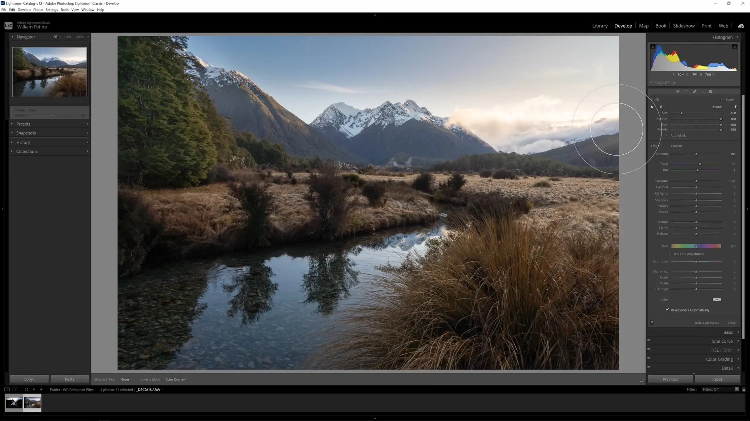
We’ll continue this process of creating new brushes to adjust any areas we see that need help. I’ll create another brush to pull up some of the dark tones on those plants in the mid-ground. For this brush I will just pull up the shadows and see if that accomplishes the effect we want. That leaves me with the following.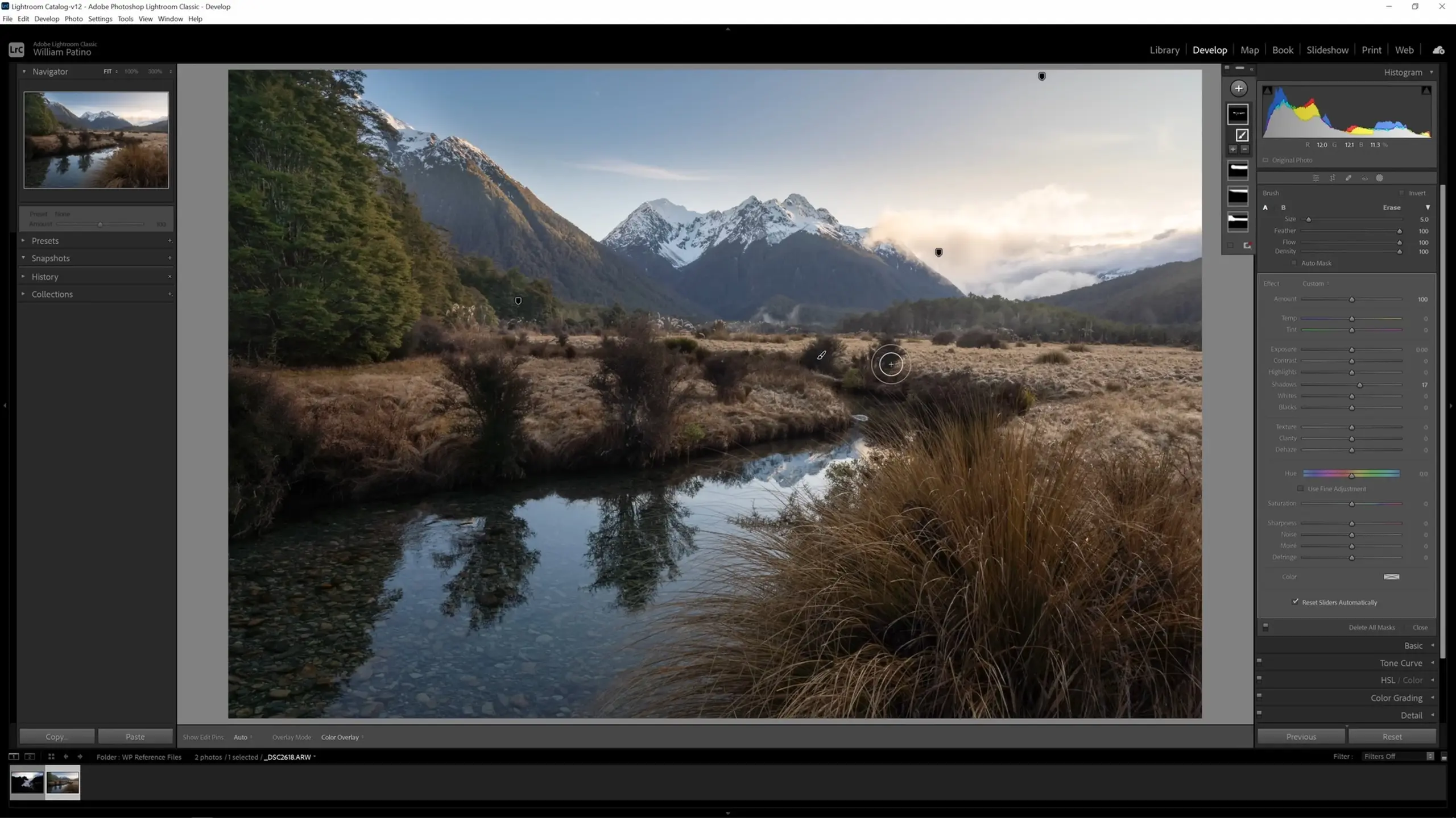
That’s it for our local adjustments using the adjustment brush. You can still use the Masks pane to go through and view, edit, or erase those adjustments if you’d like, but for now let’s move on to the color grading.
Color grading the image
Let’s push the Masking button to close the masking options, and then we can click Color Grading in the editing menu to open the color grading options.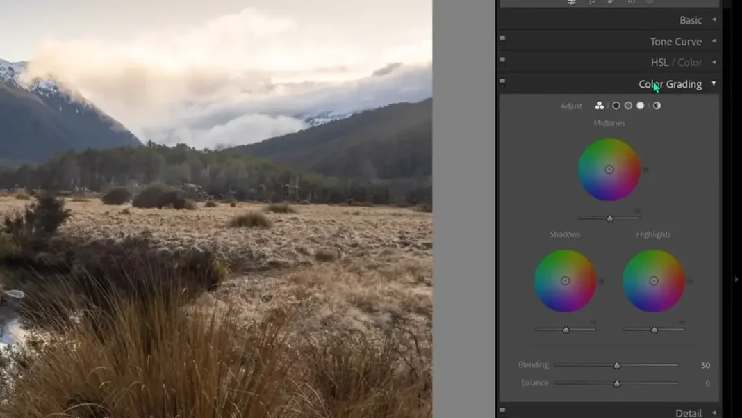
Here we will see three wheels, and what this is allowing us to do now is introduce a certain hue—a color tone—into these areas of light, the shadows, the highlights, or the mid-tones. A very effective thing you can do in your images is warm your highlights and cool your shadows, which creates a nice natural contrast that we find in the real world. This effect is already present in our image, but I would like to accentuate it.
To do this, first move the outer circle on the edge of the highlights wheel into the warmer tones. Then click the inner circle and start dragging it outwards to start saturating the highlights with this color. Make sure to hold Shift before dragging to keep the outer circle fixed and drag the inner circle along that line.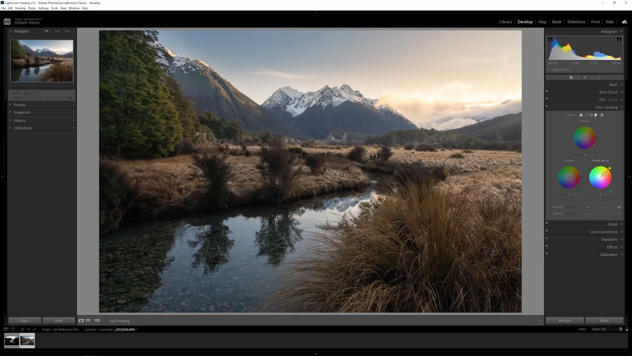
Then, to create that nice natural contrast, move the shadows wheel outer circle into the blues, hold Shift, click, and drag the inner circle out just a bit.
You can grade the mid-tones as well. For this image, I’m going to leave the mid-tones as is, but have a play around with changing them yourself. Typically, I primarily work with the shadows and highlights.
Using the healing tool
Another common tool you’ll need to know how to use is the healing tool. The healing tool is often used for removing things that you don’t like in the scene—particularly dust spots. To find these, we can take a closer look at the image. When your cursor is a magnifying glass, you can click the mouse to automatically zoom. Also, you can either use your trackpad or scroll wheel to slide around the image, or when your cursor is a hand you can click and drag to do so. Using these navigation options to zoom in and scan the picture, we see a lot of dust spots in this image.
To correct these, we select the healing tool. We then get three options for the mode: content-aware remove, heal, and clone. For dust spots, I’ll often use heal.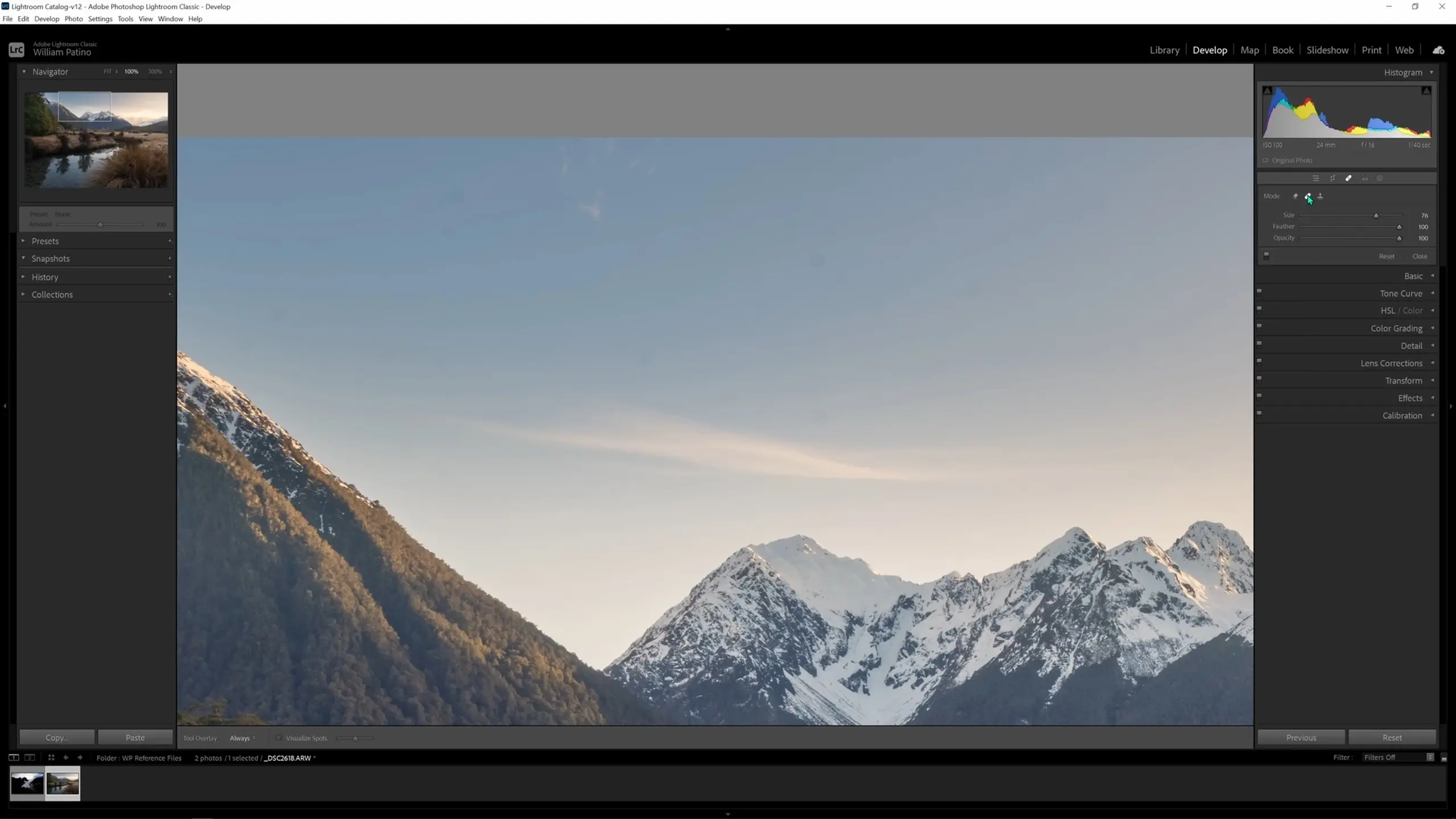
I’ll leave the feather and opacity high on the heal tool. I’ll then make the brush slightly larger than the area we want to work on and then brush over it, either clicking and holding and sliding around or just clicking once. It will grab an area of similar color and tonality to replace the dust spot. If we’re happy with that, we can lock that change in by just pushing the Enter button.
If you repeat this process by just clicking across the various dust spots, it should generally do a good enough job.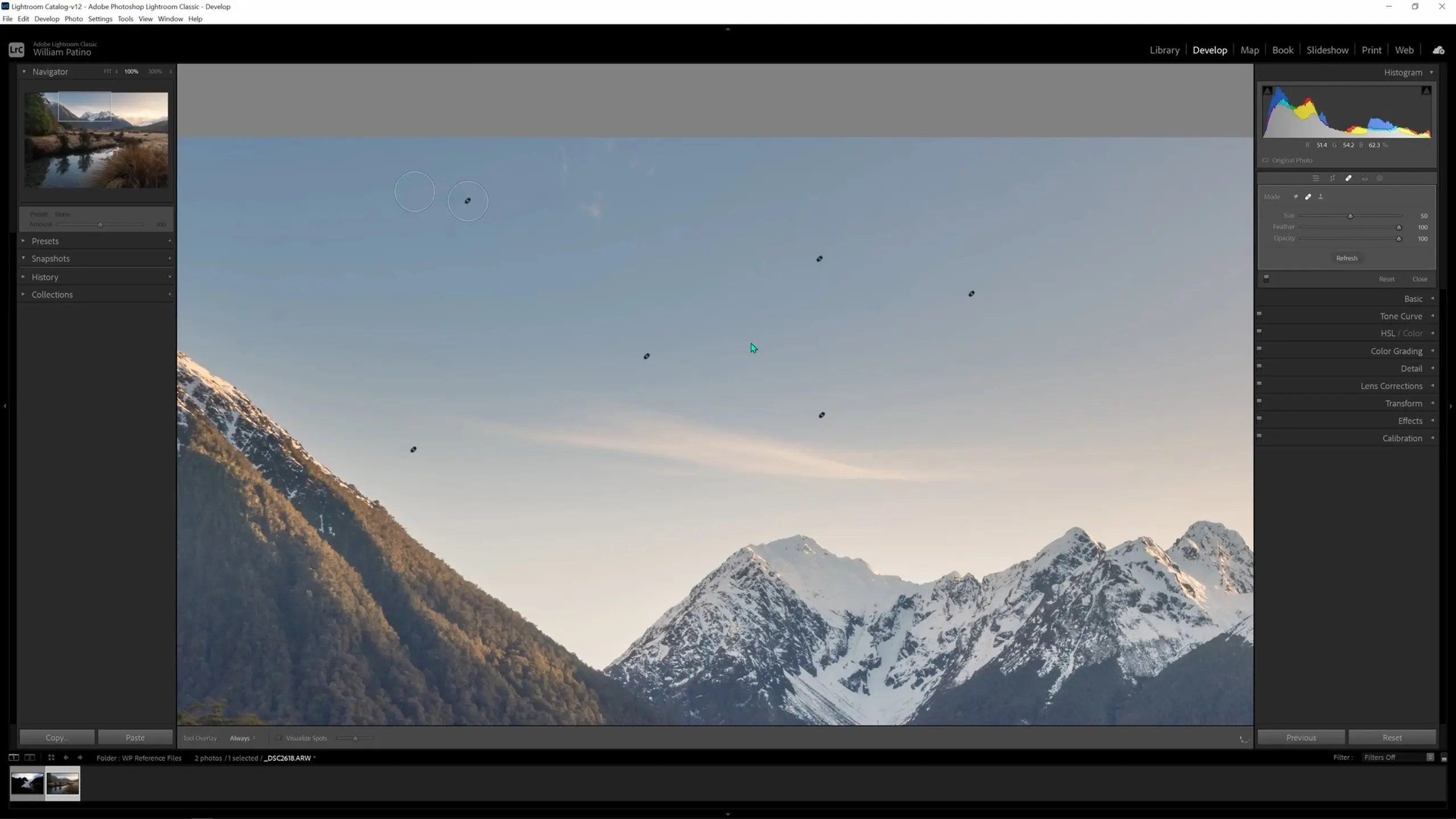
Boosting lit areas
One other thing that I’ll show you is utilizing the adjustment brush to boost lit areas of the image. If we push K, the adjustment brush comes up. We can then put some white on the brush; what I like to say is, “White is light,” so I use this white brush to boost anywhere that just has a little bit of light on it already. As I run my brush along those areas (the mid-ground grass, the trees, the highlights in the water, etc), it gives a very nice gentle lift that looks quite realistic and not too over the top. I just apply that change all through the areas where I want to make sure the eye can enjoy those details.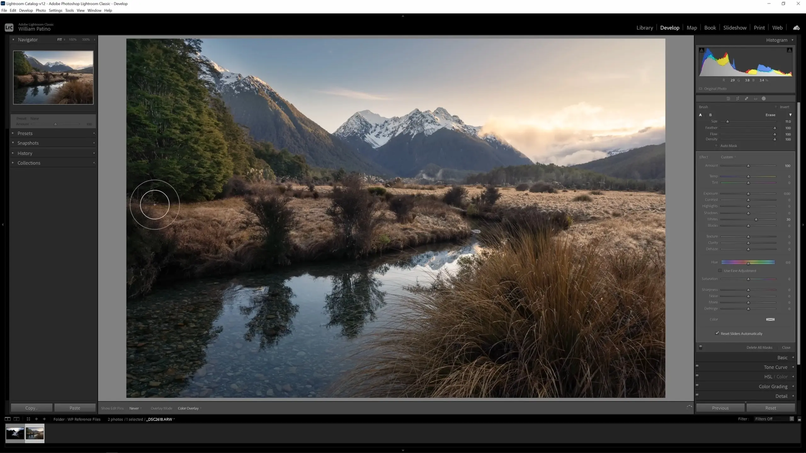
Creating soft glowing light
Let’s cover one last technique with the adjustment brush: creating a soft glowing light. I’ll push K to create another adjustment brush. We’ll go for a larger brush size, and we’ll turn down the dehaze slider and just apply a glow to the background of the image.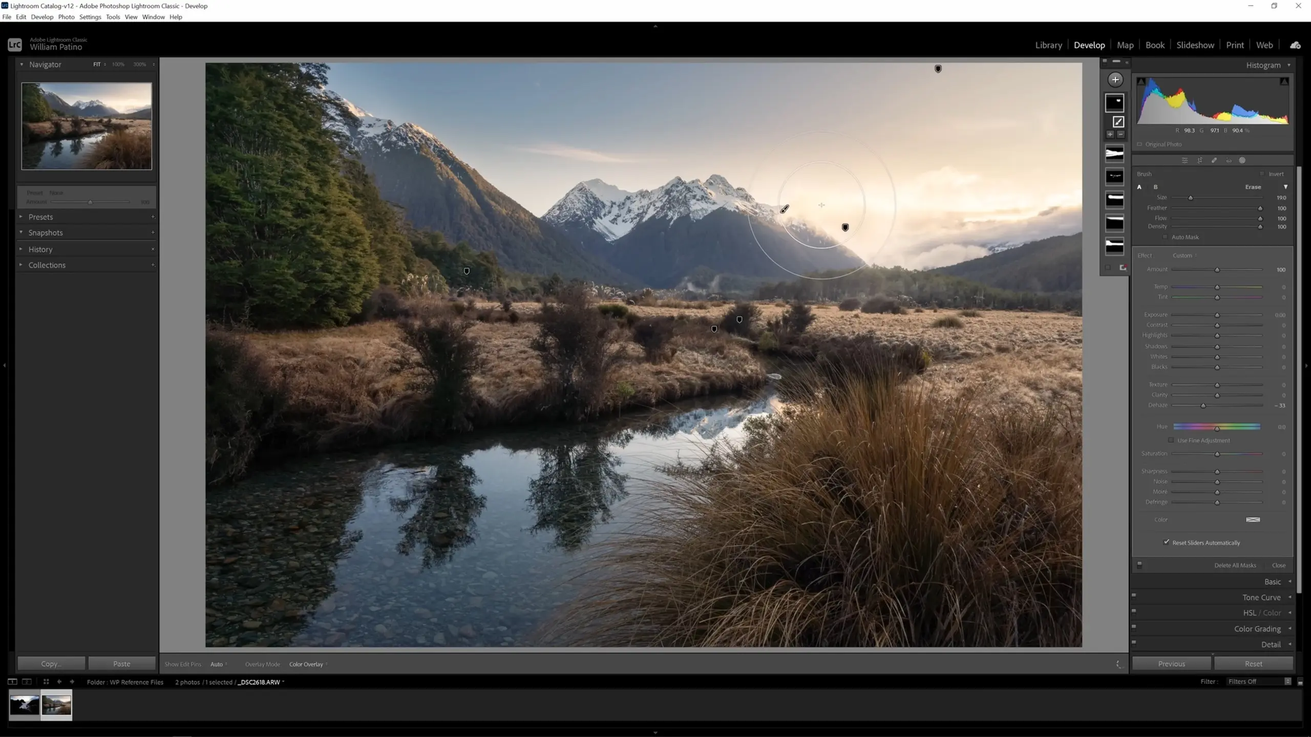
I’ll warm that glow up slightly by turning up the temp slider, and I’ll dial that rehaze effect back a little bit by dragging the dehaze slider back up.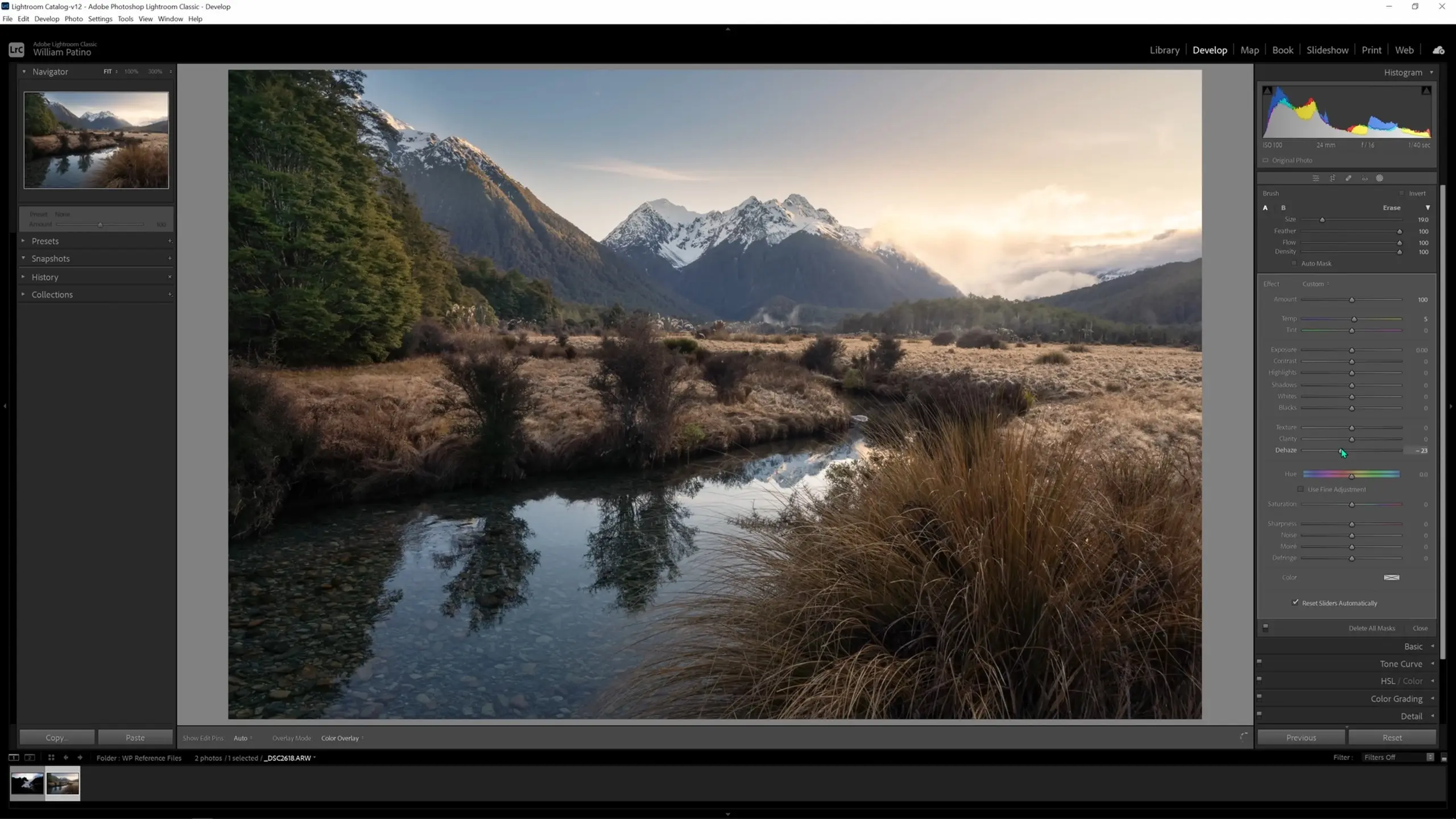
In the masks pane in the upper right, you are able to toggle each of our masks on and off to see a Before and After and see the local adjustments we’ve made, which allows you to see how powerful those masks are.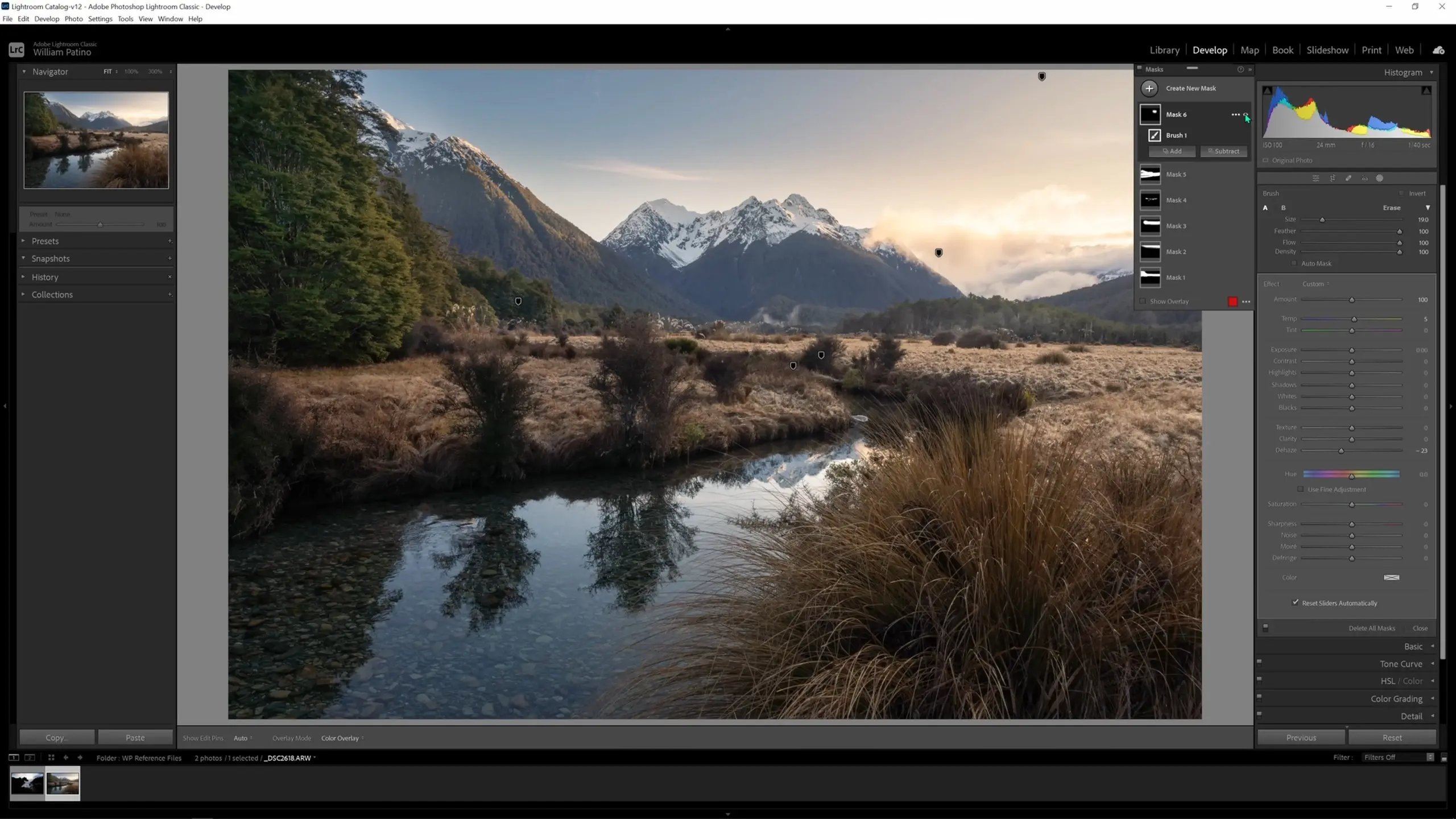
If we turn off all of the local adjustments we’ve made, below is how the image looks.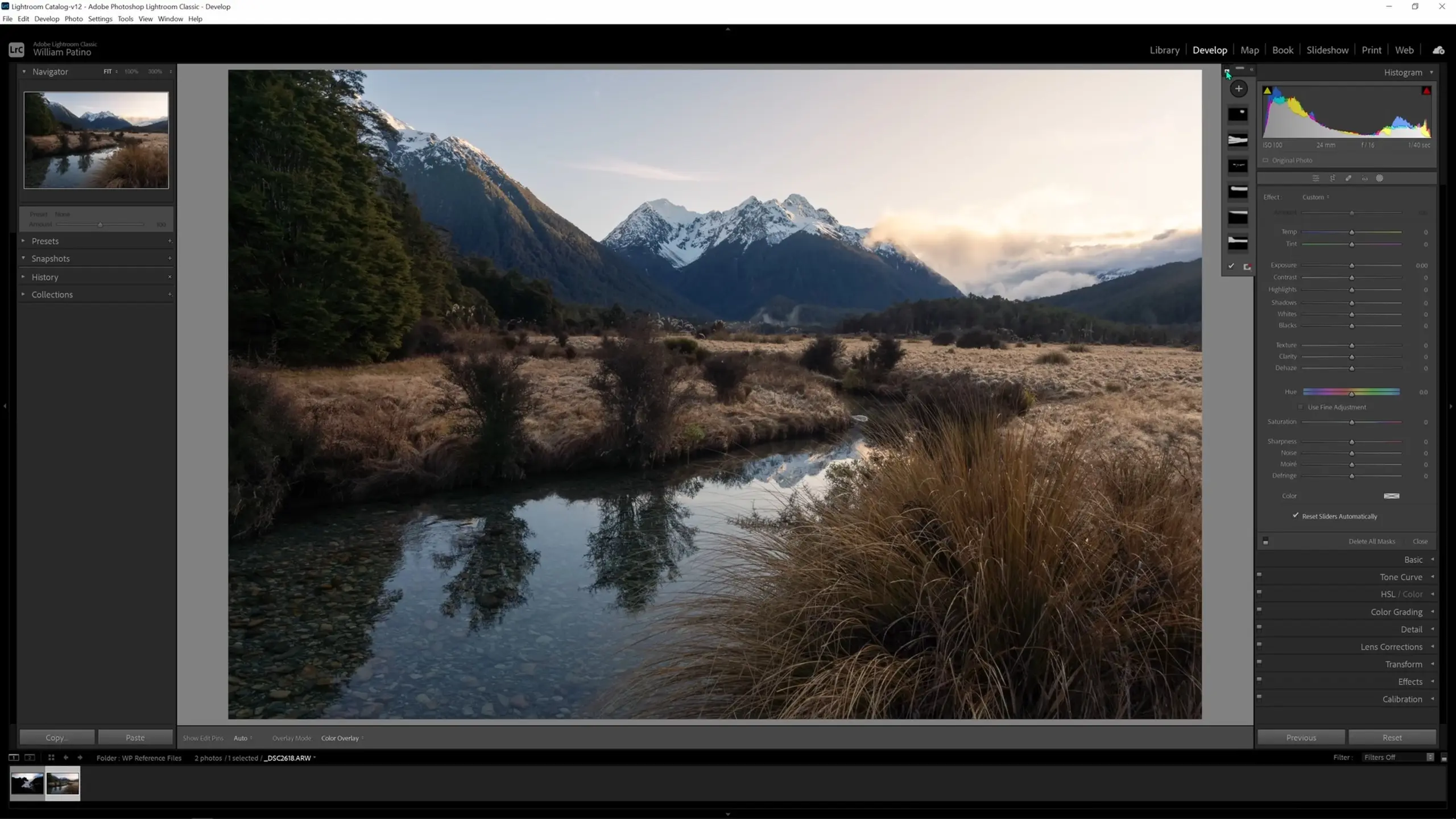
And here is our image with those local adjustments turned back on.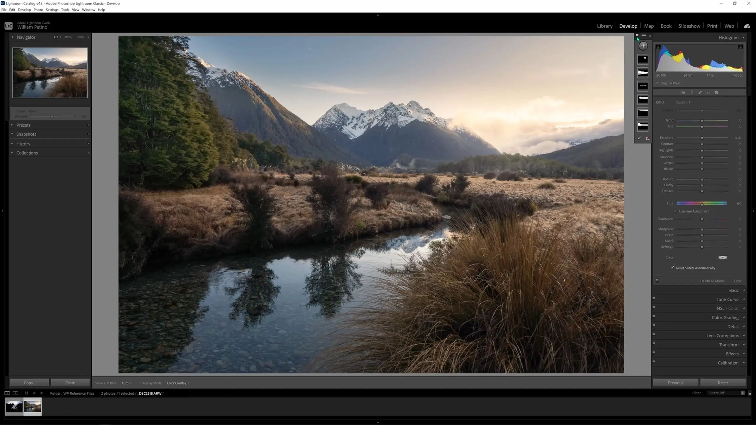
So now you can see how we have been able to reveal those details and lead the eye through the scene, creating a sense of depth in the image.
Editing a Seascape Image
Let’s now apply what we’ve learned. We’ll go down to our thumbnails and select the seascape image.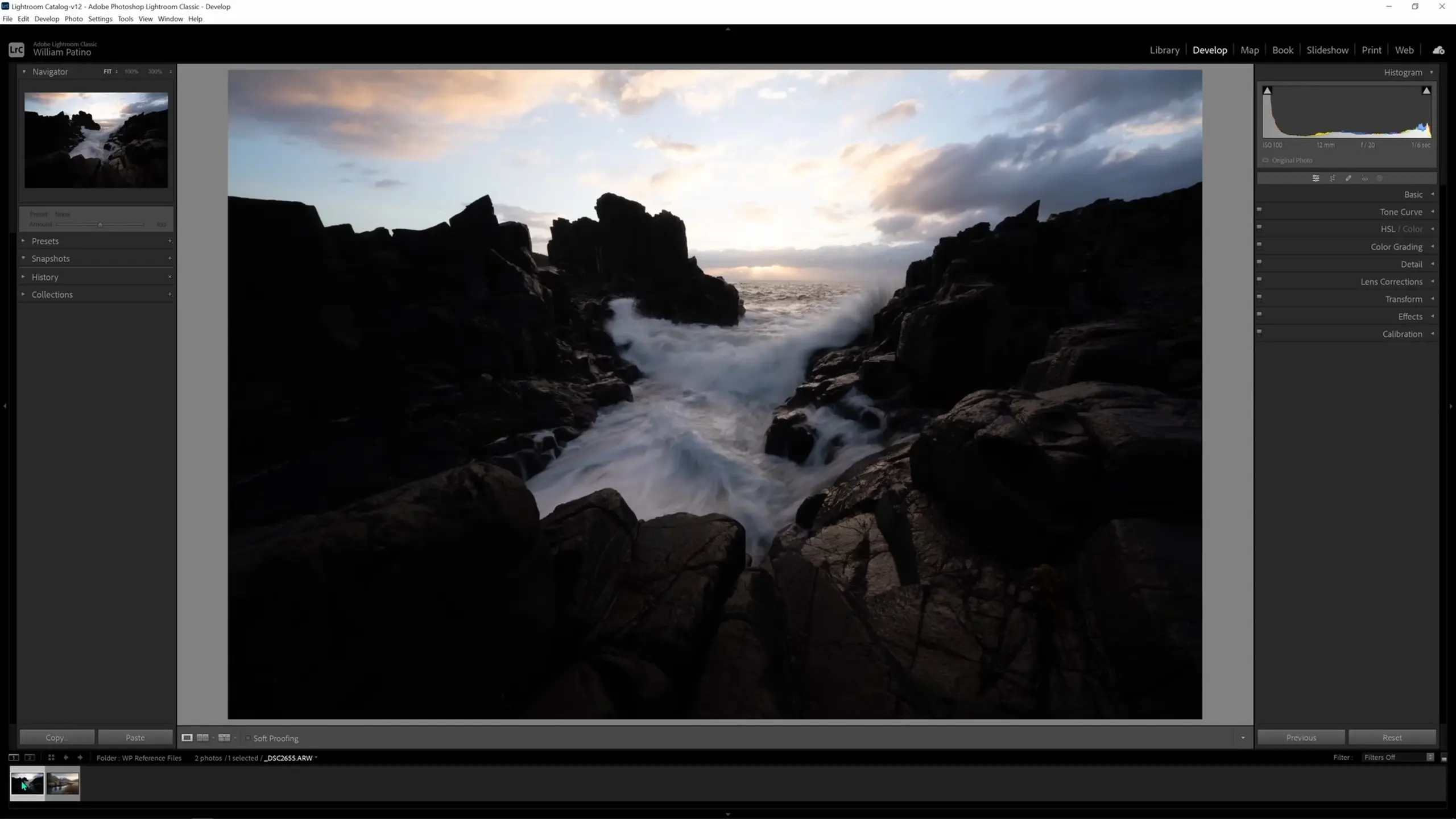
Making global adjustments
Let’s start working on this image with our global adjustments. This image has an even more extreme dynamic range (the tonal range from the shadows to the highlights) than the last one. We have very dark darks and very bright brights to the point of being muddled, which can be seen in both the image and the histogram. 
We’ll correct this by evenly bringing up the overall exposure, recovering some of the details in the highlights in the sky by bringing the highlights down, and then bringing up the shadows to reveal those details, all while taking care to preserve as much of the dynamic range as we can.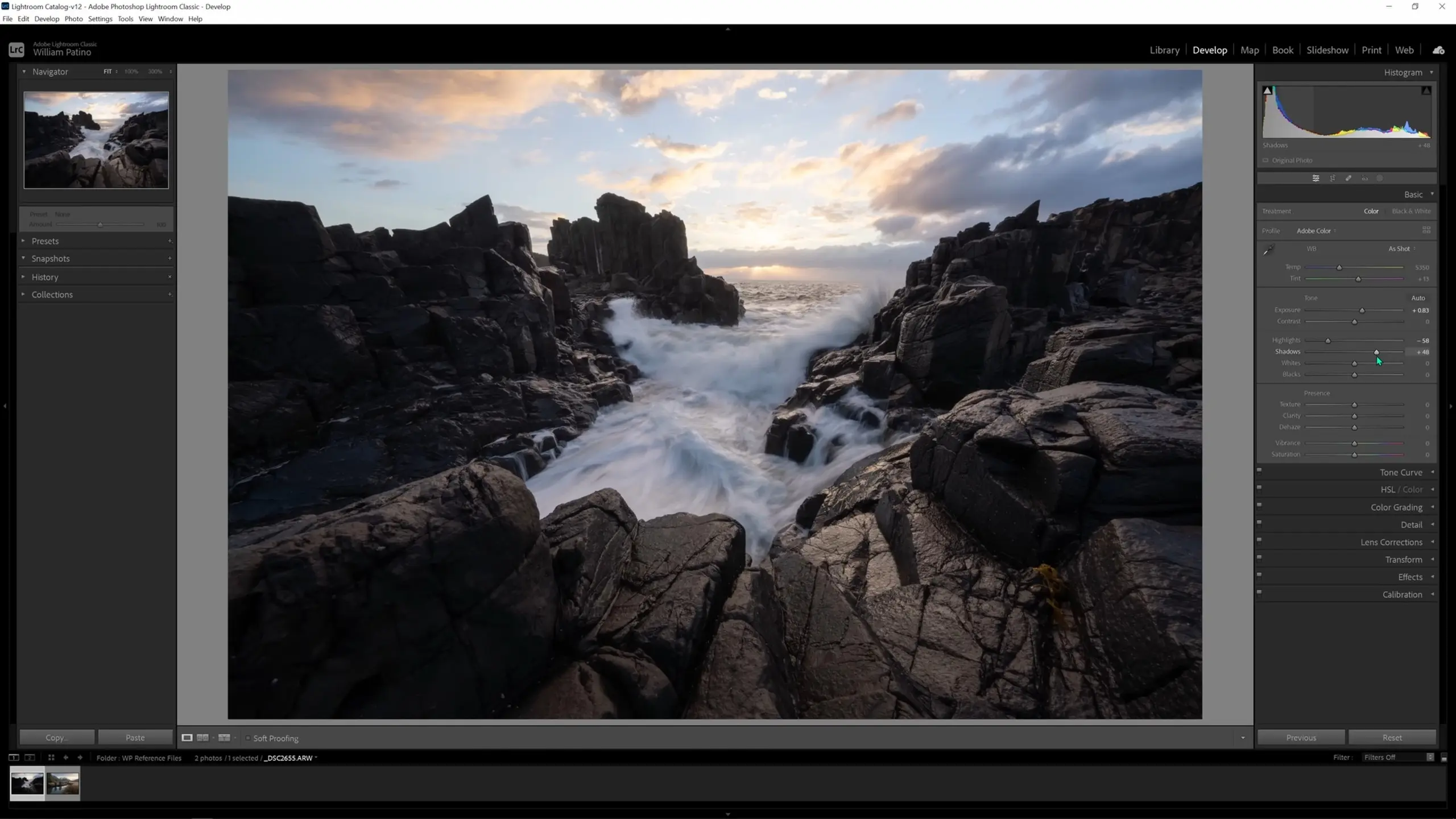
We’ll then go to the Lens Corrections tab and enable both the “Remove Chromatic Aberration” and “Enable Profile Corrections” options.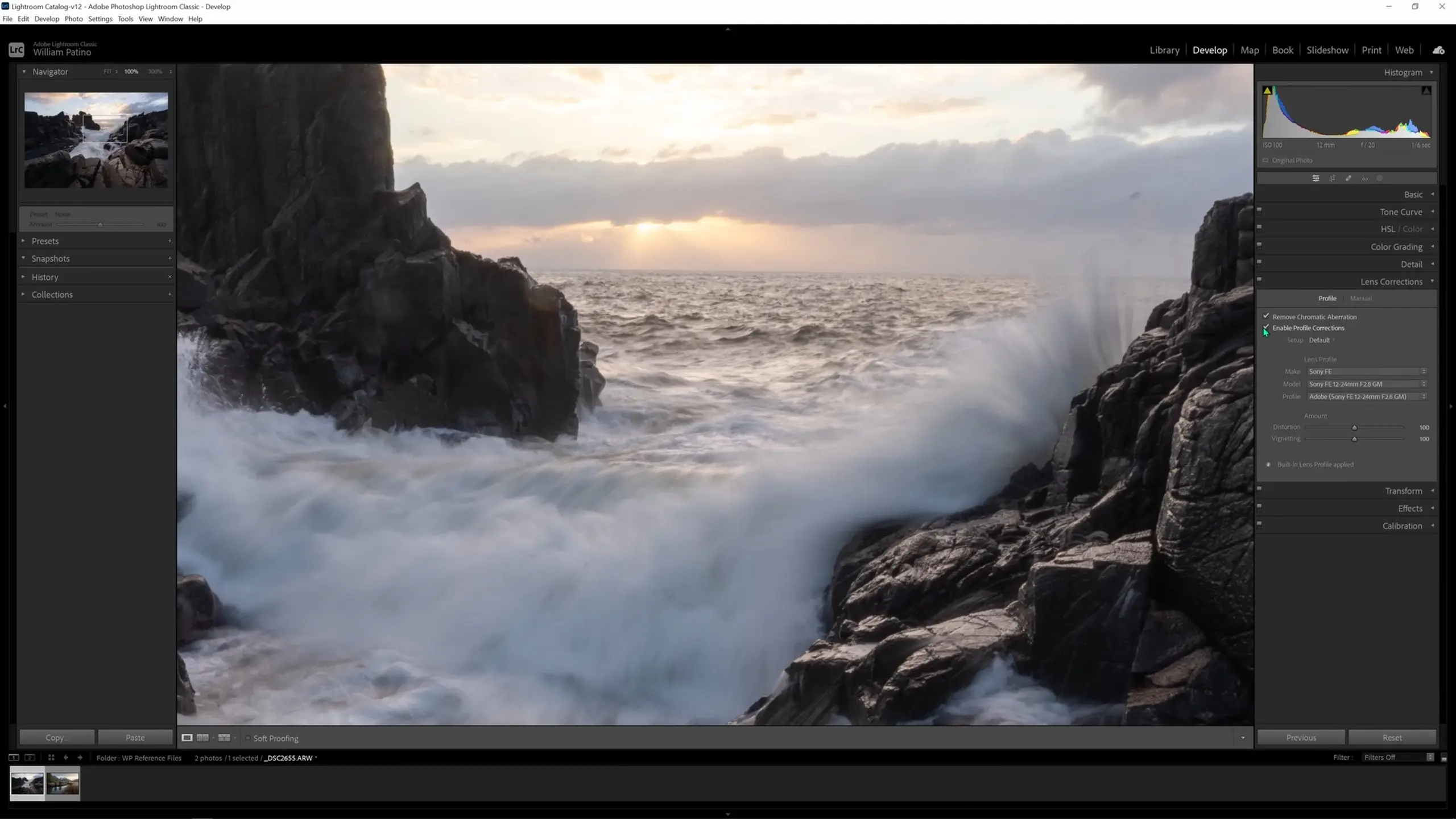
Now let’s jump into the crop tool and rotate the image slightly to straighten it out and make sure the horizon is lined up with the grid.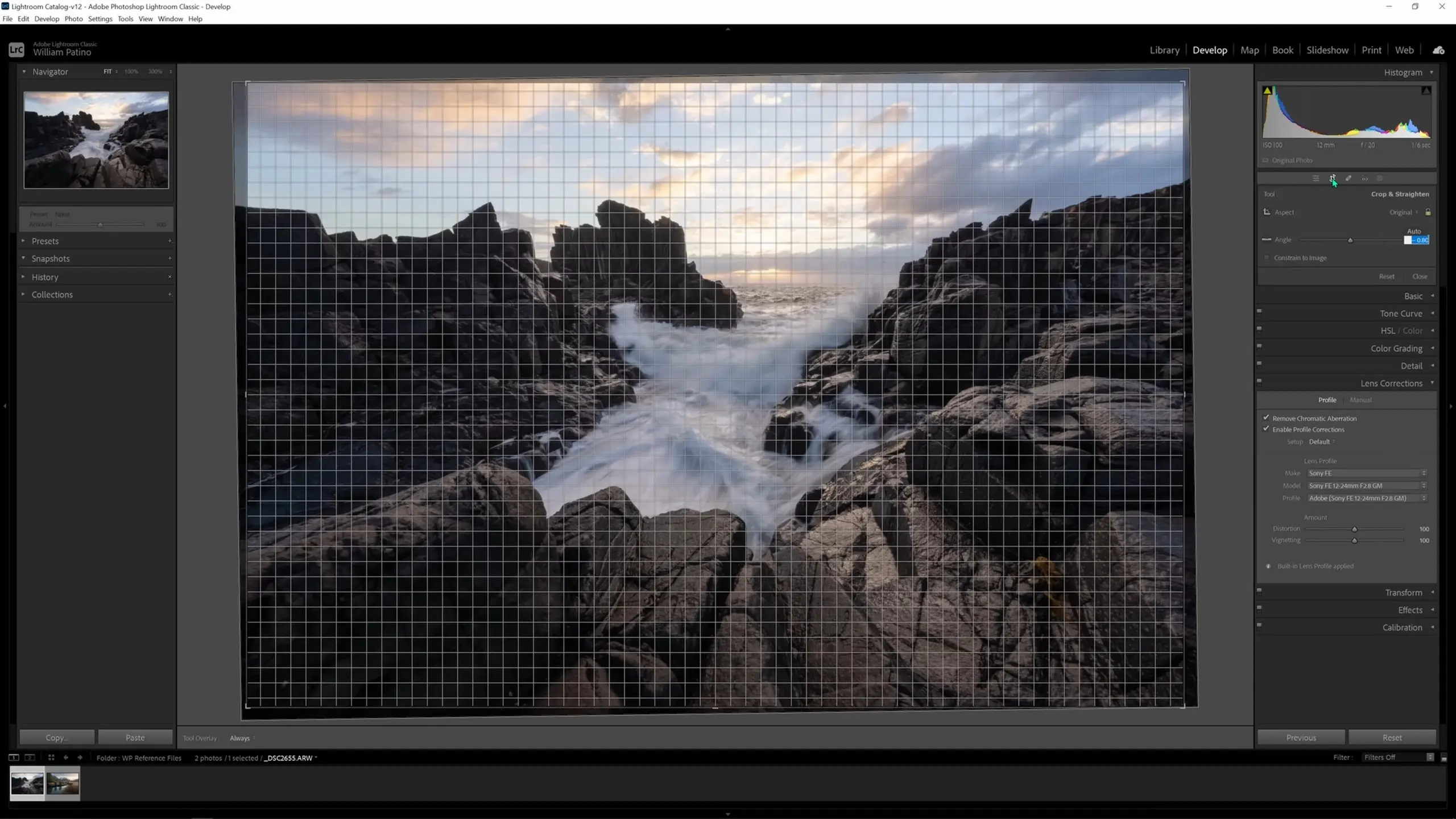
I’ll also raise the vibrance, saturation, temperature, and tint of the image globally back in the Basic tab.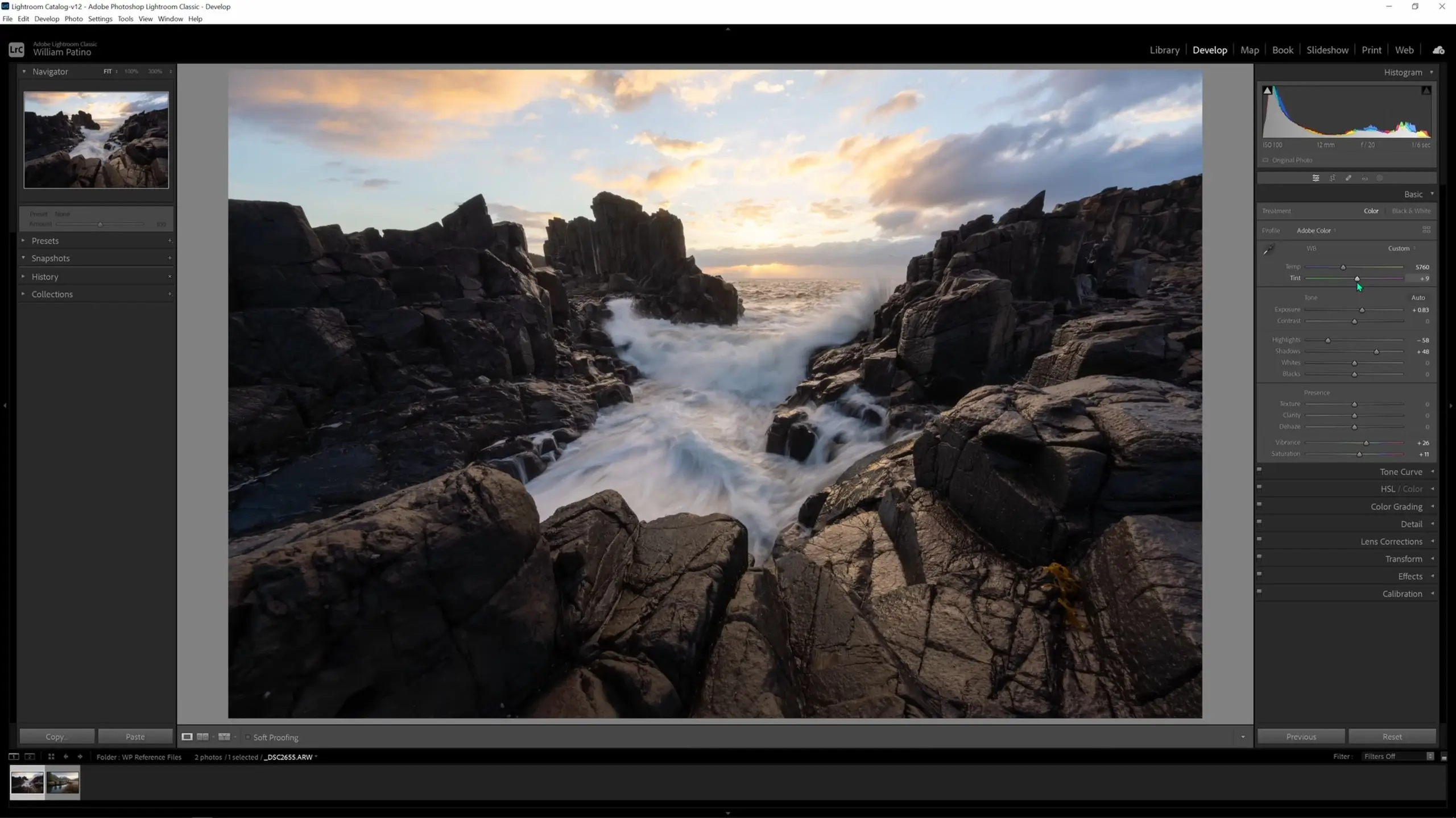
Now it’s time to start our local adjustments.
Making local adjustments
We’ll start by hitting “K” to bring up an adjustment brush. For the first adjustment, I’ll lower the exposure and use it to darken the sky at the edge of the image to lead the eye down.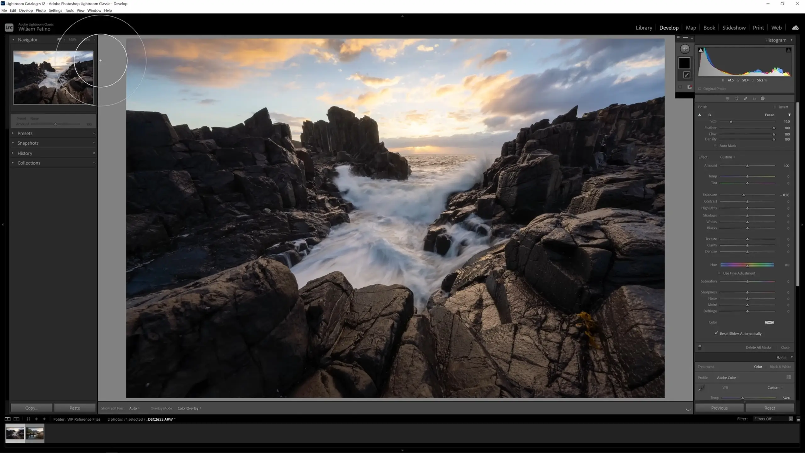
We’ll create another new adjustment brush and use this one to adjust the image so that it’s less dark as things travel off into the distance towards the horizon, since that reflects reality. I’ll bring up the shadows and blacks and bring down the dehaze slider slightly, and then I’ll use this brush to paint over the horizon area.
Let’s create our third adjustment brush and raise the temperature and the tint and then bring down the dehaze slider, and we’ll use these to accentuate the soft warm glowing light over the water at the horizon.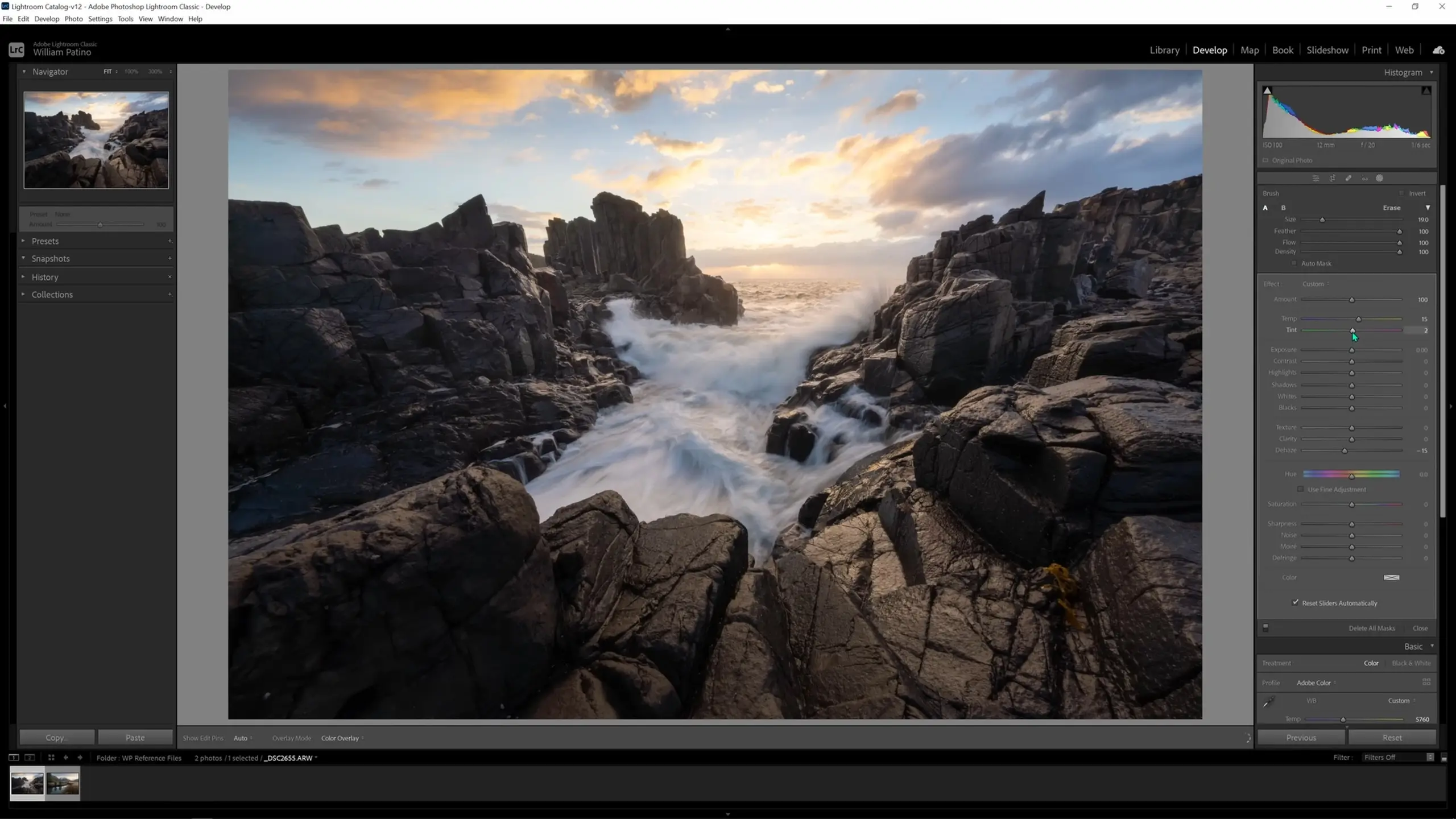
Time for another new brush, and on this one we’ll raise the whites and highlights. When we globally lowered the highlights earlier to recover details in the sky, we lost the highlights on the rocks in the foreground. We’ll use this brush to subtly bring those back.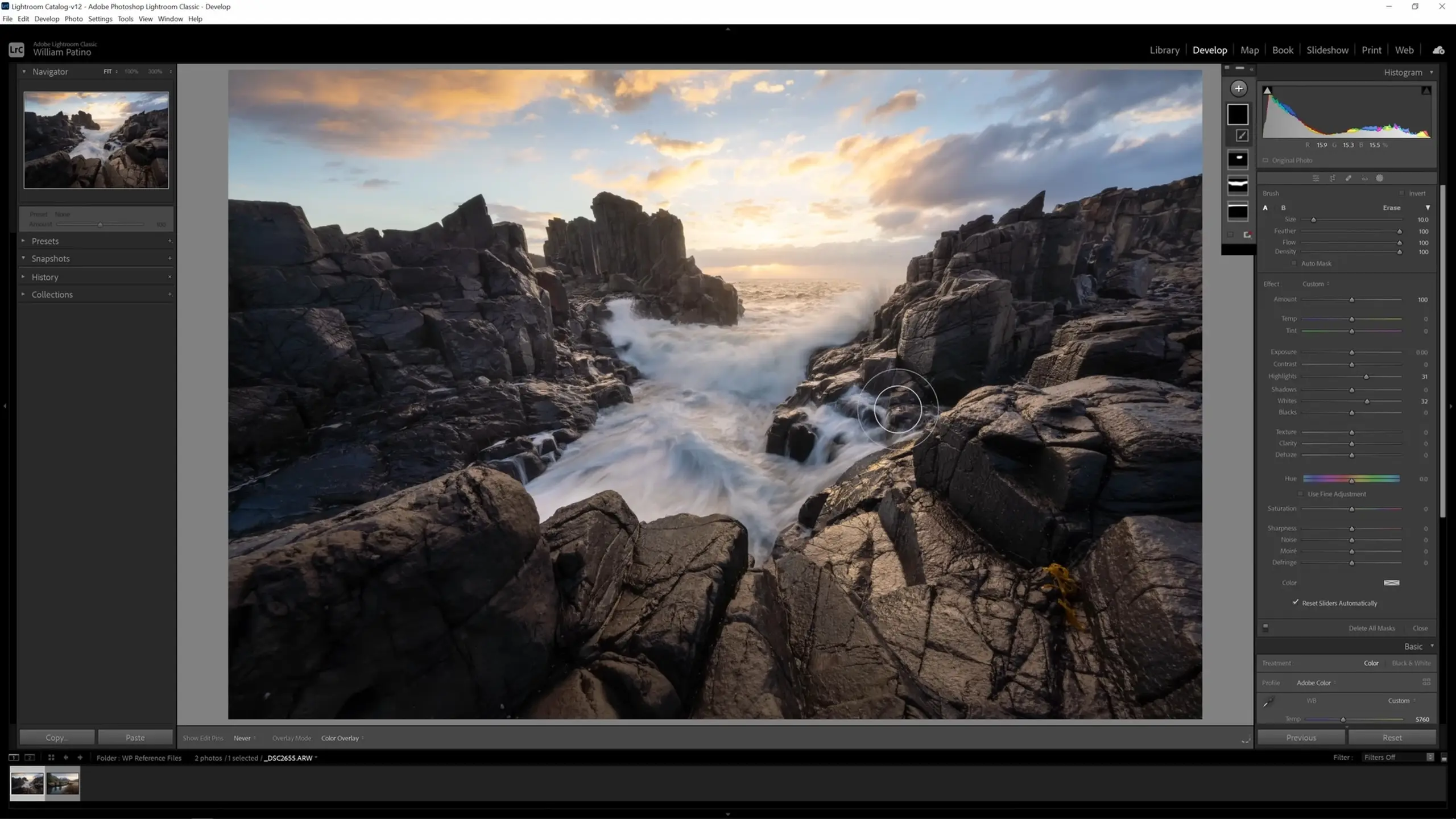
New brush, and this time I might actually do some texture. I’ll increase the texture slider and brush over the rocks that are closest to the lens in particular.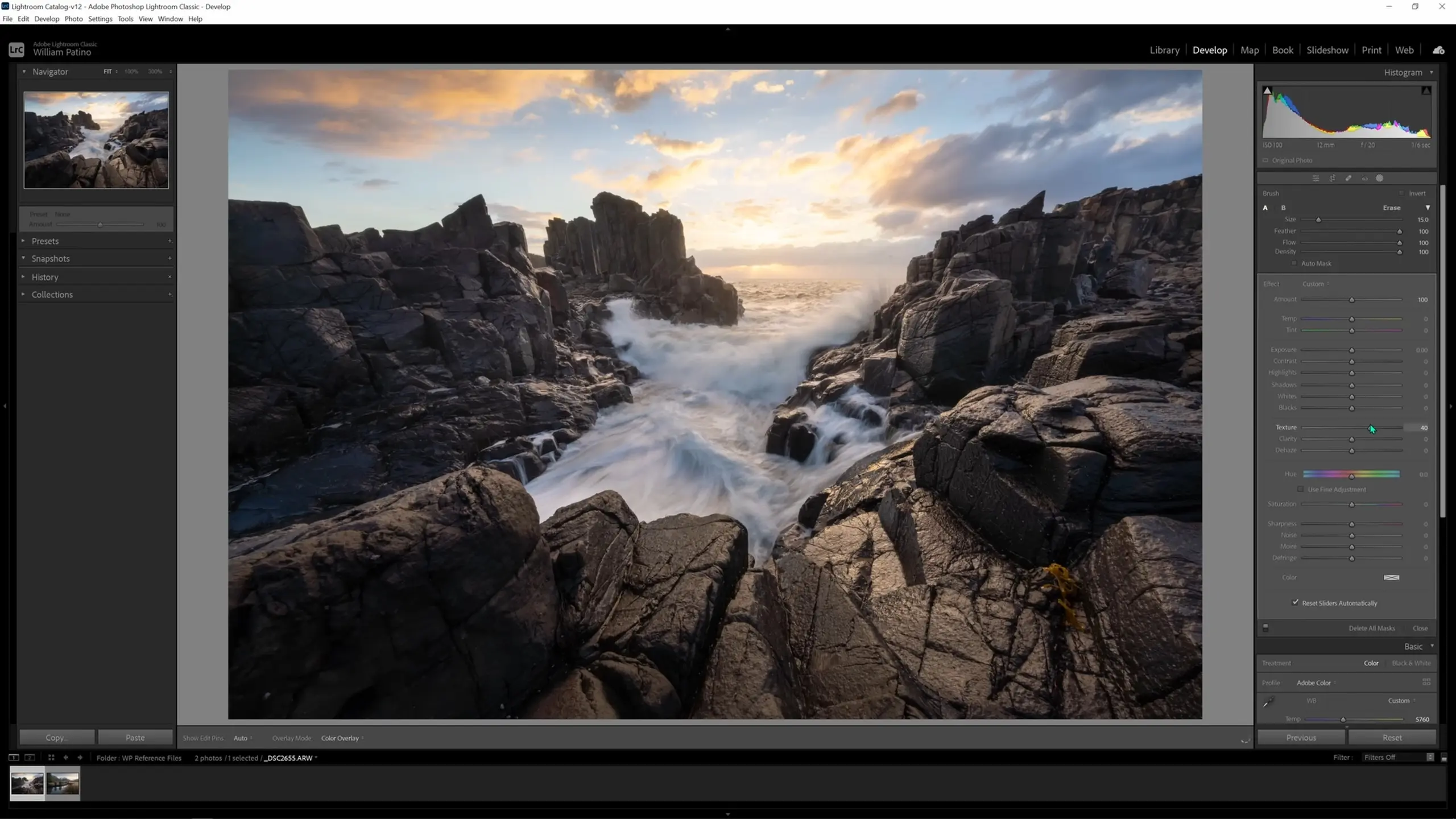
And those are all of our local adjustments! Let’s move on to color grading.
Color grading the image
As before, we will warm the highlights. Look how warm that sky looks; it’s beautiful and just very slightly enhanced.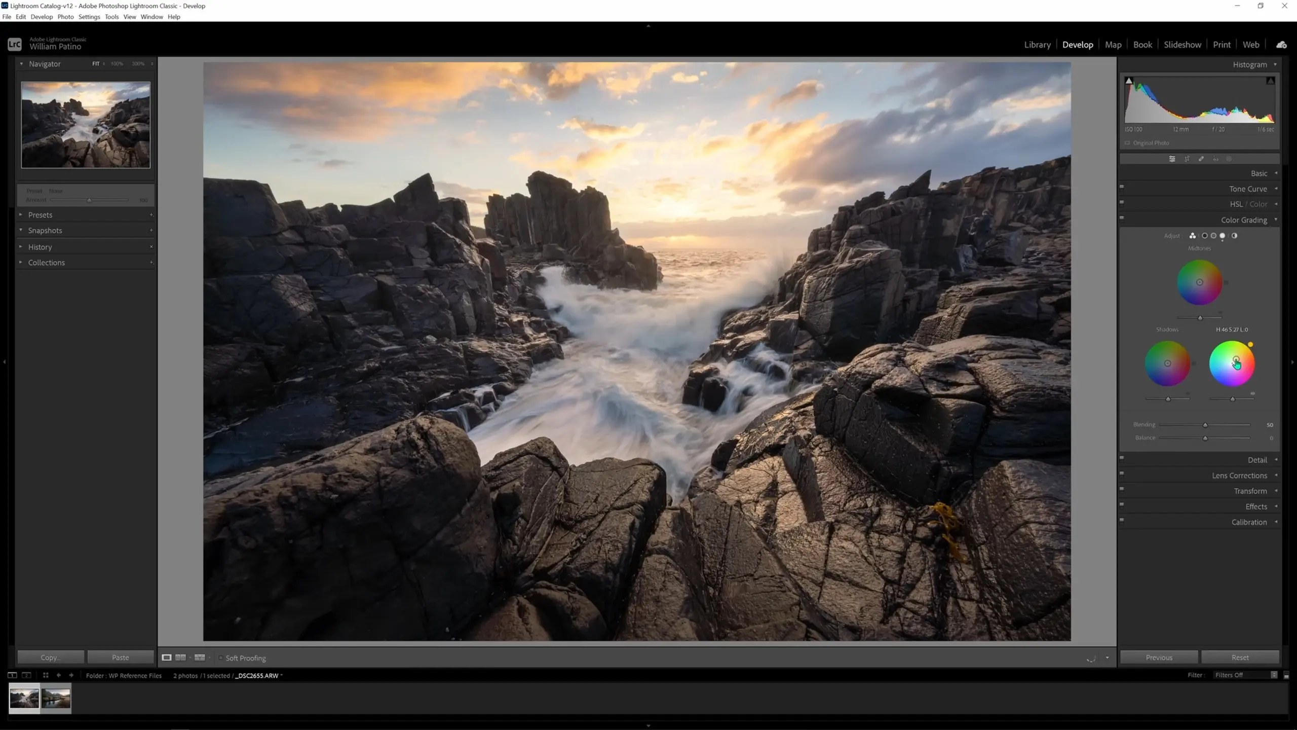
However, when the shadows are cooled like we did before, the effect is unpleasant to me. Feel free to experiment with grading the shadows, but I will personally leave them as is.
We’ll also warm the midtones a touch in order to bring out the rock tones and boost the light that the sun is throwing.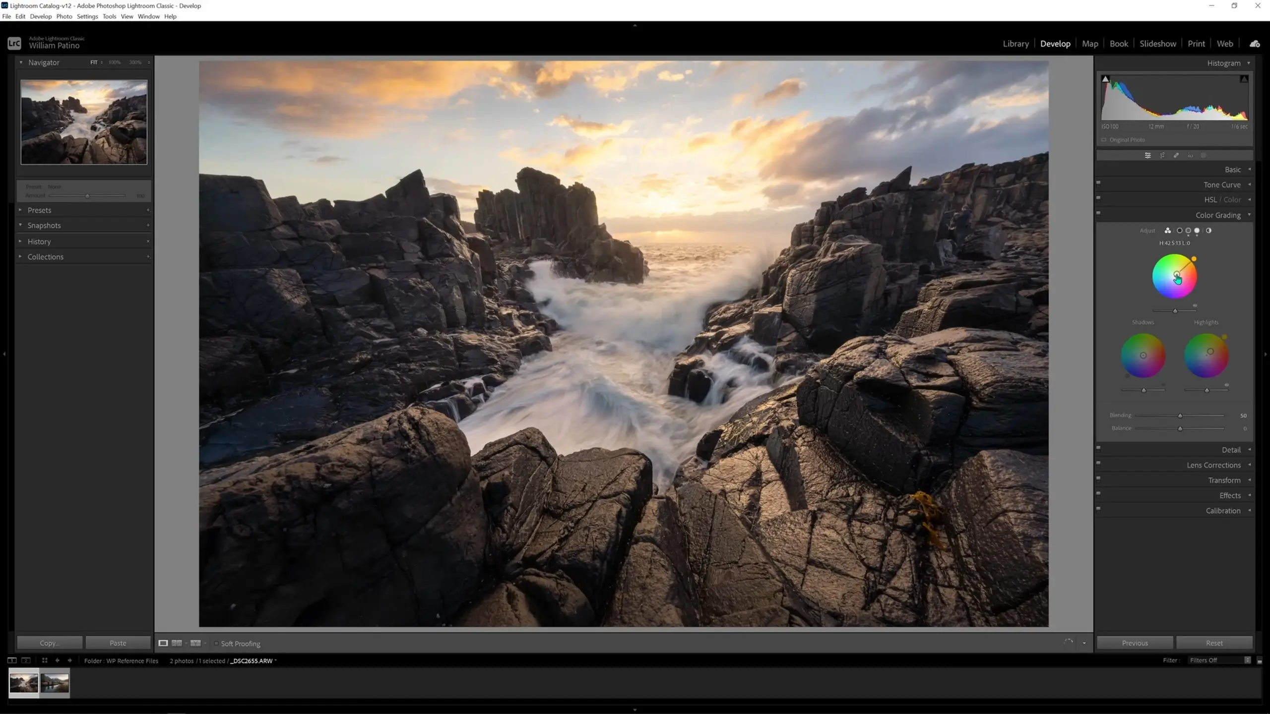
Another common adjustment is to slightly cool down water if it is present in your image. To do this, let’s hit “K” again to bring up a new brush, and we’ll turn down the temperature very slightly. We can then use this brush to cool down some of the shadows in the water in the foreground, leaving the highlights and horizon alone.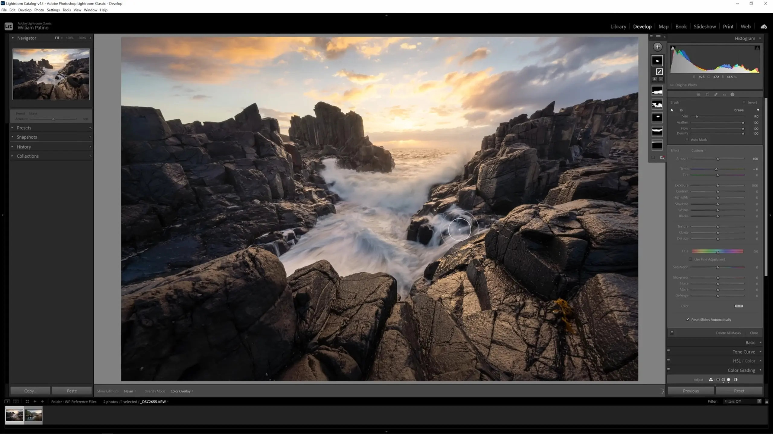
Sharpening the image
The last common adjustment I’ll mention is sharpening, which can be done from the Detail tab. I rarely do it, but it can be useful at times. However, one thing worth keeping in mind is that sharpening might look great on hard-edged surfaces like rocks, but it won’t look as good on soft surfaces like water or clouds.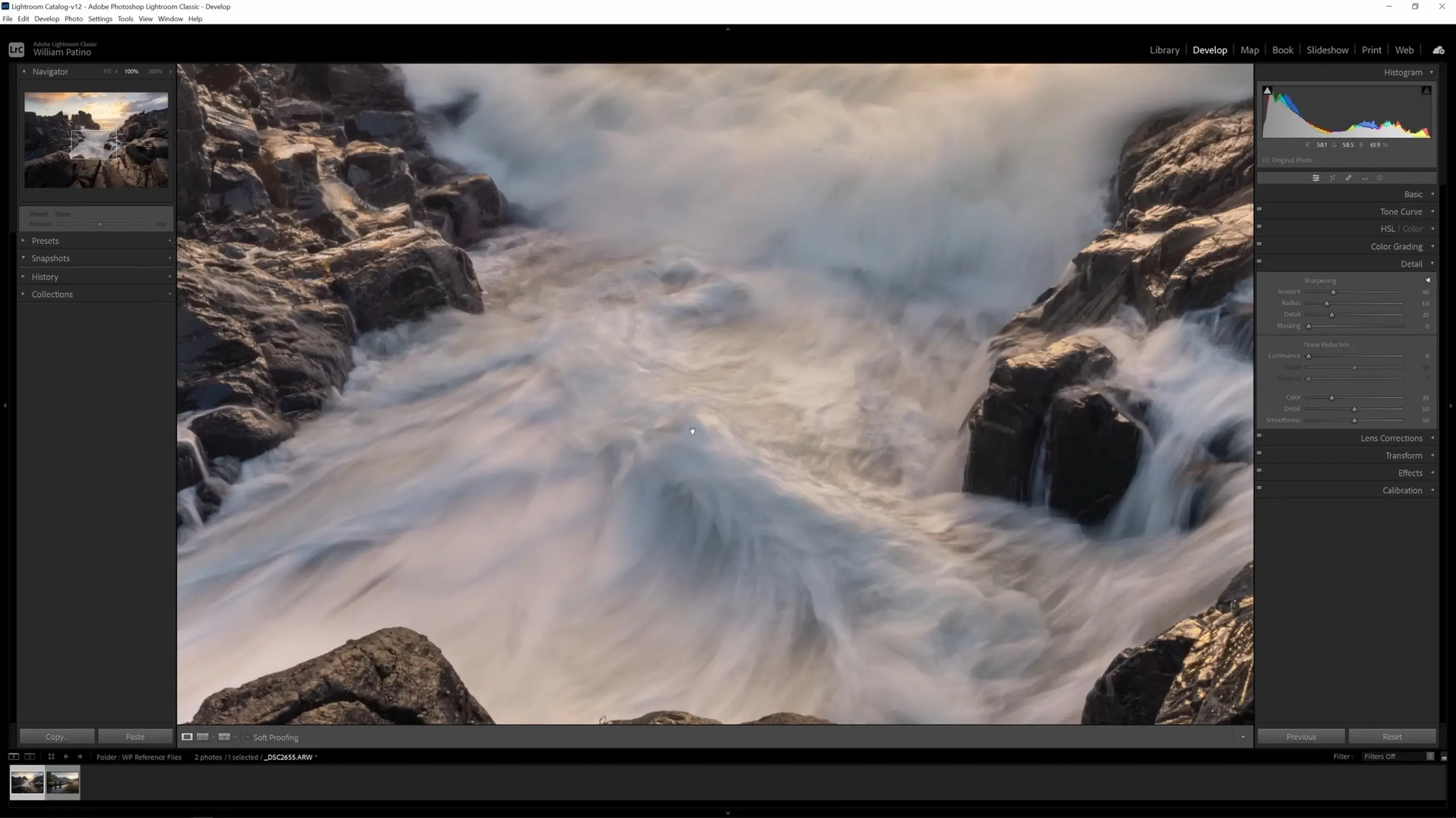
This image is soft in general because of the F-stop I’ve used when shooting this scene. I closed the F-stop down quite a lot in order to get the slower shutter speed; when you do that, the lens optically won’t be as good. That being said, sharpening is something that I was obsessed with when starting out, but as time has gone on I’ve realized the level of an image’s sharpness is overrated beyond making sure the image is in focus. It’s unlikely we’ll print the image out huge and view it from very close up, and oversharpening can introduce artifacts, so if we’re going to sharpen the image we’ll use the effect in moderation.
With a moderate sharpening effect in place, what we can do now is mask that off in certain areas using the masking slider. Typically what you’d want to do is have the sharpening on your dark tones and edges but not in something like the sky, for example. We can use the masking slider to adjust this.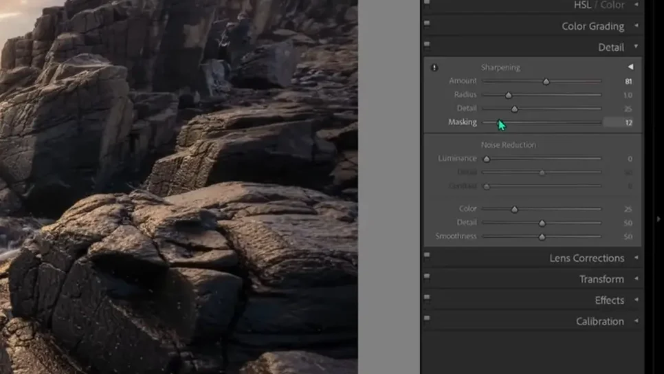
If you hold the Alt key on the keyboard while adjusting the masking slider, you will see the following view. In this view, anything white is getting the sharpening, anything black is not, and anything gray is getting the effect partially.
So I’ll adjust the masking slider to a point like this. Now the sharpening is present in most places I want it to be (like in those dark tones) but not in the soft areas (like in the sky). So keep in mind that that’s a good way to mask the sharpening off and have it apply exactly where you want.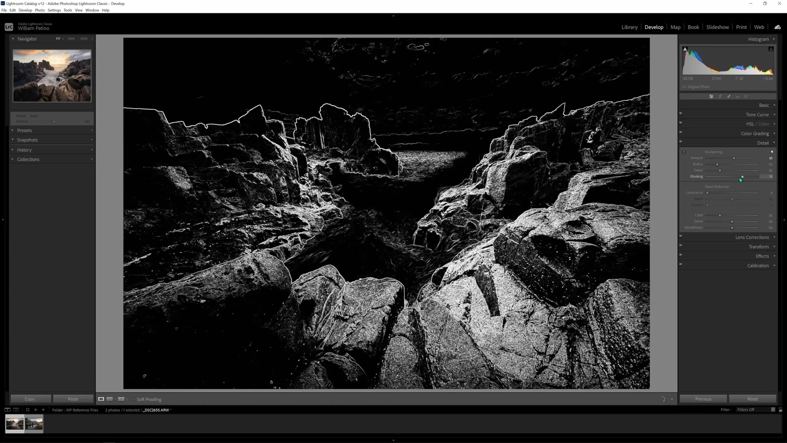
Using the option at the bottom and cycling through the available views, we can view a Before and After to see what the changes we’ve made are doing. The change in the level of detail we’ve revealed is quite dramatic, as you can see below.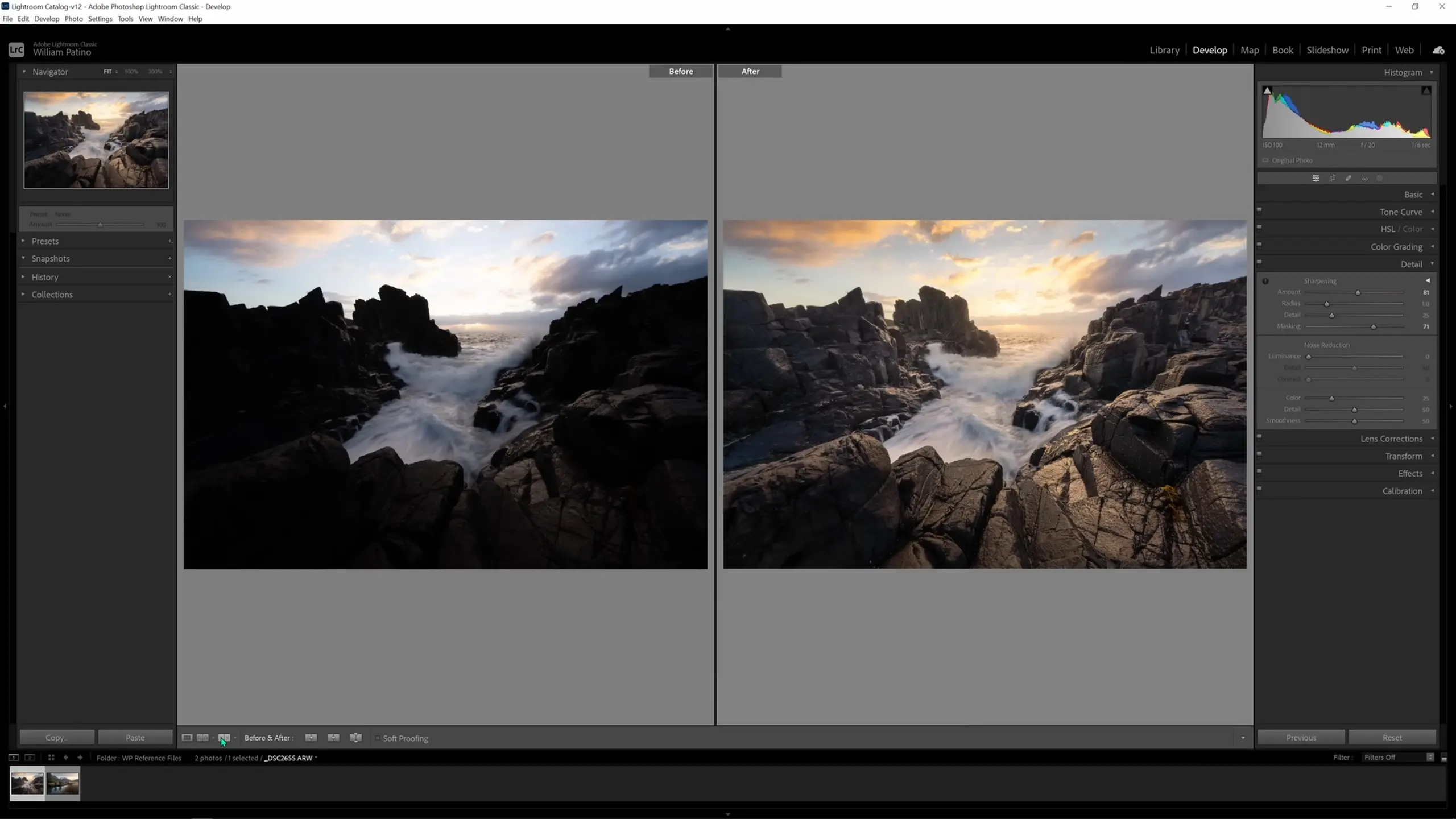
Exporting the image
The last thing I’ll show you on this image is how to export it from Lightroom so you can share it online and elsewhere. This is important because none of our edits have actually changed the original raw files; they have essentially just created a log of changes to overlay on our image within Lightroom, and that changelog has been stored in memory. To export the edited version of our image, first navigate to the Library tab in the top-right corner next to Develop.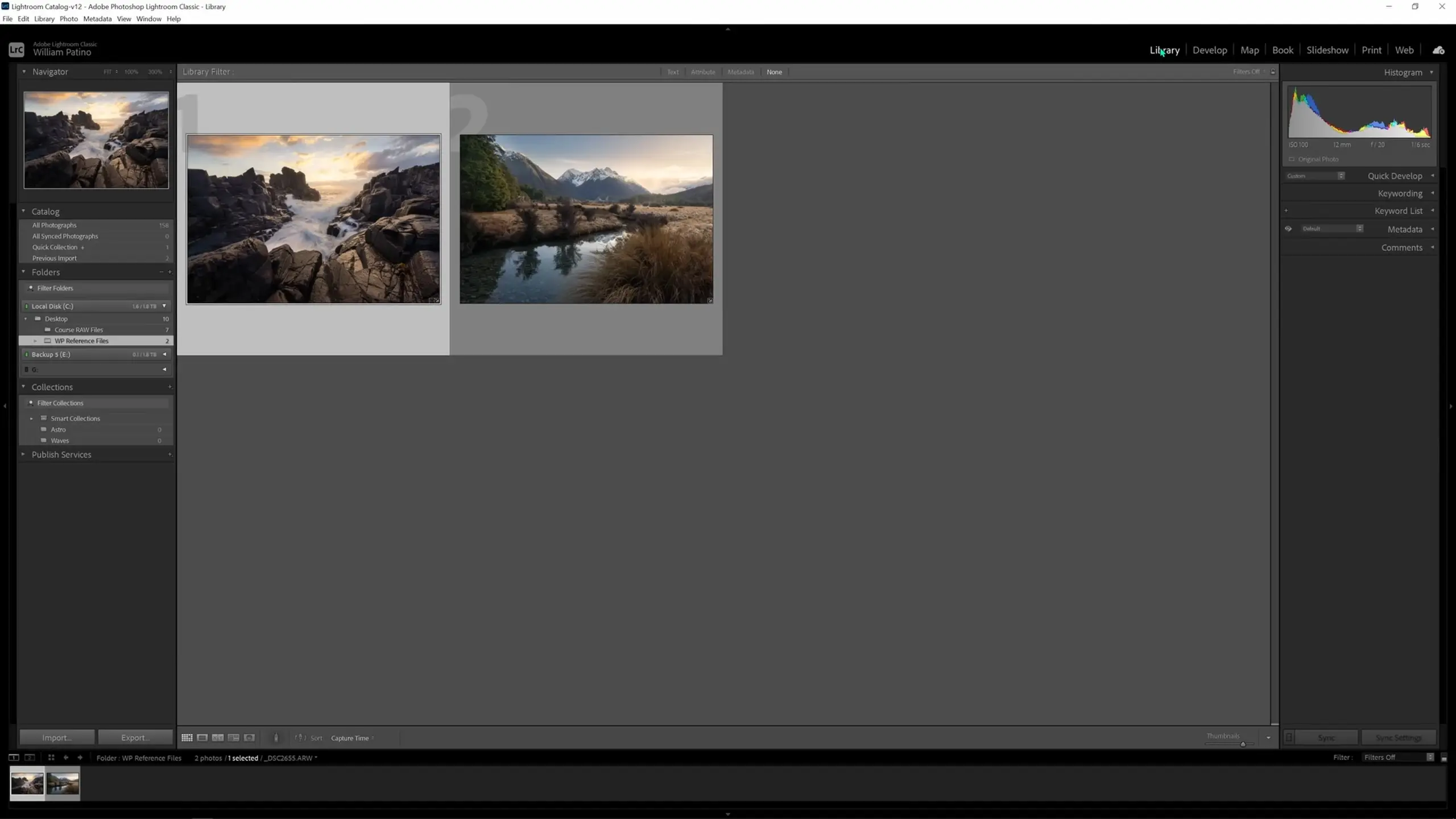
Then in the bottom left-hand corner, select the Export button.
At this point, there are two things I would like to do. The first is to add the images to my portfolio. I would not do this until I have let the edited images sit and I have looked at them multiple times over the course of a week or longer. What we’ve done today is probably 90% complete, but some of the finer details may take longer to be tweaked and cleaned up.
Once you’ve done that and are happy with it, you may want to save the image to be a high-res, uncompressed file (with all of the edits applied) that you’re able to access in years to come. If you’re just a Lightroom user and don’t use Photoshop at all, you can save this as a TIFF file. To do this, in the Export settings window, navigate to File Settings > Image Format > TIFF.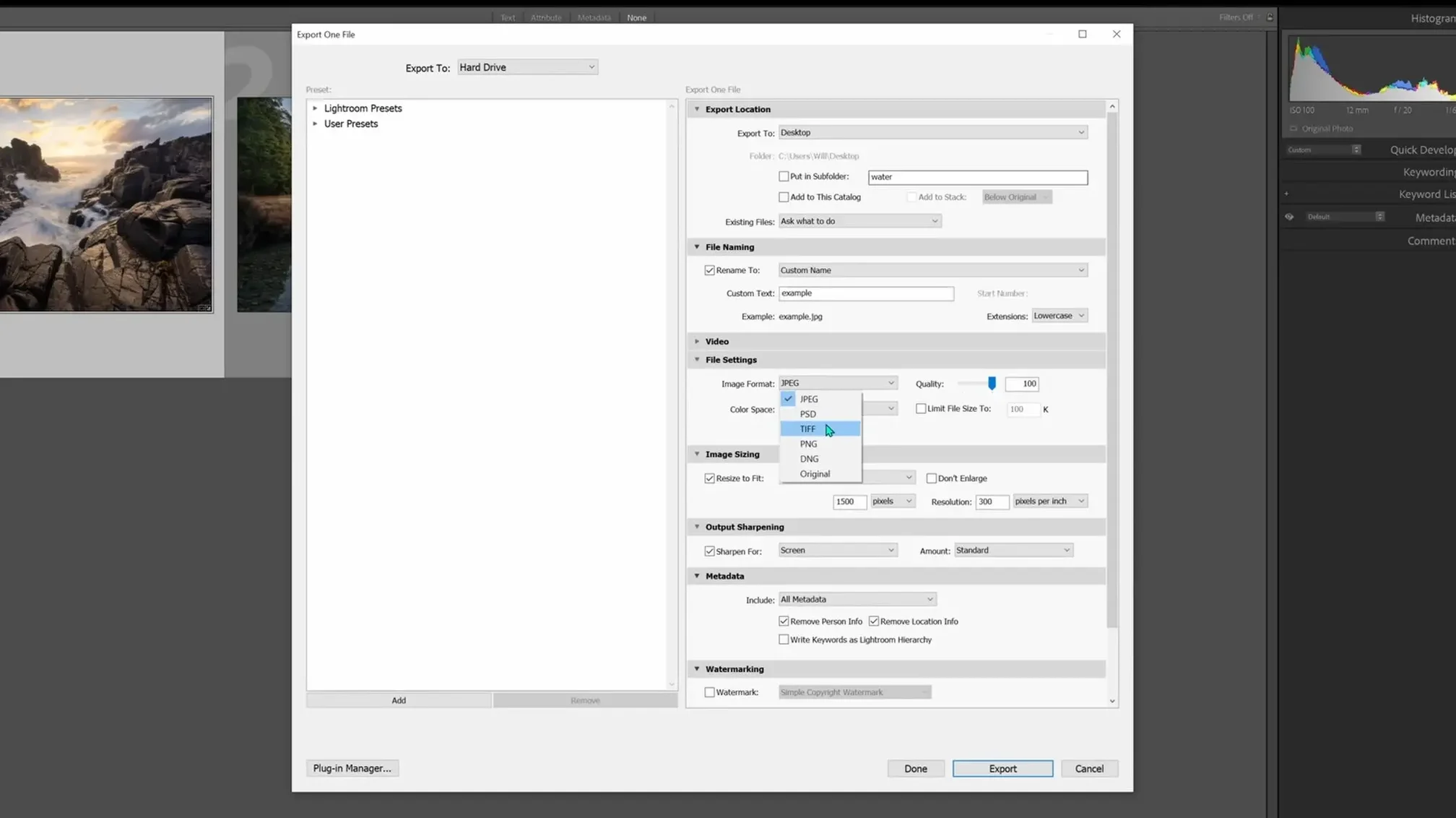
I often leave the Bit Depth at 16 bits/component, and I often leave the Color Space as either Adobe RGB or sometimes Display P3, which is just another color profile that’s common on Macs and most operating systems. I will also deselect the Resize to Fit option and make sure I enter a descriptive name under the File Naming options. Set the Export Location and then hit Export to complete the process.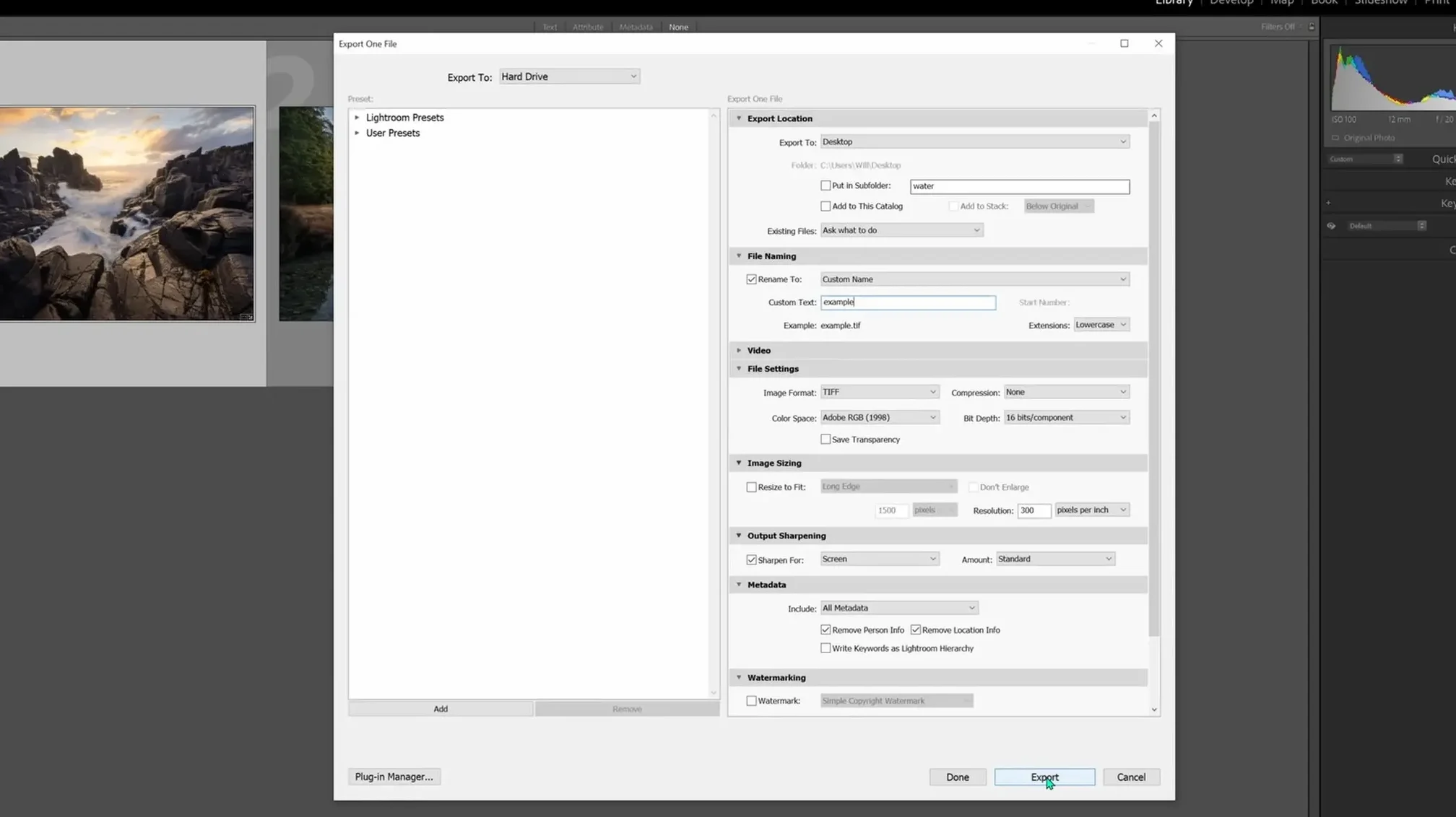
For an image which can be shared online, set the Image Format instead to JPEG. Also, enable the Resize to Fit option; I usually set the Longest Edge to be resized to 1500 pixels. That will bring the size of the image down so that it still looks good online but isn’t big enough that people can save and print it and use it without your permission. From there, hit Export to complete the process.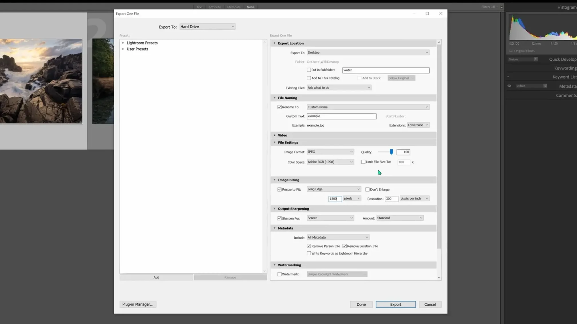
And that’s it! Hopefully this gave you a good beginner-level overview of how to use Lightroom to accomplish the most essential image editing and formatting functions. If you learned something about Lightroom here and would like to see more Lightroom, Photoshop, and photography tutorials, you can find more on my YouTube channel, so please subscribe and share with your friends.