Why Your Composites Look Fake (And the Blending Workflow That Fixes It)

Why Your Composites Look Fake (And the Blending Workflow That Fixes It)

A few years into my agency career, I handed a composite to a creative director and he looked at it for about four seconds before saying, “The light is lying.” He didn’t say the mask was bad. He didn’t say the colors were off. He went straight to light, because that’s what the brain reads first when it decides whether an image feels real or fake. That one comment probably saved me years of chasing the wrong problems.


Why Your Raw Files Are Doing Half the Work Before You Even Open Photoshop

Why Your Raw Files Are Doing Half the Work Before You Even Open Photoshop

I used to open Camera Raw, drag the exposure slider until the image looked “about right,” hit Open, and get straight to Photoshop. That was my workflow for years at the agency. Fast, functional, and wrong in ways I didn’t fully understand until I started teaching. The moment I slowed down and actually explained raw processing step by step to a student, I realized how much I’d been leaving on the table.

Why Your Edits Fall Apart After Raw: The Camera Raw Workflow That Actually Holds Up

Why Your Edits Fall Apart After Raw: The Camera Raw Workflow That Actually Holds Up

Every few months I get a message from someone who’s confused about why their finished edit looks muddy or oversaturated, even though their individual adjustments looked fine at each step. Nine times out of ten, the problem isn’t in Photoshop. It’s in what happened, or didn’t happen, before the file ever got there. Raw editing is where photographs are either protected or permanently compromised. Most people treat it like a quick stop on the way to the real work.

Why Your Background Removals Look Fake (And the Exact Workflow to Fix That)

Why Your Background Removals Look Fake (And the Exact Workflow to Fix That)

Every week I get the same message from students: “My cutout looks fine on a white background, but the moment I drop it onto something else, it looks pasted on.” They’re not wrong. It does look pasted on. And the reason is almost never the selection itself — it’s everything that happens after the selection. Background removal sounds like one task. It’s actually three: isolating the subject, cleaning the mask edge, and matching the subject to its new environment.

Why Your Skin Retouching Looks Fake (And the Frequency Separation Workflow That Fixes It)

Why Your Skin Retouching Looks Fake (And the Frequency Separation Workflow That Fixes It)

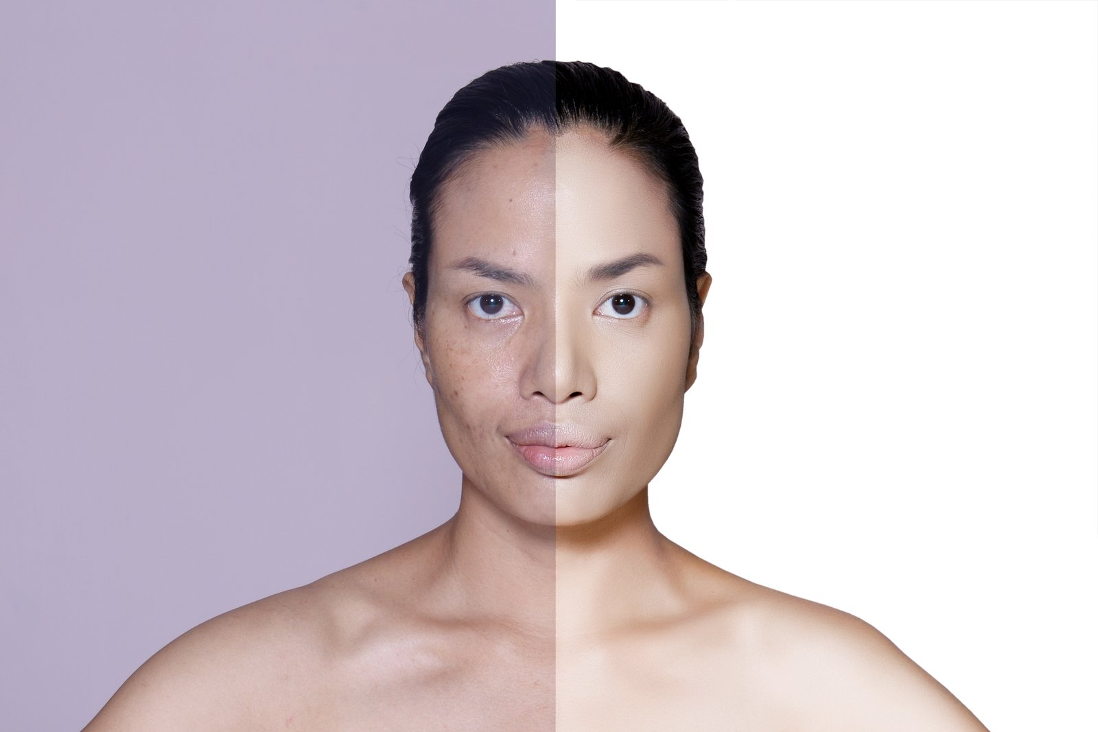
I once handed a retouched headshot to an art director and she looked at it for about three seconds before saying, “He looks like he’s made of wax.” She wasn’t wrong. I had spent two hours with the Healing Brush going over every pore, every shadow, every hint of texture, until the skin was perfectly smooth. Perfectly fake. That was early in my agency days, and it was the moment I realized I had been solving the wrong problem.

Frequency Separation: The Retouching Technique That Changed How I Edit Skin Forever

Frequency Separation: The Retouching Technique That Changed How I Edit Skin Forever

I once sent a retouched portrait to a client and got back a two-word reply: “Looks plastic.” She was right. I had smoothed the skin so aggressively that her face looked like it had been rendered in a video game. I had wiped out every pore, every texture, every trace of what makes skin look like skin. The tones were clean. The person was gone. That was the moment I got serious about frequency separation.

Why Your Photos Look Worse After Editing (And How Raw Files Fix That)

Why Your Photos Look Worse After Editing (And How Raw Files Fix That)

Every few months I get a message from someone who says their edited photos look “plasticky” or “over-processed,” and when I ask to see the file, it’s always the same story. They shot JPEG, pushed the exposure two stops, cranked the saturation, and then wondered why their highlights blew out into flat white puddles and their skin tones turned the color of a traffic cone. This is not a skill problem.

Dodge and Burn in Photoshop: The Manual Light Shaping Technique That Changes How You See Photos

Dodge and Burn in Photoshop: The Manual Light Shaping Technique That Changes How You See Photos

A student once told me that curves was a better sculpting tool than dodge and burn. I disagreed. He disagreed back. We went three tutorial videos deep before either of us budged an inch, and honestly, I still think about that argument every time I open a portrait file. Here’s where I landed: curves is a correction tool. Dodge and burn is a painting tool. And once you understand that difference, you stop treating them as rivals and start using each one for what it was actually built to do.

How to Build a Dimensional Chrome Text Effect in Photoshop Without Using a Single Filter

How to Build a Dimensional Chrome Text Effect in Photoshop Without Using a Single Filter

A client once handed me a logo file and said, “Make it look expensive.” No brief. No reference image. Just that. I was three years into agency work, sitting in front of a 27-inch monitor with a deadline in four hours, and I had to make plain black text look like it had weight, depth, and money behind it. That job is where I figured out that chrome text effects aren’t about applying a metallic gradient and calling it done.

Dodge and Burn in Photoshop: The Technique That Makes or Breaks Your Retouching

Dodge and Burn in Photoshop: The Technique That Makes or Breaks Your Retouching

A few years back, a student in one of my live workshops sent me a portrait retouch that was technically flawless. Smooth skin, clean background, sharp eyes. And it looked completely dead. Flat. Like a wax figure. She had fixed every “problem” but removed all the dimension in the process. The light that made the photo interesting in the first place was gone. That’s the trap most people fall into when they retouch.

Layer Masks Explained: The One Skill That Separates Good Photoshop Work From Great

Layer Masks Explained: The One Skill That Separates Good Photoshop Work From Great

I once handed a client a revised composite only to hear, “Can we go back to what it looked like before you erased that part?” The problem was that I had, in fact, erased it. Gone. Pixels deleted with the Eraser tool like it was 2003. I spent 45 minutes reconstructing work that would have taken ten seconds to undo if I’d just used a layer mask. That was early in my agency days, and I never made that mistake again.

Stop Fighting Your Selections: The Photoshop Selection Tools That Actually Match the Job

Stop Fighting Your Selections: The Photoshop Selection Tools That Actually Match the Job

Every hour I wasted fighting a bad selection is an hour I’d like to have back. Early in my agency days, I was cutting out product shots for a catalog client. Forty images, tight deadline, and I was using the Magnetic Lasso on everything because it felt fast. Smooth-edged bottles? Fine. A wicker basket? An absolute disaster. I spent more time fixing fringe and jagged edges than I would have if I’d just started with the right tool.