Retouching
Frequency Separation in Photoshop: Retouch Skin Without Destroying Texture
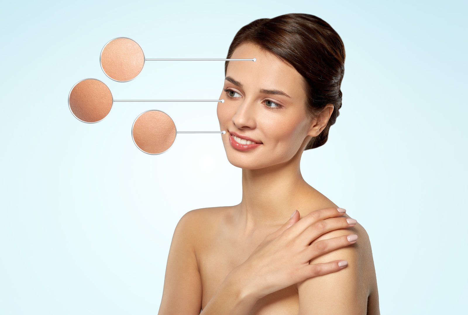
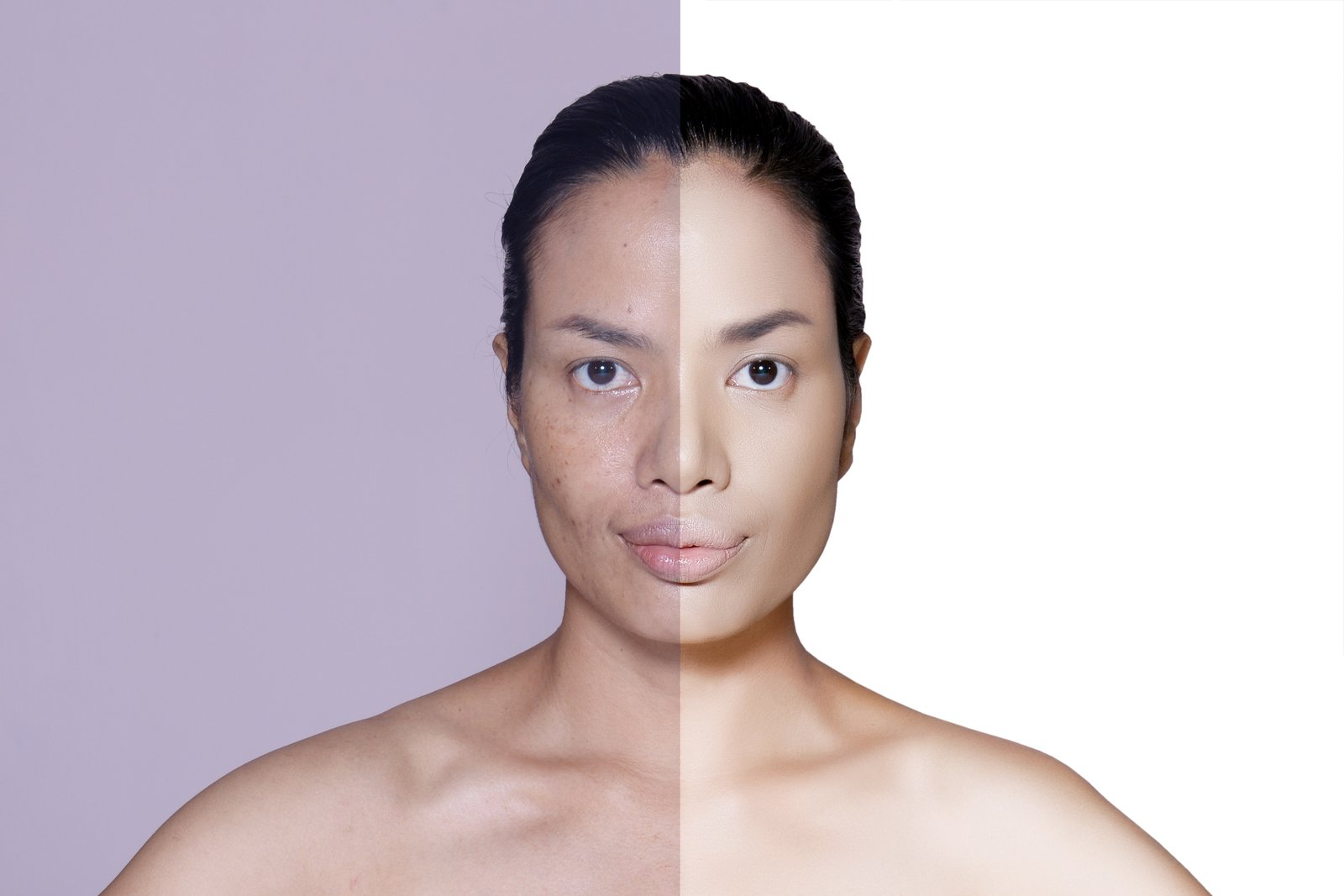
I once handed a retouched portrait to a creative director and watched her zoom straight in to 200%. She didn’t say a word. She just pointed at the cheek, where the skin looked like it had been wrapped in wax paper. I had blurred the blemishes away, and in doing so, I had blurred everything else with them. The pores, the fine texture, the thing that made the skin look like skin — gone.