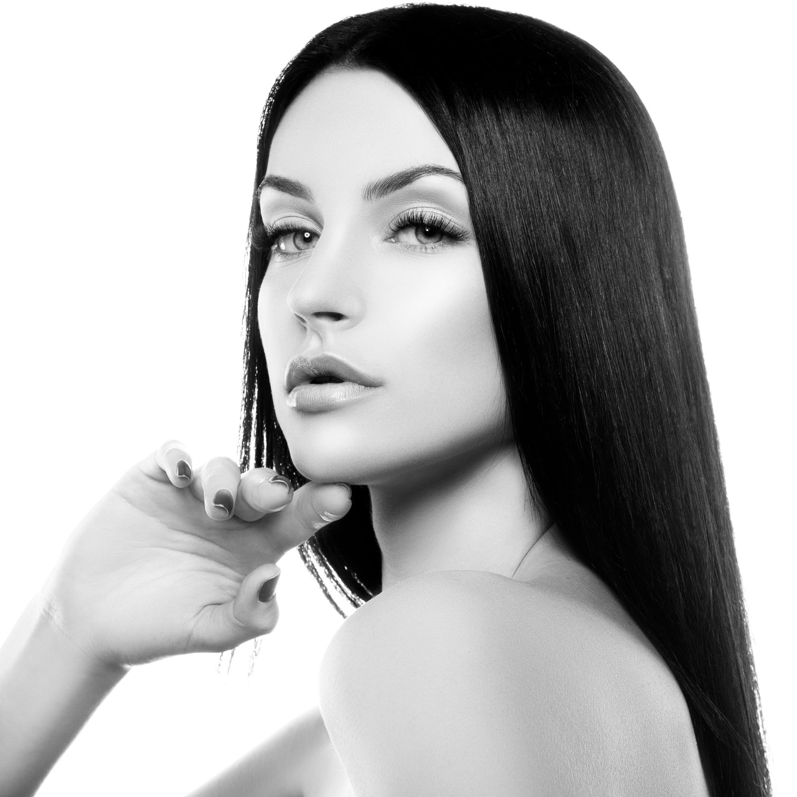
A student once told me curves was a better tool than dodge and burn. I told him he was wrong. He told me I was wrong. We went back and forth long enough that I ended up making three separate tutorial videos just to settle the argument. Spoiler: we both had a point, but I still think dodge and burn wins when you’re working on texture, dimension, and light at the pixel level. Curves is a macro tool. Dodge and burn is a scalpel.
If your retouching looks flat, or your composites never quite feel like the subject belongs in the scene, this is almost certainly where the problem lives.
What Dodge and Burn Actually Does to Your Pixels
Dodge lightens. Burn darkens. That’s the simple version. But what’s actually happening is that you’re locally adjusting the luminosity of your image, which means you’re sculpting how light appears to fall across a surface.
Your eye reads dimension through contrast. A highlight next to a shadow reads as a raised edge. When you paint that relationship deliberately, you’re not just cleaning up an image. You’re directing the viewer’s eye and reinforcing the three-dimensional structure that the camera may have flattened. That’s why dodge and burn shows up in high-end beauty retouching, in matte painting, in product photography. It works because it’s mimicking the thing light does in the physical world.
The built-in Dodge and Burn tools in Photoshop work directly on pixels, which is the first problem. The moment you paint on your actual image layer, you’ve made a destructive edit. One wrong stroke and you’re either hitting undo repeatedly or starting over. Nobody has time for that.
The Non-Destructive Setup That Actually Works
Here’s the workflow I use on every single retouch. It takes about 20 seconds to set up and saves you from a lot of regret.
Create a new layer above your image. Fill it with 50% gray. To do this fast, go to Edit, Fill, and choose 50% Gray from the contents dropdown. Then set that layer’s blend mode to Soft Light. At 50% gray, Soft Light is perfectly neutral. It adds nothing to the image. But the moment you paint white or light gray on that layer, it lightens. Paint black or dark gray, it darkens. Your original image stays completely untouched.
Now grab a soft round brush. Set your foreground color to white, opacity to 10%, and flow to 10%. Start painting the areas you want to lighten. Switch to black for the areas you want to darken. Build it up slowly with multiple low-opacity strokes. That 10% opacity is not a suggestion. Go higher and you’ll blow past the effect you want before you even realize it.
For skin retouching specifically, I stay in the Range of 10 to 15% opacity the entire time. For composite work where I’m matching lighting between a subject and a background, I’ll sometimes go up to 20%, but that’s the ceiling.
Reading the Light Before You Touch the Brush
This is the step most people skip, and it’s why their dodge and burn looks fake.
Before you paint a single stroke, look at your image and identify the primary light source. Where is the light coming from? What angle? What color? The highlights you dodge should follow that logic. The shadows you burn should fall on the opposite side of any raised surface, consistently.
A quick trick I use: desaturate a duplicate of your image, drop the saturation to zero with a Hue/Saturation adjustment layer clipped to that duplicate, and use it as a reference while you work. Removing the color lets you see the luminosity structure clearly. You’ll spot areas that should be lighter or darker that you’d never notice in full color. When you’re done referencing, just delete that layer.
On portraits, the places that almost always need a burn pass are the sides of the nose, the area just beneath the lower lip, and the transition from forehead to hairline. The places that almost always need a dodge pass are the top of the nose bridge, the cheekbones, the cupid’s bow, and the center of the forehead. These aren’t rules. They’re starting observations based on where light naturally falls on a face.
Where I Went Wrong Before I Learned to Work Slowly
I still use a Wacom Intuus that is almost ten years old. The pen feel is just right, and I’ve never found a reason to replace it. But early in my retouching days, the tablet actually worked against me. The pressure sensitivity made it too easy to paint a heavy stroke without meaning to. I’d be working on a commercial beauty shot, feel like I was being subtle, and then zoom out to find one cheek looked like it was lit by a spotlight and the other was in shadow.
The fix wasn’t better hardware. It was slowing down and working at 200% zoom on the area I was editing, then zooming out to 50% to evaluate the overall effect. I still do this. Zoom in to work. Zoom out to judge. Never trust what something looks like at 100% when you’re making local luminosity changes.
The One Situation Where You Should Use Two Gray Layers
If you’re doing high-end retouching where you need to separate your dodging and burning visually, make two 50% gray Soft Light layers. Label one Dodge and one Burn. Paint only white tones on the Dodge layer and only dark tones on the Burn layer. This lets you reduce the opacity of each pass independently. If your highlights are too hot, drop the Dodge layer opacity to 80%. If the shadows are too heavy, pull the Burn layer back. You now have independent control over each direction without merging everything into one layer you can’t separate later.
Most working retouchers I know use this two-layer approach on any job where a client is likely to ask for revisions. And clients always ask for revisions.
The single most important thing to understand about dodge and burn is that it is a tool for describing light, not removing flaws. When you approach it that way, everything you paint starts to look intentional rather than corrected.
Comments
Leave a Comment