The Problem With Most Metal Text Tutorials
I’ve seen thousands of Photoshop text effects over the years, and most of the “molten metal” ones fall apart in the same way. The glow is too clean. The edges are too sharp. The whole thing looks like a stock icon from 2009 rather than something that actually radiates heat. I used to make that same mistake when I was working at agencies, rushing through type treatments for campaign mockups. The client wants drama, and the temptation is to stack up outer glows and call it done.
The actual problem isn’t effort. It’s that people are treating text as a flat object. Metal that’s molten has depth, imperfection, and a light source that behaves differently across the surface. Once you understand what you’re actually simulating, the settings start to make sense instead of feeling like guesswork.
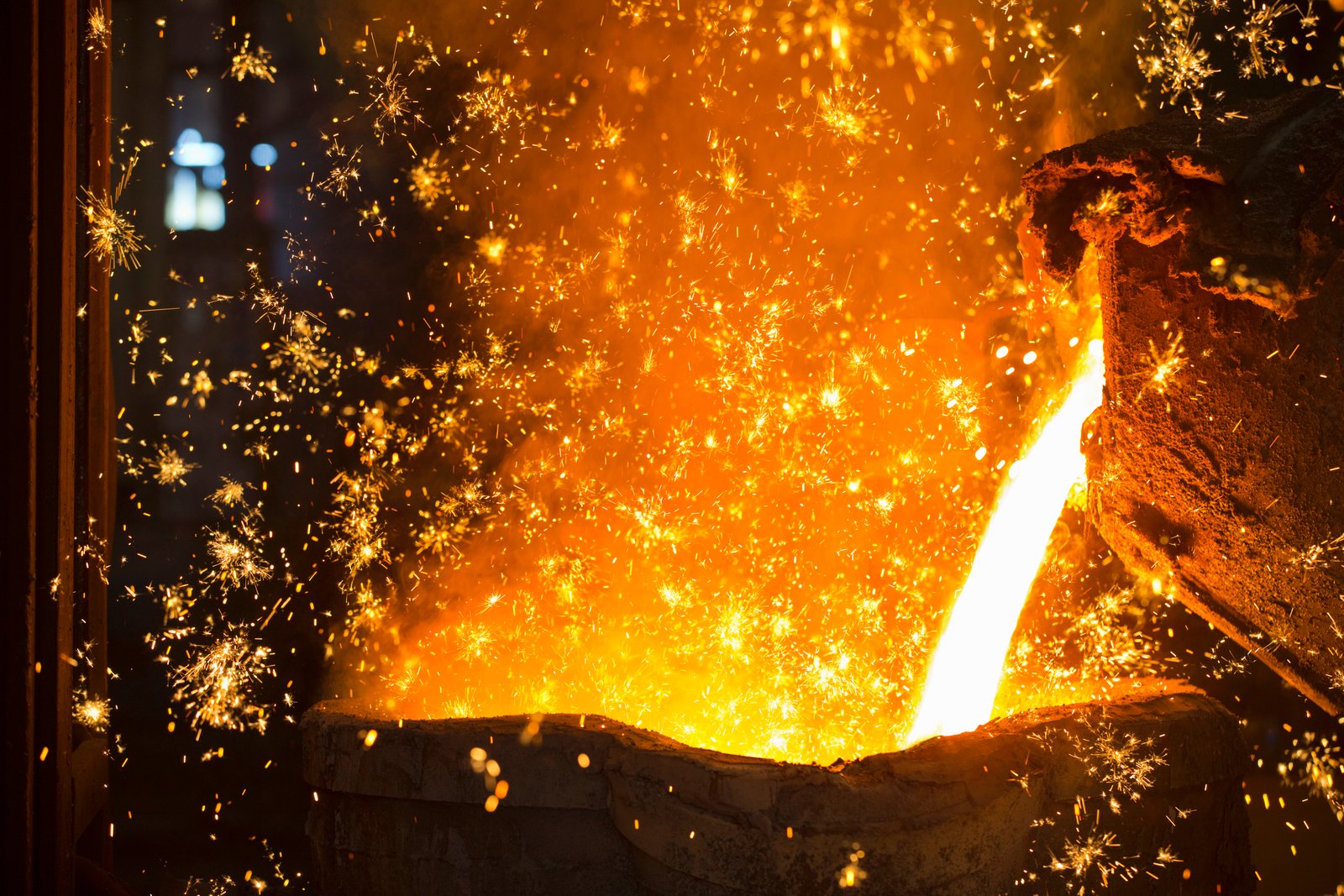
What’s Actually Happening With Light on Liquid Metal
Molten metal doesn’t glow uniformly. The hottest points, usually the interior of cracks or pooling areas, are closer to white or light yellow. The cooling edges shift toward deep orange, then red, then near-black. This is called blackbody radiation, and it’s the same physics that makes a heating element on a stove change color as it warms up.
In Photoshop terms, that means you’re not building one glow. You’re building a temperature gradient, and it needs to read from the inside out. The tools that get you there are Layer Styles (specifically Inner Glow and Gradient Overlay), a displacement map for surface distortion, and a Hue/Saturation adjustment layer for final temperature control. You do not need any third-party plugins for this. Everything below works in Photoshop CC 2020 or later.
The Core Layer Stack, Step by Step
Start with a black background. Set your type in a heavy font. I use Impact or Bebas Neue at 200pt or larger because you need the letter shapes to have enough surface area for the effect to read. Thin fonts at small sizes just turn into noise.
Rasterize your text layer, then duplicate it twice. You want three copies total. Lock the bottom copy as your backup.
On your working layer, go to Filter > Distort > Ripple. Set the amount to 35%, size Medium. This introduces the irregular edge that stops the final result from looking computer-generated. Then run Filter > Distort > Ocean Ripple at a Ripple Size of 4 and Ripple Magnitude of 3. Small values here. You want texture, not chaos.
Now open Layer Style on that same layer. Your Gradient Overlay should run from pure white at the center to a deep orange (#FF4500) at 70%, then to near-black (#1A0000) at the edges. Set the blend mode to Hard Light, opacity 85%. For Inner Glow, use a light yellow (#FFF176), blend mode Screen, opacity 90%, size 18px, with the source set to Center. Add an Outer Glow in deep red (#8B0000), blend mode Screen, opacity 60%, size 25px.
On a separate layer above everything, paint loose orange and yellow strokes along the text with a soft round brush at 30% opacity, then set that layer to Color Dodge. This simulates the uneven heat distribution across the letterforms and is the step that most tutorials skip entirely.
Using a Displacement Map to Break Up the Surface
Flat text stays flat without this step. Create a new document at the same pixel dimensions as your main file. Fill it with 50% gray, then go to Filter > Render > Fibers using Variance: 16, Strength: 4. Save that file as a PSD to your desktop. Back in your main document, go to Filter > Distort > Displace on your text layer, with Horizontal Scale 8 and Vertical Scale 8, choosing the fiber PSD you just saved. This warps the edges organically and makes the surface look like it’s actually flowing.
I ran a version of this workflow for a poster series a few years back, doing the whole thing on a 2015 Wacom tablet that I still haven’t replaced. The pressure sensitivity when painting those Color Dodge strokes made a real difference in how the heat variation looked. A mouse works, but the organic irregularity you get with a stylus is worth the setup.
Final Temperature Correction and the One Adjustment That Changes Everything
Add a Hue/Saturation adjustment layer clipped to your text stack. Set Hue to -5, Saturation to +20, Lightness to -10. This small shift pushes the color away from the generic orange that every auto-glow produces and toward the specific red-orange of cooling iron.
Then add a Curves adjustment layer, also clipped. Pull the red channel up slightly in the midtones. Pull the blue channel down slightly across the whole range. This is subtle, maybe a 5-10% shift on each, but it’s the difference between “hot” and “actually on fire.” I learned this trick by staring at reference photos of foundry work for about an hour before a project deadline, and I’ve used it ever since.
Flatten a merged copy with Shift+Ctrl+Alt+E, then run Filter > Camera Raw Filter. Bring Clarity up to +25 and Texture up to +15. This sharpens the micro-detail that gets softened during all the distortion steps without blowing out the highlights.
The text effect that works is the one built on physical logic, not on stacking presets until something looks dramatic. Learn what light actually does to a hot surface, and your layer settings will stop being arbitrary.
Comments
Leave a Comment