A student once told me that dodge and burn was “basically just for old photographers who don’t know Curves.” I disagreed. We argued about it for so long that it ended up spanning three separate tutorial videos. I still think he was wrong, and here’s why.
Dodge and burn is not a workaround or a legacy tool. It is one of the most precise, localized toning methods in your entire Photoshop workflow. When you use it correctly, it adds depth and dimension that Curves simply cannot replicate at the same level of spatial control. The problem is that most people use it the wrong way, directly on the pixel layer, and then wonder why their image looks blown out or muddy after ten brush strokes.
Why Dodging and Burning Directly on Your Image is a Mistake
The Dodge and Burn tools in the toolbar (the lollipop and the hand, if you’re new here) work by permanently altering the luminosity values of your pixels. Every stroke you make is baked in. There is no going back unless you hit undo repeatedly, and you lose any chance of making global adjustments later. This is destructive editing, and it will cost you time and quality.
What’s actually happening under the hood: the Dodge tool increases the brightness of pixels by pushing their luminance values toward white, and the Burn tool does the opposite, pulling them toward black. These changes are applied directly to the image data. Once your file is saved and closed, those edits are permanent. That is a bad position to be in at 11pm when a client decides they want the shadow “a little less intense.”
The Gray Layer Method: How to Do This Right
Here is the technique I use on every retouching job. It keeps everything editable, everything separate, and everything reversible.
- With your image open, go to Layer > New Layer.
- In the New Layer dialog, set the Mode to Overlay and check the box that says Fill with Overlay-neutral color (50% gray). Click OK.
- Name this layer “Dodge and Burn.”
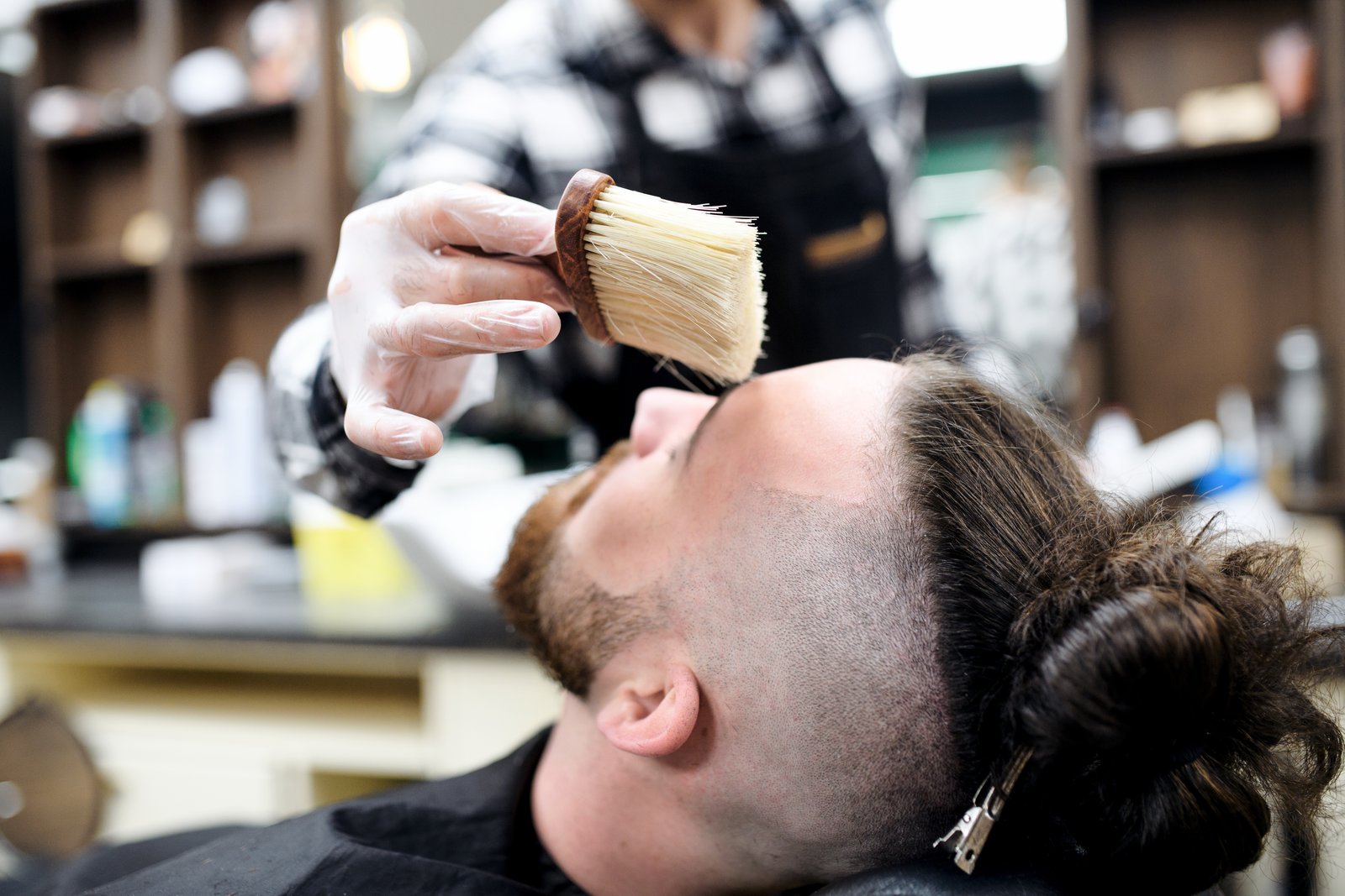
- Select your Brush tool. Set it to a soft round brush, Flow at 5-10%, Opacity at 100%, and make sure you are painting with pure white (to dodge) or pure black (to burn).
Now paint on that gray layer, not on your image. White strokes push areas toward light. Black strokes deepen shadows. Because the layer is set to Overlay mode, the 50% gray base is invisible, and only the light and dark values you paint show through to the image below.
The Flow setting at 5-10% is the key detail people skip. High flow is the enemy of subtle retouching. You want to build the effect gradually, pass by pass, the same way a darkroom printer would expose specific areas of a print under the enlarger in small increments.
Where to Actually Apply Dodge and Burn
This is where technique becomes art, and it is worth slowing down on. Dodge and burn is most powerful when it follows the natural light logic of the image.
On portraits: lighten the bridge of the nose, the forehead highlight, and the tops of the cheekbones. Deepen the sides of the nose, the eye sockets, and the area just under the jawline. You are not inventing new light. You are reinforcing what is already there.
On landscapes and composites: use burning to push back mid-ground elements that are competing for attention with your subject. Even a 10-15% darkening on a background tree line can separate your subject from the scene dramatically without touching a single Curves adjustment.
On product shots: follow the contour of the object. A cylinder gets a gradual burn on both edges and a dodge strip down the center. A flat surface gets a subtle vignette burn around the perimeter to draw the eye inward.
Checking Your Work with a Curves Clipping Layer
Once you have finished your dodge and burn pass, add a temporary Curves adjustment layer directly above your Dodge and Burn layer. Drag the midpoint of the curve sharply upward to about 75% brightness. This blows out the image but makes every subtle tonal variation on your gray layer visible. You will immediately see any streaking, hard edges, or over-worked areas.
Fix those, then delete the Curves layer. This is a quality check I run on every single file before flattening or sending to a client. It has saved me from embarrassing deliverables more than once.
Adjusting Without Rebuilding
Because your dodge and burn work lives on its own layer, you have options that destructive editing never gives you. You can lower the overall layer Opacity to dial back the intensity of the entire effect at once. You can add a Layer Mask to the gray layer and paint out any areas where the effect feels too heavy. You can even duplicate the layer and switch its blend mode to Soft Light instead of Overlay if you want a stronger, more contrasty result.
I run everything on this site on a setup with three monitors, and I keep my gray layer on one screen at actual pixel level while the full composite renders on another. The ability to zoom into the gray layer and see exactly what I have painted, with no image data underneath distracting me, has changed how I spot problems. You may not have three screens, but zooming into the gray layer alone, with all other layers hidden, is worth doing regardless.
The single most important thing to take away from this is not the steps, it is the mindset: dodge and burn is a light painting tool, and like any painting, it rewards patience and low opacity passes over fast, heavy strokes. Build it slowly, check it hard, and keep it on its own layer.
Comments
Leave a Comment