
In Part 3 of this Photoshop tutorial, I will teach you how to use overlays in Photoshop including neural filters and displacement maps.
This post has been adapted from the YouTube tutorial found here.
Project 3: Using neural filters and displacement maps
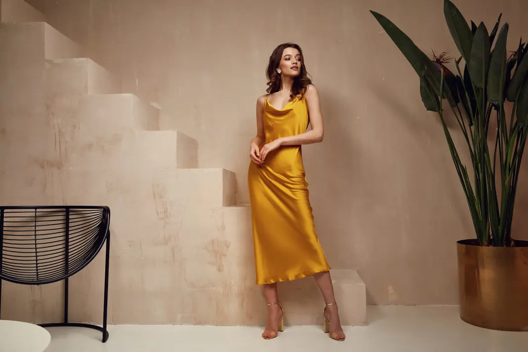
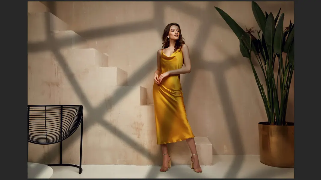
Project 3 is really special. You can see the before image here, which is a great photo but pretty flat:
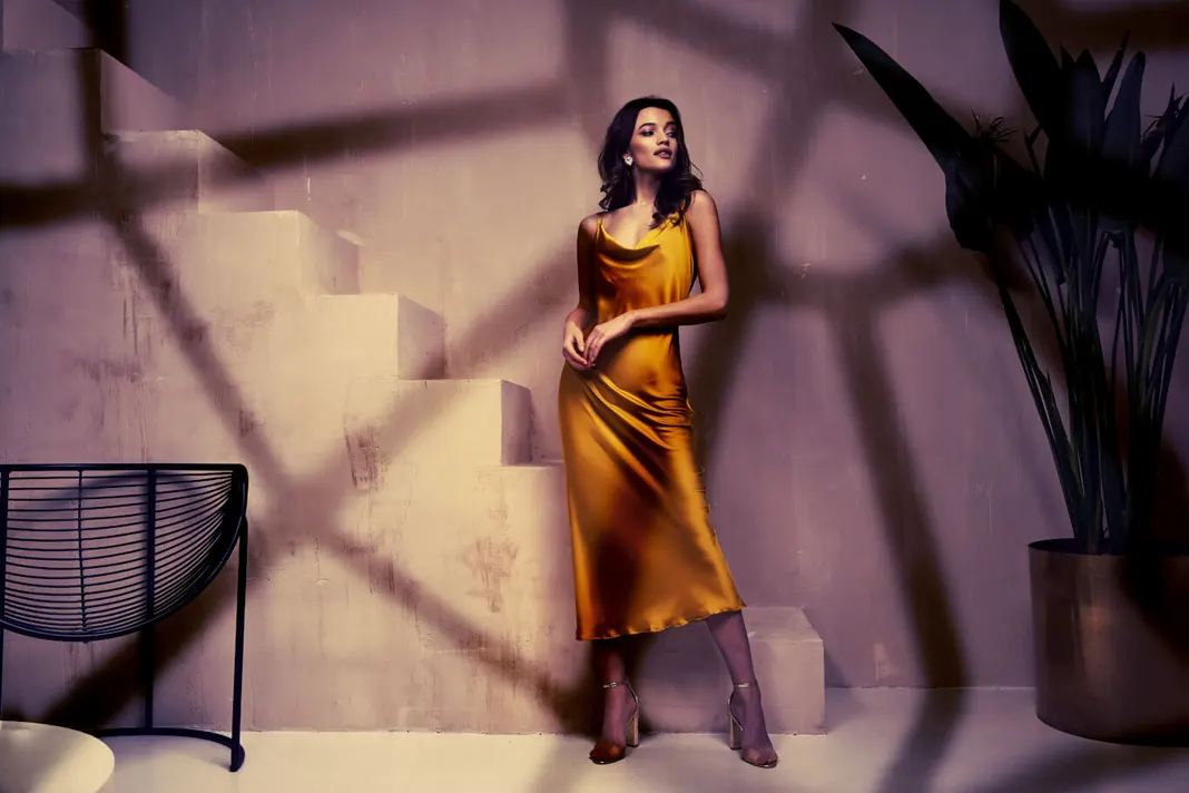
and the after image here, which has a lot of depth added by shadows and lights:
In this project, we’ll cover how to achieve this effect using what’s called neural filters and displacement maps. It is pretty simple, but you will have to follow along really carefully to not miss anything. If you need to repeat this part a few of times to get the hang of it, feel free to do so.
To start this project off, I’m going to go ahead and open this third image in Photoshop.
We can go ahead and zoom in and then zoom out as always so that we have some room to work.
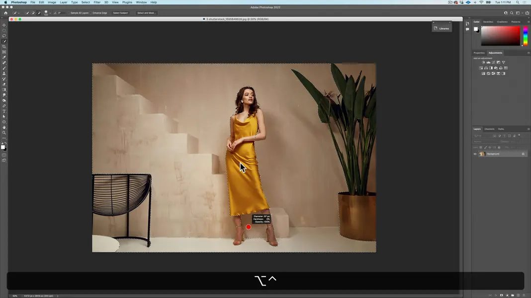
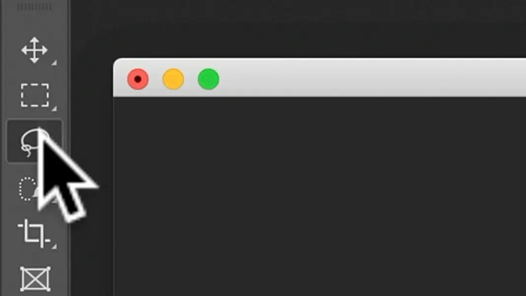
The first step we’ll take for this image is to outline the woman. A neat little trick for outlining is that I often find it easier to outline or select a background as opposed to a subject, which is what I’m going to do in this case.
So let’s take the Quick Selection tool here.
Now I’ll just select the background here by clicking and dragging over the whole background. If anything that is not the background is selected, you can subtract that area from the selection by holding the Option key and clicking and dragging over it.
If you need to change the brush size or hardness for finer control, then you can hold down the Option key and the Control key. With these buttons held, moving your cursor left to right will change the brush size, and moving it up and down will change the brush hardness. I’ll choose a brush that is pretty soft and pretty small.
Holding the spacebar and clicking will also let you move around the window. These are all very useful shortcuts when working in Photoshop.
Now, a quick selection tool can sometimes be very useful, but in some cases the tones are too similar and there isn’t enough contrast to get an accurate quick selection, in which case some manual selection may be needed. In this case we shouldn’t have to change too much manually.
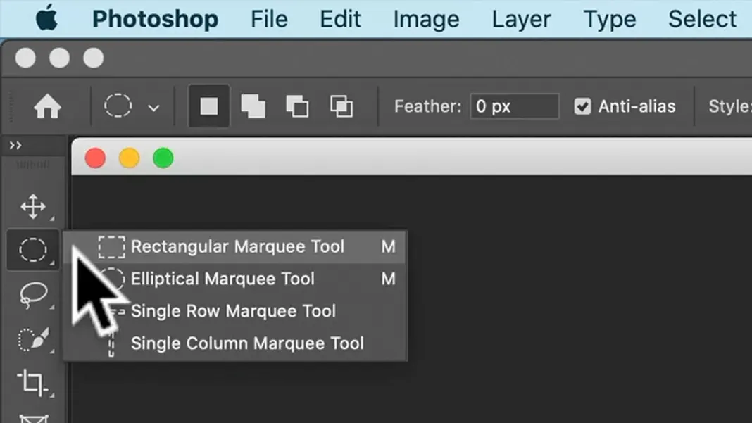
At this point, using the Quick Selection tool I’ve gotten a pretty decent selection, but it’s not perfect. For one thing, the plant on the right and the furniture on the left aren’t selected. To fix this, I’m going to select the Rectangular Marquee tool.
Hold the Shift button and click and drag rectangles around the plant section of the image on the right and the furniture section on the left, being careful to avoid the woman. This should add both of those sections to the selection.
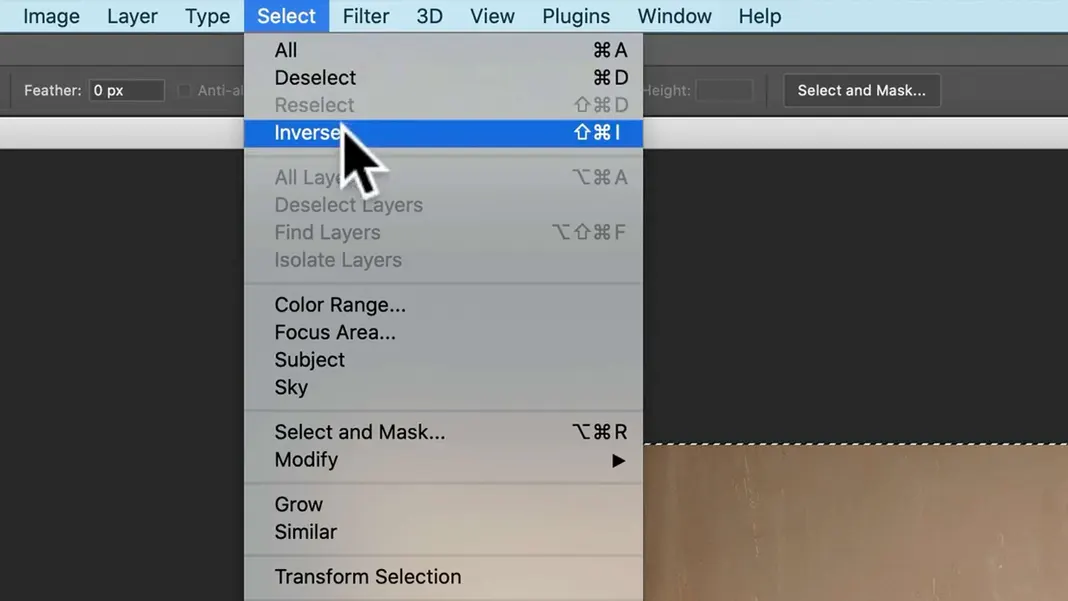
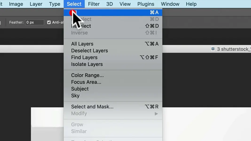
Now we can inverse our selection. You can either select Inverse from the Select menu as shown below, or use the keyboard shortcut Shift-Command-I.
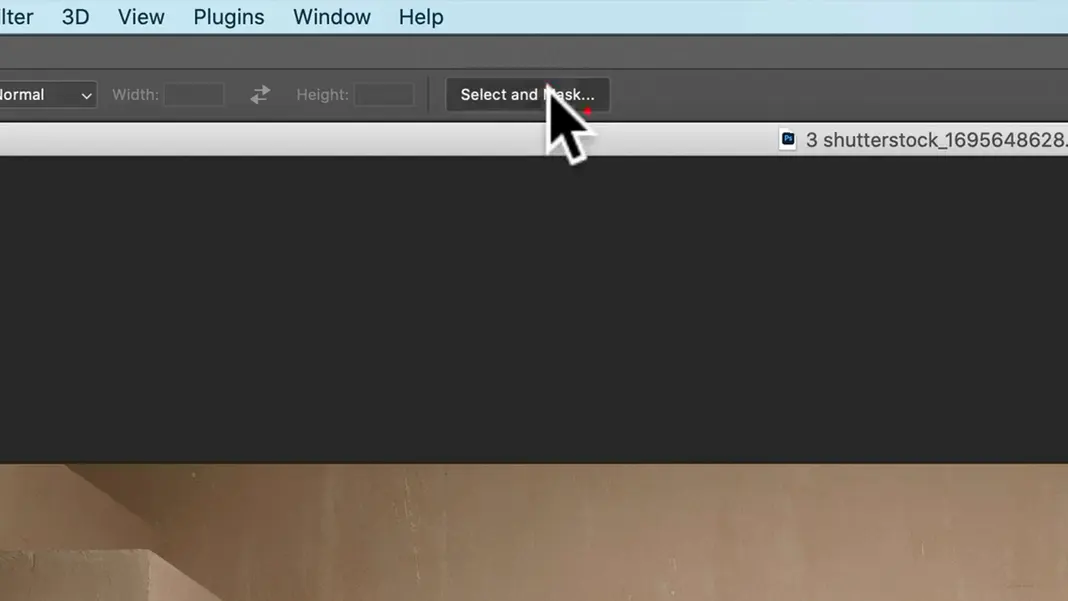
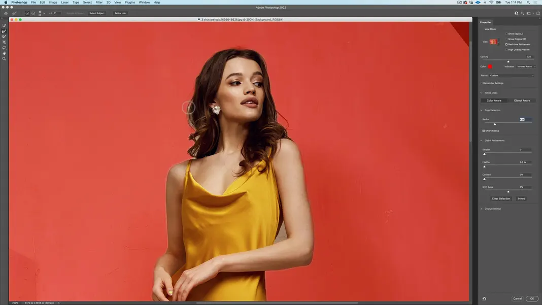
Now we really have the subject selected. However, the edges of the selection still aren’t perfect. So we’re going to go into the Select and Mask menu as shown below to make the selection a little bit better.
If we zoom in on the image now, we can see that the selection edge is decent but a little ragged. Note that I’m not outlining the subject to make a composite. I want to use her selection for some manipulation which we’ll get to shortly.
To improve the selection, let’s enable the smart radius option. This allows the edge to adjust so that sometimes it’s soft and sometimes it’s hard rather than being uniform. We can then increase the radius just a little bit as shown below.
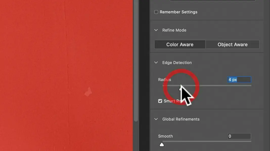
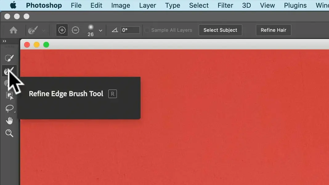
Now select the Refine Edge Brush tool. Make sure the size is set so that it covers the selection’s edge.
With this tool selected, brush over any areas where the background is showing through the selection, and it should basically automatically detect the edges.
The tool usually does a pretty good job. Sometimes it needs a little bit of manual work, but anywhere I have some semi-transparencies, it has pretty good results. This is a neat feature that didn’t exist a few years ago.
Using a smaller brush, we can also use this tool to subtract the background section showing through the crook of the woman’s left arm. I previously had not had this selected out, but this tool makes it simpler. I’ll probably still have to adjust this selection manually, but the main benefit of using the Refine Edges tool is getting the border around the hair right, because setting the edge around the hair manually is extremely tedious and quite difficult to do. So if I am able to get that part done with the Refine Edges tool, the rest can be tweaked as needed without the tool.
Once you’re done with this, hit OK.
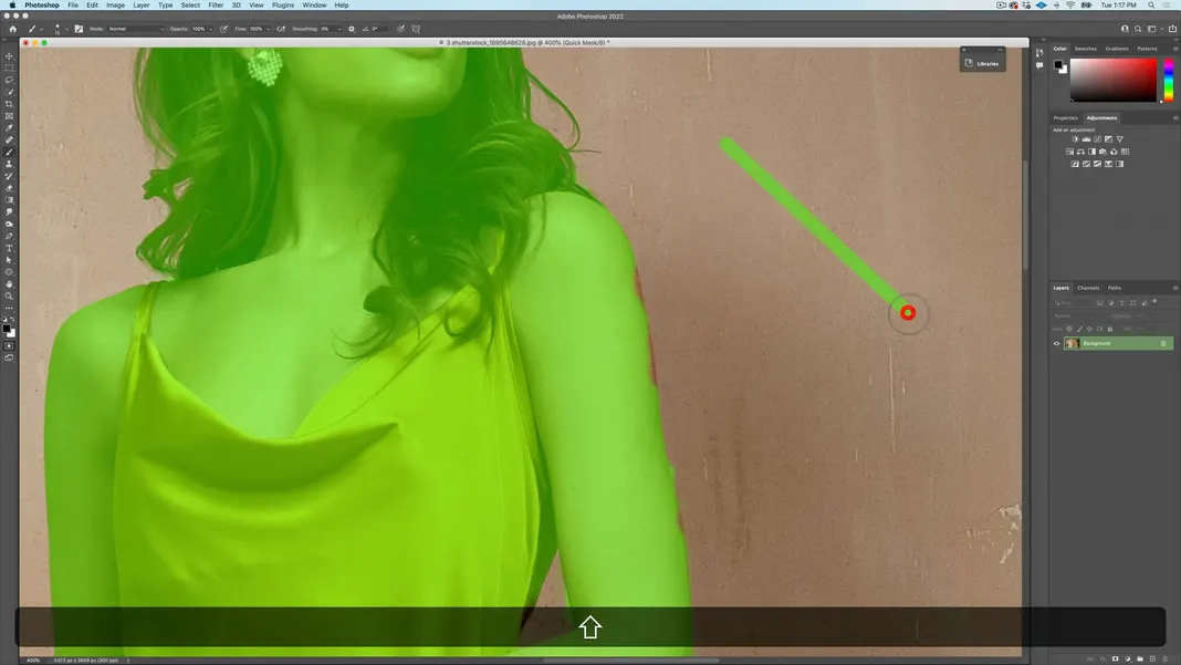
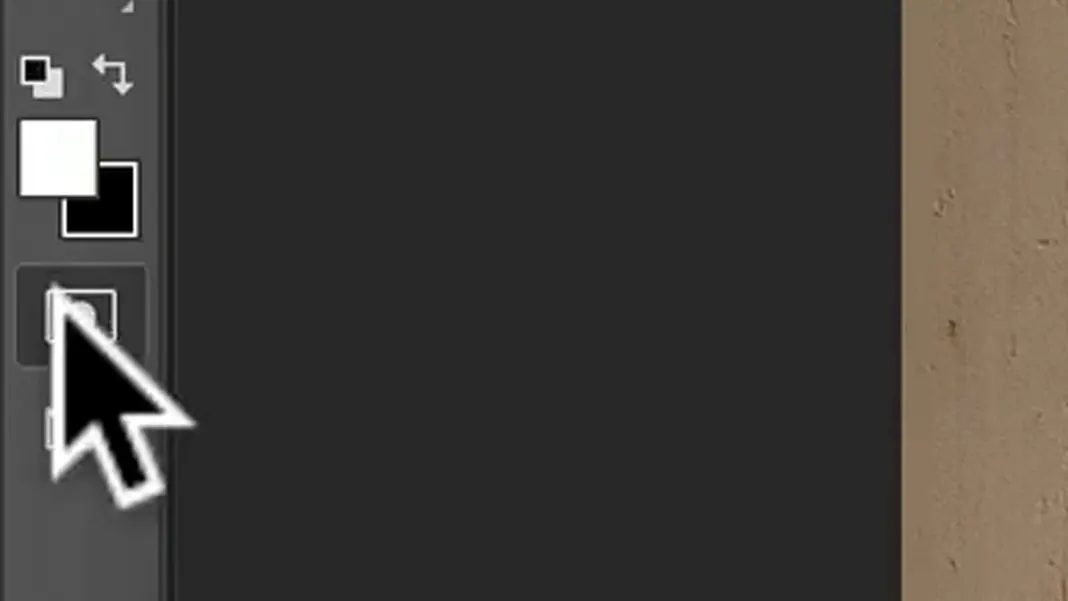
Now we have ourselves a selection that needs some work here. So to edit your selection, you can go into the Quick Mask mode, as shown below.
Now everything that’s selected is red for me. Yours may be the other way around, as the default is for the masked areas to be red instead. I usually prefer to paint in my selection, so I have the selected areas set to red. To change this setting, you can double-click on the Quick Mask mode button and set it to your preference.
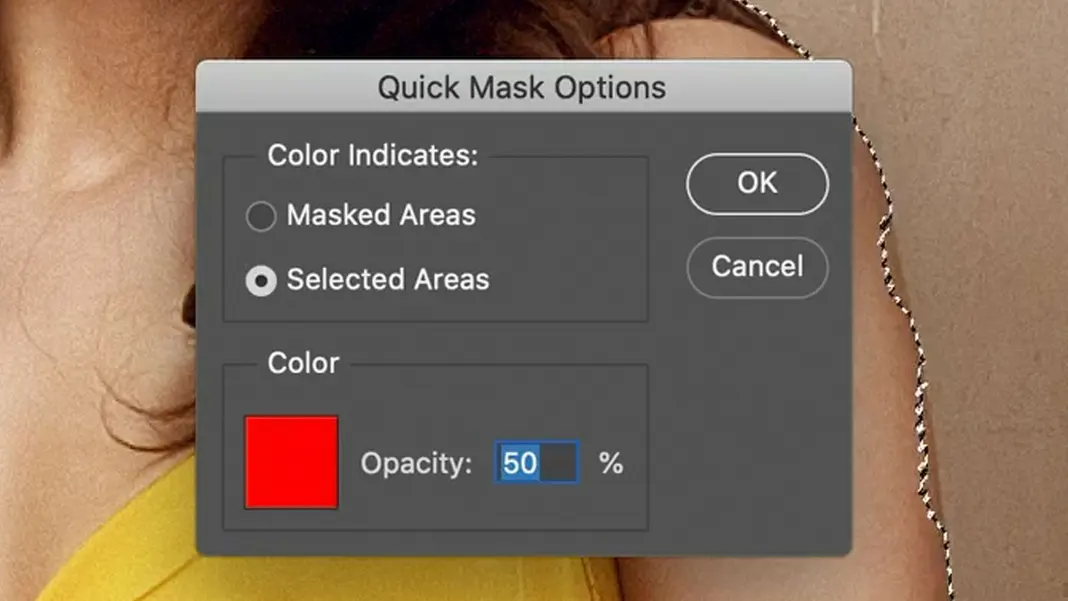
You can also change the color the selection is highlighted with, which can be very useful. In this case, it will be useful to do so because red is close to the woman’s skin tone and it’ll be hard to differentiate the mask from the subject. So in this case, a green would be a little more useful.
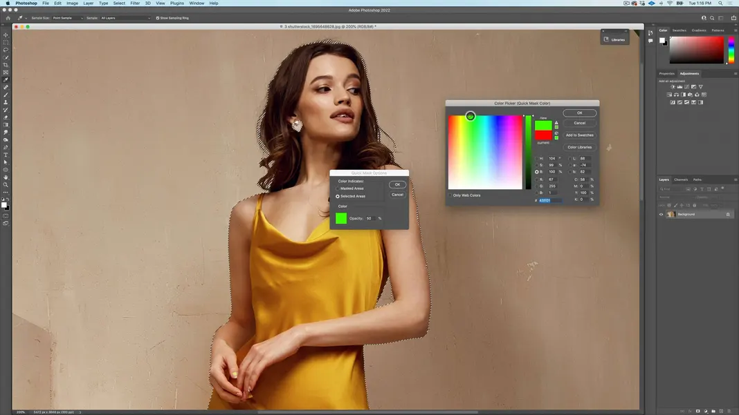
Once your color and settings are selected, hit OK. Now we can zoom in and switch to the brush tool, either by pressing B, which is the keyboard shortcut, or selecting it here.
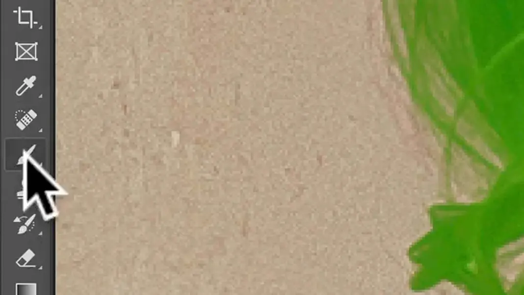
I’ll set the brush size much smaller (around 15 px) for finer control. And when I’m doing hard edges such as in this case, I like using 85% hardness. I find that 100% is just too crisp and doesn’t give any softness to work with, whereas 85% is actually really good for selecting subjects.
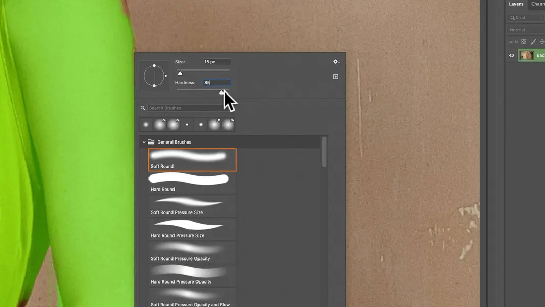
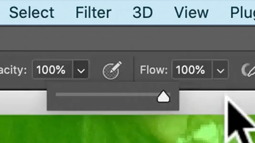
Hit OK, and set the brush opacity back to 100%.
Now as long as I have the foreground color set to black, whatever I paint becomes selected. So the trick in using Quick Selection tools or masking in the Quick Mask mode is to hold down Shift while clicking along the desired edge. What that does is automatically connect the new point to the previous point you placed and make a line between the two, as shown below.
So I’ll use this process of holding Shift and clicking along an edge to select the whole thing precisely. In places where the selection is outside of the boundaries and needs to have an area removed, I can use the keyboard shortcut X to invert my colors so that now I’m painting with white. I can then brush out that part of the selection using the white, and then hit X again to invert the colors back to black.
Again, I’m not actually cutting her out to put her on top of a new background, so some minor errors won’t make a dramatic difference, but a good selection now is worth a lot of time saved in the future in compositing.
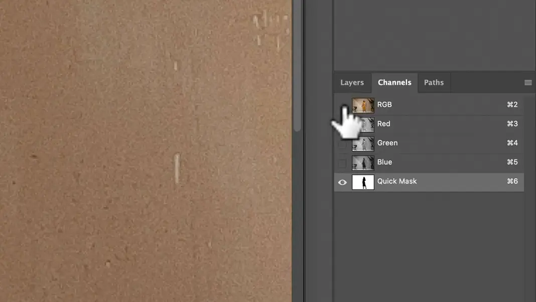
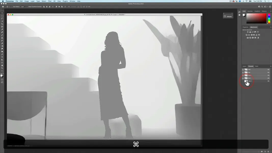
Another tip is that if you want to see the selection a little bit better, given that it’s sometimes hard to see the color, you can go to your channels menu and hide the RGB channel to just see the quick mask as shown here.
This allows me to see that there are some random pixels which do not match the subject, so I will go ahead and clean those up. Once the selection is as good as we can get it, we can leave Quick Mask mode using either the keyboard shortcut Q or this button.
So now we have our selection. I’m not going to use it right this second, so I’ll click on the Mask button as shown below.
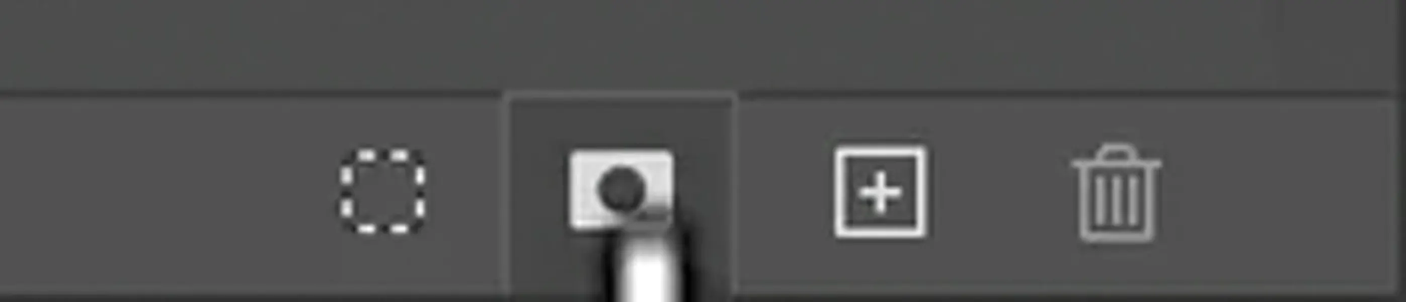
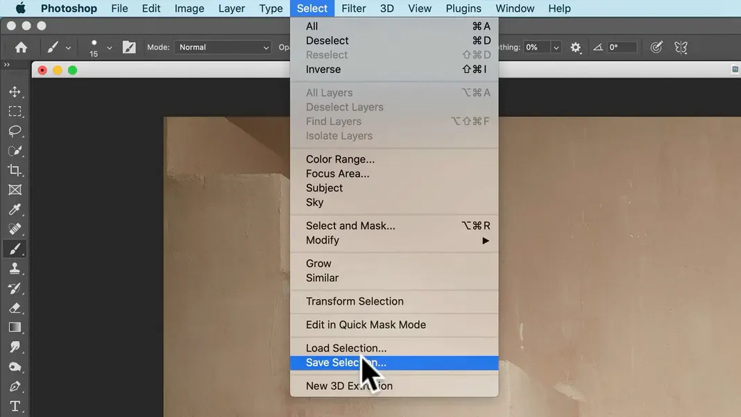
This saves the selection as what’s called an alpha channel. This is the same as going to the Select menu and hitting Save Selection.
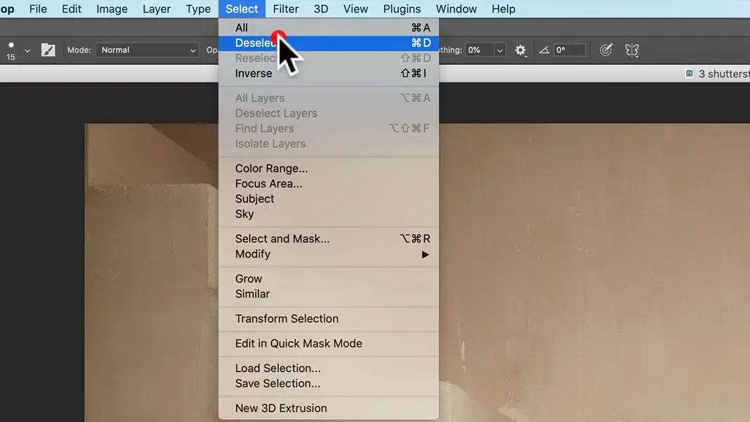
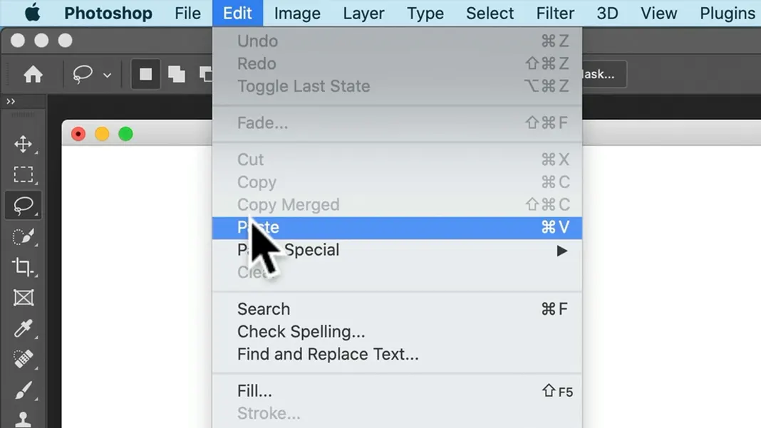
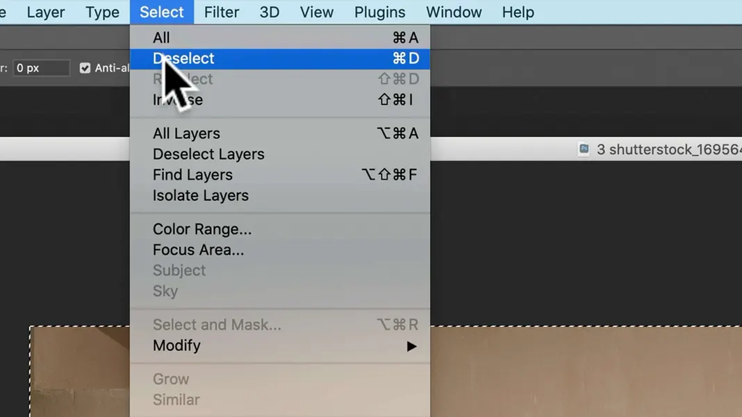
Now we can go ahead and deselect the selection, either by going to the Select menu and hitting Deselect or by using the keyboard shortcut Command-D
Now let’s talk about depth here, because I’m going to add this shadow to make it look like there’s an interesting light and that the subject is in some kind of a church or similar setting. And the way we’re going to do that is using what’s called a depth map.
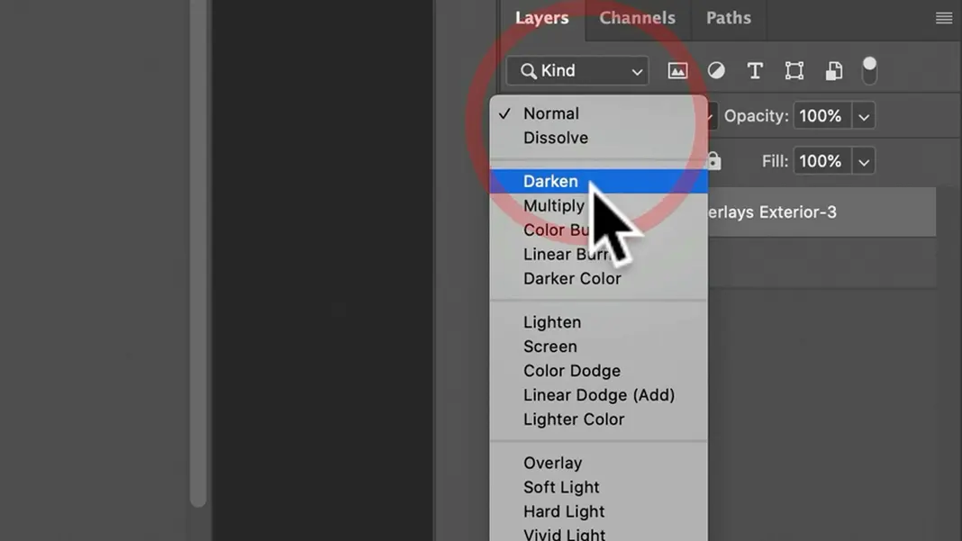
First, drag and drop in the “Shadow Overlays Exterior-3” overlay and hit Return. Next, let’s change the blending mode to Multiply, which is very common. The effect this provides is already pretty cool and definitely adds character, but there’s something wrong here. The shadow is not following the image. The image has depth; the stairs and the subject are both in front of the wall, but the shadow isn’t reflecting that. So we’re going to add a shadow using actual depth.
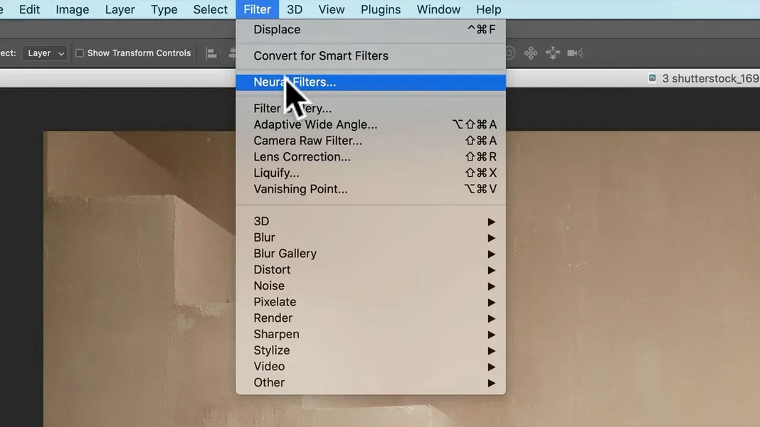
To do this, we’ll use a new feature in Photoshop called neural filters. Click on the Filter menu and select Neural Filters as shown below.
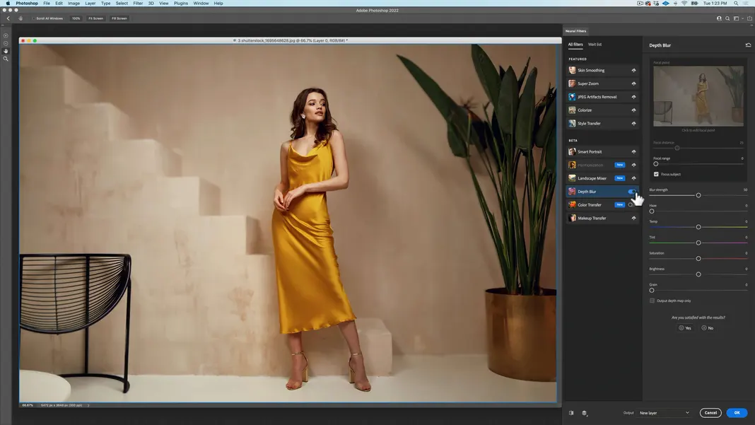
I will zoom out on the image a bit and then select the Depth Blur neural filter.
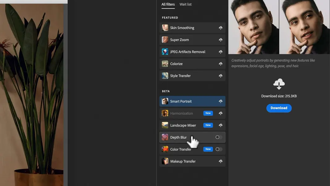
If you haven’t downloaded it yet, just click on the download button and then it’ll be available. Let’s turn it on to see what it does; it may take a bit of time to process.
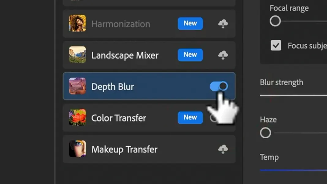
What it does is it tries to simulate depth by sharpening the woman, for example, and blurring the background (such as the stairs) a bit.
You can toggle it on and off to see the difference in sharpness it makes.
Now, we’re actually not going to apply this filter, but instead we’ll use it for a really cool feature called a depth map. Enable the “Output depth map only” option.
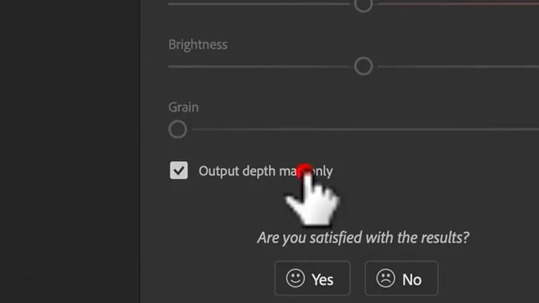
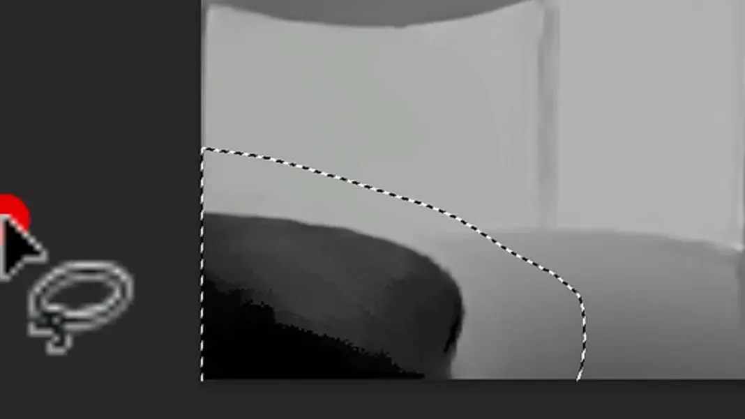
And what the depth map does is tell us what in the image is in front and what is in the back. Anything that’s dark, like the woman or the furniture, is in the front, while everything that is white is in the back.
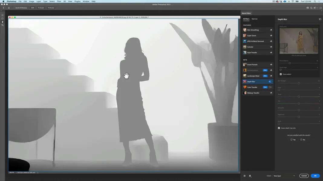
So that’s all we’re doing with this neural filter is creating a depth map. Hit OK on the filter settings, and we now have our depth map.
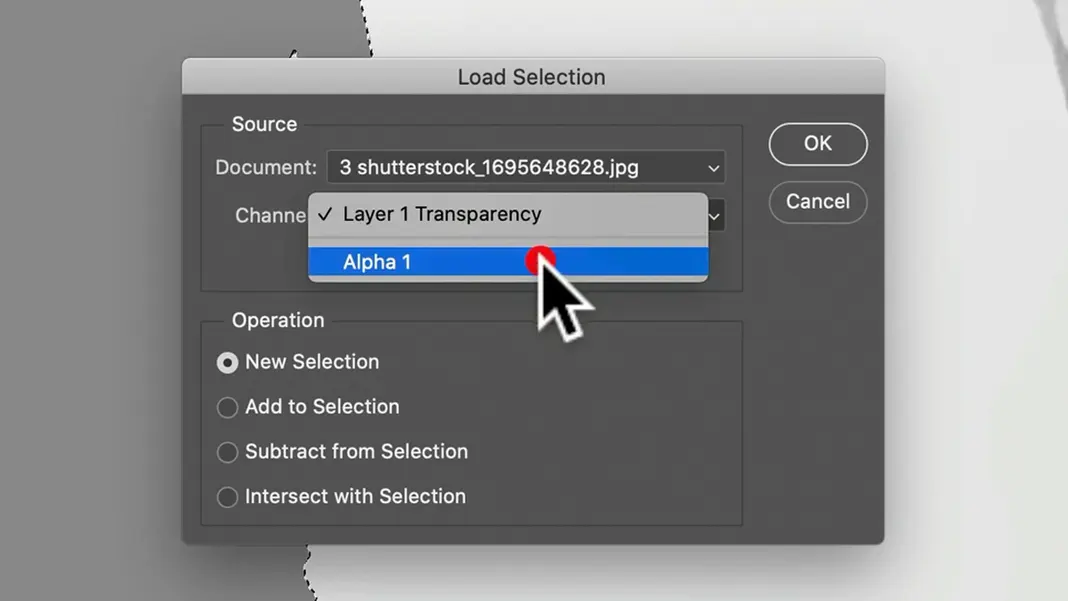
Now I want her to be even more forward, especially around her shoes, than is being portrayed, which is why I made that selection earlier. So now we want to load our selection.
You can load your selection a number of ways. The easiest is to hold down the Command key and click on the alpha channel we created earlier.
You can alternatively go to the Select menu and hit Load Selection.
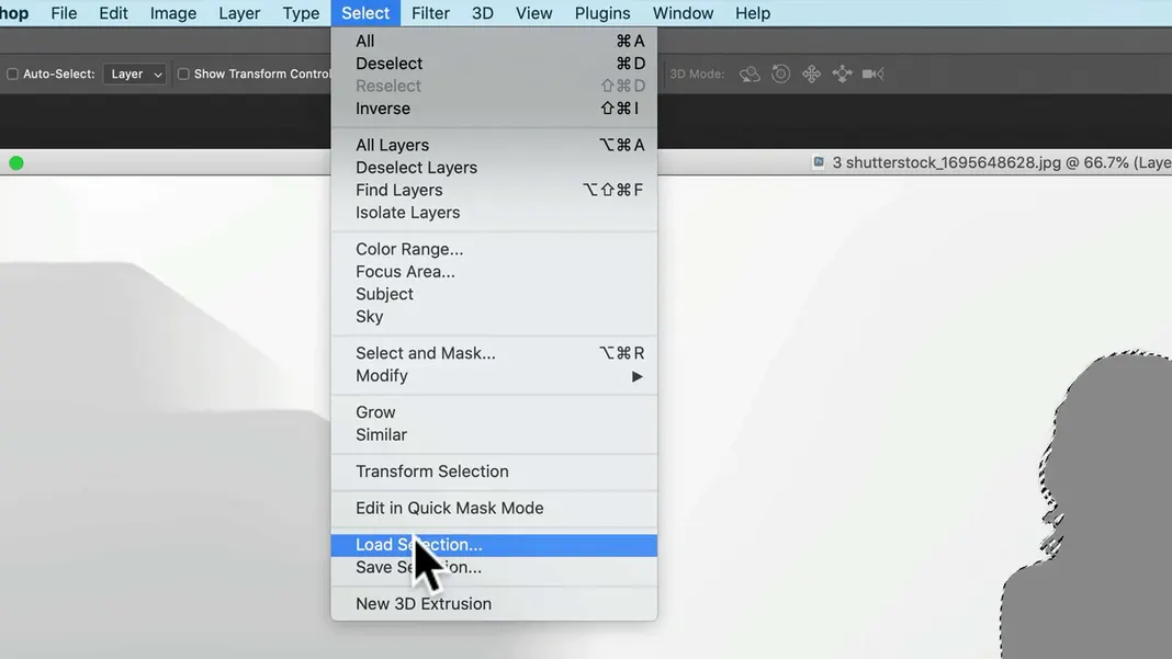
Then change the Channel dropdown to Alpha 1 and hit OK, and this will do the same thing.
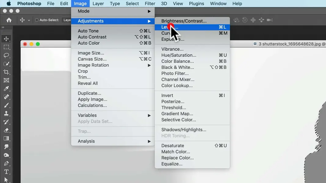
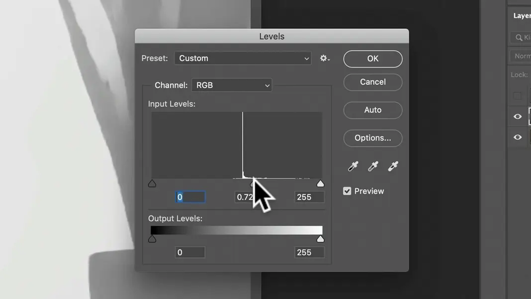
Once that’s selected, I’m going to darken to the area of my selection. To do that, we can navigate to Image > Adjustments > Levels.
We can then darken the area by moving the adjustment marker to the right, taking care not to go too far.
Now, I don’t want my shadows to get overly complex interacting with the plants. There’s a lot of detail in those plants, so even though it’s kind of cheating, I don’t really want my shadows to go forward and backwards around them.
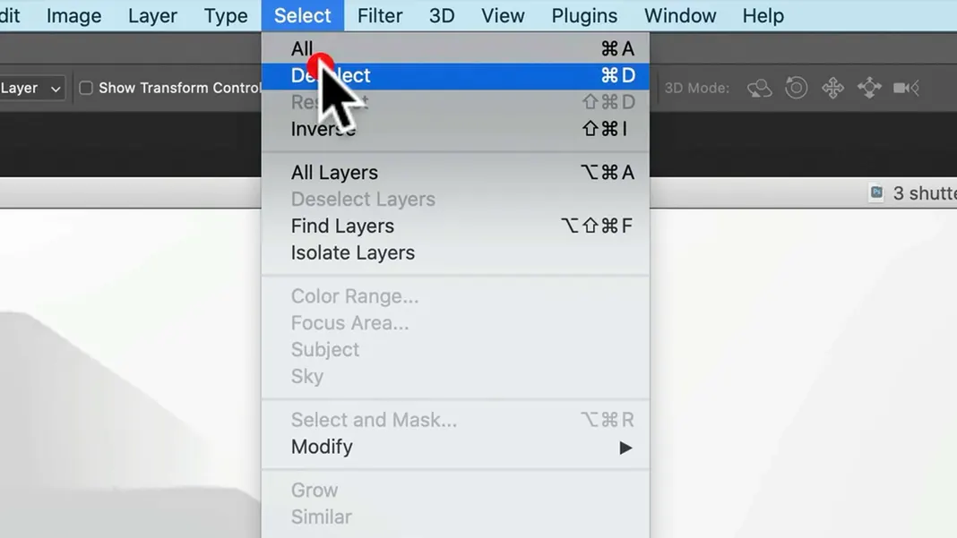
To deal with this, let’s first deselect our selection.
We can minimize the detail in the plants a number of ways. One way would be to just fill it with white; however, in this case I’d like to do it in a gradient.
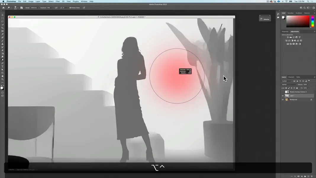
Let’s go ahead and grab the Dodge tool.
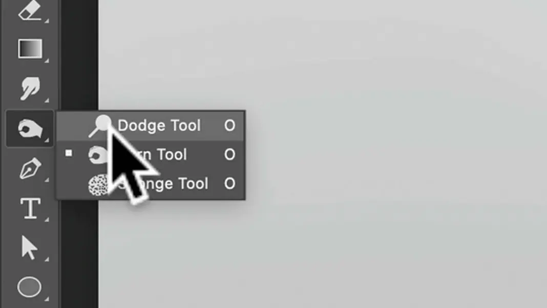
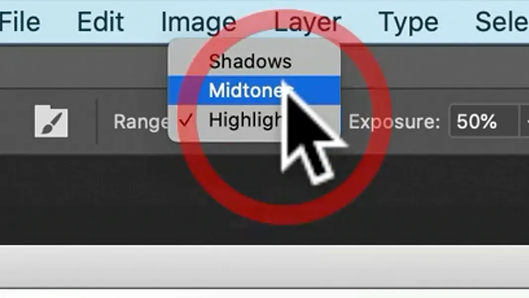
Let’s then set the Range field to Midtones, and set the Exposure to 50%.
Now we can use Option-Control to make a bigger brush and get rid of as much detail as we can, especially in the high-detail leaf and stem areas. I’m dodging the color here so that it doesn’t really come into play with with our gradient and with our shadows.
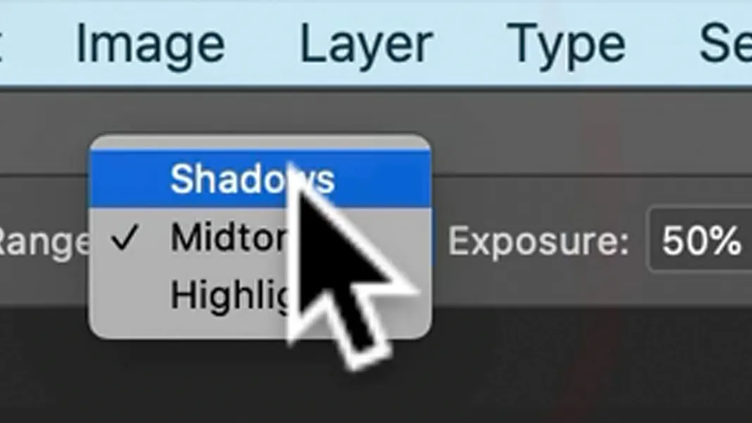
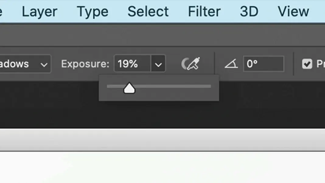
I would also like to dial back the white table in the lower left corner which is currently very far forward. To fix that, I just want to dodge shadows and be more subtle than with the plant. I’ll set the Range field to Shadows.
Now I’ll set the Exposure to 19%.
Trying to brush out the table, I’m finding that it’s difficult to modify that whole section because it’s in the corner of the image, and I don’t actually like this part of the photo anyway. So another way to deal with this is to use the Lasso tool.
We can then make a selection around the table.
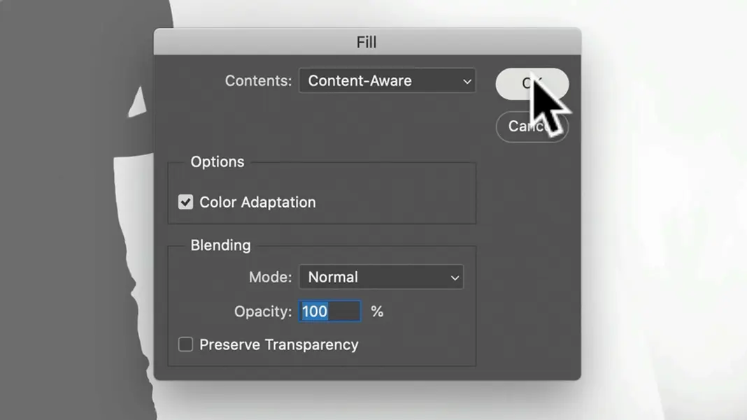
Then we can go to the Edit menu and choose Fill.
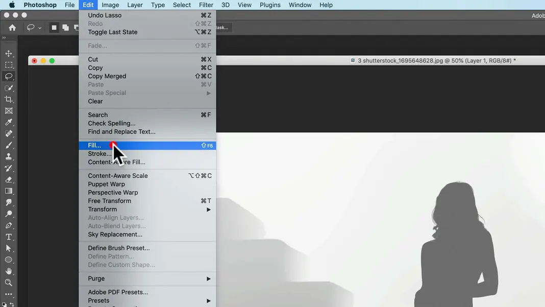
Finally, we can set Contents in the Fill menu to “Content-Aware” and hit OK. We should see the table section of the depth map be mostly set back to white.
Then we can deselect our selection. These steps should keep too much attention off of the white table in the foreground.
Now we’re going to apply the shadow overlay using the depth map we have created. To do this, we will have to save the depth map image as a psd.
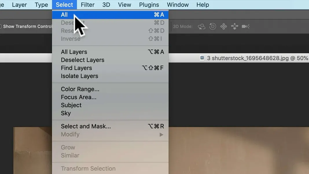
First, while on the depth map layer, select all by either using the Command-A keyboard shortcut or by navigating to Select > All.
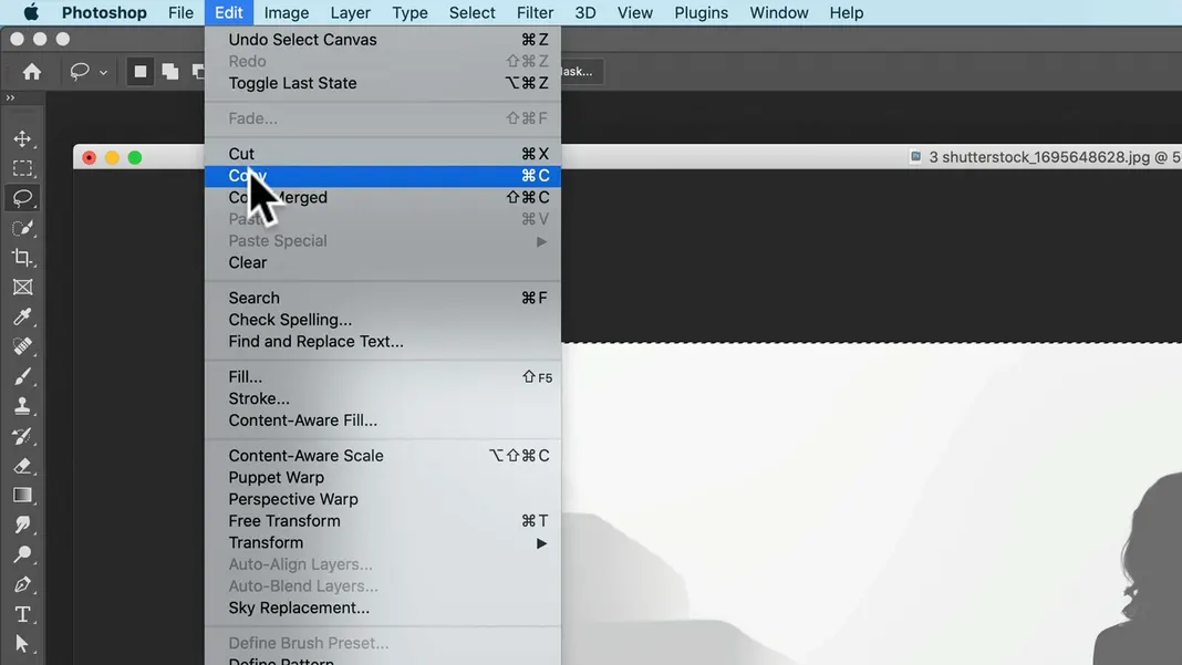
Next, copy the selection by either using the Command-C keyboard shortcut or by navigating to Edit > Copy.
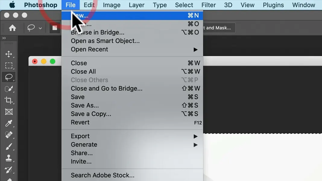
Then create a new document (Command-N or File > New).
The size of the new document will be taken from the size of the clipboard. Now paste (Command-V or Edit > Paste).
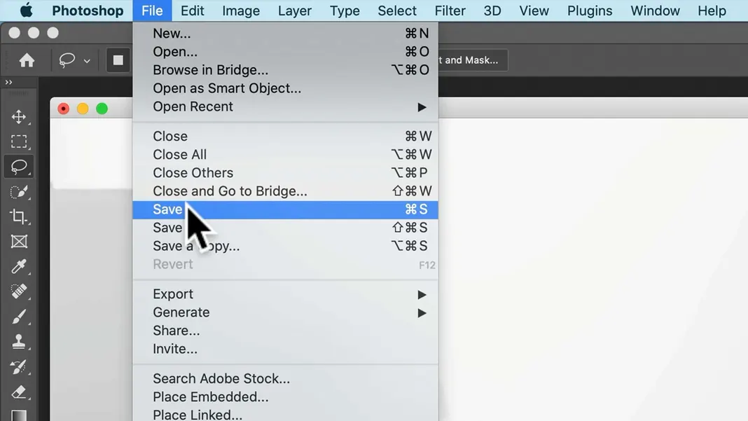
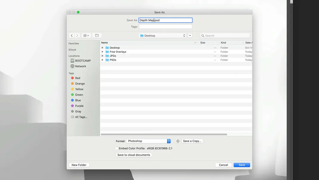
Now I can go ahead and save this as a psd on my desktop. First save (Command-S or File > Save).
Navigate to the Desktop and save the file as “Depth Map.psd”.
That should work great. Now go ahead and deselect the selection again (Command-D or Select > Deselect).
Now here’s the cool part. Select the shadow layer we imported earlier so that it’s visible, and then switch to the Move tool.
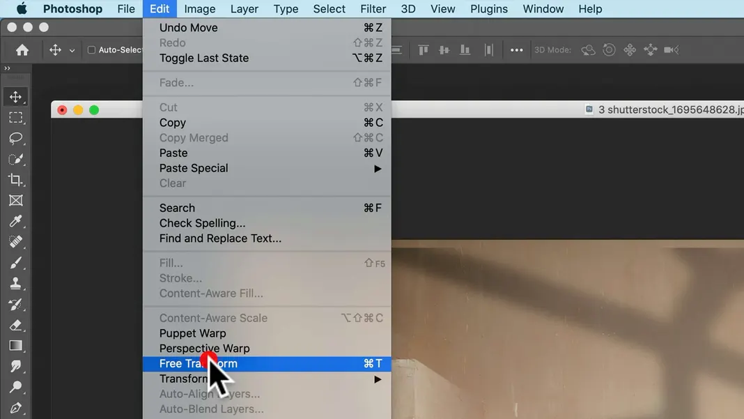
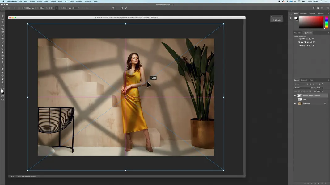
Move the shadow layer so that it covers the full image. Use the Free Transform tool (Command-T or Edit > Free Transform) to resize the shadow overlay and make it bigger if needed to make sure it spans the full image.
I’ve chosen the following position because I like that the light is on her face while the shadows frame her. Now hit Return.
Now, it’s important that the overlay that you’re using is the same size as the image of your depth map. Currently, my overlay is actually larger than my image. So to make them the same size, we’re going to Select All.
Then go to Layer > New > Layer Via Copy, or use the keyboard shortcut Command-J to do the same.
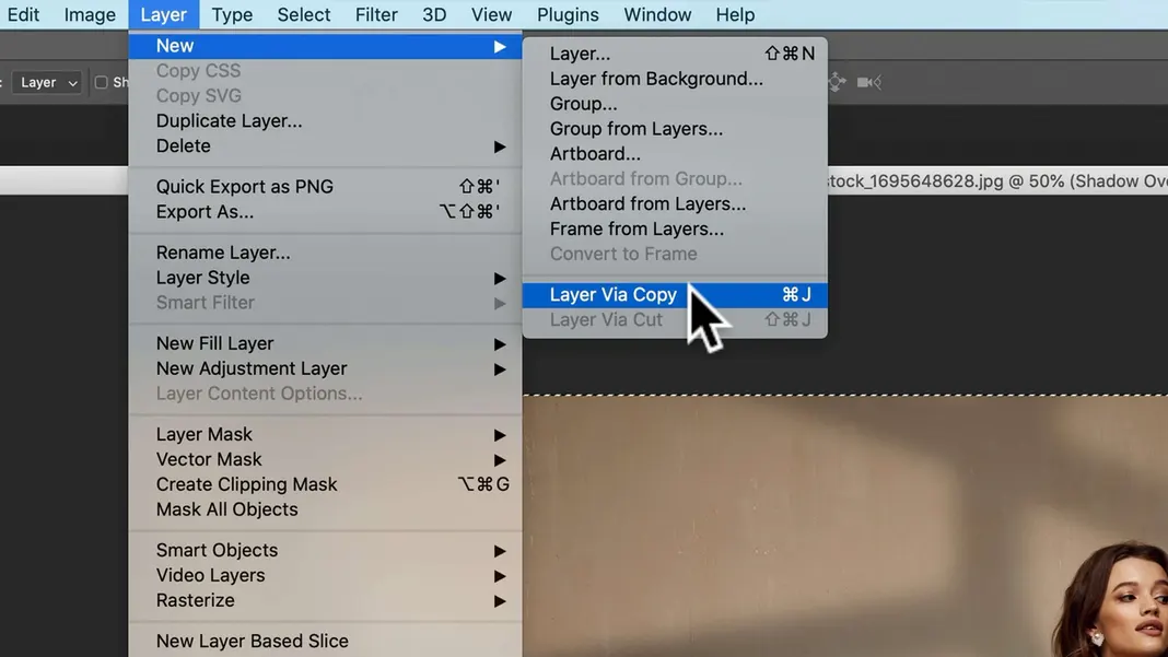
This created a new layer, and if I switch to the Free Transform tool using the Command-T keyboard shortcut, we can see that the layer is exactly the size of my artboard. You can hit Escape to get out of the Free Transform tool.
Now I’m going to hide the original shadow overlay layer and just leave the newly created one visible, and then I’ll create a group.
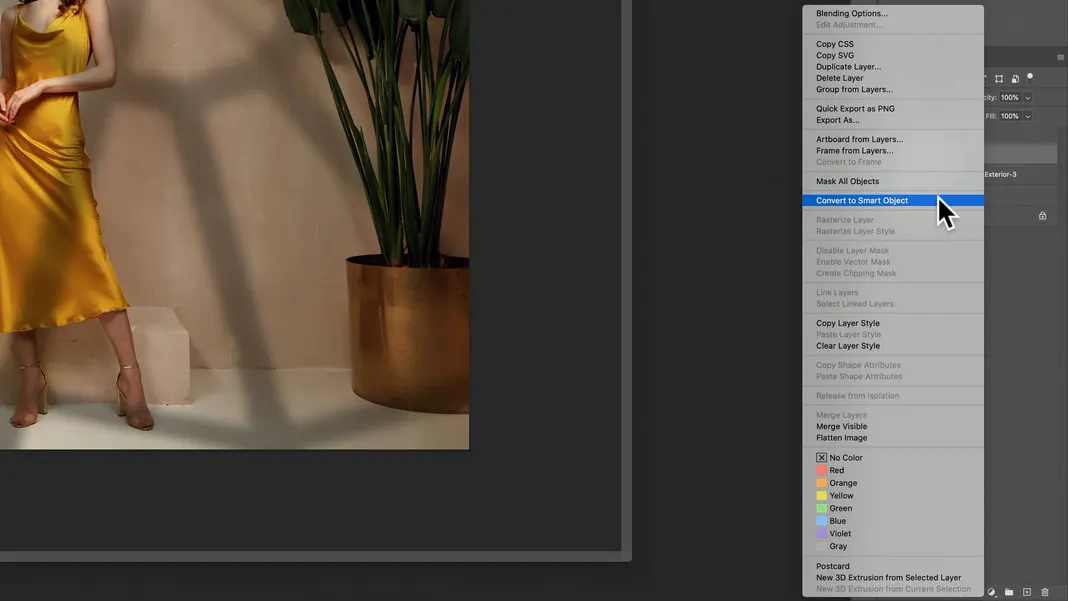
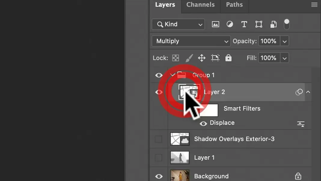
I’ll put the visible shadow overlay image into the group, then right-click the layer and convert it into a smart object.
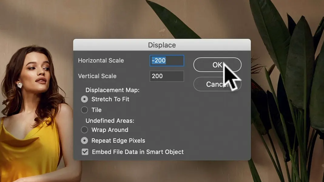
And now we’ll use a displacement filter. To do this, go to Filter > Distort > Displace.
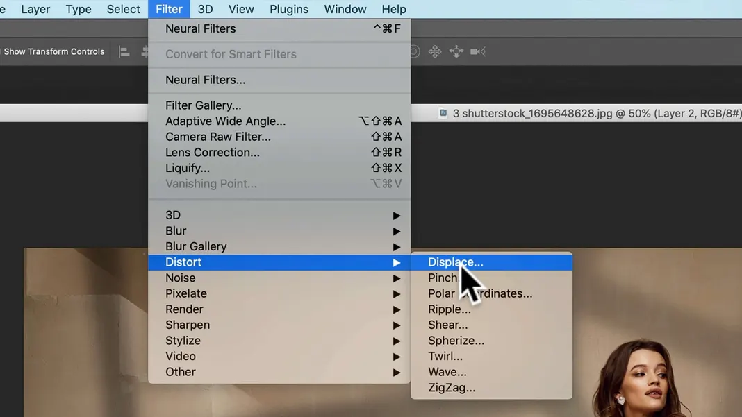
The units for the horizontal and vertical scale settings here are pixels, so we’ll set the horizontal scale to -200 pixels and the vertical scale to 200 pixels. This will displace the shadow to the left and down. We can leave the rest of the options as the default and hit OK.
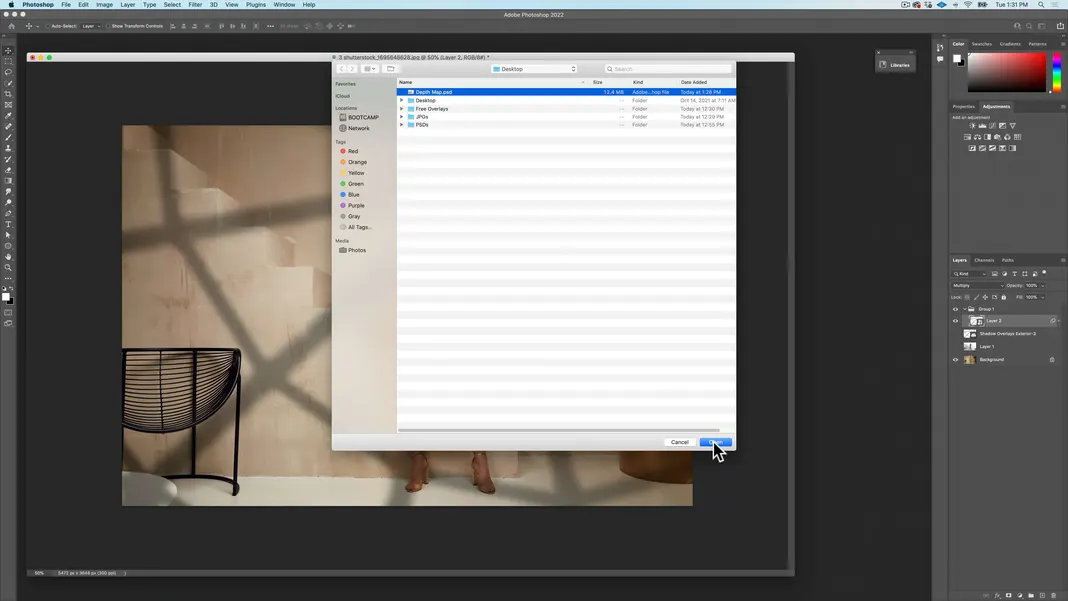
You’ll now be prompted to find a depth map file. Go ahead and select the depth map psd we saved on our desktop earlier and hit Open.
The displacement should now be applied. When looking at the shadows overlaid on the woman, you should be able to see it displaced to the left and down relative to the shadows on the back wall. You can see it more easily by hiding the image and leaving just the shadow overlay layer. So it basically displaced the overlay based on the depth map, which is quite fantastic.
Had I exaggerated the depth of the stairs when I was creating the depth map, my shadow would have been displaced even more over the steps. Having control over that effect is why you can draw in the desired depth when you’re creating your depth map.
The reason I have this overlay in a group and the reason I have it in a smart layer is because I’d like to be able to edit my overlay, without having to redo the displacement filter every time. So to do that, you can just double-click into the layer here.
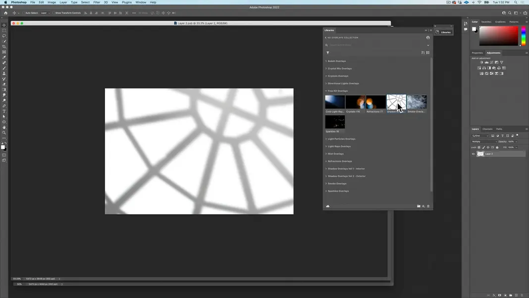
We can zoom out a bit and go back to the libraries. Drag and drop in the shadow overlay smart object and hit Return.
I will set the overlay to the Multiply blending mode temporarily so I can more easily make sure I’m putting it in the right spot.
Line the smart object up with the other shadow layer, hit Return, and then either hide or delete the shadow overlay that is not the smart object.
Now we can save the smart object overlay (Command-S or File > Save). Now you should have a window where you can move the shadow overlay and save your change, and the overlay on the image itself will be moved accordingly and the displacement filter automatically updated.
Now, you can’t necessarily see what the displace filter would have done over the leaves where we modified the depth map, but trust me, when you have a lot of unwanted detail on an object, it’s just not worth keeping. But you should be able to see the perspective created in other places, such as the shadows bending where the floor meets the wall, which is very cool.
We can close the shadow overlay window now.
So that was the more technical, difficult part of adding shadows and using depth maps. Now, I actually don’t want to use the Multiply blending mode in this case. Multiply feels a little flat, whereas the Color Burn mode looks a little more natural and dramatic.
If I feel like the shadows are too strong on the subject, I still have my selection of her, so I can take out some of it if I want, but I’m going to leave it as is for now.
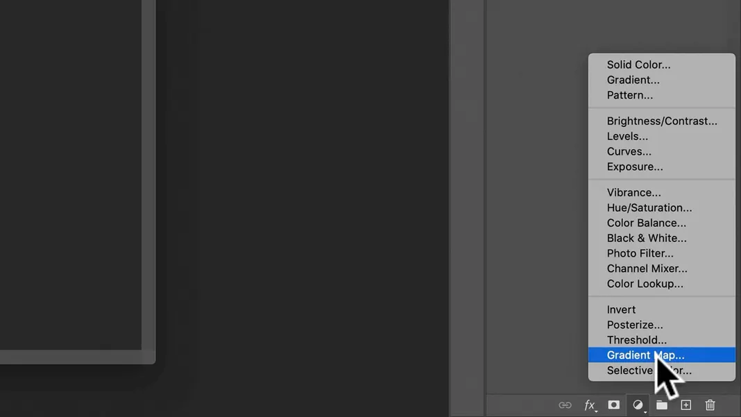
I do have a cool little trick that I want to show you that is unrelated to overlays. We’re going to go ahead and create a gradient map as shown below.
We can take it out of the group. By default, it’s just a black and white gradient. So click on the black and white gradient in the Properties section on the right.
We’re going to use this gradient to colorize this image. Let’s choose some basic colors, blue and yellow, for the gradient.
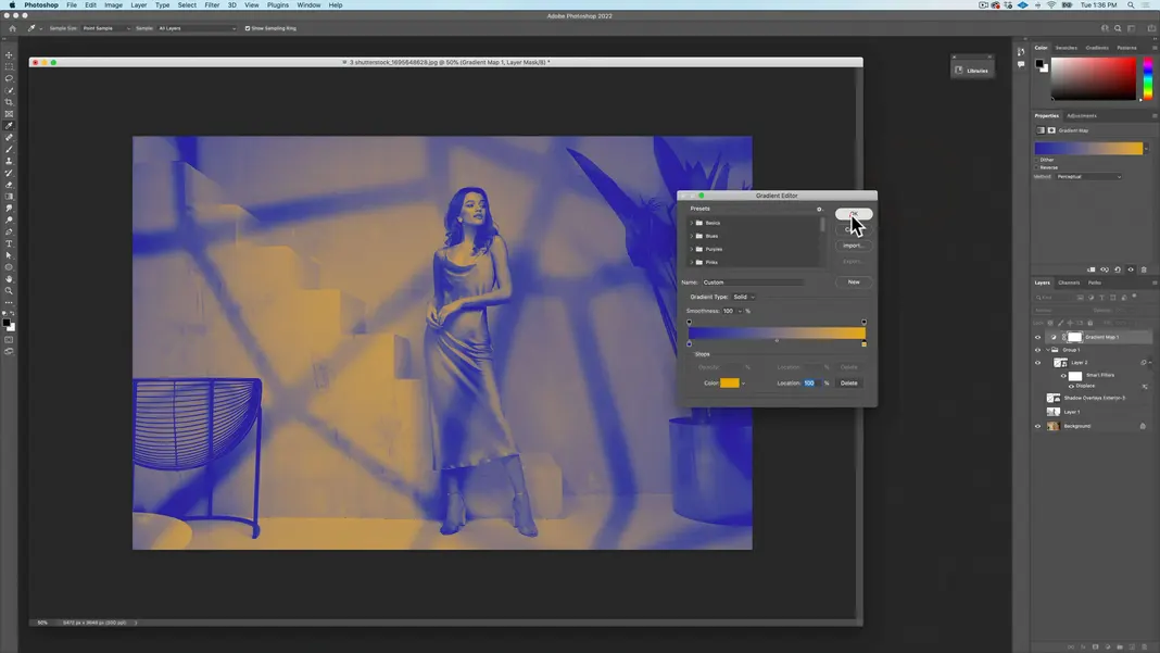
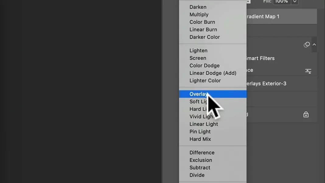
Now here’s the cool part. Now that I have this gradient map, we can change it to the Overlay blending mode so that it overlays those colors on top.
This change adds some dramatic coloring to the image, which is a neat way to bring everything together.
Taking a look at the image, I feel like there’s too much blue and not enough yellow, so to correct this we can go back into the Gradient Editor from the gradient map’s Properties. We can change the balance of the colors by moving the point in the middle of the gradient map. My final choice is the following, but you can play with your gradient and set it as you’d like.
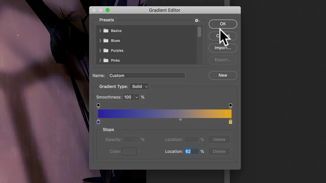
I can even lower the opacity a bit to lower the contrast of the colors, but I like the color.
Anyhow, that’s how you create a depth map and how you can use one of these shadow overlays.
Like I said, you can always just drop the overlay over the image and put it in the Multiply or Color Burn mode, but creating that depth map to have the actual perspective affect the shadows is a very cool technique, and it’s actually quite easy to do in Photoshop.